# Avirtualfuture's - 3D Fungible Data Viz Tool


## AI meeting summary
Developer @avirtualfuture presents a blender project for generating visualizations of large quantities of money. The project aims to accurately represent the scale of monetary amounts using pallets of bills, with 100 million and 1 trillion as examples. Another visualization for cryptocurrency prices using Big Macs is shown. Goal is to make conversations about money more engaging and understandable. Tech challenges also addressed. The tool has potential uses in DAO proposals and governance tools.
# Source:
- https://github.com/avirtualfuture/daily-crypto
- https://sketchfab.com/3d-models/100-million-dollars-cash-pallet-9e3d18e8a3d140318ef48fbcd92173d7


# Manually Edited transcript
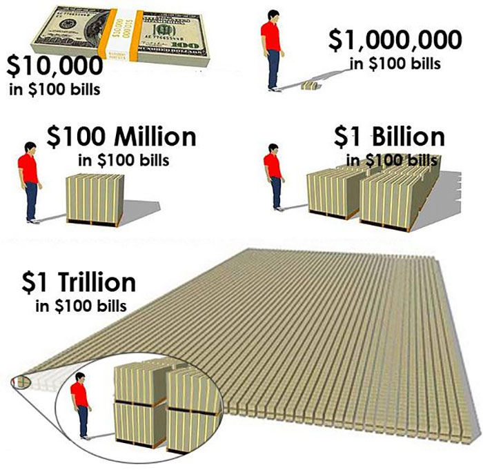
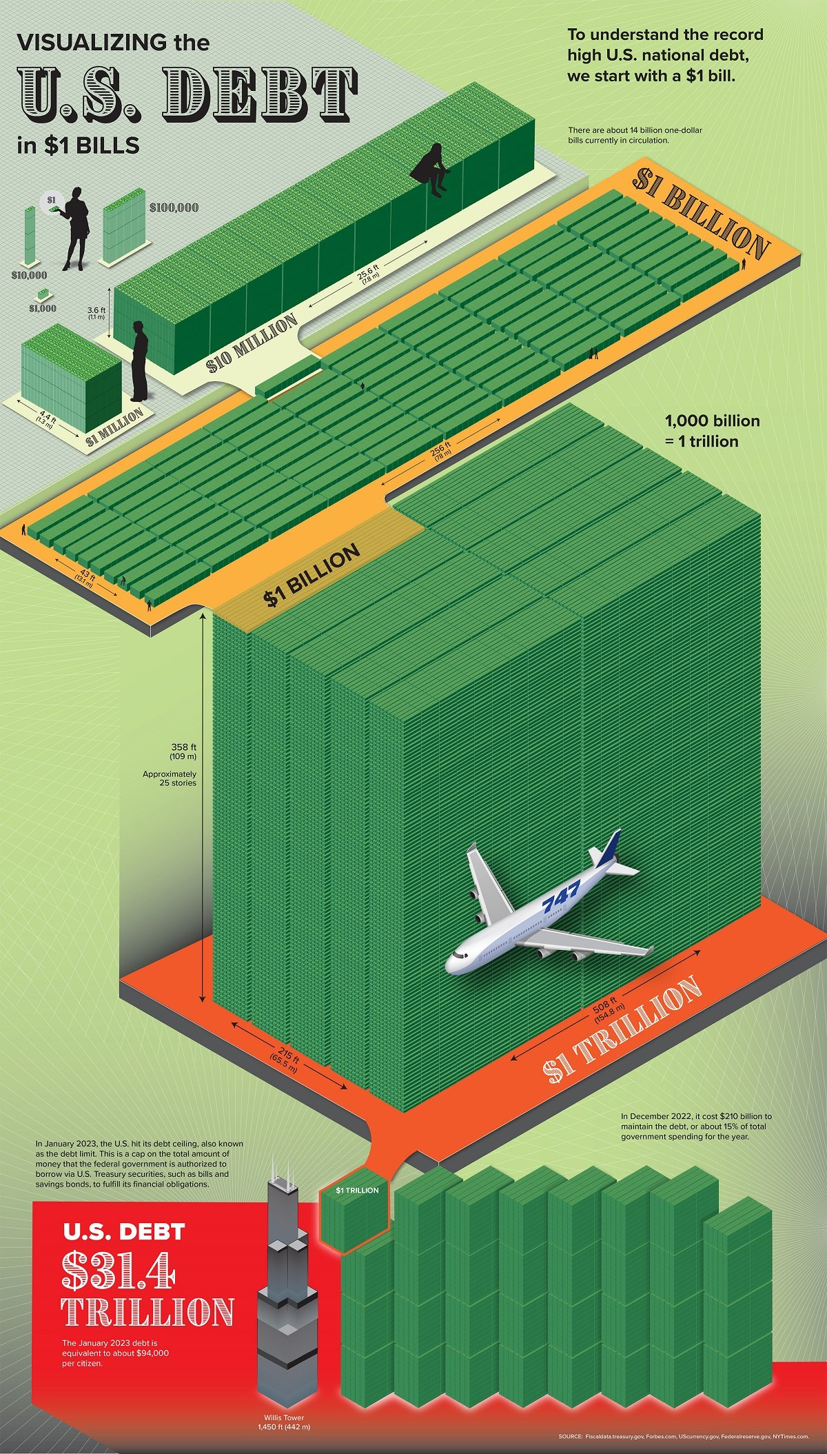
A: Hello, I'm "A" or "avirtualfuture". I've been involved in XR development for many years and for me, VR is a medium to help people think and develop ideas together. Today I'm presenting work done on a blender script for visualizing large quantities of money, specifically inspired in a diagram that circulates on the Internet. Jin wanted to recreate that kind of thing and to make it dynamic so that any given quantity of money can be represented in a performant way. So the challenge was to figure out a way to do this through blender and generate the output as an optimized GLTF model that can work anywhere. So the idea in general was to start from pallets of money and to get some precise dimensions on everything so that it's an accurate representation.
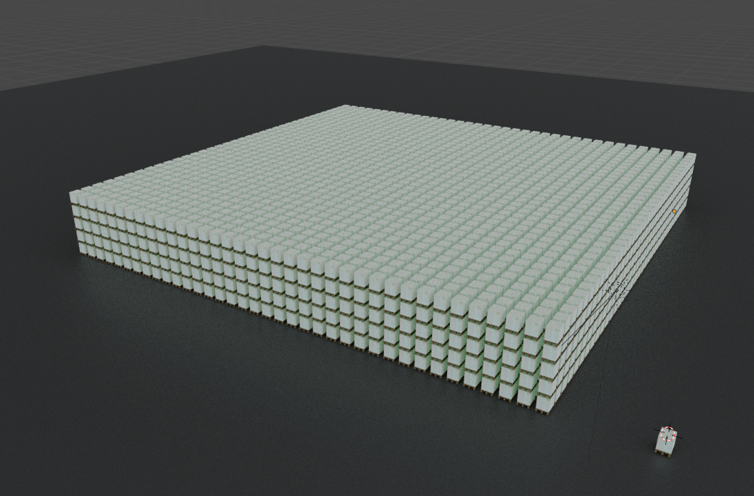
And the first task was to create, to figure out how does $100 million look like in real scale. And this is what you're looking at. To my left, there's the fear of human body to represent the scale of the pallet. And in front of you there's $100 million in bills of 100. Let me check my notes. And then behind you there's the huge quantity of pallets. Represents $1 trillion in 100 bills. So let me. Okay, so the main challenge with visualizing money is that anything past $1,000 is very abstract. Like people will make mistakes. Even with how much money can you fit in a suitcase, for example? Everyone will give you a different answer. Very rarely we see large sums of money, and anything past like a million dollars is just absolutely abstract.
So this is not the only way to represent such a thing, but I think that it's very illustrative. The familiar element here is the pallet base, because everyone has seen a wooden palette. So the scale is absolutely familiar, like if you've ever been to Costco or something like that. There are pallets everywhere. There are some technical challenges for doing this project. Like for example, you can't just do a for loop and spawn so many cubes because it's not going to perform well. It's going to destroy the performance of any place where you put this 3D model. So there's a glTF extension that's for instancing, and the platforms that support such extension use a feature called instancing that reduces the number of draw calls dramatically. If you are drawing the same object many times, it will save a lot in performance.
This is the main tool that we have used to achieve such large number of pallets. And then of course, there are other optimization that they are less interesting. Fundamentally, this is both a showcase of the instancing extension for a good use, or like clearly useful use. And on the other hand, it's also a demonstration that if we can, that visualizations don't need to be pictures, which seems obvious, but they can be an interesting tool to convey the scale of economic events, which is usually lost in a picture like the one I'm in front of. It's crazy in terms of how wild the scale of things is. You can just compress all the information in a single picture. You absolutely lose the scale of everything. Anyway, if people can join me, we can click here where it says click to teleport tower.

Okay, so in front of you, there's a pallet with one hundred million dollars. And if you go near the edge, you can see down below 1 trillion dollars in one hundred dollar bills. As you can see, it's quite a lot of money. Next to it, there's a typical plane, a typical commercial plane for scale. And the red thing far there is the same human you can see here, the same red human. And I typically use the human to really give people scale of what they're looking at far away. And I think that it's very useful to have this kind of visualization, not only as it is here, it's like a novelty because I'm showing the results.
But if you are explaining something like the bulget of a government, or the losses of a project, or a market cap or something like that, it's way easier to convey how much money this is, and it's not an abstract number.
If everyone can join me, here's another visualization that's generated from blender. And in this one, you can visualize for a given day the price of each cryptocurrency. For example, Ethereum, Bitcoin, Tron, et cetera. So the goal of this kind of visualization is to see how many Big Macs you can buy with each, because internationally there's something called the Big Mac index, that it's a tool to compare buying power around the world. In the United States a Big Mac is like 5.60 or around that. So you can see how many Big Macs one bitcoin is. And it's like a lot. You can see. And then for the currencies that are less than $100, you can see how many Big Macs is $100 of that currency. For example, 101 dai.
I don't know what mantle is, but it's 285 for this many Big Macs. So in any case, the idea here is that this is also using the instancing extension for GLTF. But the idea is that through procedural visualizations, we can have more interesting, more grounded conversations about money, which is extremely abstract to talk about. Also, this is open source.
Cynnx: What does it mean when it says a coin X times?
Response: That's how many you need for $100. Like, for example, USDC. Obviously, you need 100 of them. This is spending $100 on Big Macs.
Jin: Awesome. Well, this is powerful when it comes to DAO proposals, I personally think that visualizing a proposal like what's in a treasury and how much you're asking is powerful and that we could export our governance tools to perhaps public goods type organizations like governments in the future because it's so abstract to talk about anything over a million dollars for the average person. Most people haven't seen a million.
A:Big Mac price is used around the world for comparing buying power for example.
Also, market cap is a massive number in general. So the dollar pallets visualization is good for that kind versus this because it gets ridiculous. The market cap of Bitcoin is huge. I think that it's like half of the trillion dollar stack in there. it's also super performant. The whole thing is two draw calls.
## Outline
- Chapter 1: Introduction to the Blender Project
- Timestamp: 00:15-02:30
- Description: The speaker introduces themselves and their experience in XR development. They explain that they have worked on a Blender script for visualizing large quantities of money. The goal is to create an accurate and dynamic representation of money using Blender.
- Chapter 2: Challenges in Visualizing Money
- Timestamp: 02:30-04:36
- Description: The speaker discusses the challenges of visualizing money, especially amounts above $1,000, which can be abstract. They explain that the project aims to create an illustrative representation using pallets of money as a familiar element.
- Chapter 3: Technical Aspects of the Project
- Timestamp: 05:46-06:26
- Description: The speaker explains the technical aspects of the project, specifically the use of instancing extension in Blender to optimize performance. They highlight the usefulness of visualizations in conveying the scale of economic events.
- Chapter 4: Visualization of $100 Million
- Timestamp: 06:26-08:50
- Description: The speaker presents the visualization of $100 million in bills of 100. They describe the scale of the pallet of money and its representation using a human body for scale. They emphasize the importance of such visualizations in conveying the magnitude of financial concepts.
- Chapter 5: Visualization of Cryptocurrency Prices
- Timestamp: 10:06-11:47
- Description: The speaker introduces another visualization generated from Blender, showing the price of various cryptocurrencies in terms of Big Macs. They explain the concept of the Big Mac index as a tool to compare buying power globally.
- Chapter 6: Open Source and Questions
- Timestamp: 12:11-13:06
- Description: The speaker mentions that the project is open source and welcomes questions. They address a question about the meaning of "coin X times" and explain how it relates to the visualization of different currencies.
- Chapter 7: Practical Applications and Future Possibilities
- Timestamp: 13:06-14:07
- Description: An attendant discusses the practical applications of visualizations in DAO proposals and governance tools. They express optimism about the potential for exporting these tools to public goods organizations like governments. They also mention the possibility of more visualizations in the future.
- Chapter 8: Reflections and Conclusion
- Timestamp: 14:07-16:27
- Description: The participants share their thoughts on the visualizations and express appreciation for the speaker's work. They discuss the impact of visualizations in understanding buying power and inflation. The chapter concludes with plans to teleport back to the stage and wrap up the session.
Note: The timestamps provided are approximate and may vary depending on the interpretation of sentence boundaries.
## Notes
- Presentation on a blender script for visualizing large quantities of money
- Challenge of representing money past $1,000, as it becomes abstract
- Visualization of 100 million dollars in bills of 100, using pallets of money for scale
- Demonstration of using instancing extension for optimized performance
- Visualization of cryptocurrency prices in terms of Big Macs
- Procedural visualizations for more grounded conversations about money
- Open-source project
- Potential application in DAO proposals and governance tools for public goods organizations
- Comparing buying power using the Big Mac index
- Positive feedback on the visualization