---
title: (2022) Practical Data Analytics for Solving Real World Problems - participants
author:
- Maria Teresa Grifa
- Patricio Reyes
date: 2022-02-07
slideOptions:
transition: 'slide'
---
# Hello :hand:
[](https://hackmd.io/6wrG0OCLRJiYXhSihKDlrg)
<!-- .slide: data-background="https://media.giphy.com/media/26xBwdIuRJiAIqHwA/giphy.gif" -->
----
## Patricio Reyes
- researcher at BSC, [Data&Vis Team](http://bsc.es/viz/)
- member of PyBCN
- repos
- [cuentalo](https://github.com/BSCCNS/cuentalo-dataset)
- [Streamlit-Urbana](https://share.streamlit.io/pareyesv/streamlit-urbana)
- X: [@pareyesv](https://x.com/pareyesv)
- github: [pareyesv](https://github.com/pareyesv)
- LinkedIn: [patricioreyes](https://www.linkedin.com/in/patricioreyes)
----
# ==You ?==
- Vinay Narayanappa
- Albert Martinez
- Elnaz Ghorbani
- Patricio Reyes
- Oscar Collado
- Raphael Grodofzig
----
- Carlos Moreno Escobar
- Juan David Valencia Mendieta
- Marta Curto
- Marc Palacín Marfil
- Ariadna Batalla Ferrés
- Alejandro Astruc
----
- Amadeu Moya Sardà
- Karla Vizcarra L.
- Alejandro Aguirre
- Andrés Castro
- Cristina España-Bonet
- Carme Armentano Oller
----
## Dadaist approach
feel free to collaborate on this presentation
- suggestions?
- new content?
- errors, typos?
----
# Share your roadmap
----
## ==Wise Apple Bowl 2020==
- Reading Group [Fluent in Python](https://github.com/fluentpython)
- [Landscape Steiner Project](https://github.com/pareyesv/landscape_steiner)
- Reading Group [Elements of Statistical learning](https://web.stanford.edu/~hastie/ElemStatLearn)
- [Alice in Wonderland: Object Oriented Programming in Lewis Carroll Games](https://github.com/MT-G/OOP-Games)
- [PyDay BCN 2020](https://pybcn.org/events/pyday_bcn/pyday_bcn_2020/)
- [Advent of Code 2020](https://adventofcode.com/)
----
## A different approach
- [Awesome Python Features Explained Using the World of Magic](https://github.com/zotroneneis/magical_universe)
----
## Let's collaborate
- Slack/Discord group?
- learning community
----
## Next steps
- share yor notes [Example: fastai course](https://becominghuman.ai/fast-ai-v3-2019-lesson-1-image-classification-db93bb63e819)
- share your ML roadmap [Example](https://github.com/mrdbourke/machine-learning-roadmap)
- start a repository
- wiki?
- README file
- tools
- markdown
- show your own data science roadmap
---
<!-- .slide: data-background="https://media.giphy.com/media/LQiq27myXGPXO6WzAE/giphy.gif" -->
# Pre-requisites
----
- Github + Google (colab)
- Python
- Brewed coffee :coffee:
- Chocolate :chocolate_bar:
- Good Will!
---
<!-- .slide: data-background="https://media.giphy.com/media/LQiq27myXGPXO6WzAE/giphy.gif" -->
# Target audience
----
- Who is this tutorial for?
- PhD students, master thesis students
- researchers
- working on
- personal/data-science projects
---
# Tips for data scientists
----
1. social skills!!!
- documentation
- team members
- clients
----
2. Reproducibility/Replicability

----
3. Data analysis $\neq$ Stats on a MacBook
---
# How to structure a data science project
----
## collaboration :handshake:
- Slack/MS Teams/Discord is not enough!
- team, team, team
----
## 1. "I work alone. I don't care" :sunglasses:
- you collaborate with yourself
- your _future self_ will need
- documentation
- debugging
----
## you always need to ==collaborate==
- looking for advice
- blogs: bloggers share knowledge
- books: authors share knowledge
- beta-testing
- you are not the best programmer to test your own code
- why don't you ask for collaboration?!?!
----
## 2. "I work on a team"
- your _future self_ is part of the same team
- smart member :nerd_face:
- your _future self_ will need documentation
- you (your code) have to interact with others
- documentation
- README file
- end-user
- how to run the code?
- developer
- how to start working on the code?
----
## Reproducibility
- [Reproducibility PI Manifesto :: Lorena A. Barba Group](https://lorenabarba.com/gallery/reproducibility-pi-manifesto/)
- [slides](https://speakerdeck.com/labarba/how-to-run-a-lab-for-reproducible-research)
- [Reproducible Science. PhD Training Programme at BSC](https://github.com/pareyesv/rs2021)
----
## Data Science Template
- [Cookiecutter Data Science](https://drivendata.github.io/cookiecutter-data-science/)
- [You will thank you](https://cookiecutter-data-science.drivendata.org/why/#you-will-thank-you)
- Github templates
- [project-templates · GitHub Topics](https://github.com/topics/project-templates)
- [Creating a repository from a template - GitHub Docs](https://docs.github.com/en/repositories/creating-and-managing-repositories/creating-a-repository-from-a-template)
----
## Install the Data Science template
- [data science template](https://drivendata.github.io/cookiecutter-data-science/#example)
----
## Directory Structure
- [structure](https://cookiecutter-data-science.drivendata.org/#directory-structure)
----
## Data is immutable
- ==Don't ever edit your raw data==
- especially not manually...
- ...and especially not in Excel
- ==Don't overwrite your raw data==
- Treat the data (and its format) as immutable.
- data folder in `.gitignore`
----
- Data science project template
- templates
- documentation
- README files
- LICENSE
- semantic versioning
- collaboration
- issues
- Pull Requests
----
- tools
- Github
- CookieCutter
- See also: [Copier](https://github.com/copier-org/copier)
- documentation
- MkDocs
- Sphinx
----
## Data version control
- [Data Version Control · DVC](https://dvc.org/)
- [Git Large File Storage](https://git-lfs.github.com)
- [MLflow Dataset Tracking | MLflow](https://mlflow.org/docs/latest/ml/dataset/)
- [AWS Amazon Simple Storage Service (S3)](https://aws.amazon.com/s3/)
----
## Template for Workflows
- [Snakemake template](https://snakemake.readthedocs.io/en/stable/snakefiles/deployment.html#distribution-and-reproducibility)
----
## AI Ethics
- [Deon: An ethics checklist for data scientists](https://deon.drivendata.org/)
---
# Data Analytics Tools
----
## Jupyter notebook
- [Project Jupyter | Home](https://jupyter.org/)
- [Try it online](https://docs.jupyter.org/en/latest/start/index.html#try-in-your-browser-no-installation-needed)
- notebooks in the IDE
----
## Deployment
- according to [wikipedia](https://en.wikipedia/wiki/Software_deployment)
> Software deployment is all of the activities that make a software system available for use.
----
> notebooks are just for exploration
- [I don't like notebooks - Joel Grus](https://pyvideo.org/jupytercon-2018/i-dont-like-notebooks-joel-grus-allen-institute-for-artificial-intelligence.html)
- let's deploy jupyter notebooks :zipper_mouth_face:
----
### ==papermill== + nbconvert
- run notebooks from command line
- parameterize
- from command line
- from yaml config file
- inject variables into the notebook
- [cell tagged `parameters`](https://papermill.readthedocs.io/en/latest/usage-parameterize.html)
- See [how Netflix uses papermill](https://netflixtechblog.com/scheduling-notebooks-348e6c14cfd6)
----
### papermill + ==nbconvert==
- jupyter notebook $\rightarrow$ webpage (html)
- [how to](https://nbconvert.readthedocs.io/en/latest/usage.html)
----
- further reading:
- [Automated Report Generation with Papermill: Part 1 - Practical Business Python](https://pbpython.com/papermil-rclone-report-1.html)
- [Automated Report Generation with Papermill: Part 2 - Practical Business Python](https://pbpython.com/papermil-rclone-report-2.html)
- cons
- nbconvert
- no interactivity
- javascript running in the browser
----
### webapps / Dashboarding
- :star: [GitHub Star History](https://www.star-history.com/#marimo-team/marimo&streamlit/streamlit&gradio-app/gradio&widgetti/solara&type=date&legend=top-left)
- streamlit
- [GitHub - alonsosilvaallende/streamlit-test](https://github.com/alonsosilvaallende/streamlit-test)
- [Streamlit-Urbana](https://share.streamlit.io/pareyesv/streamlit-urbana)
- [Gradio](https://www.gradio.app/)
- [Solara: Build high-quality web applications in pure Python](https://solara.dev/)
----
### webapps / Dashboarding (2)
- voilà
- [voilà: notebook running on heroku](https://pythonforundergradengineers.com/deploy-jupyter-notebook-voila-heroku.html)
- anvil
- [local notebook to a webapp](https://anvil.works/learn/tutorials/jupyter-notebook-to-web-app)
- [simple tutorial](https://medium.com/datadriveninvestor/create-your-own-machine-learning-app-with-anvil-basic-6bf3503e80f1)
- [webapp with user registration](https://anvil.works/learn/tutorials/hello-world)
---
# Maria Teresa Grifa
- data scientist at Bridgestone EMA
- github: MT-G
---
## Data Science Steps
----
- [Data Preparation](#Data-Preparation)
- [Exploratory Data Analysis](#Exploratory-Data-Analysis)
- [Visualization](#Visualization)
- [Features Engeneering](#Features-Engeneering)
- [Features Selection](#Features-Engeneering)
- [Modelling](#Modelling)
- [Deployment](#Deployment)
----
## Data Preparation
----
### Raw Data
- structured data: data matrix
- graph: web and social networks
- spatial data
- time series
- sensors data
- stock exchange data
- unstructured data:
- text
- images
----
### Data Cleaning
- extract data with different formats
- excel, json, csv, pdf, jpg, mp4, etc.
- evaluation of data accuracy and reliability
- presence of missing values
- outliers
- inconsitencies
- level of noise
----
<!-- .slide: data-background="https://i2.wp.com/flowingdata.com/wp-content/uploads/2014/09/outlier.gif" -->
----
### Data Consolidation
- consistency across different data sources
- consistency of units
- consistency of scales
- consistency of file, folder names, etc..
- data testing
----
## Exploratory Data Analysis
----
### Problem identification
- analysis before modelling
- the objective is to understand the problem in order to generate testable hypotheses
- clear, concise and measurable
- define
- target/label (dependent variable)
- features (indepent variables)
- crucial to select the right class of algorithms
----
### Basic Statistics
- describe dimensions
- type of distributions
- descriptive statistics
- mean, median, mode, std
- correlation between features
- relationships and pattern due to the structure of the data
---
## Visualization
----
### Quintessential rules
Data visualization is a key part of communicating your work to others
----
- less is more
- check properly the type of graph,
with a graph you are able to tell a story
- check dimension of axes marks
- reduce the clutter
- avoid unecessary or distracting visual elements
- ornametal shading, dark gridlines
- 3D when not mandatory
----
### Tips
A color can be defined using three components (aka RGB channels)
- hue: component that distinguishes “different colors”
- vary hue to distinguish categorical data
- saturation: the colorfulness
- vary saturation to stratify the plot
- luminance: how much light is emitted, ranging from black to white
- vary luminance to rages/bins in numerical data
----
### Sequential palettes
A sequential palette ranges between two colours ranging from a lighter shade to a darker one. Same or similar hue are used and saturation varies.
----
#### Viridis palette
- is implemented using blues and yellow sequences (and avoiding reds), in order to increase the readability for the visualizations

- When to use it:
- intended to represent numeric values
- range of the data without meaningful midponint, no highlighting a specific value
----
### Diverging palettes
A diverging palettes can be created by combining two sequential palettes (e.g. join them at the light colors and then let them diverge to different dark colors)
----
#### Icefire palette

- When to use it:
- two hue are used indicating a division, such as positive and negative values or booleans
- there is a value of importance around which the data are to be compared
----
### Visualization packages
- Matplotlib
- used for basic graph plotting like line charts, bar graphs
- it works with datasets and arrays
- is more customizable and pairs well with Pandas and Numpy
----
- Seaborn
- can perform complex visualizations with fewer commands
- It works with entire datasets treated as solitary unit
- it contains more inbuilt theme, and it is considerably more organized and functional than Matplotlib and treats the entire dataset as a solitary unit
----
## Hands-on
- [EDA pandas profiling](https://github.com/pareyesv/ibda2022/blob/main/notebooks/hands-on/1.0-eda_pandas_profiling.ipynb)
- [Data preparation: Anime dataset notebook](https://github.com/pareyesv/ibda2021/blob/main/notebooks/data-analysis/1.1-data_analysis.ipynb)
- Data Consolidation
- EDA
---
## Machine Learning Intro
----
## ML WorkFlow
Process of solving a practical problem by
1. gathering a dataset
2. building a statistical model on that dataset
----
> Machines don't learn
> A learning machine finds a mathematical formula, which, when applied to a collections of input produces the desired output.
> If you distort your data inputs, the output is very likely to become completely wrong
----
## Why the name Machine Learning?
Arthur Lee Samuel was an American pioneer in the field of computer gaming and artificial intelligence.
He popularized the term "machine learning" in 1959 at IBM.
...Marketing reason...
----
## Two Types of Learning
----
### Supervised Learning
The dataset is a collection of labeled examples
$\{(x_{i}, y_{i})\}_{i=1}^{N}$
$x_{i}, i=1, \dots, N$ is called feature vector
$y_{i}, i=1, \dots, N$ is called label or target
> Goal: use a dataset to produce a model that takes a feature vector as input and outputs informations that allows deducing the label for this feature vector
----
### Unsupervised Learning
The dataset id a collection of unlabeled exaples
$\{(x_{i})\}_{i=1}^{N}$
> Goal: create a model that takes a feature vector as input and either trasforms it into another vector or into a value that can be used to solve a practical problem
----
## Classification Problem
Classification predictive modeling is the task of approximating a mapping function from input variables to discrete output variables.
A discrete output variable is a category, such as a boolean variable.
Example: Spam detection
----
## Regression Problem
Regression predictive modeling is the task of approximating a mapping function from input variables to a continuous output variable.
A continuous output variable is a real-value, such as an integer or floating point value.
Example: House price prediction
----
## Machine Learning Map
https://scikit-learn.org/stable/tutorial/machine_learning_map/index.html
----
## Scikit-Learn
https://scikit-learn.org
----
### Linear Regression
$\{(\textbf{x}_{i}, y_{i})\}_{i=1}^{N}$<br>
$\textbf{x}_{i}$ D-dimensional feature vector of sample $i=1, \dots, N$<br>
$y_{i}\in \mathbb{R}$ $i=1, \dots, N$, $x_{i}^{(j)}\in \mathbb{R},\; j=1,\dots, D$
Model:
$$f_{\textbf{w}, b}(\textbf{x})= \textbf{wx} +b, \; \\ \textbf{w}\;\mbox{is a D-dimesional vector of parameter}, b\in \mathbb{R}$$
----
Goal:
predict the unknown $y$ for a given $\textbf{x}$
$$y = f_{\textbf{w}, b}(\textbf{x})$$ find the best set of parameters $(\textbf{w}^{*}, b^{*})$
How:
Minimize the objective function
$$\dfrac{1}{N}\sum_{i=1}^{N}(f_{\textbf{w}, b}(\textbf{x}_{i})-y_{i})^{2}$$
----
## Logistic Regression
$\{(\textbf{x}_{i}, y_{i})\}_{i=1}^{N}$<br>
$\textbf{x}_{i}$ D-dimensional feature vector of sample $i=1, \dots, N$<br>
$y_{i}\in \{0,1\}$ $i=1, \dots, N$, $x_{i}^{(j)}\in \mathbb{R},\; j=1,\dots, D$
----
Model:
$$f_{\textbf{w}, b}(\textbf{x})= \dfrac{1}{1+\exp(-(\textbf{wx}+b))}$$
where $\textbf{w}$ is a D-dimesional vector of parameter; $b\in \mathbb{R}$
----
Goal: maximize the likelihood of the training set
$$L_{\textbf{w}, b}= \prod_{i=1}^{N} f_{\textbf{w}, b}(\textbf{x}_{i})^{y_{i}}
(1- f_{\textbf{w}, b}(\textbf{x}_{i}))^{(1-y_{i})}$$
When $y_{i}=1$ then $f_{\textbf{w}, b}(\textbf{x})$
When $y_{i}=0$ then $(1- f_{\textbf{w}, b}(\textbf{x}))$
No close solution, use numerical optimization via **gradient descent**
---
# Basic Practice
----
## Feature Engineering
Problem of traforming raw data into a dataset
Everything measurable can be used as a feature
Define features with high predictive power
----
### Feature creation
- creativity
- domain knowledge
- aggregation: define new features s.a. sum, product, linear combination, power, lags in time
- binning: from numerical data to categorical data
- encoding: from categorical data to numerical data
- normalization: reduce to same range, avoid numerical overflow
----
### Feature Validation
- Missing data
- data imputation techiques
- Imbalance data
- algorithm based techniques: oversampling minority class using synthetic examples (SMOTE)
----
## Choose the right algo for your problem
- Try all algos
- Explainability: black-box issue
- Nonlinearity of the data
- Number of features and examples
----
## Splitting Techniques
- Training set $\rightarrow$ built your model <br>
- Holdout sets: <br>
- Validation set $\rightarrow$ model selection and hyperparameter tuning <br>
- Test set $\rightarrow$ evaluation
**The rule of thumb**
70% training set, 15% validation set, 15% test set
On Big Data: 95% training set, 2.5% validation set, 2.5% test set
----
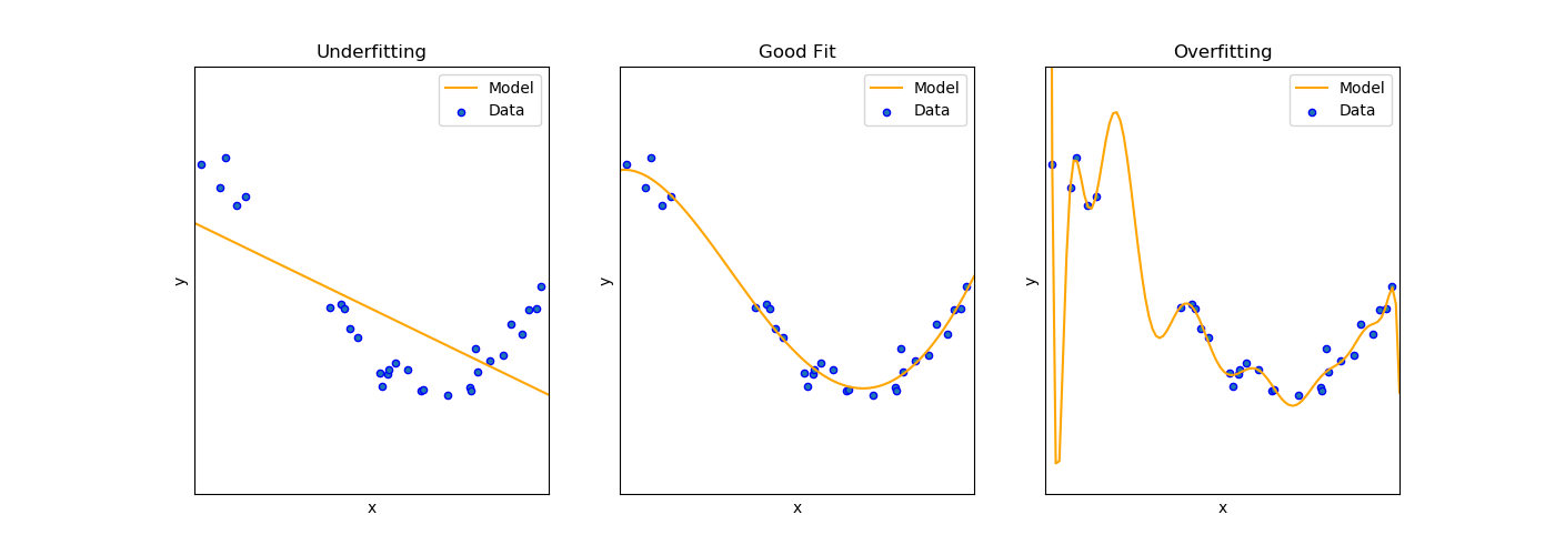
### Model Performace Visualization
----
## Model Performace
### Overfitting
- high variance
- models the training set too well
- learns detail and noise in the training data and it negatively impacts the performance of the model on new data
- probs: the models ability of the model to generalize
----
When:
- nonlinear model, flexibility when learning a target function
How to solve:
- try simpler model
- dimensionality reduction
- regularization
----
### Underfitting
- high bias
- can neither model the training data nor generalize to new data
- probs: poor performance on the training data
- how to solve:
- increase the algo complexity
- engineer fetures with higher predictive power
----
## Model Performance Metrics i
Qst: How good is my model on unseen data?
#### Linear regression metrics examples
- Mean squared error
$MSE=\dfrac{1}{N}\sum_{i=1}^{N}(y_{i}- \hat{y}_{i})^{2}$
- $MSE(test)>>MSE(train)\rightarrow \mbox{Overfitting}$
- Coefficient of determination
$R^{2}=1-\dfrac{\sum_{i=1}^{N}(y_{i}- \hat{y}_{i})^{2}}{mean(y_{i})}$
indication of the goodness of fit of a set of predictions to the actual values
----
## Model Performance Metrics ii
Qst: How good is my model on unseen data?
#### Classification Metrics Example
- classification accuracy:
ratio number of correct predictions on all predictions made
- confusion matrix
table presents predictions on the x-axis and accuracy outcomes on the y-axis
----
### Improve Model Performace
**hyperparameter tuning**
model configuration argument specified by the developer to guide the learning process for a specific dataset
- grid search:
define a search space as a grid of hyperparameter values and evaluate every position in the grid
----
**cross validation**
- k-fold cross validation
- stratified cross validation
- rolling cross validation (time series)
----
# Hands-on
----
## 1. exploratory data analysis
<!-- .slide: data-background="https://media.giphy.com/media/OJw4CDbtu0jde/giphy.gif" -->
[colab](https://github.com/pareyesv/ibda2022/tree/main/notebooks/hands-on) :arrow_left:
- [ydata-profiling](https://docs.profiling.ydata.ai/latest/) (formerly pandas-profiling)
- [Examples](https://docs.profiling.ydata.ai/latest/getting-started/examples/)
- [Titanic](https://docs.profiling.ydata.ai/4.10/examples/titanic/titanic_report.html)
- [1978 Automobile dataset](https://docs.profiling.ydata.ai/latest/examples/stata_auto/stata_auto_report.html)
- [Census Dataset](https://docs.profiling.ydata.ai/latest/examples/census/census_report.html)
----
> :warning: If you run the Jupyter Notebook locally, bear the following in mind:
>
> - If you are using a Python 3.12 kernel, install the additional dependencies:
> ```bash
> pip install --upgrade setuptools==81
> pip install scikit-learn ipywidgets
> ```
----
## 2. scikit-learn (Colab)
- linear regression
- [colab](https://colab.research.google.com/github/pareyesv/ibda2022/blob/main/notebooks/hands-on/2.0-linear_regression_with_scikit_learn.ipynb) :arrow_left:
- logistic regression
- [colab](https://colab.research.google.com/github/pareyesv/ibda2022/blob/main/notebooks/hands-on/3.0-logistic_regression_with_scikit_learn.ipynb) :arrow_left:
----
## project template
- [Cookiecutter data science](https://drivendata.github.io/cookiecutter-data-science/)
---
<!-- .slide: data-background="https://media.giphy.com/media/DAtJCG1t3im1G/giphy.gif" -->
# Thanks!
---
# Tips
----
- Data Consolidation
- [great-expectations](https://greatexpectations.io/)
- EDA
- [ydataai/ydata-profiling: 1 Line of code data quality profiling & exploratory data analysis for Pandas and Spark DataFrames.](https://github.com/ydataai/ydata-profiling)
- Visualization
- [understand types of plots](https://totaldatascience.com/wp-content/uploads/2019/10/p75.png)
- [matplotlib cheatsheet](https://totaldatascience.com/wp-content/uploads/2019/10/p59.pdf)
- Choosing the right estimator, from [scikit-learn](https://scikit-learn.org/stable/tutorial/machine_learning_map/index.html)
- RISE slides in jupyter notebook
---
# Acknowledgements
----
- a BIG thanks to [José Carlos Carrasco Jimenez](https://www.bsc.es/carrasco-jimenez-jose-carlos)
- [CINECA course](https://eventi.cineca.it/en/hpc/school-scientific-data-analytics-and-deep-learning-0)
----
## Thanks to all the contributors :clap:
---
# References
----
- learning
- [Machine Learning Mastery's FAQ](https://machinelearningmastery.com/faq/)
- tutorials
- [scikit-learn](https://scikit-learn.org/stable/)
- [Machine Learning Mastery](https://machinelearningmastery.com)
- books
- [Fluent in Python](https://github.com/fluentpython)
- Luciano Ramhamallo
- The hundred-page machine learning book
- Andriy Burkov
- Machine Learning with PyTorch and Scikit-learn
- Sebastian Raachka