---
tags: tutorials
---
# Types of Data Visualization Tools
The last step of every project is communicating your results to other people. Whether it is a research project or a class you collected performance data for, you'll need to communicate what you learned, and often this involves showing the raw or processed data.
Data visualization, the display and meaningful communication of data, has often been overlooked or underestimated as the last and inconsequential step of a project. Surely you've seen impossible pie charts or misleading bar charts on news channels. There are many graphical principles and statistical best practices that should be observed when designing charts and figures, lest the visualization become illegible at best and actively dishonest at worst. The collection of these best practices and principles has become substantial enough that data visualization is now considered its own field of study. People can even have careers as "data visualizers" (among many other possible terms like "information designer").
Accompanying, or perhaps even facilitating this boom in data visualization as a field, has been a boom in data visualization tools. The purpose of this blog is to survey the different types of tools and the factors that you should consider when deciding which tool is right for you and your data.
## Factors
Before settling on one specific dataviz tool, it's important to ask yourself a couple of questions. The answers to these questions will determine what set of tools (even which specific tool) would be the best one for you to use.
**1) Do you know, or want to learn, how to code?**
Some data visualization tools require knowledge of a specific coding language (R, python, javascript and/or css/html), but there are several great 'no-code' options if coding isn't yet a skill in your repertoire or if you need to make a prototype figure quickly.
**2) In what medium will the final product be published?**
Will your data viz be published in a scientific paper, or an online article/stand-alone website, or perhaps shown in a presentation?
**3) Do you want your audience to be able to interact with the data?**
This question is quite closely related to the previous question. When you publish a figure in a paper, the audience can only see what is right before them in the figure. However, if the visualization is posted online, there may be an opportunity for the audience to interact with the visualization and explore the data themselves. For instance, if you are using a map, an online version might support interactive zoom while the paper version can't. Or the audience can change years on the x-axis in order to focus in on a particular time period of the data. Or perhaps they can even change which variable is plotted, but keep the x-axis the same. Or if you have multiple graphs together, they can all update together if just one of the graphs is changed (e.g. a particular bar is highlighted, and so all the bars in the other graphs also become highlighted). You can, of course, have an online visualization that isn't interactive at all, as well, which is why these are two separate considerations.
**5) What is your time frame for making your dataviz(s)?**
Do you need to have a prototype figure ready to show someone in a meeting tomorrow? Are you looking to have figures ready by the end of the week for a proper presentation? Do you have a month or a semester to make an online tool or database that your audience can use to deeply explore the data themselves?
**6) Who is your audience?**
This is also closely related to the question about medium, but can influence how much creative leeway you have. The vizualization your make for the peers who read your scientific paper might be very different from the visualization you create for a sci-comm blog, or even a general-audience magazine. At what level can you present the data? Will your audience be likely to spend the time to investigate a complicated but interesting figure, or will they have maybe a second or two to glance at it as it scrolls by on their feed?
**7) Are you thinking of using a standard figure (e.g. bar chart, line chart) or are you making a custom visualization?**
And lastly, this question directly connects with question 6: if your audience is scientific peers, then you might be best served by using a standard figure, or at least a figure common in your field. However, in most other publications, there might be leeway to showcase the data in creative and novel ways, breaking away the standard chart mold. Creating your own custom visualization, however, comes at the cost of needing more time, and often the need to code, as well, if you also want it to be interactive.
Now that you have an idea of what sort of questions you should ask yourself before making your visualizations, we can talk about the different tools available and their respective advantages and disadvantages.
## Survey of Tools
### Graphic Design Softwares
Graphic design softwares are options like Adobe Illustrator or Affinity Designer. These softwares are a no-code option that allow for a high degree of customization - if you can sketch it, you can make it. The drawback of this option, however, is that you, the creator, are the renderer. What do I mean by that? If your data was to update, would your data visualization update semi-/automatically with the changed data, or would you have to be the one to manually change the visualization to match? If the latter, you are the renderer; the former, the tool is the renderer. If you have data that will constantly or even infrequently be updated and you know that the visualization will likewise need to update, then this probably isn't a good option. However, if you're making a one-and-done visualization for print, for example, or as a submission in an art gallery as data art, then this could still be a great option for you.
_Trigger Warning, please skip this example if you are sensitive to mental health and suicide issues._
 _A View on Despair: Sonja Kuijpers visualizes suicide in the Netherlands in 2017. Each element visible in this virtual art piece represents a person.
The most well-known examples of this tool are Adobe Illustrator, Affinity Designer, or Inkscape.
### Data Viz Softwares
Data visualization softwares like Tableau or Flourish are great low-code/no-code options that can be as simple as dragging and dropping your data into a selection of pre-made chart types. This is great option if you want to do some cursory exploration of your data before diving into a heavy-coding option like the low-level building block packages (so you get an idea of what the data looks like and what you might want to make before you spend a lot of time coding a figure that you can't use), or if you want to produce the final product right in the software. Tableau and Flourish can be extremely quick to use, going from loading data to making a chart in under 5 minutes. The sky isn't the limit in terms of chart types possible and making something entirely custom might be extremely difficult (and will mostly likely require you to use Tableau syntax to process and map your data in some way), but you can pull out all sort of graphical design tips and tricks to really make your figures pop, either as stand-alone figures, interactive posters, or full-on presentations.

*Jonathan Minutillo visualized the 100-best selling video games and classified them by genre, platform, and publisher for the past four decades.* [(Source)](https://public.tableau.com/en-us/gallery/best-selling-video-games?tab=viz-of-the-day&type=viz-of-the-day)
`Examples include Tableau, Flourish, Rawgraphs.io, or Google Data Studio.`
### Small Building Blocks
Looking at the bar chart below, we can break it down into its base components: rectangles of data, the aesthetics of those rectangles (are they filled or outlined a specific color, maybe slightly transparent, a label at the end to indicate a final value or percentage), the lines of the axes, the tick marks, the tick labels, the titles of the axes, the legend block and all of the individual components that make up the legend, and literally anything else you see. These are the building blocks of a chart, and you can either have fine-tuned control over all of these bits and pieces ('low level building blocks') or you can have control over the bits that are uniquely relevent to your data ('high level building blocks', like what columns in your data map to each axis), but maybe you don't have the ability to control all the small bits and pieces.
~ [(Source)](http://bl.ocks.org/erikvullings/raw/51cc5332439939f1f292/c29bdaf6882523299eeaad8a1191eda5928407e4/thumbnail.png)
We can categorize different data visualization softwares based on this granularity of control: small to large building blocks. This is technically a spectrum, but I'll discuss the two extremes for now.
Arguably the most well-known of the low-level building block packages is D3.js (btw, the three "D's" are 'Data-Driven Documents' ). The pros of packages like D3.js are that you have absolute control over what you see in the visualization, because you build most things from scratch (though there are a lot of templates and examples to get you started), and you can add a startling high degree of interactivity, which is fantastic if you would like your audience to interact with the data in a significant way. This presents the obvious con of these low-level packages: you have to manually add every little bit, which comes with a slightly longer if not steeper learning curve and time period from 'beginning of the project' to 'final product' - or even 'rough prototype' (I'll present a shortcut for this later).
But the biggest advantage of small building blocks is that you, the creator, are not bound to standard chart types. If you can code it, you can make it - whether what you make can be classified as a 'chart type' or something more akin to 'data art'.

_Shirley Wu documents the colors of her photos during her many travels using D3.js_ [(Source)](https://shirleywu.studio/travel/)
`Examples of these libraries include: visx, D3, flubber, and labella. `
### Large Building Blocks
At the other end of this spectrum are 'large building block' libaries. You can think of these packages as pre-built walls to a house, delivered to your doorstep. You don't quite have control over how the walls were built or how they're shaped, but you can control how the house is put together (e.g. what variables go with what axes, the paint job). Because you yourself are not required to code every little bit from scratch, these packages can offer you a much lower barrier of entry to get started as well as much quicker turn-around times from start to finished product. If you aren't an experienced coder but wouldn't mind getting your feet wet, so to speak, these are also a good option as they require less coding experience to get started.
![[Pasted image 20210428214106.png]]_An example area chart made using G2.plot_[(Source)](https://g2plot.antv.vision/en/examples/area/basic#basic-gradients)
The lack of detailed customization is the main drawback.
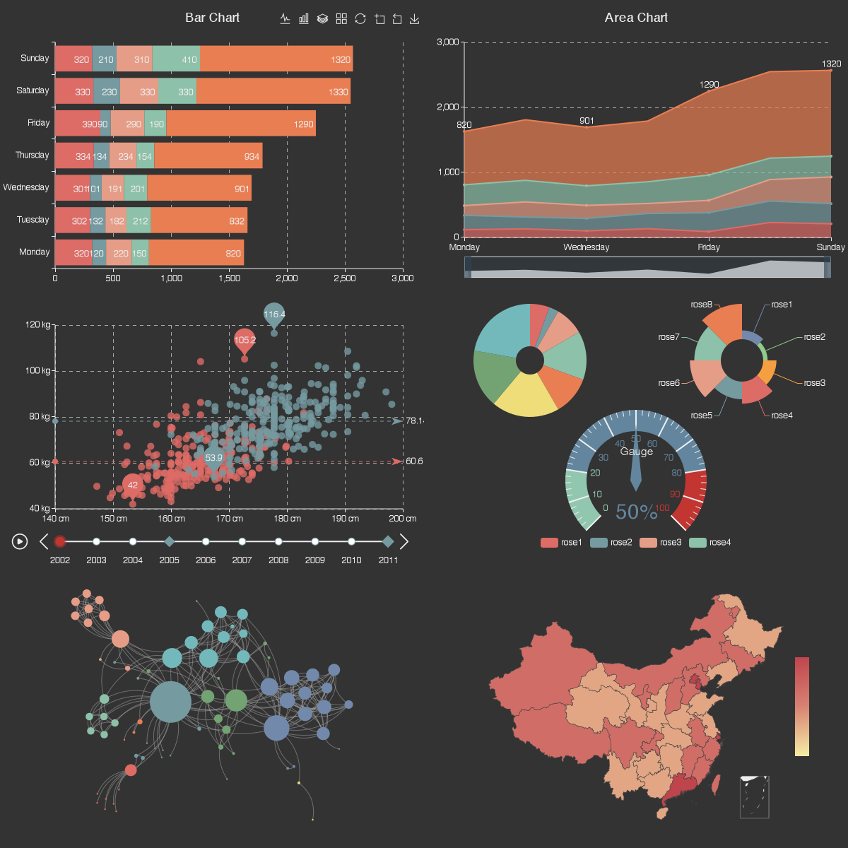_An example survey of ECharts chartypes. _[(Source)](https://sdtimes.com/softwaredev/apache-echarts-now-top-level-projet/)
Examples of these libraries include Recharts, G2Plot, Chartist, ECharts, Dimple, React-VIz, and Plotly.
>#### Side Note
>If you'd ultimately like to make a custom visualization and will use a package like D3.js, it could significantly decrease your total working time to conduct the intial exploration of your data using large building block libraries or visualization softwares. This could save you hours and hours of coding the rough prototype in D3.js before realizing that what you had in mind simply doesn't work with the data (which might happen more often than you might think). Don't be afraid to mix and match as you go and to use different tools for different parts of the project (e.g. initial exploration versus making the final product).
### Graphic Design Libraries
Graphic Design Libraries are like a weird combination of graphic design softwares and low-level libraries that allow you to make 3D data art that users online can interact with. This would not be the best option if your goal is to make more traditional charts and figures, as it is definitely coding-intensive, but the advantages are a high degree of customization, 3D design, and interaction.
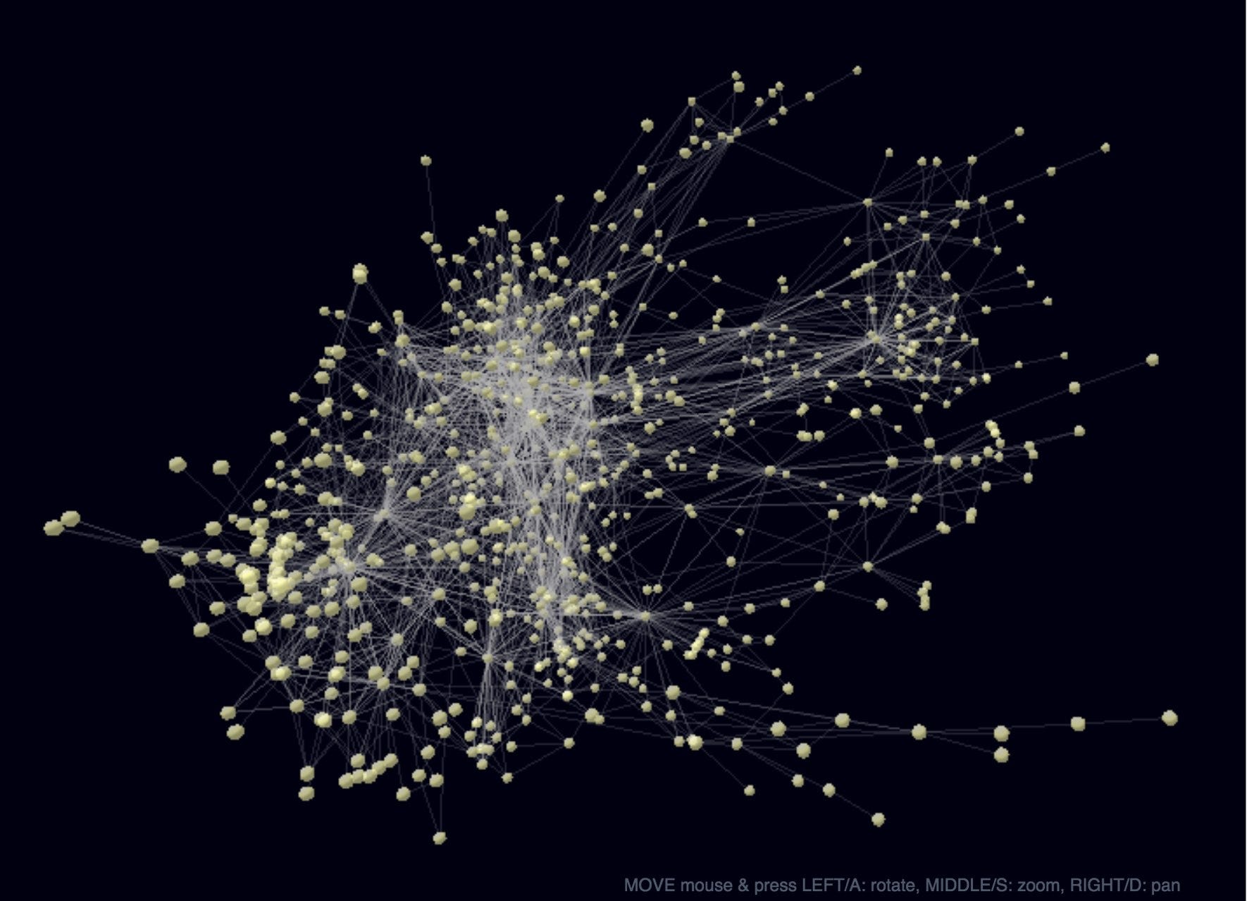 _A 3D network visualization of the characters on Game of Thrones using 3d_force_graph, a wrapper around three.js_ [Source](https://neo4j.com/developer-blog/visualizing-graphs-in-3d-with-webgl/)
Three.js, p5* js, and react-three/react-three-fiber are the go-tos for this type of visualizaiton.
## Wrapping Up
This article is simply meant to be a primer on the types of data visualization tools available and the factors that should be considered before starting a project and eciding on a tool. It is my no means exhaustive in either the list of tools or the differences between them, but it should be more than enough to get you going.