# A Guide to Statistics in R
> Updated 2 November 2020 - [Dave Angelini](mailto:dave.angelini@colby.edu)
## Overview
This document will serve as a basic guide to statistical analysis using R. This is a huge subject! I encourage everyone to take a good statistics course -- ideally more than one. The main goal here is to provide a refresher on common statistical tests you may have encounters in other classes, such as BI164, BI279, or SC212 and to explain how these tests can be run in R.
Some excellent resources exists to help you with data analysis in R including the follow books and websites. The text by Field et al. is large, but I can highly reccommend it as an excellent explaination of statistics and R. The author is also a nut and peppers the book with ancedotes about his youth in a heavy metal band and the examples are all bizarre studies from the world of medicine and psychology.
> **Field, A., Miles, J. and Field, Z.** (2012). *Discovering Statistics Using R*. London, UK: SAGE Publications Ltd. - [Olin Library ](http://www.colby.edu/olin/search-results/?type=k&q=Discovering+Statistics+Using+R)
> **Gardener, M.** (2012). *Statistics for Ecologists Using R and Excel*. Pelagic Publishing. - [Publisher's website](https://pelagicpublishing.com/products/statistics-for-ecologists-using-r-and-excel-gardener-2nd-edition)
> **Whitlock, M. C. and Schluter, D.** (2015). *The Analysis of Biological Data. 2nd ed.* Greenwood Village, Colorado: Roberts & Co. - [Olin Library](http://www.colby.edu/olin/search-results/?type=k&q=The+Analysis+of+Biological+Data)
### Using R for statistical analysis
There are many software programs and websites available to help you organize data, plot them, and make statistical tests. Two of the best tools I can recommend are [Google Sheets](https://www.google.com/sheets/about/) and [R](https://www.r-project.org/). Google Sheets is a free web-based spread sheet app. It is an alternative to Excel, which is expensive, but more commonly used by older people in science and business. Excel has more extensive functionality, but both it and Sheets do a good job of organizing data. Exel is also freely [available to Colby students](http://www.colby.edu/its/software/). GoogleSheets and Excel can both run some statistical tests, but their range is rather limited.
[Rstudio](https://www.rstudio.com/) is a free R shell that is extremely powerful, allowing statistical analysis, dazzling graphics, as well as interpreted, object-oriented programming. There is an active online community of R users in science and business who can provide support for the questions of new users. And did I mention it's free?
#### Why should I bother learning R?
"Why should I use R", you ask? "I already have Excel."
Two reasons: While Excel is great for organizing numbers in a spreadsheet, it is limited for statistics and graphics. Microsoft designed Excel to enable business people without much knowledge of math or computers to make graphs. The result is a cumbersome program that cannot easily deviate from its defaults. Second, R is the future. It is an open-source and flexible tool that has huge potential in quantitative and computational fields. Learning it is already a valuable skill in the workplace. R does not look as friendly as Excel, but in truth it is faster and easier to run stats and make graphs in R.
## Data exploration
Before you do anything with your data, it's important to understand what it is. This may seem obvious, but if you make improper assumptions about your data, then it can lead you to improper analyses and perhaps unwarranted conclusions.
### Samples
If your data are purely descriptive, then there won't be a place for statistics in your project. However, if you can count or measure something, then those are quantitative data and a statistical test can potentially help give you confidence in your conclusions. However, this process is based on your data, which must necessarily be a sample of a much larger reality. We will use "sample" to refer to all the measurements you've made of one treatment or group.
### Questions
There are many different statistical tests, and each one makes different assumptions about your data. One of the most important parts of doing stats correctly is simply choosing the right test to use for the question you're asking and the data that you have.
In order to choose the right statistical test, you first need to think about the nature of your question. Can you frame your biological question as a version of one of the two questions below:
1. Are two samples the same or not?
2. Are two different measurements related in some way?
### Data types
Another important part of choosing a test is determined by the type of data you have. Can you describe your data in one of these ways?
1. **Counts** -- For example, the number of eggs laid by a female, number of individuals that survived in a treatment and the number that died, the number of males and females in a treatment, the number of embryos that appear normal and the number that display some defect. Statisticians also call these categorical or discrete data. If it wouldn't make sense to discuss a fractional value, then your data are probably count data.
2. **Continuous measurements** -- such as the width of a head or the length of a tail, the concentration of blood glucose, the length of time to hatching. As their name implies, these data can range continuously across non-integer values.
If you have continuous data, there are two more important criteria. First, are your data distributed "normally"? In other words, could your data be described by the normal distribution, the classic bell-shaped curve? This is important, because the math that underlies some tests will only be valid assuming the data are normally distributed. If each of your samples is normally distributed, the second consideration is whether their variances are similar.
### Exploring continuous data
Before rushing into a statistical test, it's a good idea to "explore" your data. This means getting a sense for which groups might have larger or smaller average values and how much spread or "dispersion" there is your samples. An excellent place to start is to graph your data.
#### Boxplots with R
It's easy to plot categorical data, such as measurements from different treatments, in R. First you need to get your data into R. After that a simple plot can be generated with one command. Imagine we have fruit fly wing widths for 3 genotypes.
```{r}
apGal4 <- c(130,133,135,141,140,125)
apInRK <- c(115,123,131,111,120,108)
apInRCA <- c(145,143,155,131,160)
boxplot(apGal4,apInRK,apInRCA)
```
There are some important differences between this plot and the kind produced by Excel. R's default is what's called Tukey's box-whisker plot. For each group, the heavy black horizontal line represents the median value. The box encompasses middle 50% of the data in that category. Normally, the whiskers extend to the outer most values. (Although if you have extreme "outliers" they will appear as separate circles.) Because this boxplot already shows you the dispersion of the samples (with the size of the box and whiskers), there's no need to add error bars. See why R is awesome?
This plot is still pretty rough, but a few extra switches can add some useful graphic features.
```{r}
boxplot(apGal4,apInRK,apInRCA, names=c("Gal4","InR.K","InR.CA"), xlab="misexpression by ap-Gal4", ylab="wing width (microns)", col="chartreuse")
```
Let's unpack that statement. The `names` parameter adds the individual group labels. The axis labels are added with the `xlab` and `ylab` parameters with the text in quotes. You can also change the color of the box with `col` and refer to one of several color names that R recognizes. <http://www.stat.columbia.edu/~tzheng/files/Rcolor.pdf>
Additionally, you can change the range of the y-axis if you add the `ylim` switch. For example including `ylim=c(0,160)` within the `boxplot()` statement will make it include zero and the boxes will appear near the top of the plot.
### Testing continuous data for normality
#### By eye, using histograms
One easy way to see if your data are normally distributed is to plot them. You can do this easily in R using the histogram function, `hist()`. If the data look obviously skewed compared to a bell curve, you can simply assume they are not normally distributed. You need to address this question with each sample: all the measured values from one treatment.
Below, R will generate some random values and plot them as a histogram. The first bit of code uses a function that generates random values from a normal distribution. The second draw random values from a uniform distribution. The `hist()` function will take many of the same formatting parameters as `plot()` include `col`, `xlim`, `ylim`, `xlab` and `ylab`.
(For R power-users, there's also a bit of code here used to show two plots side-by-side.)
```{r}
## Pick 30 values randomly, from a normal distribution with mean 100 and standard deviation of 10.
sample1 <- rnorm(30, mean = 100, sd = 10)
## Pick 30 values randomly, from a uniform distribution between 80 and 120.
sample2 <- runif(30, min = 80, max = 120)
par(mfrow=c(1,2)) # Allows two columns of plots
hist(sample1, col="darkred")
hist(sample2, col="darkorange")
par(mfrow=c(1,1)) # Returns the plot window to just a single plot
```
#### The Shapiro-Wilk normality test
A more rigorous test of normality is the Shapiro-Wilk test. In this test, the null hypothesis is that the data *are* normally distributed.
```{r}
shapiro.test(sample1)
```
A high p-value, above 0.05, suggests that the sample is normally distributed.
```{r}
shapiro.test(sample2)
```
It is important to separately examine whether each of your samples is normally distributed. If you combine them, before plotting or running the Shapiro-Wilk test, you might think the data are not normally distributed, when in fact the individual groups just have different mean values.
#### Should I worry if my data are not normally distributed?
No. Often times in experimental biology, a manipulation does not have the same influence on all individuals. This variability often causes a skew, with some treated individuals having measurements similar to the control group. In such a case, the sample won't be normally distributed. You just need to use other statistical tests. The down-side is that non-parametric tests (those that don't assume the data fit a particular distribution) often have less power to detect real differences, but that only matters if the difference is small or you have a low sample size.
A second reason your samples may not be normally distributed is that the scale on which you've measured may hide an underlying normal distribution. Many natural phenomena actually fit a log-normal distribution. In this case, a frequency histogram will have a long tail in one direction, and the Shapiro-Wilk test may not support normality (p < 0.05). However, if the values are log-transformed, they may become sufficiently close to a normal distribution to allow the use of tests that require normality.
```{r}
## Pick 30 values randomly, from a log-normal distribution with mean 100 and standard deviation of 10.
sample3 <- rlnorm(30, meanlog = 2, sdlog = 1)
hist(sample3, col="darkred")
shapiro.test(sample3)
shapiro.test(log10(sample3))
```
#### Testing normally distributed, continuous samples for equal variances
*Heteroscedasticity* is a fancy term meaning that two or more samples have different variances. If your samples are normally distributed, then a frequency histogram will be roughly bell-shaped. Variance describes the width of that bell. The traditional Student's t-test assumes that your samples both have similar variances. If this isn't the case, you simply need to use the alternative: Welch's t-test.
So, how to know if your samples have unequal variances? One way is to just look at the spread of the x-axis in a histogram and see if it feels like too much difference.
However, there is also a formal test called the F-test for equal variances. In R this test is implemented in the function `var.test()`. It tests the null hypothesis that the variance are similar. A p-value below 0.05 is evidence that in fact the variance of the two samples is significantly different.
```{r}
var.test(sample1,sample2)
```
## Statistical analysis
### Choose the right statistical test
Once you have considered the type of question you're asking and the type of data you have, you can choose an appropriate statistical test. Here is a basic table that will help direct you.
| Question | Data type | Normality | Group number | Variance | Test |
| -------------------------------- | ---------- | --------- | ----------------------------------- | ----------- | -------------------------------- |
| Are groups the same? | Counts | NA | 1 group, compared to an expectation | NA | [$\chi$^2^ test](https://hackmd.io/_PfeG5iTTxiIuw2FIdJVvA?both#The-chi-squared-test) |
| | | | 2 groups, 1 with >2 categories | NA | [$\chi$^2^ test](https://hackmd.io/_PfeG5iTTxiIuw2FIdJVvA?both#The-chi-squared-test) |
| | | | 2 groups, each with 2 categories | NA | [Fisher's exact test](https://hackmd.io/_PfeG5iTTxiIuw2FIdJVvA?both#Fisher%E2%80%99s-exact-test) |
| | Continuous | Yes | 2 | Similar | Student's [*t*-test](https://hackmd.io/_PfeG5iTTxiIuw2FIdJVvA?both#t-tests) |
| | | | | Not similar | Welsh's [*t*-test](https://hackmd.io/_PfeG5iTTxiIuw2FIdJVvA?both#t-tests) |
| | | | >2 | NA | [ANOVA](https://hackmd.io/_PfeG5iTTxiIuw2FIdJVvA?both#One-way-ANOVA) |
| | | No | 2 | NA | [Wilcoxon rank sum test](https://hackmd.io/_PfeG5iTTxiIuw2FIdJVvA?both#The-Wilcoxon-rank-sum-test) |
| | | | >2 | NA | [Kruskal-Wallis rank sum test](https://hackmd.io/_PfeG5iTTxiIuw2FIdJVvA?both#The-Kruskal-Wallis-rank-sum-test) |
| Are two measurements correlated? | Counts | NA | 2 variables that can be ranked | NA | Spearman's rank [correlation test](https://hackmd.io/@aphanotus/rJmbl8Q2S#Correlation-tests) |
| | | | 2 variables, 1 with >2 categories | NA | |
| | | | 2 variables, each with 2 categories | NA | |
| | Continuous | Yes | 2 variables | NA | Pearson's product-moment [correlation](https://hackmd.io/@aphanotus/rJmbl8Q2S#Correlation-tests) |
| | | No | 2 variables | NA | Spearman's rank [correlation test](https://hackmd.io/@aphanotus/rJmbl8Q2S#Correlation-tests) |
Details of how to run each of these tests in R are given below.
### The chi-squared test
The $\chi$^2^ test is used in BI164 and BI279, so many of you will be familiar with it. It can be used in a number of ways. Its purpose is to test whether two groups with two or more categories have counts less similar than might be expected by chance. One of these categories can be determined by you based on *a priori* expectations, such as a 50/50 sex ratio or the Mendelian expectations from a genetic cross. For example, if you count 5 males and 16 females, you might have expected an equal number of both (10.5, in this case). Are your observed data significantly different from the expectations?
The first step is to create a matrix or data frame that has one column of expected values and a second column of observed values.
```{r}
sexes.expected.and.observed <- matrix(c(10.5,10.5,5,16), ncol=2)
chisq.test(sexes.expected.and.observed)
```
In this case, the answer is, no, 5 and 16 is not significantly different from the expectation (if our critical p-value is 0.05).
You can also use this test to compare the frequencies of different outcomes in two treatments. For example, let's say a control treatment produces 3 dead embryos, 1 deformed hatchling, and 20 normal hatchlings, while a drug treatment yields 6 dead, 6 deformed, and 4 normal hatchlings. Are the results of these two treatments likely to be due to chance alone?
```{r}
treatment.results <- matrix(c(3,1,20,6,6,4), ncol=2)
chisq.test(treatment.results)
```
Differences in the data from these treatments are unlikely to be due to chance alone. The p-value is well below 0.05. So we can conclude the drug did have an effect.
### Fisher's exact test
R.A. Fisher was a productive guy, and he developed a number of statistical ideas and tools. Fisher's exact test is a special case of the $\chi$^2^ test, in which you have a 2-by-2 matrix of count data. Mathematically it is equivalent to the $\chi$^2^ test, with something called Yates' correlation (all deviations are halved). If you use the `chisq.test()` function with a 2x2 matrix, R will automatically make this correction, and you should get the same answer as when you run `fisher.test()`.
As an example, imagine you have soapberry bugs raised under high and low food conditions. The high food treatment produces 9 long-winged adults and 34 short-winged adults, while in the low food treatment you count 9 long-wing bugs and 9 short-wing bugs. Should we conclude that the counts from each treatment are different?
```{r}
bugs.hi.lo.food <- matrix(c(9,34,9,9), ncol=2)
fisher.test(bugs.hi.lo.food)
```
Yes, it looks like these two treatments are different, if we take the critical value of p to be 0.05.
One nice thing about Fisher's test, is that because of the way its math works, you can enter your data either by row or column and the results will be the same! One limitation with Fisher's test however is that your values must be integers (no fractions).
### t-tests
A t-test is used to compare two samples of continuous measurements. Both samples should be normally distributed. The default for the `t.test()` function in R is Welch's t-test for unequal variance. This is the more "conservative" version of the t-test, because it will produce a slightly higher p-value, and therefore we are less likely to support a conclusion that two samples are different, when they really aren't. However, Student's t-test has slightly greater power to detect differences, but assumes that both samples have similar variances. Therefore, if Student's t-test is appropriate for your situation, it is usually better to use it. In R, Student's t-test can be called by adding the `var.equal=TRUE` parameter as input to the `t.test()` function.
As an example, the code below will generate some random, normally distributed values with and without similar variances and then run the appropriate tests.
```{r}
## Pick some random values from the normal distribution, with different means and the same variance
sample1 <- rnorm(30, mean = 100, sd = 10)
sample2 <- rnorm(20, mean = 110, sd = 10)
par(mfrow=c(1,2)) # Allows two columns of plots
hist(sample1, col="darkred")
hist(sample2, col="darkorange")
par(mfrow=c(1,1)) # Returns the plot window to just a single plot
## Test the samples for equal variance
var.test(sample1,sample2)
## Student's t-test
t.test(sample1,sample2, var.equal=TRUE)
```
```{r}
## Pick some random values from the normal distribution, with different means and different variances
sample3 <- rnorm(30, mean = 100, sd = 10)
sample4 <- rnorm(20, mean = 110, sd = 5)
par(mfrow=c(1,2)) # Allows two columns of plots
hist(sample3, col="darkgreen")
hist(sample4, col="aquamarine")
par(mfrow=c(1,1)) # Returns the plot window to just a single plot
## Test the samples for equal variance
var.test(sample3,sample4)
## Welch's t-test
t.test(sample3,sample4)
```
### One-way ANOVA
*Analysis of variance* (or ANOVA) is a powerful family of statistical methods. It can be used to test for differences in continuous measurements among 3 or more groups. (For two groups, ANOVA gives the same result as a t-test.) Like the t-test, ANOVA is a parametric test, which means that the way its math works, it is based on several assumptions about the data. These assumptions include normality, similar variance, and the fact that the values in each group are independent of one another. ANOVA also works best when the sample sizes of each group are similar, and somewhere between 25 and 1000.
ANOVA tests the null hypothesis that the means of each group are the same. Importantly, if the p-value from an ANOVA is less than your cut-off (typically 0.05), it means that a difference among the groups exists *somewhere*-- but that doesn't tell you *which of the groups* differ from the others. That requires, a "post-hoc test" such as Tukey's test for honest significant difference (HSD), which is described later.
The example below imagines an experiment testing the effect of two drugs, rapamycin and erythromycin, on zebrafish embryos, compared to a vehicle control. The head width of two-day-old embryos were measured in microns.
The code below generates some random data to stand in for a real experiment, 25 measurements for each treatment. Histograms are then shown for each treatment.
```{r}
zebrafish.control <- rnorm(25, mean = 130, sd = 5.5)
zebrafish.rapa <- rnorm(25, mean = 120, sd = 6.25)
zebrafish.erythro <- rnorm(25, mean = 132, sd = 6)
par(mfrow=c(1,3)) # Allows two columns of plots
hist(zebrafish.control, col="gray50")
hist(zebrafish.rapa, col="beige")
hist(zebrafish.erythro, col="brown")
par(mfrow=c(1,1)) # Returns the plot window to just a single plot
```
#### Creating a data frame
Many functions in R, including ANOVA, work best with data that is organized as a data frame. For large data sets it can be convenient to curate and organize data in Excel and import the data into R as an `xls`, `csv`, or `tsv` formatted file. However, you can also manipulate data with commands directly in R. As an example, we can combine the vectors we just created with the zebrafish head width data into a data frame. The data frame will have one column with the name of the treatment. The second column will combine the values for all treatments. To make life easier, R included the `rep()` function, which will repeat the treatment names for us.
```{r}
treatment <- c(rep("vehicle control",25), rep("rapamycin",25), rep("erythromycin",25))
head.width <- c(zebrafish.control,zebrafish.rapa,zebrafish.erythro)
```
So far `treatment` and `head.width` are just vectors. They can be combined to make columns of a data frame, which we'll call `drug.experiment`, using the `data.frame()` function. Then, we can take a look at it using the `head()` and `dim()` functions, and by creating a box plot.
```{r}
drug.experiment <- data.frame(treatment,head.width)
head(drug.experiment)
dim(drug.experiment)
with(drug.experiment, plot(head.width ~ treatment))
```
#### ANOVA in R
Is there a difference among head widths in these treatments? From the plot above we should already suspect that rapamycin-treated embryos have smaller head width. ANOVA can test formally for a difference. There are several different functions that can perform ANOVA in R. I like `aov()`, which can do several other things, but you will typically want to nest it within the `summary()` function, as shown below. This code also demonstrates the way that some functions can take a parameter to specify the data object you're working with, so that you need only name the columns.
```{r}
drug.aov <- aov(head.width ~ treatment, data = drug.experiment)
drug.aov.table <- summary(drug.aov)
drug.aov.table
```
The output is a classic "ANOVA table", listing the degrees of freedom, sum of squares, mean squares and F statistic, as well as the p-value. The p-value is given under the `Pr(>F)` column. Here it is quite low, suggesting different mean values for the head width measurements among the different groups. The post-hoc test `TukeyHSD()` gives pairwise, adjusted p-values testing the similarity of groups.
```{r}
drug.hsd <- TukeyHSD(drug.aov)
drug.hsd
```
The output from Tukey's test is a table with individual, pairwise comparisons, testing the null hypothesis that there's no difference between the means of these groups. The most useful column is at right-hand listing p-value for each comparison. Where the p-value is less than 0.05, there's evidence of significant difference between those groups.
Here, the rapamycin treatment appears to be significantly different from the other two, but the erythromycin treatment is not significantly different from the vehicle control.
#### Reporting ANOVA results
Obviously, if you're writing in R markdown, it's easy to just show output of the `summary(aov())` and `TukeyHSD()` functions. (And that's what you should be for our class!) However these days, when you report ANOVA results in the text of a manuscript, rather than showing the tables, you can report the results this way. The subscripts on the *F* give the degrees of freedom from the number of groups and individuals.
```{r, include=FALSE}
## The "include=FALSE" part of the header means this R code chunk is not included in the R mardown output.
## The statements are here to round and format the p-value sothat they can be called with the in-text `r` statements in the indented paragraph below.
p.aov <- as.character(signif(drug.aov.table[[1]][1,5],4))
p.hsd.rapa.v.control <- as.character(signif(drug.hsd$treatment[3,4],4))
```
> A significant difference in head widths was found among treatments, with a significant reduction after rapamycin treatment, compared to controls (one-way ANOVA, *F*~`r drug.aov.table[[1]][1,1]`,`r drug.aov.table[[1]][2,1]`~ = `r signif(drug.aov.table[[1]][1,4],4)`, *p* = `r p.aov`; Tukey's HSD, *p* = `r p.hsd.rapa.v.control`).
Readers of the raw Rmd file will see that I've used several in-line calls to R to get that statement to include the actual results stored in the `drug.aov.table` and `drug.hsd` objects. The values are rounded using the `signif()` function, which rounds to a certain number of significant digits. The `drug.aov.table` object is another data type R uses called a "list". The values from the ANOVA table are stored in a matrix that is part of the list object, which is accessed through `drug.aov.table[[1]]`.
### More complex variations on ANOVA
As mentioned above, there is a family of related ANOVA methods for more complex experimental designs. The example above had one measurement (head width) that was tested for differences based on one factor (drug treatment) with 3 different categories (control, erythromycin, rapamycin). Suppose that for each drug treatment, you split the embryos into two groups to be raised at two different temperatures, 20 °C and 25 °C. You now have two factors, drug treatment and temperature, that might influence head width. To test for these effects, you need to run what's called two-way ANOVA. Importantly, a two-way ANOVA will examine "interactions" of your factors. In other words, does rapamycin have an effect on head width, but the degree of that effect is dependent on temperature?
Let's assume that the first 12 values for each treatment above were raised at 20 °C and the other 13 at 25 °C. We can add a column to the data frame to account for this. We can also use `as.factor()` to force R to consider our temperatures as a factor, not simply as continuous data.
```{r}
## The rep() function can really save time if you need to repeat entries!
drug.experiment$temp <- as.factor(c(rep(c(rep(20,12),rep(25,13)),3)) )
head(drug.experiment)
dim(drug.experiment)
```
#### Using `which()`
For the sake of an interesting example, I'll modify the data, so that there might be some non-random effect of temperature. This also exemplifies the use of `which()`, a function that returns the row numbers of elements in a vector for which a logical statement is true. So below, the `temp=="25"` is true for all rows where the `temp` column has the value of `25`. Those row numbers are nested in the brackets as the index numbers called for `head.width[]`. So this calls all the head width samples from 25 °C.
```{r}
## Add a random vlaue to all samples from 25 degC
drug.experiment$head.width[which(drug.experiment$temp=="25")] <- drug.experiment$head.width[which(drug.experiment$temp=="25")] + runif(length(drug.experiment$head.width[which(drug.experiment$temp=="25")]), 1,20)
## Subtract a random value from rapamycin treated samples from 25 degC
drug.experiment$head.width[which(drug.experiment$temp=="25" & treatment=="rapamycin")] <- drug.experiment$head.width[which(drug.experiment$temp=="25" & treatment=="rapamycin")] - runif(length(drug.experiment$head.width[which(drug.experiment$temp=="25" & treatment=="rapamycin")]), 0,15)
with(drug.experiment, boxplot(head.width ~ temp * treatment, ylab="head width (microns)"))
```
Two-way ANOVA is run by simply adding a second factor, after the `*` symbol.
```{r}
drug.aov2 <- aov(head.width ~ treatment * temp, data = drug.experiment)
drug.aov.table2 <- summary(drug.aov2)
drug.aov.table2
```
Notice that while, temperature increases head width for the control and erythromycin treatments, it doesn't have the same effect in rapamycin treatments. This is likely to produce a significant interaction effect (*p* = `r signif(drug.aov.table2[[1]][3,5],4)`, in this example -- individual results may vary!). A significant interaction would suggest an interesting biological idea: perhaps rapamycin limits the ability of temperature to influence growth.
### The Wilcoxon rank sum test
There are non-parametric substitutes from the t-test and ANOVA. The Wilcoxon test (very similar to the Mann-Whitney U-test) compares the values from two samples if one or both is not normally distributed. The null hypothesis is also that no real differences exists between the two groups.
```{r}
## Pick some random values from the normal distribution, with different means and the same variance
sample5 <-runif(20, min = 90, max = 110)
sample6 <-runif(20, min = 100, max = 115)
par(mfrow=c(1,2))
hist(sample5, col="cornflowerblue")
hist(sample6, col="cadetblue")
par(mfrow=c(1,1))
shapiro.test(sample5)
shapiro.test(sample6)
wilcox.test(sample5,sample6)
```
### The Kruskal-Wallis rank sum test
If you wish to test for differences among 3 or more groups, but your measurements are not normally distributed or they violate some other parametric assumptions, then the Kruskal-Wallis test is best. Here this example uses the same data used above for ANOVA.
```{r}
with(drug.experiment, kruskal.test(head.width ~ treatment))
```
If the p-value is below 0.05, we would normally conclude there is significant difference among groups. The next step is a post-hoc test to look at pairwise differences among each of the treatments. Following Kruskal-Wallis, the appropriate post-hoc test is Dunn's test, which isn't available in the basic set of R functions. No worries. It only takes an internet connection and a few extra commands to load a package that provides a function for Dunn's test.
If you haven't done it before (pardon the pun), run `install.packages("dunn.test")`
By now you've surely noticed that R is picky about things like spelling, capitalization and the placement of things like commas. While `kruskal.test()` can handle either a commas or the tilda, `dunn.test()` will only work if the dependent and categorical variable names are separated by a comma.
```{r}
library(dunn.test)
with(drug.experiment, dunn.test(head.width, treatment, method="bonferroni"))
```
The function repeats the Kruskal-Wallis test itself. While you should get the same $\chi$^2^ value, the p-value for the Kruskal-Wallis test here is only approximated, so use the `krukal.test()` function to get a more precise p-value. The Dunn's test output is a table that lists the pairwise comparisons of each group. The number at the top of each cell is the Z statistic generated by the test. The bottom number in each cell is the pairwise p-value.
You should always include `method="bonferroni"` in the command. This parameter insures that the p-values are corrected for the fact that you have made multiple comparisons using the same data. Multiple-test correction of this kind is a good idea in general, and while there are many ways to do this, the Bonferroni method is widely accepted.
### Correlation tests
If you wish to examine the correlation between two continuous variables, two related tests exist. Both of them examine the deviations of the observed data from a linear regression line relating the two variables. The null hypothesis of the tests is that no correlation exists. However, a low p-value (typically < 0.05) suggests that their association may be due to more than chance alone.
```{r}
plot(sample5,sample6)
abline(lm(sample6~sample5))
cor.test(sample5, sample6, method="spearman")
```
```{r, include=FALSE}
## This code chunk is hidden from the PDF output. It just saves the statistics from this correlation test to be used in text later.
sample.cor <- cor.test(sample5, sample6, method="spearman")
```
Both Pearson's and Spearman's correlation tests are called in R using `cor.test()`. Pearson's test, which assumes a normal distribution of both variables, is the default. If you need to use Spearman's test, the command would be `cor.test(variable1, variable2, method="spearman")`.
Keep in mind that negative correlations can also be significant. In such a case, `variable2` might go down as `variable1` increases, giving a best-fit line with a negative slope. Also remember that you may find a stronger correlation if one or both of the variables are transformed in some way, e.g. `cor.test(log10(variable1), variable2)`.
## The results of statistical analyses
### Recording and reporting statistical tests
You should think of stats as an extension of your lab research. That means that you need to keep good notes on what you do, and record the results. Rstudio makes this easy, if you start a new analysis by opening a new R script or Rmd document. In this panel you can type your R commands, then hit `[command-Enter]` to run them. Add notes to yourself by starting lines with #, in with R markdown put your code in R chunks and jot text to accompany it explaining what you're doing. Imagine that this R log is an extension of your lab notebook. Add notes on the purpose of specific tests and the conclusions you draw.
If you use R markdown to produce your final product, then the statistical tests you've run and their output will be automatically included. If you're not writing in Rmd, you should be sure that when you mention a statistical test you include certain information to allow a reader to understand and interpret what you did. At a minimum you need to:
* State the name of the test
* Include the degrees of freedom-- typically listed in R's output as `df`
* Include the value of the test statistic, the calculated value that is used in combination with the number of degrees of freedom to obtain a p-value. For different tests, the relevant statistic might be:
+ *$\chi$^2^* from the *$\chi$^2^* test and Kruskal-Wallis test
+ Fisher's exact test calculates *p* directly, and has no test statistic
+ *t* from the t-test
+ *F* from ANOVA and the test of equal variance
+ *W* from Shapiro's test and the Wilcoxon test
+ *Z* from Dunn's test
+ Pearson's and Spearman's correlation tests use their respective correlation coefficients, *r* and *$\rho$* (rho)
* Provide the *p*-value
To take the most recent example of the correlation test above, you might write something like this.
> The two samples were not correlated (Spearman's rank correlation, *$\rho$*~`r sample.cor$parameter`~ = `r sample.cor$estimate`, *p* = `r sample.cor$p.value`)
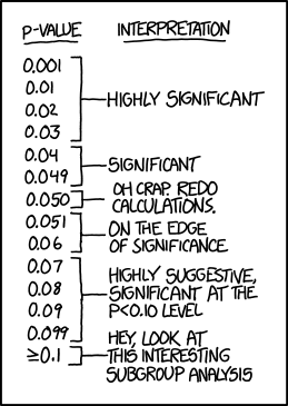
### *p*-values and biological significance
So what does a p-value mean? And how should it be interpreted? Statisticians argue about how to describe it, but one useful way of thinking about *p* is that it is the probably of the null hypothesis, which usually posits that there is no difference among groups or association among variables. So, a low *p*-value means the null hypothesis is unlikely.
Traditionally, in biology, 0.05 is taken as the critical *p*-value for decision-making. Treatments with tests where *p* < 0.05 are said to be "significantly different". What this cannot encapsulate is whether the result is biologically significant. It may certainly be the case that values that do not reach statistical significance still matter to organisms. Conversely, some measurable differences may be irrelevant *in vivo*. This is not to dismiss the usefulness of statistics. But the results of tests must be considered in context. Many readers give great deference to statistical results, but you may find times when you are justified in arguing for the importance of a difference where *p* = 0.06. Choose your words carefully, but trust in your knowledge and experience as a biologist.
## Help!
To get detailed information on each function in R, you can search from the help tab in the lower right panel of Rstudio. This will always explain what the function is expecting you to pass it-- the input the function needs to run. Sometimes there may also be a rather technical discussion of how the function works or how to use it. These entries can sometimes be useful, and other times they may not really help solve your problem. But R's help is usually a convenient place to start.
For more everyday descriptions of how to do something in R, make an internet search and include "in R". You are almost certainly not the only person to have this question! For example, "bar graph in R" will explain how to make graphs in R that look more like Excel. The online community of R users often has very helpful advice for users of all experience levels and most people post their R code as examples.
Importantly, you should always feel free to talk with me!
## R Basics
This will serve as a basic introduction to R. Several online resources provide additional guides to beginning R. Manny Gimond has a useful two-minute video introduction to Rstudio <http://mgimond.github.io/ES218/Videos/RStudio_environ1.webm>. *[Swirl](http://swirlstats.com/students.html>)* is an interactive Rstudio tutorial, available at <http://swirlstats.com/students.html>.
### Rstudio
Rstudio is a shell for R. The window is divided into 4 panels that each provide different tools.
* The top left panel displays files that you can edit and save. These may be R scripts or R markdown files.
* The R the command line is in the bottom left. When a command is run here, nothing is "saved" except if a value is put into an object.
* The top right panel shows either a list of objects currently in memory, or the command history. This is typically the least useful panel, and you can minimize it by double-clicking on the tabs in the bottom right panel.
* The bottom right panel displays lots of useful stuff, including plots generated in the command line. It also has tabs for navigating the hard drive's folders, looking at installed packages, or consulting the help pages.
Rstudio allows you to plan an elaborate command in the script panel (upper left), and when you're ready to run it, keep the cursor on your command and mouse-click the `Run` button at the top of the panel or hit `command`-`enter` on the keyboard. The command will be run in the console panel. If it doesn't do exactly what you want, you can tweak the text in the script panel. When it does what you want, you can save the script file. This provides a saved record of your analysis. If your editing an R markdown file, rather than a plain R script, you can also include descriptive text that explains the background and interpretation of your analysis.
### The command line
R has a command line interface, indicated by the `>` character. In Rstudio this is the bottom right panel. Any expression you enter here will be evaluated. Try playing around with a few simple commands.
R will evaluate simple math statements, just like a calculator.
```{r}
2+3
9^2
log(1000)
```
Note that the `log()` function uses the natural log. Use `log10()` for base-10 logs.
```{r}
log10(1000)
```
It will quickly become useful to define *objects* to save data. Do this using `=` or `<-`.
```{r}
a = log10(1000)
```
If you enter an object's name, it's value will be displayed.
```{r}
a
```
Two equal signs (`==`) is a test of Boolean logic, not the definition of an object (`=`). For this reason, many folks working in R will typically use the arrow for definitions (`<-`).
```{r}
a == log10(1000)
a == log(1000)
```
The `c()` function combines values into a *vector*. Similarly, you may want your data in a matrix.
```{r}
b <- c(1,2,3)
b
c <- matrix(c(1,2,3,4,5,6), ncol=2)
c
```
### Getting data into R
The hardest part about using R is getting data into it. Several methods exist, but the most simple is to simply define a vector that includes counts or measurements from your treatments.
```{r}
sample1 <- c(2,4,6,8)
variable1 <- c(84.5,47.3,18.9,57.2,44.6,50.1)
```
Rather than entering many values into the R command line one by one, you can also paste them from the clipboard. Select the values from a row or column in Excel, and copy them. Use the `scan()` function. Hit enter, and R will prompt you to enter values with `1:`. Paste the values from the clipboard, and hit enter twice.
```{r}
sample1 <- scan()
```
### Defining functions
Time is limited this semester. But if you're intrigued by the use of R, it is worth exploring further. Besides a wide range of conventional statistical tools, R also gives you the ability to define your own functions. Here's a simple function to find the standard error of the mean for a vector of values.
```{r}
se <- function(x) sd(x)/sqrt(length(x))
sample1 <- c(1,2,3,4)
se(sample1)
```
## Working with `ggplot`
### Installation
If necessary, install the library `ggplot2`. Say "yes" to any dependencies R asks you to install in support of this package.
```{r, eval=FALSE}
install.packages("ggplot2")
```
### Load the library
In R libraries provide additional functions and data sets not available in the base R distribution. To access these, installing it to your computer (or the Colby R studio server) is the first step, which only needs to be dome once. After that you'll need to load the library each time you want to use it. This can be done by going to the `Packages` tab in the lower right hand panel of Rstudio and checking the box for `ggplot` or any other package you want to use. Alternatively, you can use the command below.
```{r}
library(ggplot2)
```
### Sample data
So we have some sample data to explore, we'll load the sample `iris` data set [@Fisher1936].
```{r}
data(iris)
names(iris)
```
For starters, here's what a base boxplot of these data might look like.
```{r}
with(iris, plot(Sepal.Length ~ Species))
```
### The basics of `ggplot`
The base `plot()` function is just that, a function. It's called once and then its output is delivered to the screen. In contrast, `ggplot` is fundamentally different in that it creates graphical objects that remain stored in R's environment. This has advantages for complex plots, and it lets you add "layers" to existing plots later.
Here's how to make a nicer version of the boxplot above using `ggplot`. Here I'll define an object `p` that holds the plot information. Then I call `p` to display the plot.
```{r}
p <- ggplot(iris, aes(x=Species, y=Sepal.Length)) + geom_boxplot()
p
```
That's already a bit more aesthetically pleasing!
Notice that there are two parts to the statement above. The first part, `ggplot()`, takes as input the data frame we want to consider, in this case it's `iris`. Next we define the x and y axes as `Species` and `Sepal.Length`. If you try that part alone, you'll see that it displays an empty field. That's because `ggplot` needs to be told what sort of graphical elements to generate using those x and y data. That's given by the second element, `geom_boxplot()`. The parentheses are necessary, even though in this example we don't pass anything into `geom_boxplot()`. However you can give it additional information to change things like color and transparency too.
### Adding layers: `geom_jitter`
One good practice in generating graphs is to show the actual data. Box plots give a good sense of the median and dispersion of the data, but it's not immediately clear what the sample size is. We can use `ggplot` to add another layer that shows individual points for the sepal length in each species. Since it may be hard to interpret if they all line up above a species name, we can plot them with a random "jitter" in the x-axis.
```{r}
p + geom_jitter()
```
An important note about `geom_jitter()`: it randomly moves points in both dimensions. This is fine for a categorical axis, like the species names in this example. But we don't want that randomness in the continuous y-axis! You can control that with the `position` parameter.
```{r}
p + geom_jitter(position = position_jitter(width = 0.2, height = 0))
```
Of course, you can also just edit the original object definition. If the line defining your `ggplot` object is getting crowded, you can break it into multiple lines. Just be sure to copy it all into the console window to run it. Or from the script window in Rstudio, hit Run `[command]-[enter]` from the top line of the `ggplot` definition. But notice that each layer needs to be separated by a `+`. It's easy to forget about the `+` when your layers span multiple lines like this.
```{r}
p <- ggplot(iris, aes(x=Species, y=Sepal.Length)) +
geom_boxplot() +
geom_jitter(position = position_jitter(width = 0.2, height = 0))
p
```
### Using functions in graphs
You can build in functions to the data being graphed too. So if we want to look at the log of sepal length...
```{r}
p <- ggplot(iris, aes(x=Species, y=log10(Sepal.Length))) +
geom_boxplot() +
geom_jitter(position = position_jitter(width = 0.2, height = 0))
p
```
### Formatting axes
The real appeal of `ggplot` is that it allows you to customize almost everything about a plot. The title and axes can be defined using `ggtitle()`, `xlab()` and `ylab()`. The y-axis label uses a trick to get the "10" in log~10~ sub-scripted.
```{r}
p <- ggplot(iris, aes(x=Species, y=log10(Sepal.Length))) +
geom_boxplot() +
geom_jitter(position = position_jitter(width = 0.2, height = 0)) +
ggtitle("Length of sepals in different Iris species") +
xlab("Iris species name") +
ylab(expression(paste(log[10]," sepal length (cm)", sep="")))
p
```
### Themes
Use use of themes allows customization of font face, size, orientation and other elements of the plot.
Below I'll center the title, increase the sizes of all the fonts, and add a black border around the plot
```{r}
p <- ggplot(iris, aes(x=Species, y=log10(Sepal.Length))) +
theme(
plot.title = element_text(size=16,face="bold",hjust=0.5),
axis.text.x = element_text(size=14,face="italic"),
axis.text.y = element_text(size=12,face="plain"),
axis.title.x = element_text(size=14,face="plain"),
axis.title.y = element_text(size=14,face="plain"),
panel.border = element_rect(fill = NA, color = "black")
) +
geom_boxplot() +
geom_jitter(position = position_jitter(width = 0.2, height = 0)) +
ggtitle("Length of sepals in different Iris species") +
xlab("Iris species name") +
ylab(expression(paste(log[10]," sepal length (cm)", sep="")))
p
```
Theme definitions can get big. One helpful thing to do is to define the theme as a separate object that you then call within the `ggplot` definition. If you have multiple plots in your analysis, you can define a theme once and have all the individual `ggplot` objects call the same theme.
```{r}
large.text.theme <- theme(
plot.title = element_text(size=16,face="bold",hjust=0.5),
axis.text.x = element_text(size=14,face="italic"),
axis.text.y = element_text(size=12,face="plain"),
axis.title.x = element_text(size=14,face="plain"),
axis.title.y = element_text(size=14,face="plain"),
panel.border = element_rect(fill = NA, color = "black")
)
## Now you just include that theme object in your ggplot definition.
p <- ggplot(iris, aes(x=Species, y=log10(Sepal.Length))) +
large.text.theme +
geom_boxplot() +
geom_jitter(position = position_jitter(width = 0.2, height = 0)) +
ggtitle("Length of sepals in different Iris species") +
xlab("Iris species name") +
ylab(expression(paste(log[10]," sepal length (cm)", sep="")))
p
```
### Preset themes
Alternatively, `ggplot` comes with a few predefined themes. Some people don't like `ggplot`'s default gray background. If so, there is a theme called `theme_bw()` which sticks to black and white elements.
```{r}
p <- ggplot(iris, aes(x=Species, y=log10(Sepal.Length))) +
theme_bw() +
geom_boxplot() +
geom_jitter(position = position_jitter(width = 0.2, height = 0)) +
ggtitle("Length of sepals in different Iris species") +
xlab("Iris species name") +
ylab(expression(paste(log[10]," sepal length (cm)", sep="")))
p
```
### Color and Opacity
Another thing you can customize is the size, color and opacity of the layers. This is especially useful if you want to layer actual data points on top of something, like a boxplot or a violin plot. The opacity is controlled through a parameter called `alpha`, where 1 is completely opaque and 0 is completely transparent. If you're displaying lots of dots, giving them some transparency helps show where they're overlapping.
```{r}
p <- ggplot(iris, aes(x=Species, y=log10(Sepal.Length))) +
large.text.theme +
geom_boxplot(colour="grey", size=1, alpha = 0.6) +
geom_jitter(position = position_jitter(width = 0.2, height = 0), colour = "darkblue", size=3, alpha = 0.8) +
ggtitle("Length of sepals in different Iris species") +
xlab("Iris species name") +
ylab(expression(paste(log[10]," sepal length (cm)", sep="")))
p
```
### Violin plots
If you have a lot of data points, and you want a reader to easily have a sense of their distribution, you can use what's called a violin plot. This doesn't include the median, though, so we can also add a `stat_summary` layer that plots the median value.
```{r}
p <- ggplot(iris, aes(x=Species, y=log10(Sepal.Length))) +
large.text.theme +
geom_violin(colour="grey", size=1, alpha = 0.6) +
geom_jitter(position = position_jitter(width = .2, height = 0), colour = "darkblue", size=3, alpha = 0.8) +
stat_summary(fun.y=median, geom="point", shape=95, size=30) +
ggtitle("Length of sepals in different Iris species") +
xlab("Iris species name") +
ylab(expression(paste(log[10]," sepal length (cm)", sep="")))
p
```
### Re-ordering groups in a categorical axis
By default, functions in R will order the levels of a factor alphabetically. Often, you'll want to reorder those groups on the x-axis in a way that makes more biological sense. The easiest way to do this is to redefine the categorical variable using the `factor()` function with its categorical levels in a new order. You can see the current order using the `levels()` function.
```{r}
levels(iris$Species)
new.species.order <- factor(iris$Species, levels = c("versicolor","virginica","setosa"))
iris$Species <- new.species.order
p <- ggplot(iris, aes(x=Species, y=log10(Sepal.Length))) +
large.text.theme +
geom_violin(colour="grey", size=1, alpha = 0.6) +
geom_jitter(position = position_jitter(width = .2, height = 0), colour = "darkblue", size=3, alpha = 0.8) +
stat_summary(fun.y=median, geom="point", shape=95, size=30) +
ggtitle("Length of sepals in different Iris species") +
xlab("Iris species name") +
ylab(expression(paste(log[10]," sepal length (cm)", sep="")))
p
```
### Scatterplots
So far, we've been looking at plots of data by a categorical variable, `Species`. So box plots and violin plots are the most appropriate way to display those data. However, `ggplot` can also display data on two continuous axes. Let's look at the relationship between petal length and sepal length in the iris data set.
```{r}
scatterplot.theme <- theme(
plot.title = element_text(size=16,face="bold",hjust=0.5),
axis.text.x = element_text(size=12,face="plain"),
axis.text.y = element_text(size=12,face="plain"),
axis.title.x = element_text(size=14,face="plain"),
axis.title.y = element_text(size=14,face="plain"),
panel.border = element_rect(fill = NA, color = "black")
)
petal.sepal.plot <- ggplot(iris, aes(x=log10(Petal.Length), y=log10(Sepal.Length))) +
scatterplot.theme +
geom_point(size=3, alpha = 0.8) +
xlab(expression(paste(log[10]," petal length (cm)", sep=""))) +
ylab(expression(paste(log[10]," sepal length (cm)", sep="")))
petal.sepal.plot
```
### Coloring points based on group identity
As biologists, you should all wonder what's up with the two distinct clusters of points. One obvious explanation might be the they belong to different species. This can be explored by coloring the points differently according to their species. This is done by adding a `aes()` -- that's short for "aesthetics" -- statement inside the `geom_point()` call. Since `ggplot` was created by a New Zealander, [Hadley Wickham](http://hadley.nz/), the spelling of the `colour` parameter is in the British style.
```{r}
petal.sepal.plot <- ggplot(iris, aes(x=log10(Petal.Length), y=log10(Sepal.Length))) +
scatterplot.theme +
geom_point(aes(colour = Species), size=3, alpha = 0.8) +
xlab(expression(paste(log[10]," petal length (cm)", sep=""))) +
ylab(expression(paste(log[10]," sepal length (cm)", sep="")))
petal.sepal.plot
```
### Customizing colour palletes
You can choose from a range of color palettes to use in `ggplot`, although it can get confusing since different types of layers have their colors set differently. For `geom_point()` you can set custom colors with a separate layer, `scale_colour_manual()` that then references a vector of [color names](http://www.stat.columbia.edu/~tzheng/files/Rcolor.pdf).
```{r}
iris.colors=c("darkblue","deepskyblue4","cornflowerblue")
petal.sepal.plot <- ggplot(iris, aes(x=log10(Petal.Length), y=log10(Sepal.Length))) +
scatterplot.theme +
geom_point(aes(colour = Species), size=3, alpha = 0.8) +
scale_colour_manual(values = iris.colors) +
xlab(expression(paste(log[10]," petal length (cm)", sep=""))) +
ylab(expression(paste(log[10]," sepal length (cm)", sep="")))
petal.sepal.plot
```
Notice that a legend is automatically created and defaults to the right-hand side.
Alternatively, you can define colors using hexadecimal RGB color values.
```{r}
iris.colors2=c("#eebb00","#eeee00","#eebb88")
petal.sepal.plot <- ggplot(iris, aes(x=log10(Petal.Length), y=log10(Sepal.Length))) +
theme_bw() +
geom_point(aes(colour = Species), size=3, alpha = 0.8) +
scale_colour_manual(values = iris.colors2) +
xlab(expression(paste(log[10]," petal length (cm)", sep=""))) +
ylab(expression(paste(log[10]," sepal length (cm)", sep="")))
petal.sepal.plot
```
### Trend lines
When graphing data on two continuous axes, you're often trying to communicate some sort of relationship between those axes. That the relationship can be highlighted by a trend line. In `ggplot` a trend line can be included with a `stat_smooth()` layer. Be sure to set `se=FALSE` or a shaded confidence interval will be included (+/- standard error).
```{r}
trendy.plot <- ggplot(iris, aes(x=log10(Petal.Length), y=log10(Sepal.Length))) +
theme_bw() +
geom_point(aes(colour = Species), size=3, alpha = 0.8) +
stat_smooth(method = "lm", size = 1, se=F) +
scale_colour_manual(values = iris.colors) +
xlab(expression(paste(log[10]," petal length (cm)", sep=""))) +
ylab(expression(paste(log[10]," sepal length (cm)", sep="")))
trendy.plot
```
Different kinds of trend lines can be specified with the `formula` parameter. The table below lists some common trends
| code | trend line |
| --------------------------- | ----------- |
| `formula = y ~ x` (default) | linear |
| `formula = y ~ exp(x)` | exponential |
| `formula = y ~ log(x)` | log |
```{r}
trendy.plot <- ggplot(iris, aes(x=log10(Petal.Length), y=log10(Sepal.Length))) +
theme_bw() +
geom_point(aes(colour = Species), size=3, alpha = 0.8) +
stat_smooth(method = "lm", formula = y ~ exp(x), size = 1, se=F) +
scale_colour_manual(values = iris.colors) +
xlab(expression(paste(log[10]," petal length (cm)", sep=""))) +
ylab(expression(paste(log[10]," sepal length (cm)", sep="")))
trendy.plot
```
### Subsetting data for a plot
Often times you'll want to focus in on only some of the data to make a plot. For example, we may only want to look at petal and sepal lengths for *Iris virginica*. There are many ways to do this, but let's just consider one. The data statement at the beginning of the `ggplot()` call can be modified with a subset statement using `which()` to filter just the rows in the `iris` data frame where the species is *virginica*.
```{r}
virginica.plot <- ggplot(iris[which(iris$Species=="virginica"),], aes(x=log10(Petal.Length), y=log10(Sepal.Length))) +
theme_bw() +
geom_point(aes(colour = Species), size=3, alpha = 0.8) +
stat_smooth(method = "lm", size = 1, se=F) +
scale_colour_manual(values = iris.colors) +
xlab(expression(paste(log[10]," petal length (cm)", sep=""))) +
ylab(expression(paste(log[10]," sepal length (cm)", sep="")))
virginica.plot
```
### Legends
The legend can be eliminated, modified, or re-positioned using various statements. Remove the legend by adding `theme(legend.position="none")`. If the legend refers to the colors of a `geom_point` layer, then the title and labels of the legend can be modified by adding parameters to the `scale_colour_manual()` statement. The position of the legend can be moved to the interior of the plot using `theme(legend.position=c(0.1,0.85))`. The values are relative x and y positions for the center of the legend, where 0 and 1 are the minimum and maximum displayed ends of each axis. Optionally, you can also define what relative x and y location on the legend you want to use as the anchor point using `legend.justification`, as shown below.
```{r}
legendary.plot <- ggplot(iris, aes(x=log10(Petal.Length), y=log10(Sepal.Length))) +
theme_bw() +
theme(legend.justification=c(0,1), legend.position=c(0.01,0.99)) +
geom_point(aes(colour = Species), size=3, alpha = 0.8) +
scale_colour_manual(values = iris.colors,
name="Floral species",
breaks=c("versicolor", "virginica", "setosa"),
labels=c("I. versicolor", "I. virginica", "I. setosa")) +
xlab(expression(paste(log[10]," petal length (cm)", sep=""))) +
ylab(expression(paste(log[10]," sepal length (cm)", sep="")))
legendary.plot
```
### Facets: Automatically generate multiple panels
Sometimes you'll want to show the relationship of two variables, separately for a number of groups within your data set. An easy way to do this using `ggplot` is the use what it calls "facets". For example, let's plot petal and sepal length for each species separately.
```{r}
facet.plot <- ggplot(iris, aes(x=log10(Petal.Length), y=log10(Sepal.Length))) +
theme_bw() +
theme(legend.position="none") +
geom_point(aes(colour = Species), size=3, alpha = 0.8) +
stat_smooth(method = "lm", size = 1, se=F) +
facet_grid(. ~ Species) +
scale_colour_manual(values = iris.colors) +
xlab(expression(paste(log[10]," petal length (cm)", sep=""))) +
ylab(expression(paste(log[10]," sepal length (cm)", sep="")))
facet.plot
```
By default each "facet" panel will use x- and y-axes with the same scale, which makes the comparisons more immediately obvious. If you want to organize the panels in a column, rather than in a row (in this example), you change no the order of the factors in the statement to `facet_grid(Species ~ .)`. If the date frame contained two categorical variables for which you wanted to look at facets, you could organize facets in rows for one factor and columns for another, like so `facet_grid(factor1 ~ factor2)`.
### Other tutorials on `ggplot`
The list below provides links (in bold) to several other excellent online resources for using `ggplot`. Happy plotting!
* A simple [**cheatsheet**](https://www.rstudio.com/wp-content/uploads/2015/03/ggplot2-cheatsheet.pdf) for common `ggplot` elements
* Herb Wilson teaches extensively with R in BI223 Science and Baseball. He has recorded a number of instructional videos on YouTube, including this one on [**making a histogram using `ggplot`**](https://www.youtube.com/watch?v=BvykvAgSnUg&feature=youtu.be)
* A [**Harvard University workshop**](http://tutorials.iq.harvard.edu/R/Rgraphics/Rgraphics.html) on data science walks through the use of `ggplot`, with the example of deconstructing a clear and informative plot from *The Economist*
* [**ggplot2: Elegant Graphics for Data Analysis**](http://cbbcat.net/record=b4724928) by Hadley Wickham is a book that provides a comprehensive presentation of `ggplot`'s capabilities. The complete text is available online through the CBB library consortium.
