###### tags: `CSS`
# Flexbox, Media Queries, and CSS Reset
1. What is flexbox?
2. A CSS web layout that allows for element responsivness inside containers.
## Git repo
- [Main Repo](https://github.com/Coding-Dojo-ACC/week4-flexbox)
- Check the branches to see changes
## Flexbox
### So why use it and how?
- Like we learned with the box model, every element in your HTML doc is a box. Each box can contain more boxes and so on and so forth. When it comes to using flex 1st understanding what will be effected is important.
- Here we see our box model the element content is what we are focusing on now...we know that paddings, borders, and margins affect the elements but what about when those elements contain children.
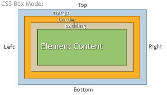
- Our flex container here is our element content. So we are inside our box now. In this case our content or box has 3 smaller boxes contained inside.

- Lets do some pseudocode using a school.
```
<school>
<scienceRoom>
<desk></desk>
<desk></desk>
<desk></desk>
<desk></desk>
<desk></desk>
<desk></desk>
</scienceRoom>
<englishRoom>
<desk></desk>
<desk></desk>
<desk></desk>
<desk></desk>
<desk></desk>
<desk></desk>
</englishRoom>
</school>
```
So we have this school with 2 rooms in it. The school it's self being a box will have it's own padding, border, and margin to it. and as will each and every other element listed. By default html reads top to bottom, meaning as it is written right now everything will line up in 1 column on the left.
But along with our HTML we were given the following blueprint:

Looking at this and the code above and knowing the default properties we have some changes to make.
- 1st we need to tell our code to use flex so we will apply that too the school element, which will tell the children of school how to behave:
```
school {
display: flex;
}
```
- By default this has the properties of row but just to make sure lets make sure it's in there:
```
school {
display: flex;
flex-direction: row;
}
```
- Ok better. Now from the blueprint we see that the children of school seem to be centered in the school. So lets add that:
```
school {
display: flex;
flex-direction: row;
justify-content: center; // This centers along the horizontal axis
align-items: center; // This centers along the vertical axis
}
```
Ok so if we were to look at our page we would have our school and 2 rooms next to each other each with 6 desks in a column.
- Next we will need to apply some flex styling to the rooms themselves. We will just add the code for the englishRoom for now but assume we are doing it to the 2 rooms.
```
englishRoom {
display: flex;
}
```
- Ok so now we have all 6 desks in a single row instead of a column because remember display: flex; has a default of row. Although we do want the desks in a row we dont' want them in 1 row but 2 in this case. With out changing the HTML we can accomplish this using flex
- 1st lets go ahead and center these desks in the room:
```
englishRoom {
display: flex;
flex-direction: row;
justify-content: center;
align-items: center;
}
```
- Ok thats done, now because of the size of our screen we have some left and right scrolling going on and thats not good. So to stop some of that we should give the rooms a width, but that still won't fix our desks. However allowing those desks to wrap would so lets do that:
```
englishRoom {
display: flex;
flex-direction: row;
justify-content: center;
align-items: center;
width: 400px; // This makes it so they are the same width and a bit smaller
flex-wrap: wrap; // Allows elements that don't fit to move to the next line
}
```
So now if we have this page pulled up it should look like the blueprint.
## Media Queries
What are they and why?
- Although flexbox helps in making your web page more responsive using media queries allows you to view your web page on any size screen and makes it so it looks good too.
As a rule of thumb you should style your site to work on 3 basic sized devices
1. A phone (350-500px)
2. A tablet (500-900px)
3. A desktop (over 900px)
Before you start styling you need to 1st descide do you want to style for mobile or desktop 1st. What this means is the bulk of your css will apply for which screen size, mobile or desktop, after that you will create the media queries to go up (if you chose mobile first) or down (if you chose desktop first)
Many developers now are styling mobile first now as most of the end users are viewing websites on their phones not desktops.
Always remember that your CSS document is read top down. So all media queries must be at the bottom of your document and in the proper order as well.
- For a Desktop 1st CSS here is a basic layout
```
header {
background-color: blue; // On a desktop my background will be blue
}
@media only screen and (max-width: 900px) {
header {
background-color: red; // On screen sizes under 900px wide the background will now be red
}
}
@media only screen and (max-width: 630px) {
header {
background-color: yellow; // On a screen size under 630px the background will be yellow
}
}
@media only screen and (max-width: 450px) {
header {
background-color: white; // on a screen size under 450px the background will be white.
}
}
```
Here order is important so that it only changes what we want it too when we want it too.
- For a Mobile 1st Css here is a basic layout
```
header {
background-color: blue; // On a moble my background will be blue
}
@media only screen and (min-width: 430px) {
header {
background-color: red; // When the screen size is over 430 the background changes to red
}
}
@media only screen and (min-width: 630px) {
header {
background-color: yellow; // When the screen size is over 630 the background changes to yellow
}
}
@media only screen and (min-width: 900px) {
header {
background-color: white; // When the screen size is over 900 the background changes to white.
}
}
```
Again oder is important so that it changes when we want it too.
You style just as you normally would just make sure that the changes are inside the brackets for the media you are working on.
## CSS Reset
What is this and why?
Well A CSS Reset is how you would over ride the browser defaults. As you know by now an h1 tag has natural built in styling, it's font size is bigger and bolder than a p tag and there seems to be some margin's around it.
A CSS reset when applied to the begining of your stylesheet takes defaults like that and well resets them. There are many ways you can create a reset like just making it so there are no natural padding or margins, or using some others that are pre done so to speak.
Here is a link to a collection of them. [CSS Reset Collection](https://perishablepress.com/a-killer-collection-of-global-css-reset-styles/)
 Sign in via Google
 Sign in via Facebook
 Sign in via X(Twitter)
 Sign in via GitHub
 Sign in via Dropbox
 Sign in with Wallet
Connect another wallet
Sign in with Wallet
Connect another wallet