###### tags: `R` `ggplot2::geom_linerange` `ggplot2::ggplot`
# Plot time series data
## Control multiple legends. Control top X axis breaks
**data file shared on Google drive**
[plot-data_Daily-number-containers-collected-refunded_holidays.csv](https://drive.google.com/file/d/1qKRicSeJ-fhDrUUJIRohRPivrqozIFZl/view?usp=sharing)
[plot-data_number-to-place-on-top-of-bars.csv](https://drive.google.com/file/d/1b5OR8QpWTQ2NW352Ta_3R8orwgvImGZX/view?usp=sharing)
[plot-title-data_totals.csv](https://drive.google.com/file/d/1lzLgRWjsnanGQFsc7cdA_Ex2abWtKMza/view?usp=sharing)
[plot-title-data_running-totals.csv](https://drive.google.com/file/d/1VghRsXzO-1RfjpYxk5KHJLHMLa3RI2uQ/view?usp=sharing)
**Plot**
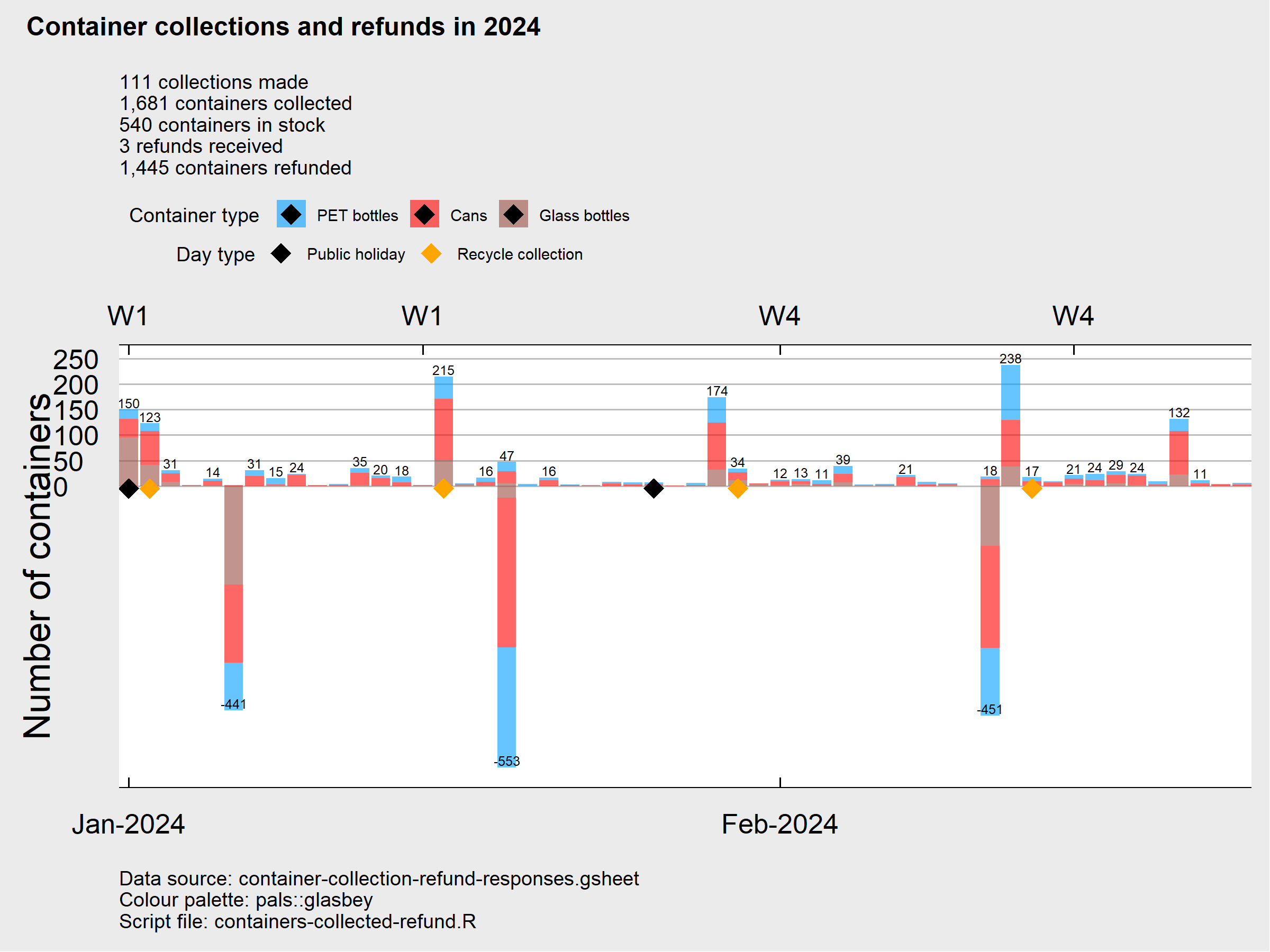
**R code to produce the plot above**
* Problem 1: Black diamond appears in legend 1 items. How to remove them?
* Problem 2: Top X axis has duplicated weeks. How to show every week rather than every 2 weeks?
```r!
# Directory
dir.drive.C <- "C:"
dir.R <- file.path(dir.drive.C, "R")
dir.R.packages <- file.path(dir.R, "R-4.3.2")
dir.main <- file.path(dir.drive.C,"GoogleDrive")
dir.containers <- file.path(dir.main,"containers-for-changes")
dir.output <-file.path(dir.containers,"output")
# install.packages("gsheet", lib = dir.R.packages, dependencies = TRUE)
# install.packages("ggrepel", lib = dir.R.packages, dependencies = TRUE)
# install.packages("tidyverse", lib = dir.R.packages, dependencies = TRUE)
# install.packages("ggbreak", lib = dir.R.packages, dependencies = TRUE)
# install.packages("forcats", lib = dir.R.packages, dependencies = TRUE)
# install.packages("tsibble", lib = dir.R.packages, dependencies = TRUE)
# install.packages("ggtext", lib = dir.R.packages, dependencies = TRUE)
# install.packages("hutilscpp", lib = dir.R.packages, dependencies = TRUE)
library(tzdb, lib.loc = dir.R.packages)
library(vroom, lib.loc = dir.R.packages)
library(gsheet, lib.loc = dir.R.packages)
library(stringr, lib.loc = dir.R.packages)
library(httr, lib.loc = dir.R.packages)
library(curl, lib.loc = dir.R.packages)
library(lubridate, lib.loc = dir.R.packages)
library(ggridges, lib.loc = dir.R.packages)
library(ggplot2, lib.loc = dir.R.packages)
library(labeling, lib.loc = dir.R.packages)
library(farver, lib.loc = dir.R.packages)
library(cowplot, lib.loc = dir.R.packages)
library(magick, lib.loc = dir.R.packages)
library(tidyr, lib.loc = dir.R.packages)
library(png, lib.loc = dir.R.packages)
library(jpeg, lib.loc = dir.R.packages)
library(RCurl, lib.loc = dir.R.packages)
library(grid, lib.loc = dir.R.packages)
library(ggrepel, lib.loc = dir.R.packages)
library(readr, lib.loc = dir.R.packages)
library(forcats, lib.loc = dir.R.packages)
library(tidyverse, lib.loc = dir.R.packages)
library(ggbreak, lib.loc = dir.R.packages)
library(timeDate, lib.loc = dir.R.packages)
library(tsibble, lib.loc = dir.R.packages)
library(cowplot, lib.loc = dir.R.packages)
library(ggthemes, lib.loc = dir.R.packages)
library(markdown, lib.loc = dir.R.packages)
library(xfun, lib.loc = dir.R.packages)
library(ggtext, lib.loc = dir.R.packages)
library(pals, lib.loc = dir.R.packages)
library(hutilscpp, lib.loc = dir.R.packages)
# Download shared CSV files from Google drive. Read them into R
## This is the plot data
containers.holidays.collection.days <- read.csv(
file = file.path(dir.output,"plot-data_Daily-number-containers-collected-refunded_holidays.csv")
,header = TRUE) |>
# Put date columns to Date type
dplyr::mutate(
date.of.activity=as.Date(date.of.activity)
) # dim(containers.holidays.collection.days) 168 11
## This is number data to place on top of stacked bars
totals.all.types <- read.csv(file = file.path(dir.output,"plot-data_number-to-place-on-top-of-bars.csv")
,header = TRUE) |>
# Put date columns to Date type
dplyr::mutate(
date.of.activity=as.Date(date.of.activity)
) # dim(totals.all.types) 56 4
## This is plot title data
totals <- read.csv(file = file.path(dir.output,"plot-title-data_totals.csv")
,header = TRUE) # dim(totals) 2 6
## This is plot title data with running totals
containers.2 <- read.csv(file=file.path(dir.output,"plot-title-data_running-totals.csv")
,header = TRUE) # dim(containers.2) 115 9
# Create plot title, subtitle
plot.title.stacked.bars <- "Container collections and refunds in 2024\n"
# Function to format numbers
my_comma <- scales::label_comma(accuracy = 1, big.mark = ",", decimal.mark = ".")
plot.subtitle.stacked.bars <- paste0(totals$number.activities[1], " collections made\n"
,my_comma(totals$total[1]), " containers collected\n"
,tail(containers.2$number.stock,n=1)," containers in stock\n"
,totals$number.activities[2], " refunds received\n"
,my_comma(totals$total[2]), " containers refunded")
# bar width, position setttings
width <- .75
position <- ggplot2::position_stack(vjust=.5)
#----------
# Color
#----------
# Use a palette with multiple distinct colors
pals::pal.bands(kelly, glasbey, polychrome)
# Only 22 colors are available with 'kelly'.
# Only 32 colors are available with 'glasbey'.
# Only 36 colors are available with 'polychrome'.
# Pick first 3 color from kelly()
pals::pal.bands(glasbey(n=length(unique(containers.holidays.collection.days$container.type))))
# Display color from color code
## #8 light blue for PET, #2 red for cans, #9 brown for glass
colors <- as.vector(pals::glasbey(n=9))[c(8,2,9)]
scales::show_col(colors)
# Pair legend item and color
legend.items.color <- c( PET=colors[1]
,cans=colors[2]
,glass=colors[3])
# Order legend item
plot.legend.ordered <- c("PET","cans","glass") # length(plot.legend.ordered) 3
plot.legend.label.ordered <- c("PET bottles","Cans","Glass bottles") # length(plot.legend.ordered) 3
# Caption
caption <- paste0("Data source: container-collection-refund-responses.gsheet\n"
,"Colour palette: pals::glasbey\n"
,"Script file: containers-collected-refund.R")
# Make stacked bar plot with two legends
## Legend 1 for container type
## Legend 2 for day type
stacked.bars.problems <- ggplot2::ggplot(data=containers.holidays.collection.days
,aes(x=date.of.activity
,y=container.number.adjusted
# Stacks of the bar order, from top to bottom, controlled by the levels
,fill=factor(container.type, levels = c("PET","cans","glass"))
,label=container.number.adjusted))+
# Control transparency of bar color
ggplot2::geom_col(alpha=0.6)+
# Draw sum number above the stacked bars using another dataset totals.all.types
ggplot2::geom_text(data=totals.all.types
,aes(x=date.of.activity, y=total, label=total.label, fill=NULL)
,vjust=-0.2
,size=2.5)+
# Months on bottom X axis, weeks on top X axis
ggplot2::scale_x_date(expand = c(0, 0) # expand = c(0,0) to remove margins
,date_breaks = "1 month"
,date_labels = "%b-%Y" # %b Abbreviated month name in current locale (Aug)
,date_minor_breaks = "1 week"
# Add a secondary x axis showing week number
,sec.axis = ggplot2::sec_axis(
trans= ~ .
,labels = scales::date_format("W%w"))) +
# Set breaks on Y axis
ggplot2::scale_y_continuous(breaks = seq(0, 300, 50))+
ggplot2::labs(title=plot.title.stacked.bars
,subtitle = plot.subtitle.stacked.bars
# Add data source as footnote
,caption = caption
,x = ""
,y = "Number of containers"
# Change legend title from variable name to text
,fill="Container type "
#,color="Day type"
)+
# Remove default theme background color
ggplot2::theme_bw()+
ggplot2::theme_minimal()+
# Apply The Economist theme
ggthemes::theme_economist_white()+
ggplot2::theme(plot.title = element_text(hjust = -0.15, vjust=2.12, colour="black", size = 14, face="bold")
,legend.position = "top"
,legend.justification='left'
,legend.direction='horizontal'
,legend.text = element_text(size = 8.5)
,legend.box = "vertical"
# Reduce gap between legends
,legend.spacing.y = unit(-0.25, "cm")
,plot.caption = element_text(hjust = 0) # Left align caption
,axis.title = element_text(size = 20)
,axis.text = element_text(size = 15)
,panel.grid.minor = element_blank()
,panel.grid.major = element_line(color = "gray", linewidth = 0.5)
)+
ggplot2::geom_point(aes(x=date.of.activity
,y=y.coordinate.holidays.collection.days
,color=factor(day.type, levels = c("Public holiday", "Recycle collection"))
)
,shape=18 # 15 for solid squares, 18 solid diamonds
,size=5
,show.legend = TRUE)+
# Modify legend for aesthetic=fill
ggplot2::scale_fill_manual(
# Change legend item color from default to colors
# Use palette from pals package. as.vector() needed to remove color name
values=legend.items.color
,labels=plot.legend.label.ordered) +
# Modify legend for aesthetic= color
ggplot2::scale_color_manual(
name="Day type"
,values = c("Public holiday" = "black","Recycle collection" = "orange")
)+
# Setting the order of legends
ggplot2::guides(fill= guide_legend(order = 1)
,colour=guide_legend(order=2))
# Export plot to a png
base <-300
png(file=file.path(dir.output,"Daily-number-containers-collected-refunded_holidays_plot-has-problems.png")
,width=base*8,height=base*6,res=250)
stacked.bars.problems
dev.off()
```
---
## Stacked bar graph color not matched legend color. New unspecified color appears in bar graph and legend
**data file shared on Google drive**
https://drive.google.com/file/d/14vfxeGN5xjaBA4tCbORzzse26hj0cupZ/view?usp=drive_link
**Color and legend**
```r!
#----------
# Color
#----------
# Use a palette with multiple distinct colors
pals::pal.bands(kelly, glasbey, polychrome)
# Only 22 colors are available with 'kelly'.
# Only 32 colors are available with 'glasbey'.
# Only 36 colors are available with 'polychrome'.
# Pick first 8 color from glasbey()
pals::pal.bands(glasbey(n=length(plot.legend.ordered)))
# Display color from color code
colors <- as.vector(pals::glasbey(n=8))
scales::show_col(colors)
# Pair legend item and color
x <- c( Badminton=colors[1]
,`Bike Fitting`=colors[2]
,Ride=colors[3]
,Run=colors[4]
,`Strength & Stability workout`=colors[5]
,Swim=colors[6]
,`Table Tennis`=colors[7]
,Walk=colors[8])
```
```r!
scales::show_col(colors)
```
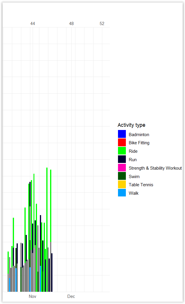
**problem** activity.type "Strength & Stability Workout" should be in pink as the legend color. But it is in gray bars
```r!
# Read tsv into R
activities.2023 <- read.table(
file = file.path(dir.Strava.output,"Strava-activities-2023.tsv")
,sep = "\t"
,header = TRUE) |>
# Change character Dates to date
dplyr::mutate(start.date.local=as.Date(start.date.local))# dim(activities.2023) 341 3
#-------------
# Legend
#-------------
# Order legend item alphabetically
plot.legend.ordered <- sort(unique(activities.2023$activity.type)) # length(plot.legend.ordered) 8
ggplot2::ggplot(activities.2023
,aes(x=start.date.local
,y=moving.time.hour
,fill = activity.type))+
ggplot2::geom_bar(position = "stack", stat = "identity") +
ggplot2::scale_x_date(
limits = as.Date(c('2023-01-01','2023-12-31'))
,expand = c(0, 0) # expand = c(0,0) to remove margins
,date_breaks = "1 month"
,date_minor_breaks = "1 week"
,date_labels = "%b" # Abbreviated month name in current locale (Aug)
# Add a secondary x axis showing week number
,sec.axis = ggplot2::sec_axis(
trans= ~ .
,breaks= c(seq.Date(as.Date("2023-01-01"), by="month", length.out = 12)
,"2023-12-25")
,labels= scales::date_format("%W"))
)+
ggplot2::scale_y_continuous(limits = c(0,8)
,breaks = seq(from=0, to=8, by=1)
,expand = c(0, 0) # expand = c(0,0) to remove margins
)+
ggplot2::labs(title="Daily hours spent on physical exercise activity in 2023"
,subtitle = "GPS-tracked activities: Ride, Run, Walk"
,x = ""
,y = "Moving time (h)"
,fill="Activity type")+
# Remove default theme background color
ggplot2::theme_bw()+
ggplot2::theme_minimal()+
# Change bar colors
## Use ggplot2::scale_color_manual() to modify aesthetics = "colour"
## Use ggplot2::scale_fill_manual() to modify aesthetics = "fill"
ggplot2::scale_fill_manual(
# Use palette from pals package. as.vector() needed to remove color name
values = colors
,labels=plot.legend.ordered
#values=x
# Reorder legend items from most frequent to least frequent
# legend text longer than the cutoff is wrapped to multiple lines
,limits=stringr::str_wrap(plot.legend.ordered,width=20)
)
```
Code above generates this plot
```r!
tail(activities.2023,n=3)
# start.date.local moving.time.hour activity.type
#339 2023-11-15 2.182778 Ride
#340 2023-11-15 1.505278 Strength & Stability Workout
#341 2023-11-16 1.158056 Run
```
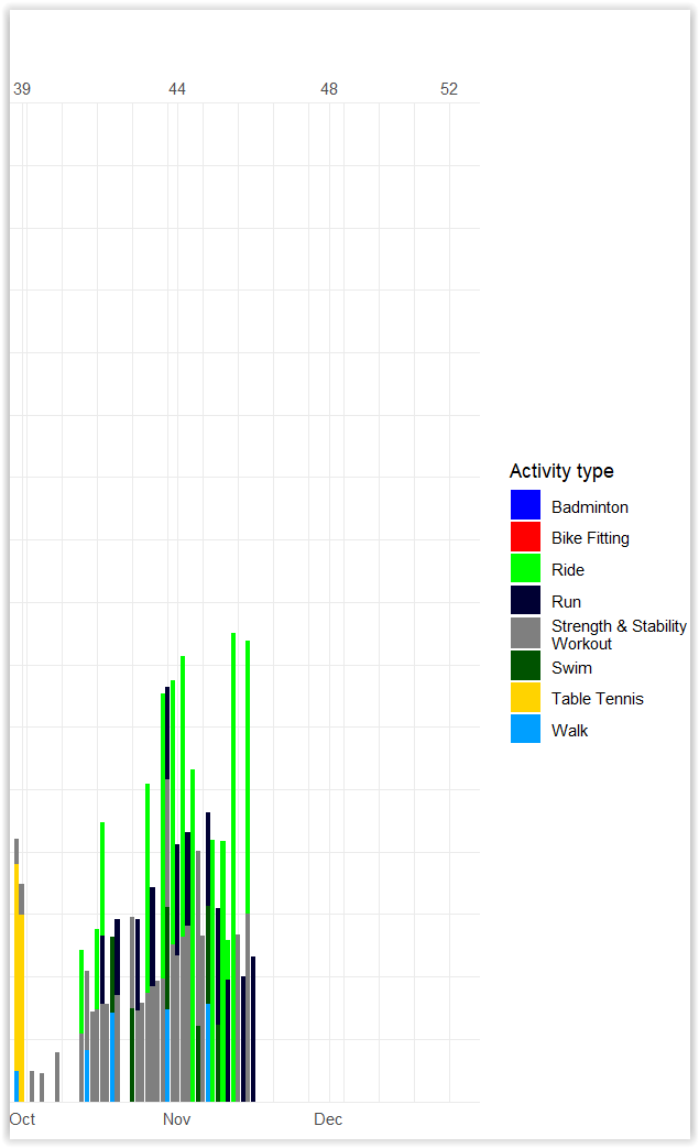
**problem** activity.type "Strength & Stability Workout" shown in grey in legend and graph, not as pink as the color palette
```r!
# Pair legend item and color
x <- c( Badminton=colors[1]
,`Bike Fitting`=colors[2]
,Ride=colors[3]
,Run=colors[4]
,`Strength & Stability workout`=colors[5]
,Swim=colors[6]
,`Table Tennis`=colors[7]
,Walk=colors[8])
ggplot2::ggplot(activities.2023
,aes(x=start.date.local
,y=moving.time.hour
,fill = activity.type))+
ggplot2::geom_bar(position = "stack", stat = "identity") +
ggplot2::scale_x_date(
limits = as.Date(c('2023-01-01','2023-12-31'))
,expand = c(0, 0) # expand = c(0,0) to remove margins
,date_breaks = "1 month"
,date_minor_breaks = "1 week"
,date_labels = "%b" # Abbreviated month name in current locale (Aug)
# Add a secondary x axis showing week number
,sec.axis = ggplot2::sec_axis(
trans= ~ .
,breaks= c(seq.Date(as.Date("2023-01-01"), by="month", length.out = 12)
,"2023-12-25")
,labels= scales::date_format("%W"))
)+
ggplot2::scale_y_continuous(limits = c(0,8)
,breaks = seq(from=0, to=8, by=1)
,expand = c(0, 0) # expand = c(0,0) to remove margins
)+
ggplot2::labs(title="Daily hours spent on physical exercise activity in 2023"
,subtitle = "GPS-tracked activities: Ride, Run, Walk"
,x = ""
,y = "Moving time (h)"
,fill="Activity type")+
# Remove default theme background color
ggplot2::theme_bw()+
ggplot2::theme_minimal()+
# Change bar colors
## Use ggplot2::scale_color_manual() to modify aesthetics = "colour"
## Use ggplot2::scale_fill_manual() to modify aesthetics = "fill"
ggplot2::scale_fill_manual(
values=x
# Reorder legend items from most frequent to least frequent
# legend text longer than the cutoff is wrapped to multiple lines
,limits=stringr::str_wrap(plot.legend.ordered,width=20)
)
```
---
## Color background of a ggplot2 bar plot
**Problems**
* How to remove these white spaces/margins
* Margin on the left of Jan 2023
* Margin above y=8
* Margin on the right of Jan 2024
* X axis ends at Dec 2023
* Margin below y=0
**plot generated**

**data file shared on Google drive**
https://drive.google.com/file/d/14vfxeGN5xjaBA4tCbORzzse26hj0cupZ/view?usp=drive_link
**Code to produce the plot**
```r!
# Read tsv into R
activities.2023 <- read.table(
file = file.path(dir.Strava.output,"Strava-activities-2023.tsv")
,sep = "\t"
,header = TRUE) |>
# Change character Dates to date
dplyr::mutate(start.date.local=as.Date(start.date.local))# dim(activities.2023) 341 3
# Number of colors needed for activity.type
plot.legend.ordered <- sort(unique(activities.2023$activity.type))
length(plot.legend.ordered) # 8
# Use a palette with >=20 distinct colors
pals::pal.bands(kelly, glasbey, polychrome)
# Only 22 colors are available with 'kelly'.
# Pick first n colors from kelly(), glasbey()
pals::pal.bands(kelly(n=length(plot.legend.ordered)))
# Manually create start dates and end dates to different time
time.zones <- data.frame(
date.start=as.Date(c("2023-01-01","2023-01-16","2023-02-06","2023-09-02","2023-10-03"))
,date.end=as.Date(c("2023-01-15","2023-02-05","2023-09-01","2023-10-02","2023-12-31"))
,time.zone=c("Australia/Brisbane","Asia/Kuala_Lumpur","Australia/Brisbane","Asia/Taipei","Australia/Brisbane")) # dim(time.zones) 5 3
# Pick color red for "Asia/Kuala_Lumpur", darkgreen for "Asia/Taipei", blue for "Australia/Brisbane". Change the color order to meet the legend text order sorted
time.zones.color <- c("darkred","darkgreen","darkblue")
moving.time.activity.2023 <- ggplot2::ggplot(activities.2023
,aes(x=start.date.local
,y=moving.time.hour
,fill = activity.type))+
ggplot2::geom_bar(position = "stack", stat = "identity") +
ggplot2::scale_x_date(
limits = as.Date(c('2023-01-01','2023-12-31'))
,expand = c(0, 0) # expand = c(0,0) to remove margins
,date_breaks = "1 month"
,date_minor_breaks = "1 week"
,date_labels = "%b" # Abbreviated month name in current locale (Aug)
# Add a secondary x axis showing week number
,sec.axis = dup_axis(name = "",labels = scales::date_format("%W"))
)+
ggplot2::scale_y_continuous(limits = c(0,8)
,breaks = seq(from=0, to=8, by=1)
,expand = c(0, 0) # expand = c(0,0) to remove margins
)+
ggplot2::labs(title="Daily hours spent on physical exercise activity in 2023"
,subtitle = "GPS-tracked activities: Ride, Run, Walk"
,x = ""
,y = "Moving time (h)"
,fill="Activity type")+
# Remove default theme background color
ggplot2::theme_bw()+
ggplot2::theme_minimal()+
# Change bar colors
## Use ggplot2::scale_color_manual() to modify aesthetics = "colour"
## Use ggplot2::scale_fill_manual() to modify aesthetics = "fill"
ggplot2::scale_fill_manual(
# Use palette from pals package. as.vector() needed to remove color name
values = as.vector(pals::kelly(n=8)) # glasbey, polychrome not good looking as kelly
# Reorder legend items from most frequent to least frequent
# legend text longer than the cutoff is wrapped to multiple lines
,limits=stringr::str_wrap(plot.legend.ordered,width=20)
)+
# Create a second fill scale and modify its color
ggnewscale::new_scale_fill()+
ggplot2::geom_rect(data=time.zones
,inherit.aes = FALSE
,aes( xmin=date.start
,xmax=date.end
,ymin=0 #ymin=-Inf
,ymax=8 #ymax=Inf
,fill=time.zone)
,alpha=0.15)+
# Change legend title. Modify color for the fill= aesthetic above
ggplot2::scale_fill_manual(name="Time Zones",values = time.zones.color)
# Export plot to png
# Create a github-style calender heat-map using ggplot
size.base <- 300
png(file=file.path(dir.Strava.output,"Activity-moving-time-hours-stacked-barplot-background-colored-timezone-2023.png")
,width=size.base*8,height=size.base*4.5,res=300)
moving.time.activity.2023
dev.off()
```
---
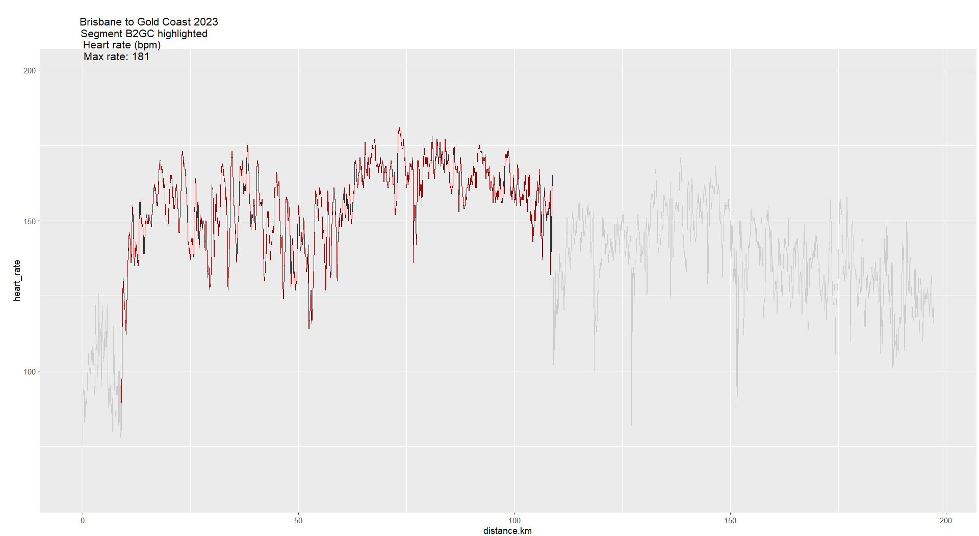
## Highlight a range of X axis in a line plot
data file on Google drive
https://drive.google.com/file/d/13B_AfldCOwWXzj_XqUv9249NQHvbsuw2/view?usp=drive_link
```r!
B2GC2023 <- readr::read_csv(file = file.path(dir.Strava,"GOTOES_FIT-CSV_4284285070831056.csv")) |>
dplyr::select(timestamp, position_lat, position_long, altitude, heart_rate, distance, speed, grade, gps_accuracy, calories) |>
dplyr::mutate(distance.km=distance/1000
# Set grade >= 15 to NA
,grade.edited=dplyr::case_when(grade < 15 ~ grade, TRUE ~ NA_real_)
# distance between 8.89 and 108.82km as B2GC, else as non-B2GC
,segment=dplyr::case_when(distance.km>=8.89 & distance.km <=108.82 ~ "B2GC", TRUE~ "non-B2GC")
) |>
# Remove speed > max speed in Strava
dplyr::filter(speed <= 64.2) # dim(B2GC2023) 32883 13
# Create plot titles
plot.title.heartrate <- paste0(
"Brisbane to Gold Coast 2023 \nSegment B2GC highlighted\n"
,"Heart rate (bpm)\n"
,"Max rate: ", max(B2GC2023$heart_rate, na.rm = T))
# Heartrate over distance highlighting segment B2GC, distance between 8.89 and 108.82km
plot.heartrate <- ggplot2::ggplot(data=B2GC2023, aes(x=distance.km)) +
ggplot2::geom_line(aes(y = heart_rate), color = "darkred")+
ggplot2::labs(title=plot.title.heartrate)+
# Change position downwards
ggplot2::theme(plot.title = element_text(vjust = - 7.5, hjust=0.05, size = 12.5)
,plot.margin = unit(c(0,0.2,0,1), "lines"))+
gghighlight::gghighlight(distance.km>=8.89 & distance.km<=108.82)+
ggplot2::ylim(60,200)
```
---
## Highlight a range of X axis in an area plot
```r!
B2GC2023.heartrate <- B2GC2023 |> dplyr::filter(heart_rate>=60 & heart_rate<=200)
# Area plots with 2 colored areas. Not what I want as there the two groups overlapped
ggplot2::ggplot(data=B2GC2023.heartrate
,mapping= aes(x=distance.km, y=heart_rate, group=segment))+
ggplot2::geom_area(data=subset(B2GC2023.heartrate, segment=="B2GC")
,aes(color=segment, fill=segment)
,alpha=0.5
,position = "identity")+
ggplot2::geom_area(data=subset(B2GC2023.heartrate, segment=="non-B2GC")
,aes(color=segment, fill=segment)
,alpha=0.2
,position = "identity")+
scale_color_manual(values=c("#FF0000","#000000")) +
scale_fill_manual(values=c("#FF0000","#000000"))
# Area plots with 2 colored areas. Not what I want as there the two groups overlapped
ggplot2::ggplot(data=B2GC2023.heartrate
,aes(x=distance.km, y=heart_rate, fill=segment, alpha=segment))+
geom_area()+
scale_fill_manual(values=c("#FF0000", "#000000"))+
scale_alpha_manual(values= c(1,0.3))
```
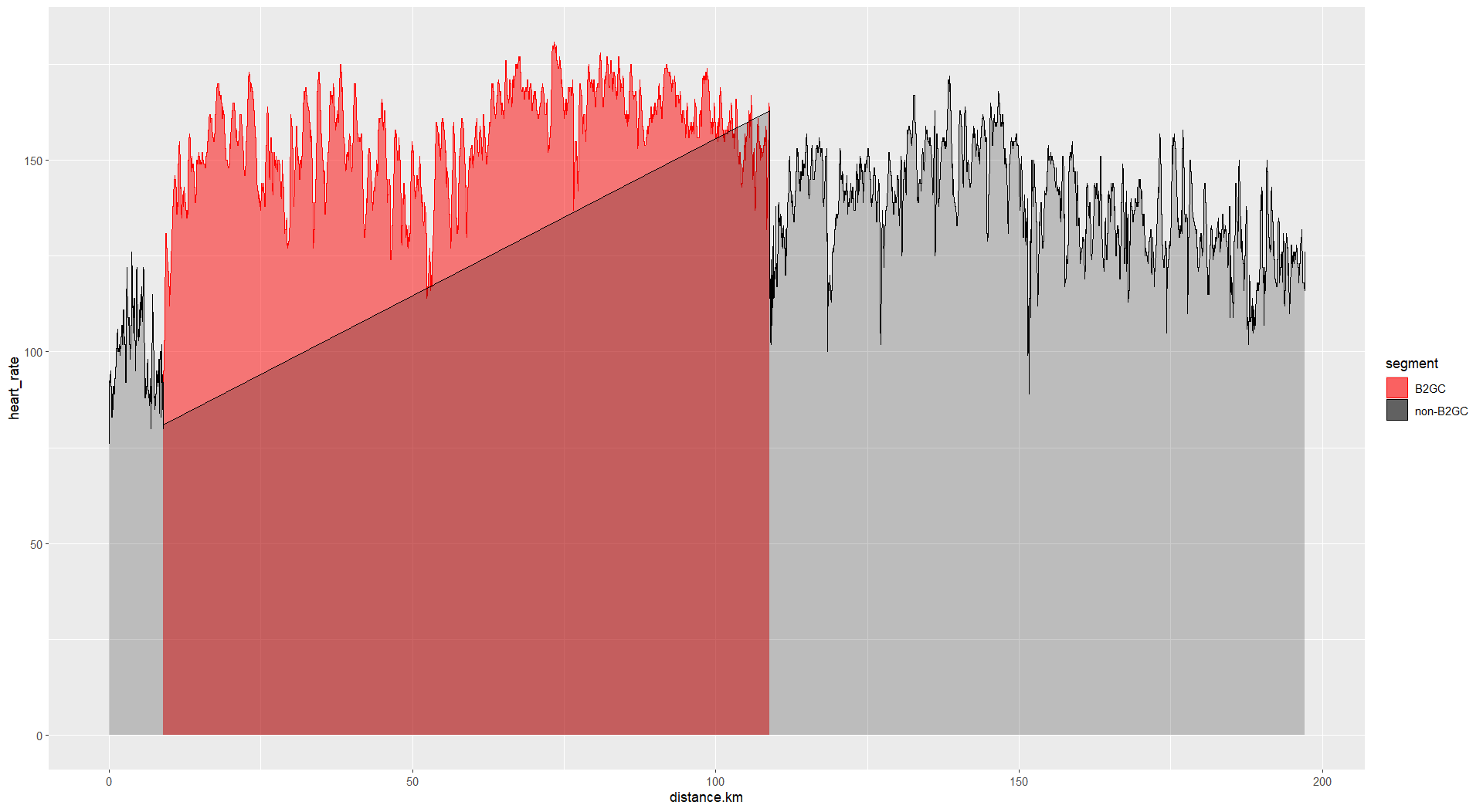
```r!
B2GC2023.heartrate <- B2GC2023 |> dplyr::filter(heart_rate>=60 & heart_rate<=200)
# Area plots with 2 colored areas. Not what I want as there the two groups overlapped
ggplot2::ggplot(data=B2GC2023.heartrate
,aes(x=distance.km, y=heart_rate, fill=segment, alpha=segment))+
geom_area()+
scale_fill_manual(values=c("#FF0000", "#000000"))+
scale_alpha_manual(values= c(1,0.3))
```

---
## Show number on bottom X axis and dates on top x axis
```r!
```

---
## Arrange multiple ggplot2 plots on one page
### Example with 3 subjects
```r!
# Create sample data with 3 subjects for plotting adverse events
subject.017_306 <- data.frame(AESEQ=1
,AETERM="fractured ankle (bilateral)"
,AESTDTC="2021-08-24"
,AESTDY=70
,AEENDTC="2022-11-01"
,AEENDY=504
,SUBJID="017-306") # dim(subject.017_306) 1 7
subject.017_313 <- data.frame(AESEQ=1
,AETERM="blurred vision"
,AESTDTC="2021-09-14"
,AESTDY=29
,AEENDTC="2021-10-05"
,AEENDY=50
,SUBJID="017-313") # dim(subject.017_313) 1 7
subject.023_302 <- data.frame(AESEQ=c(4:1)
,AETERM=c("Tearing", "Grittiness", "eyelid itchiness","Eyelid margin crusting")
,AESTDTC=c("2022-02-06","2022-02-06","2022-02-06","2022-01-16")
,AESTDY=c(25, 25, 25, 4)
,AEENDTC=c("2022-02-12","2022-03-12","2022-02-12","2022-01-22")
,AEENDY=c(31,59,31,10)
,SUBJID=rep("023-302", 4)
) # dim(subject.023_302) 4 7
# Combine three subjects to one dataframe
sample.data <- rbind(subject.017_306, subject.017_313, subject.023_302) |>
dplyr::mutate(AETERM=factor(AETERM)
,AESTDTC=as.Date(AESTDTC)
,AEENDTC=as.Date(AEENDTC)) # dim(sample.data) 6 7
ae.subjects <- unique(sample.data$SUBJID) # length(ae.subjects) 3
# Create an empty list for holding results from the for loop
ggplot.list <- list() # class(ggplot.list) "list" # length(ggplot.list) 0
# Create one plot object per subject
for(i in 1:length(ae.subjects)){
# Get data from 1 subject
plotdata <- sample.data |>
dplyr::filter(SUBJID==ae.subjects[i]) # dim(plotdata) 1 7
# Create plot object name
plot.object.name <- paste0("plot.", gsub(pattern="-", replacement="_", x=ae.subjects[i]))
# Create 1 plot object per subject
# Append plot object to the list
ggplot.list[[i]] <- plotdata %>%
ggplot2::ggplot(aes(xmin = AESTDTC, xmax = AEENDTC, y = SUBJID)) +
ggplot2::geom_linerange(aes(color=AETERM)
,linewidth = 5
, position = position_dodge(width = 0.5)) +
ggplot2::scale_x_date(name = ""
,breaks = unique(c(plotdata$AESTDTC, plotdata$AEENDTC))
,sec.axis = dup_axis(
labels = unique(c(plotdata$AESTDY, plotdata$AEENDY))
,name = "")
)+
ggplot2::labs(title = paste0("Subject ", ae.subjects[i])
,y=NULL) +
ggplot2::theme_minimal()+
# Rotate and space bottom x axis label text
ggplot2::theme(axis.text.x.top = element_text(color = "red")
,axis.text.x.bottom = element_text(angle = 90)
,legend.position= c(0.5, 0.85)
,legend.direction = "horizontal"
# Remove y axis label
,axis.text.y=element_blank()
)
#The end of the loop
}
# Arrange plots on one page
gridExtra::grid.arrange(ggplot.list, ncol=3, nrow=1)
```
The code above produces this plot

### Example with all subjects
References
[ggplot2 - Easy way to mix multiple graphs on the same page](http://www.sthda.com/english/wiki/wiki.php?id_contents=7930)
[Multiple ggplot2 charts on a single page](https://r-graph-gallery.com/261-multiple-graphs-on-same-page.html)
[Lay out multiple ggplot graphs on a page](https://stackoverflow.com/questions/58124284/lay-out-multiple-ggplot-graphs-on-a-page)
```r!
# Check the list items
length(ggplot.list) # 27
# Arrange plots on one page using the list
gridExtra::grid.arrange(grobs= ggplot.list[1:9], ncol=3, nrow=3)
```
which produces

```r!
gridExtra::grid.arrange(grobs= ggplot.list[10:18], ncol=3, nrow=3)
```
which produces

```r!
gridExtra::grid.arrange(grobs= ggplot.list[19:27], ncol=3, nrow=3)
```
which produces

---
## Plot a subject's adverse events as a gantt chart
```r!
## Sample data
sample.data <- data.frame(AESEQ=c(4:1)
,AETERM=c("Tearing", "Grittiness", "eyelid itchiness","Eyelid margin crusting")
,AESTDTC=c("2022-02-06","2022-02-06","2022-02-06","2022-01-16")
,AESTDY=c(25, 25, 25, 4)
,AEENDTC=c("2022-02-12","2022-03-12","2022-02-12","2022-01-22")
,AEENDY=c(31,59,31,10)
,SUBJID=rep("023-302", 4)
)
SUBJID <- unique(sample.data$SUBJID)
sample.data %>%
ggplot2::ggplot(aes(xmin = AESTDTC, xmax = AEENDTC, y = SUBJID, color = AETERM)
,show.legend = TRUE) +
ggplot2::geom_linerange(linewidth = 5, position = position_dodge(width = 0.5)
,show.legend = TRUE) +
ggplot2::labs(title = paste0("Adverse events of subject ", SUBJID)
,x = "Start and end dates"
,y="") +
ggplot2::theme_minimal(base_size = 16)+
# Rotate and space bottom x axis label text
ggplot2::theme(axis.text.x = element_text(angle = 0, vjust = 0.5, hjust=1)
# Remove y axis label
,axis.text.y=element_blank()
# Legend position: top right inside plot
## The coordinates for legend.position are x- and y- offsets from the bottom-left of the plot, ranging from 0 - 1.
,legend.position = c(0.75,0.8))
```
---
The produced figure:

---
The desired figure:

---