# Flourish: A LLUF Review
[Flourish](https://flourish.studio) is an online data visualization and storytelling tool. There's well over 50 (probably closer to 100) different "starting points" or templates for line, bar, and pie charts, data maps, scatter, charts, bubble charts, and [more](https://help.flourish.studio/article/118-choosing-the-right-visualization-for-your-data).
I recently used Flourish to create visuals for my av-Lab ILP, which took the form of a short video. I made the below visual:
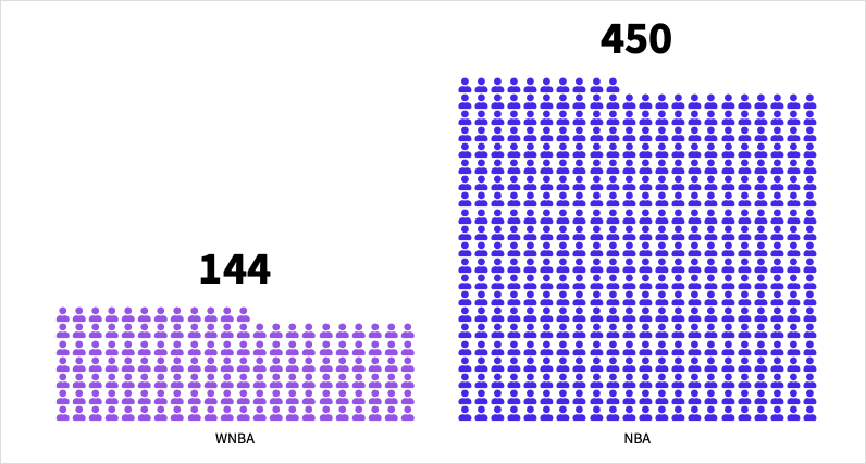
Flourish doesn't offer extensive customization options, so I had to go into Adobe Photoshop to remove the white background and create a vector image to overlay in my video.
Although my experiences thus far have been using Flourish for video, the strength of the tool actually lies in web-based applications. Flourish specializes in interactive data visualizations that allow users to hover over points (bars, markers, lines, etc.) to get more details about the data. This can be partiuclarly helpful with complicated visualizations or visualizations based on data with many different attributes.
To illustrate how web-based use cases for Flourish unlock a more complete array of storytelling capabilities, here's a more interactive version of the previous visual that I made:
<iframe src='https://flo.uri.sh/visualisation/15637416/embed' title='Interactive or visual content' class='flourish-embed-iframe' frameborder='0' scrolling='no' style='width:100%;height:600px;' sandbox='allow-same-origin allow-forms allow-scripts allow-downloads allow-popups allow-popups-to-escape-sandbox allow-top-navigation-by-user-activation'></iframe><div style='width:100%!;margin-top:4px!important;text-align:right!important;'><a class='flourish-credit' href='https://public.flourish.studio/visualisation/15637416/?utm_source=embed&utm_campaign=visualisation/15637416' target='_top' style='text-decoration:none!important'><img alt='Made with Flourish' src='https://public.flourish.studio/resources/made_with_flourish.svg' style='width:105px!important;height:16px!important;border:none!important;margin:0!important;'> </a></div>
Additionally, some templates on Flourish allow users to add filters on data and select the sub-groups of the data they want to visualize. Flourish is also a great tool when trying to depict changes in data over time, since it can [animate](https://help.flourish.studio/article/136-different-ways-to-create-animated-visualizations#:~:text=Flourish%20offers%20different%20types%20of,the%20same%20type%20of%20visualization.) elements of the visualization to move (increase or decrease) and lets the user cycle through animations at their own pace.
Once visualizations are published online in Flourish's editor, you can export them as a Script, AMP, or IFrame to later embed. One last thing to note: Flourish provides quick and easy exports to Canva. This can be helpful if you're trying to add visualizations to digital infographics or presentations.
Visit this [guide](https://help.flourish.studio/category/10-flourish-basicshttps://) to learn how to take advantage of all Flourish has to offer, step-by-step.
 Sign in with Wallet


