---
title: 2022 UC Carpentries Fall Workshop, R Day 3, Notes and Cheatsheet
tags: ggplot2
---
# 2022 UC Carpentries Fall Workshop, R Day 3, Notes and Cheatsheet
## plotting and report building with `ggplot2` and `knitr`
### Lesson Data
We're using a teaching version of the gapminder dataset. There are several ways to obtain this. Just choose one.
* [Direct csv download](https://raw.githubusercontent.com/swcarpentry/r-novice-gapminder/gh-pages/_episodes_rmd/data/gapminder_data.csv)
1. Right-click to save-as onto your computer, or
2. Right-click to copy link to read into R directly from the github-hosted file
* `gapminder <- read.csv("copied-link")`, or
3. Load gapminder package in R
* `install.packages("gapminder")` *(as with all packages, you only need to do this once)*
* `library("gapminder")`
#### Gapminder Documentation
* Original source, [gapminder.org](https://www.gapminder.org/data/)
* R Package [documentation](https://cran.r-project.org/web/packages/gapminder/index.html) on cran.r-project.org
* Many references within [r-project.org](https://search.r-project.org/?P=gapminder&SORT=&HITSPERPAGE=10&DB=r-manuals&DB=r-help&DB=cran-views&DB=cran-info&DB=cran-help&DB=cran-news&DB=cran-readme&DB=cran-vignettes&DEFAULTOP=and&FMT=query&xDB=all&xFILTERS=.%7E%7E)
* [R Documentation](https://www.rdocumentation.org/packages/gapminder/versions/0.3.0), powered by DataCamp
<hr>
# Intro - A Quick look at rstudio.cloud
Just an introduction, how to check for installed libraries.
<hr>
# Plotting with `ggplot2`
The first session of Day 3 is [Episode 8](https://swcarpentry.github.io/r-novice-gapminder/08-plot-ggplot2/index.html) from the Software Carpentry R for Reproducible Scientific Analysis Lesson.
## `ggplot` Function Basics
### Syntax of a Basic Call
```r
ggplot(data = gapminder, mapping = aes(x = gdpPercap, y = lifeExp)) +
geom_point()
```
Putting `geom_point()` on its own line aids in readability, which is useful for a plot with many layers.
### `ggplot` Elements
* `ggplot()` creates a new [ggplot](https://ggplot2.tidyverse.org/reference/ggplot.html).
* `aes()` is how [aesthetic mappings](https://ggplot2.tidyverse.org/reference/aes.html) are constructed and associated with the data.
* there are arguments for colors, how things are grouped, line size & shapes, positions, etc.
* Aesthetic arguments which are called outside of the `aes()` function will map to all data points.
* `geom_()` are [geometric objects](https://ggplot2.tidyverse.org/reference/#geoms). These are added to the plot in layers, which is why a `ggplot` call includes `+` something (geom/stat)
* how are your data displayed? lines, bar charts, heatmaps, contours, polygons, segments, etc
* individual `geom_...()` calls can include their own aesthetic mappings, both using the `aes()` function, and directly *(remember, aesthetic arguments assigned outside the `aes()` function will apply to all variables/data points)*
### Challenge #1
#### Part A
In the gapminder example we've been using,
```r
ggplot(data = gapminder, mapping = aes(x = gdpPercap, y = lifeExp)) + geom_point()
```
use the column "year" to show how life expectancy has changed over time.
#### Part B
We’ve been using the `aes` function to tell the scatterplot geom about the x and y locations of each point. Another aesthetic property we can modify is the point `color`. Modify the code from the Part A to color the points by the “continent” column. Is it easier to detect trends?
### Challenge #1 Solutions
#### Part A
```r
ggplot(data = gapminder, mapping = aes(x = year, y = lifeExp)) + geom_point()
```
#### Part B
```r
ggplot(data = gapminder, mapping = aes(x = year, y = lifeExp, color=continent)) +
geom_point()
```
### About Layers
```r
ggplot(data = gapminder, mapping = aes(x=year, y=lifeExp, color=continent)) +
geom_line()
```
add `by=`:
```r
ggplot(data = gapminder, mapping = aes(x=year, y=lifeExp, by=country, color=continent)) +
geom_line()
```
add points:
```r
ggplot(data = gapminder, mapping = aes(x=year, y=lifeExp, by=country, color=continent)) +
geom_line() + geom_point()
```
move color mapping:
```r
ggplot(data = gapminder, mapping = aes(x=year, y=lifeExp, by=country)) +
geom_line(mapping = aes(color=continent)) + geom_point()
```
### Challenge #2 *(2-minute challenge)*
Using the previous example:
```r
ggplot(data = gapminder, mapping = aes(x=year, y=lifeExp, by=country)) +
geom_line(mapping = aes(color=continent)) + geom_point()
```
Switch the order of the point and line layers from the previous example. What happened?
*Answer: the layers are drawn in a different order, so the lines now cover the points*
## Transformations and statistics
```r
ggplot(data = gapminder, mapping = aes(x = gdpPercap, y = lifeExp)) +
geom_point()
```
change scale:
```r
ggplot(data = gapminder, mapping = aes(x = gdpPercap, y = lifeExp)) +
geom_point(alpha = 0.5) + scale_x_log10()
```
add smoothing function, `lm` stands for linear model:
```r
ggplot(data = gapminder, mapping = aes(x = gdpPercap, y = lifeExp)) +
geom_point(alpha = 0.5) + scale_x_log10() + geom_smooth(method="lm")
```
```r
ggplot(data = gapminder, mapping = aes(x = gdpPercap, y = lifeExp)) +
geom_point(alpha = 0.5) + scale_x_log10() + geom_smooth(method="lm", size=1.5)
```
### About the Tilde `~`
The tilde symbol `~` is often used as an operator to describe a statistical model formula.
The left side is optional, and denotes the target or dependent variable. The right side is the predictor or independent variable(s).
* [R documentation](https://search.r-project.org/R/refmans/base/html/tilde.html) on `~`
### Challenge #3
#### Part A
Given
```r
ggplot(data = gapminder, mapping = aes(x = gdpPercap, y = lifeExp)) +
geom_point(alpha = 0.5) + scale_x_log10() + geom_smooth(method="lm", size=1.5)
```
Modify the color and size of the points on the point layer, but don't use the `aes()` function in that layer.
#### Part B
Modify your solution to Part A so that the points are now a different shape and are colored by continent with new trendlines. Hint: The color argument can be used inside the `aes()` function.
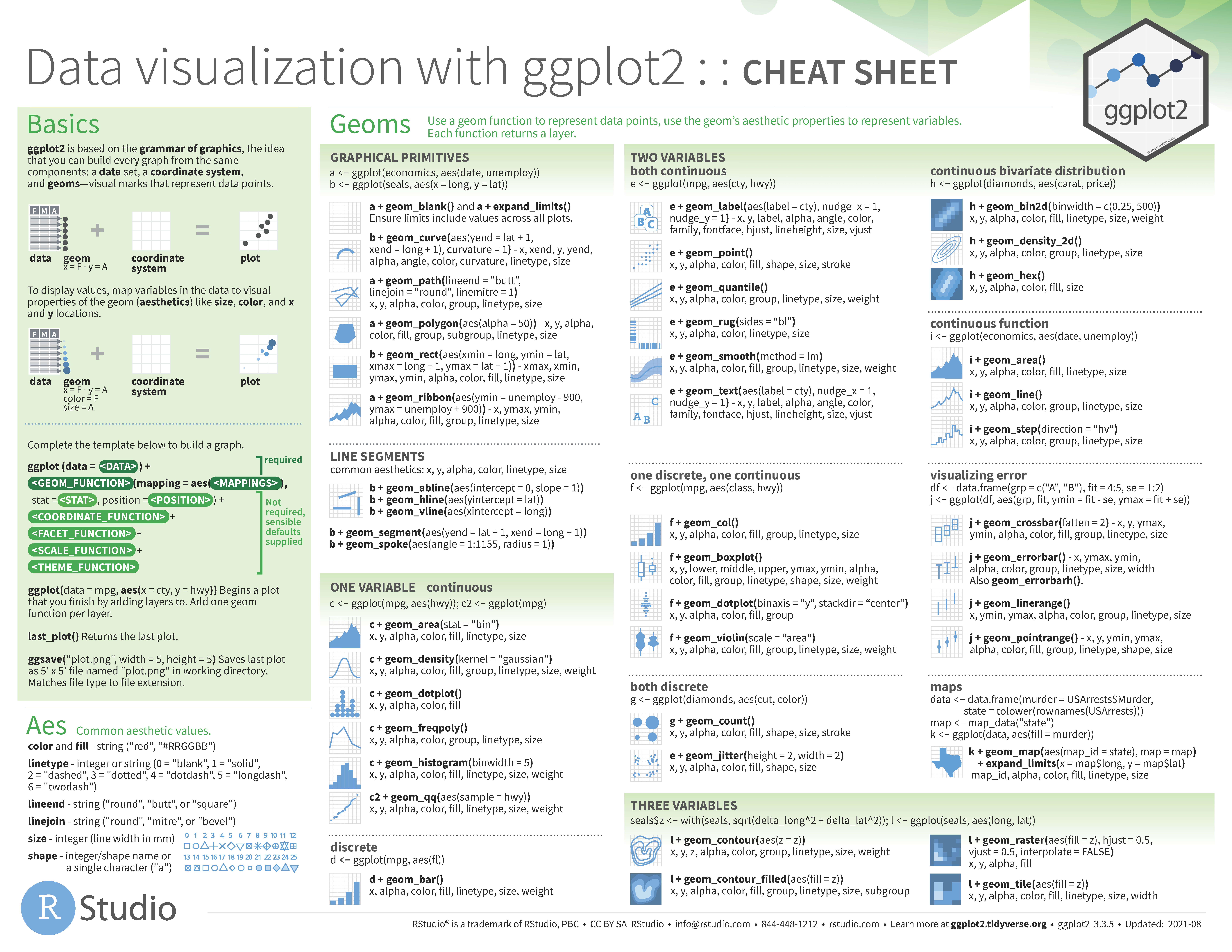
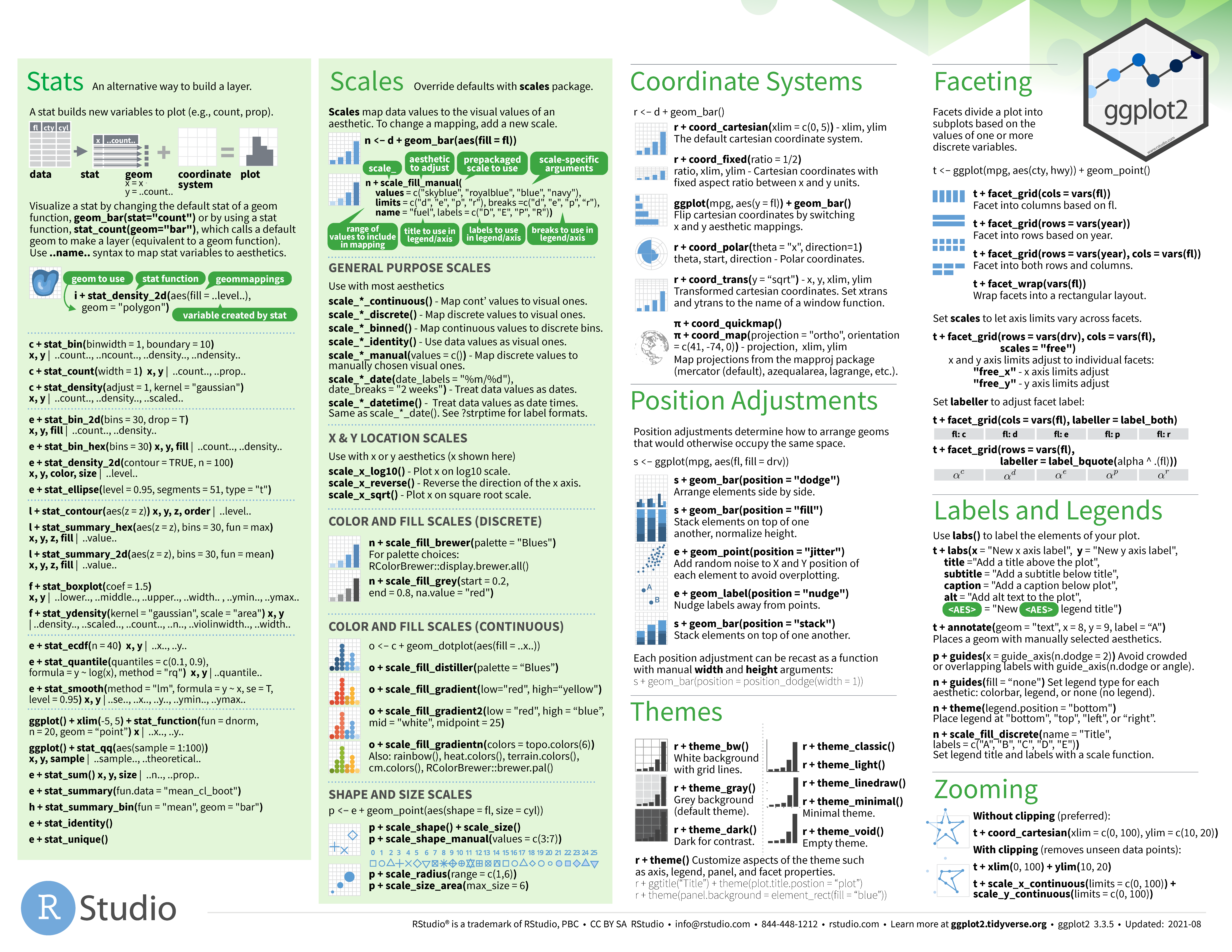
This [cheatsheet](https://kekoziar.github.io/cheatsheets/img/ggplot2_data-visualization-2-1_Page_1.png) helps with syntax on assigning arguments. A PDF version is at [RSudio Cheatsheets](https://www.rstudio.com/resources/cheatsheets/).
### Challenge #3 Solutions
#### Part A
```r
ggplot(data = gapminder, mapping = aes(x = gdpPercap, y = lifeExp)) +
geom_point(size=3, color="orange") + scale_x_log10() +
geom_smooth(method="lm", size=1.5)
```
#### Part B
```r
ggplot(data = gapminder, mapping = aes(x = gdpPercap, y = lifeExp, color = continent)) +
geom_point(size=3, shape=17) + scale_x_log10() +
geom_smooth(method="lm", size=1.5)
```
## Multipaneled Figures
```r
americas <- gapminder[gapminder$continent == "Americas",]
ggplot(data = americas, mapping = aes(x = year, y = lifeExp)) +
geom_line() +
facet_wrap( ~ country) +
theme(axis.text.x = element_text(angle = 45))
```
```r
ggplot(data = americas, mapping = aes(x = year, y = lifeExp, color=continent)) +
geom_line() + facet_wrap( ~ country) +
labs(
x = "Year", # x axis title
y = "Life expectancy", # y axis title
title = "Figure 1", # main title of figure
color = "Continent" # title of legend
) +
theme(axis.text.x = element_text(angle = 90, hjust = 1))
```
```r
```
## Exporting Plots
```r
lifeExp_plot <- ggplot(data = americas, mapping = aes(x = year, y = lifeExp, color=continent)) +
geom_line() + facet_wrap( ~ country) +
labs(
x = "Year", # x axis title
y = "Life expectancy", # y axis title
title = "Figure 1", # main title of figure
color = "Continent" # title of legend
) +
theme(axis.text.x = element_text(angle = 90, hjust = 1))
ggsave(filename = "results/lifeExp.png", plot = lifeExp_plot, width = 12, height = 10, dpi = 300, units = "cm")
```
## Cheatsheets, et al
* `ggplot` function reference on [tidyverse](https://ggplot2.tidyverse.org/reference/).
* RSudio [cheatsheets](https://www.rstudio.com/resources/cheatsheets/)


<hr>
# Create Reports with `knitr`
The second session of Day 3 is [Episode 15](https://swcarpentry.github.io/r-novice-gapminder/15-knitr-markdown/index.html) from the Software Carpentry R for Reproducible Scientific Analysis Lesson.
* `knitr` library [reference](https://yihui.org/knitr/).
* [Markdown cheatsheet](https://github.com/adam-p/markdown-here/wiki/Markdown-Here-Cheatsheet)
* [R Markdown Cheat Sheet](https://www.rstudio.com/blog/the-r-markdown-cheat-sheet/)
```r
```
## Creating a Markdown file
Within RStudio, click File → New File → R Markdown.
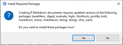
You might need to install packages

Fill out as much info as you want, and it will prepopulate the document header.
### Markdown Basics
* **bold** with double-asterisks
- italics with _underscores_ (or *single asterisks*)
* code-type font with `backticks`
1. be consistent with your methods
1. otherwise it will confuse collaborators
1. or, maybe even your future self!
# Title
## Main section
### Sub-section
#### Sub-sub section
##### with even smaller type
###### how small can it go?
When you knit the document, notice how RStudio jumps between the console and the render tab. Error messages, warnings, and other output involving creating the document will appear in the Render tab
### Challenge 1
Create a new R Markdown document. Delete all of the R code chunks and write a bit of Markdown (some sections, some italicized text, and an itemized list).
Convert the document to a webpage.
## More Markdown
* hyperlinks: `[Carpentries Home Page](https://carpentries.org/)`
* images: ``
* superscripts F^2^ `F^2^`
* subscripts F~2~ `F~2~`
* LaTeX: $$y = \mu + \sum_{i=1}^p \beta_i x_i + \epsilon$$ `$$y = \mu + \sum_{i=1}^p \beta_i x_i + \epsilon$$`
## R Code Chunks
```
```{r load_data}
gapminder <- read.csv("gapminder.csv")
```
## How things are compiled
* `knitr` uses [Pandoc](https://pandoc.org/), which is a really cool tool for document conversion!
## Chunk Options
```
```{r load_libraries, echo=FALSE, message=FALSE}
library("dplyr")
library("ggplot2")
```
```
```{r global_options, echo=FALSE}
knitr::opts_chunk$set(fig.path="Figs/", message=FALSE, warning=FALSE,
echo=FALSE, results="hide", fig.width=11)
```
## Inline R
```
`r round(some_value, 2)`
```
 Sign in with Wallet

