# Lightroom And Photoshop Portrait Editing Guide
This is a gudie to help LLUFS edit and process portraits taken during design lab both in Lighroom and in Photoshop.
#### Two sources to retrieve portraits from:
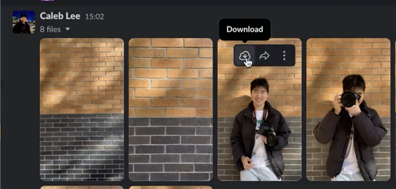
* "Show-your-images" (slack channel): Click over the image and download it to the computer by clicking on the cloud button.
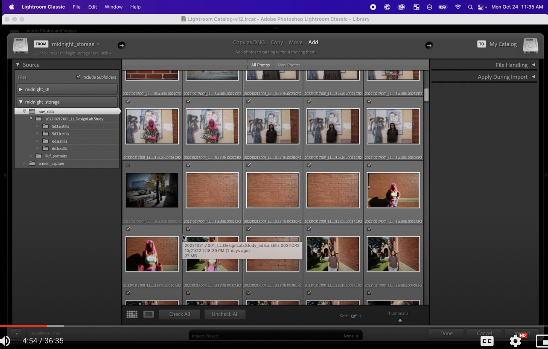
* Raw photos captures by cameras Canon 5d and 6d: Find them in the folder called "20221021.7.001_LL.DesignLab.Study". In the folder you will find four folders of each of the four cameras with the pictures taken during design lab.
Both the portraits and the raw images will be in a Drive Jordan will share
#### Uploading Photos, Rating, and Organizing in Lightroom
* Add Photos to Library: Start out in the Library module and click Import. Leave it with Add selected (instead of Copy or Move). Navigate to the folder where the photos were placed. Select the parent folder (where all of the subfolders with photos exist) and add them into lightroom by clicking Import. They will show up in the Library module!
* Rate Photos: click on a photo and use the left and right arrows to scroll through the photos. Rate the photos based on whether or not you intend to edit them. You can rate a photo by clicking on number on the keyboard (ex. 3 for 3 stars) or click on the actual stars on lightroom underneath the photo.
* Note on the traditional way that people have rated photos in the learning lab: 1 star for something that's so-so but won't be deleted; 2 stars for something average; 3 stars for something you know you want to edit. Then after editing: 4 stars or 5 stars
* You don't have to do it this way! But it's an option
(should I add the information on smart collections and keyword sets?)
* Create a Collection for the Portraits: go to the left hand side and create a collection for portraits. Go back to raw stills and select all the portraits of people and put them in this folder by dragging them into the folder. Rate the portraits
* Filter Collection: In the bottom right hand side, go to filter and filter thorugh the photos you're working on by choosing rated and the star rating (example 3 stars).
#### Editing in Lightroom
* Go into Develp module
* For reference, Presets on the left hand side will add a bunch of cool effects onto your photo, which you can further edit on the right hand-side. (Ie take a look at hue and saturation!)
* To make photos Black and White, go into the Basic tab. Click "Black and White" on the upper right hand side.
* To edit photos globally without presets, start with Basic.
* You can use Color or B&W
* The most visible effect is in the Color zone.
* Temperature can make something more or less orange, which equates to warm.
* Tint goes from green to purple.
* (You'll know something was shot inside if the color temp is around tungsten (close to the left, around 3000) and the tint is spun towards green! A temp around 5000 is considered daylight, since temp in Lightroom is based on Kelvin from the sun.)
* Exposure makes things lighter or darker.
* Contrast shifts tones of the image. If you lower contrast, the tones shift towards the middle. If you raise the contrast, the lights become lighter and the darks become darker.
* To edit contrast, highlights, shadows, whites, and blacks in a more "sophisticated" manner, there are more tools down below!
* Texture makes images more blurry (to the left) or more textured (to the right)
* Clarity changes local contrast. Clarity removes all local contrast (to the left) or increases all local contrast (to the right)
* In portrait photgraphy, clarity and texture are usually always applied locally using masks (the bandaid icon)
* Sometimes, for evil rather than for good! To create impossibly looking models for fashion magazines, etc
* Dehaze changes the contrast between lights and darks that are close together in the image. Dehaze deemphasizes the differences (to the left) or emphasizes them (to the right)
* Saturation globally increases (to the right) or decreases (to the left) all the colors.
* Vibrance increases or decreases the saturation of only some colors. For example, blues are very affected.
* The Tone Curve is a more advanced way of affecting contrast.
* There are three little arrows on the bottom of the graph.
* The arrow on the left affects where the darks to shadows line is.
* The arrow in the middle affects the lights to darks line.
* The arrow on the right affects the lights to highlights line.
* You can move the Highlights, Lights, Darks, and Shadows sliders on the bottom to change the Contrast curve in a more controlled and nuanced way than in the Basic section's sliders. Often, you'll want to make an "S-curve" for portraits, where the darks to shadows dips down and the lights to highlights round up for an S-shaped curve.
* 
* For an Advanced note, there's a Hue, Saturation, and Luminance (HSL) zone. This zone changes HSL based on a particular color band.
* Saturation affects the saturation of a color.
* Hue spins a color around the color wheel (cool!)
* Luminance makes a color more or less luminant.
* To affect the HSL of a single color you see oin the image, click the circle in the upper left hand corner of the box (you can find this in other editing zones as well!). Then, click any color you want on the image, and move the cursor up or down/left or right to change the hue, saturation, or luminance of that color!
* (as a note, brick can be close to the color of human skin, so those two may change together!)
* The Detail zone is for Sharpening and Noise Reduction.
* Most Sharpening effects will happen in Clarity and Dehaze from the previous zone.
* There's also the Transform and Lens Correction zones, which are helpful for things other than portraits, so we'll cover those another time!
* (Transform can be useful for making the brick lines perfect.)
 Sign in with Wallet


