# Image Optimization
2017/08 by YB
---
# Content
- Why
- Images
- Responsive Image
- Image Optimization
- Frontend
- Backend
- References
---
# Why
----
### Responsive Web Design

- from https://developers.google.com/web/fundamentals/design-and-ui/responsive/images
---
# Images
- Vector Image
- Raster Image
----
### Vector Image

- from https://developers.google.com/web/fundamentals/performance/optimizing-content-efficiency/image-optimization
----
#### SVG files
```xml
<?xml version="1.0" encoding="utf-8"?>
<!-- Generator: Adobe Illustrator 17.1.0, SVG Export Plug-In . SVG Version: 6.00 Build 0) -->
<svg version="1.2" baseProfile="tiny" id="Layer_1" xmlns="http://www.w3.org/2000/svg" xmlns:xlink="http://www.w3.org/1999/xlink"
x="0px" y="0px" viewBox="0 0 612 792" xml:space="preserve">
<g id="XMLID_1_">
<g>
<circle fill="red" stroke="black" stroke-width="2" stroke-miterlimit="10" cx="50" cy="50" r="40"/>
</g>
</g>
</svg>
```
- XML-based image format
- should be minified to reduce their size
- should be compressed with GZIP
----

- from http://caniuse.com/
----
### Raster images

- from https://developers.google.com/web/fundamentals/performance/optimizing-content-efficiency/image-optimization
----
| Format | Transparency | Animation | Browser |
| ------ | ------------ | --------- | ------- |
| GIF | Yes | Yes | All |
| PNG | Yes | No | All |
| JPEG | No | No | All |
| JPEG XR | Yes | Yes | IE |
| WebP | Yes | Yes | Chrome, Opera, Android |
- 與可比較的 JPEG 圖片相比,WebP 平均可以使檔案大小縮減 30%。
----

- from https://developers.google.com/web/fundamentals/performance/optimizing-content-efficiency/image-optimization
----
### Checklist
- 優先選用向量格式
- 縮減及壓縮 SVG 資源
- 選擇最佳點陣圖片格式
- 試驗點陣格式的最佳品質設定
- 刪除不必要的圖片中繼資料
- 提供可縮放的圖
- 自動化、自動化、自動化
- from [Google Web Fundamentals](https://developers.google.com/web/fundamentals/performance/optimizing-content-efficiency/image-optimization)
---
# Responsive Image
----
## Viewport
```htmlmixed=
<meta name="viewport" content="width=device-width, initial-scale=1.0">
```
----
| without viewport | viewport |
|:----------------:|:--------:|
|  |  |
- from https://developers.google.com/web/fundamentals/design-and-ui/responsive/
----
CSS pixels vs. Device pixels

----
```htmlmixed=
<meta name="viewport" content="width=device-width, initial-scale=1.0">
```
- width=device-width,讓 Device Pixels 配合螢幕寬度。
- initial-scale=1,讓 CSS Pixels 和 Device Pixels 之間建立 1:1 的關係。
----
## Device Pixel Ratios (DPR)
```
DPR = Physical Pixels / Logical Pixels
```
```
DPR = Device Pixels / CSS Pixels
```
----
## Use Cases
- Device-pixel-ratio-based selection
- Image formats
- Art direction
- The Fluid - And Variable-Sized-Image Use Cases
----
### Device-pixel-ratio-based selection

- from http://usecases.responsiveimages.org/
----
```htmlmixed=
<img
src="image_2x.jpg"
srcset="image_2x.jpg 2x, image_1x.jpg 1x"
alt="a cool image"
>
```
```css=
img {
background-image: image-set(
url(image_1x.png) 1x,
url(image_2x.png) 2x
);
}
```
----
### Image formats
```htmlmixed=
<picture>
<source srcset="large.webp" type="image/webp">
<img srcset="large.jpg" alt="a cool image">
</picture>
```
----
### Art direction

- from https://developers.google.com/web/fundamentals/design-and-ui/responsive/images
----
```htmlmixed=
<picture>
<source media="(min-width: 800px)" srcset="head.jpg, head-2x.jpg 2x">
<source media="(min-width: 450px)" srcset="head-small.jpg, head-small-2x.jpg 2x">
<img src="head-fb.jpg" srcset="head-fb-2x.jpg 2x" alt="a head carved out of wood">
</picture>
```
- [Google Sample](https://googlesamples.github.io/web-fundamentals/fundamentals/design-and-ui/media/media.html)
----
```css=
img {
background-image: image-set(
url(head-fb.jpg) 1x,
url(head-fb-2x.jpg) 2x
);
}
@media (min-width: 450px) {
img {
background-image: image-set(
url(head-small.jpg) 1x,
url(head-small-2x.jpg) 2x
);
}
}
```
----
### The Fluid - And Variable-Sized-Image Use Cases
```htmlmixed=
<img
src="image_1000.jpg" // for fallback
sizes="100vw"
srcset="image_1000.jpg 1000w, image_600.jpg 600w"
alt="a cool image"
>
```
- depending on viewport size and DPR
- [Example By Google](https://googlesamples.github.io/web-fundamentals/fundamentals/design-and-ui/media/sizes.html)
----
if (viewport === '320px' && (dpr === 1))
```htmlmixed=
// image need: 320 px * 1 dpr = 320px;
// image_600: 600 / 320 = 1.875;
// image_1000: 1000 / 320 = 3.125;
<img
src="image_1000.jpg" // for fallback
sizes="100vw"
srcset="image_1000.jpg 1000w, image_600.jpg 600w"
alt="a cool image"
>
// show image_600.jpg
```
----
if (viewport === '320px' && (dpr === 2))
```htmlmixed=
// image need: 320 px * 2 dpr = 640px;
// image_600: 600 / 640 = 0.9375;
// image_1000: 1000 / 640 = 1.5625;
<img
src="image_1000.jpg" // for fallback
sizes="100vw"
srcset="image_1000.jpg 1000w, image_600.jpg 600w"
alt="a cool image"
>
// show image_1000.jpg
```
----
if (viewport === '600px' && (dpr === 2))
```htmlmixed=
// image need: 600 px * 2 dpr * (50vw / 100vw) = 600px;
// image_600: 600 / 600 = 1;
// image_1000: 1000 / 600 = 1.667;
<img
src="image_1000.jpg" // for fallback
sizes="50vw"
srcset="image_1000.jpg 1000w, image_600.jpg 600w"
alt="a cool image"
>
// show image_600.jpg
```
----
```htmlmixed=
<img src="400.png"
sizes="(min-width: 600px) 25vw, (min-width: 500px) 50vw, 100vw"
srcset="100.png 100w, 200.png 200w, 400.png 400w,
800.png 800w, 1600.png 1600w, 2000.png 2000w" alt="an example image">
```
----
## Can I Use?
----
### Srcset and sizes

- from http://caniuse.com/
----
### Picture

- from http://caniuse.com/
----
### [Picturefill](https://scottjehl.github.io/picturefill/)
- A Responsive Image Polyfill
----
### image-set

- from http://caniuse.com/
----
### PostCSS-cssnext
- Use tomorrow’s CSS syntax, today.
```css=
/* Input example */
.foo {
background-image: image-set(
url(img/test.png) 1x,
url(img/test-2x.png) 2x
);
}
```
```css=
/* Output example */
.foo {
background-image: url(img/test.png);
}
@media (-webkit-min-device-pixel-ratio: 2),
(min-resolution: 192dpi) {
.foo {
background-image: url(img/test-2x.png);
}
}
```
---
# Image Optimization
- Image Compression
- Lossless
- lossy
- Serve Responsive Images
- Versioning
----
- Frontend
- Backend
---
## Frontend
----
### Automate
- Gulp
- Webpack
----
#### Gulp

- from http://persistentsoftware.com/
----
#### Webpack
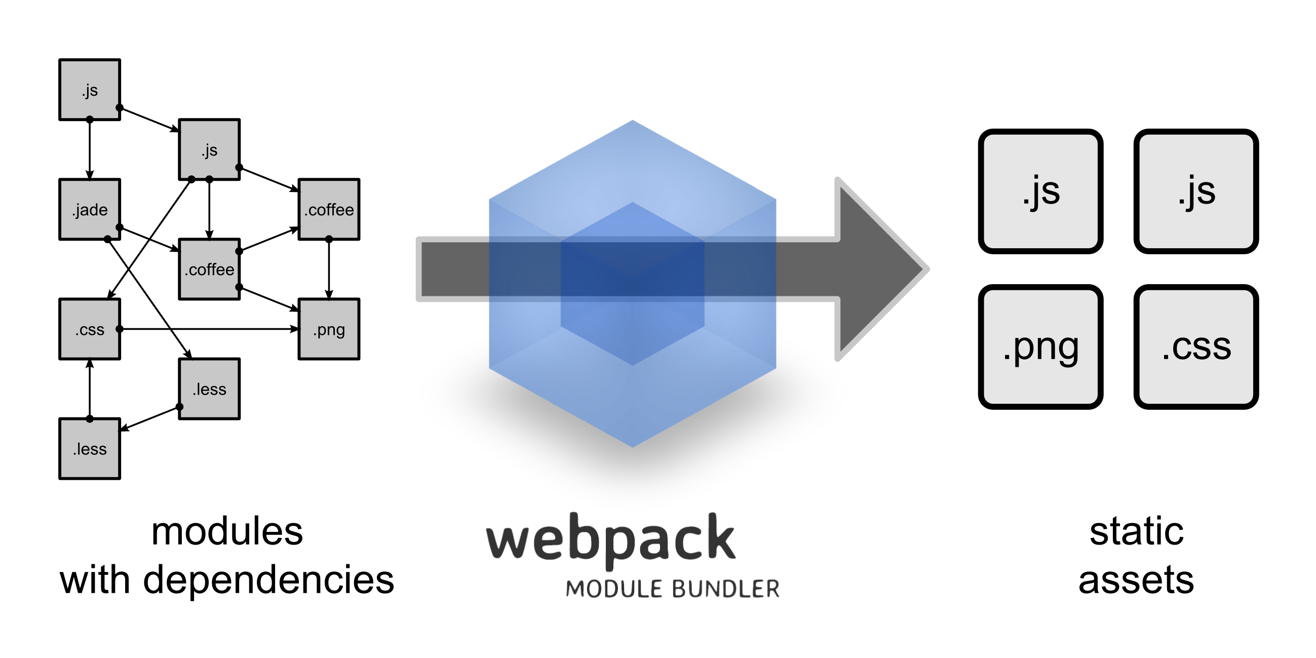
- from https://webpack.github.io/
----
### Image Compression
----
#### Tools
| Tool | Description |
| ---- | ----------- |
| gifsicle | 建立及最佳化 GIF 圖片 |
| jpegtran | 最佳化 JPEG 圖片 |
| optipng | 無失真 PNG 最佳化 |
| pngquant | 失真 PNG 最佳化 |
| svgo | SVG 最佳化 |
----
#### imagemin

- https://github.com/imagemin/imagemin
----
#### [gulp-imagemin for gulp](https://github.com/sindresorhus/gulp-imagemin)
```javascript=
var gulp = require('gulp');
var imagemin = require('gulp-imagemin');
gulp.task('images', function() {
return gulp.src('src/images/**/*.+(jpe?g|png|svg|gif)')
.pipe(imagemin())
.pipe(gulp.dest('dist/images'));
});
```
----
#### [mage-webpack-loader for webpack](https://github.com/tcoopman/image-webpack-loader)
```javascript=
module.exports = {
// ...
module: {
rules: [
{
test: /\.(gif|png|jpe?g|svg)$/i,
loaders: [
'file-loader',
'image-webpack-loader',
],
},
],
},
};
```
----
### Responsive Images
----
#### [gulp-responsive for gulp](https://github.com/mahnunchik/gulp-responsive)
- base on sharp
```javascript=
var gulp = require('gulp');
var responsive = require('gulp-responsive');
gulp.task('image:resize', function () {
return gulp.src('src/images/**/*.{png,jpg}')
.pipe(responsive({
'*': [{
width: 480,
rename: { suffix: '-480px' },
}, {
width: 1140,
rename: { suffix: '-1140px' },
}, {
// Compress, strip metadata, and rename original image
rename: { suffix: '-original' },
}],
}))
.pipe(gulp.dest('dist'));
});
```
----
```htmlmixed=
<img
src="myImage-480px.jpg"
srcSet="myImage-480px.jpg 480w, myImage-1140px.jpg 1140w"
>
```
----
```css=
.myImage { background: url('myImage-480px.jpg'); }
@media (min-width: 480px) {
.myImage { background: url('myImage-1140px.jpg'); }
}
```
----
#### [responsive-loader for webpack](https://github.com/herrstucki/responsive-loader)
- jimp (entirely in JavaScript)
- sharp (need libvips)
```javascript=
module.exports = {
// ...
module: {
rules: [
{
test: /\.(jpe?g|png)$/i,
loader: 'responsive-loader',
options: {
// If you want to enable sharp support:
// adapter: require('responsive-loader/sharp')
}
}
]
},
}
```
----
```javascript=
const responsiveImage = require('myImage.jpg?sizes[]=480,sizes[]=1140');
// responsiveImage.images => [{height: 240, path: 'myImage-480.jpg', width: 480}, {height: 570, path: 'myImage-1140.jpg', width: 1140}]
// responsiveImage.srcSet => 'myImage-480.jpg 480w,myImage-1140.jpg 1140w'
// responsiveImage.src => 'myImage-480.jpg'
ReactDOM.render(
<img srcSet={responsiveImage.srcSet} src={responsiveImage.src} />,
el
);
```
----
```css=
.myImage { background: url('myImage.jpg?size=480'); }
@media (min-width: 480px) {
.myImage { background: url('myImage.jpg?size=1140'); }
}
```
----
### Versioning
----
#### [gulp-rev for gulp](https://github.com/sindresorhus/gulp-rev)
```javascript=
const gulp = require('gulp');
const rev = require('gulp-rev');
gulp.task('default', function() {
return gulp.src('src/images/**/*.{png,jpg}')
.pipe(rev())
.pipe(gulp.dest('dist'))
});
```
----
#### [file-loader for webpack](https://github.com/webpack-contrib/file-loader)
```javascript=
module.exports = {
// ...
module: {
rules: [
{
test: /\.(jpe?g|png)$/i,
loader: 'file-loader',
options: {
name: '[hash].[ext]',
}
}
]
}
}
```
----
### Linter
- [Linter Tool](https://github.com/ausi/RespImageLint)
- [Common Mistakes and Best Practises](https://ausi.github.io/respimagelint/docs.html)
---
## Backend
----

- from [CodeTengu Weekly 碼天狗週刊](https://weekly.codetengu.com/issues/93#tzangms)
----
- [Intervention Image](http://image.intervention.io/getting_started/introduction)
- image processing libraries
- GD library
- Imagick
- Basic Usage
- Resizing
- Adjusting
- Applying Effects
- Drawing
- Retrieving Information
- Append Watermark
----
### Image Compression and Responsive
```php=
// Laravel
Route::get('images/original/{fileName}', 'ImageController@showOriginal');
Route::get('images/{type}/{size}/{fileName}', 'ImageController@show');
// type: resize or fit
// size: 100x100 or 100x or x100
```
----
```php=
// Laravel
public function show($type, $size, $fileName, Request $request)
{
// parse inputs
$rect = explode('x', $size);
$width = $rect[0] ?: null;
$height = $rect[1] ?: null;
// resize or fit img
$imgSrc = Storage::get('images/' . $fileName);
switch($type) {
case 'resize':
$img = Image::cache(function($image) use ($imgSrc, $width, $height) {
$image->make($imgSrc)
->resize($width, $height, function ($constraint) {
$constraint->aspectRatio();
});
}, 43200, true);
break;
case 'fit':
$img = Image::cache(function($image) use ($imgSrc, $width, $height) {
$image->make($imgSrc)
->fit($width, $height, function ($constraint) {
$constraint->upsize();
});
}, 43200, true);
break;
}
// response
return $img->response();
}
```
----
### HTTP Cache
----

- from https://developers.google.com/web/fundamentals/performance/optimizing-content-efficiency/http-caching#publicprivate
----
- 設定快取圖片時間為一年
```php=
<VirtualHost *:80>
// ...
<LocationMatch "^.*$(?<!\.ico|\.pdf|\.jpg|\.jpeg|\.png|\.bmp|\.gif|\.css|\.js|\.svg)">
Header set Cache-Control "max-age=31536000, public"
</LocationMatch>
</VirtualHost>
```
----
### Versioning
- 在圖片變更時,變更圖片的網址,強制使用者下載新的圖片
```php=
// Laravel
use Illuminate\Http\Request;
function store(Request $request)
{
$image = $request->file('photo');
$hashName = $image->hashName();
Storage::put('images/' . $hashName, $image);
}
```
----
### Guetzli
----
- Guetzli: A New Open-Source JPEG Encoder
- Guetzli = 一種瑞士餅乾
- Google Open Source in 2017 / 3 / 16
- 同樣品質下,可以省下29 ~ 45 % 的空間
- 需要大量的 CPU 運算
- [google / guetzli](https://github.com/google/guetzli)
- [Guetzli: Perceptually Guided JPEG Encoder](https://arxiv.org/abs/1703.04421)
----
- 適合排程處理壓縮
- 12 張 1920×1280 圖片
- Intel Core i5 3.1 GHz
- 95% 的 quality 壓縮花了 38 分 40 秒
- from [Guetzli 開放原始碼 JPEG 圖片壓縮編碼器](https://blog.gtwang.org/web-development/guetzli-jpeg-image-encoder/)
---
# Conclusion
- Responsive Image Design
- Image formats
- SVG
- JPG
- PNG
- Basic Usage
- Image Compress
- Image Resize
- Versioning
- Frontend Workflow Automation
- Backend Image API
- HTTP Cache
---
# Refereces
- [Google Web Fundamentals: Image Optimization](https://developers.google.com/web/fundamentals/performance/optimizing-content-efficiency/image-optimization)
- [Google Web Fundamentals: Images](https://developers.google.com/web/fundamentals/design-and-ui/responsive/images)
- [Use Cases and Requirements for Standardizing Responsive Images](http://usecases.responsiveimages.org/)
- [Intervention Image](http://image.intervention.io/)
- [Guetzli 開放原始碼 JPEG 圖片壓縮編碼器](https://blog.gtwang.org/web-development/guetzli-jpeg-image-encoder/)
- [Google Web Fundamentals: Http Cache](https://developers.google.com/web/fundamentals/performance/optimizing-content-efficiency/http-caching)
- [循序漸進理解 HTTP Cache 機制](http://blog.techbridge.cc/2017/06/17/cache-introduction/)
- [Can I Use](http://caniuse.com/)
 Sign in via Google
 Sign in via Facebook
 Sign in via X(Twitter)
 Sign in via GitHub
 Sign in via Dropbox
 Sign in with Wallet
Connect another wallet
Sign in with Wallet
Connect another wallet