
# Clase 16 - Introducción al diseño Responsive
>Long gone are the days when families had one desktop computer at home to surf the internet, check emails, or download music. Even longer gone, are the days when the only computer people had access to was the one at the office.
>
>Welcome to the **cross-platform** era! Today, a user might start the day by checking email notifications on their smartwatch and then later respond from their laptop. They will read the reply at their office desktop and then do one last round of emails from their phone on their commute back home.
>
>Furthermore, their smartwatch could run on Android, their laptop on iOS Sierra, their work computer on Windows, and their phone on iOS 10.
:::info
**Class Discussion:**
- How aware do you think users usually are about the fact that they are changing devices and platforms across the different touchpoints? What do you think the users' expectations are in terms of their experience across devices?
- How might the context in which a user finds themselves differ across touchpoints? What tools might they need quick access to on their phones, that they might not need on their desktops, and vice versa?
:::
From a UX perspective, these are all crucial questions we need to think about.
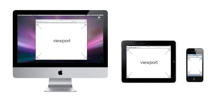
The available screen space we have on an iPhone is very different from what we are dealing with on a 27" iMac.
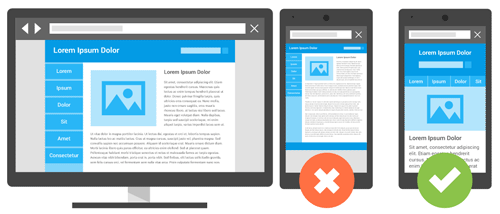
No longer is it an option to merely resize the desktop website layout so that it fits into a mobile screen. This will cause the font, images, and links to be tiny. The user will have to zoom in, probably click on the wrong button, and ultimately get really frustrated and leave your site!
So how can we adapt our site to fit all of these different screen sizes in an efficient way? The answer is **Responsive Design**, a term originally coined by Ethan Marcotte in [A List Apart.](https://alistapart.com/article/responsive-web-design).
<iframe src="//giphy.com/embed/b2CD0Qrq2ulwY" width="480" height="360" class="giphy-embed" allowFullScreen></iframe>
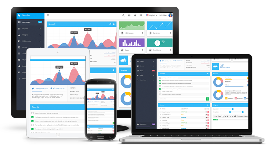
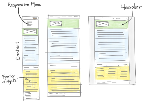
> Responsive web design responds to the needs of the users and the devices they're using. **The layout changes based on the size and capabilities of the device**. For example, phone users would see content shown in a single column view; a tablet might show the same content in two columns.
-- Google
:::info
**Class Activity**
[](https://www.forever21.com/us/shop)
1. Go to the [Forever21](https://www.forever21.com/us/shop) website.
2. Drag your browser window to make it half the size of the screen, now make it as small as you can, see how the layout changes and the content rearranges itself to fit the viewport.
- What big changes do you notice?
- What elements disappear/appear depending on the screen size?
:::
## Delivering a consistent User Experience
In order to design responsively, we need to think about how the information will be displayed for different screen sizes.
Things to consider:
- Screen real estate
- User Context
- Goals
- Surroundings
- Consistency
:::success
:key: According to [Nielsen Norman Group](https://www.nngroup.com/articles/omnichannel-consistency/): Any organization with a multichannel ecosystem should aim for independent channel interactions to coordinate to create one cohesive, consistent customer experience.
>Our user research on omnichannel user experience identified 5 key components of a successful omnichannel experience:
- Consistent
- Seamless
- Optimized for Context
- Orchestrated
- Collaborative
:::
The benefits of consistency in the omnichannel user experience include:
- **Familiarity and Confidence:** A consistent experience sets expectations for future interactions with your organization and builds user confidence.
- **Learnability:** Consistent experiences are more learnable for users who have interacted with your solutions on various channels.
- **Efficiency:** Customers can complete tasks faster and more efficiently on the channel of their choice in the context of their everyday lives.
- **Trust:** Users crave consistency and companies that can provide consistent experiences across channels will quickly earn users’ trust and build credibility.
## Applying Responsive Design
We now know that the design should change according to the device. But how do we go about applying that?
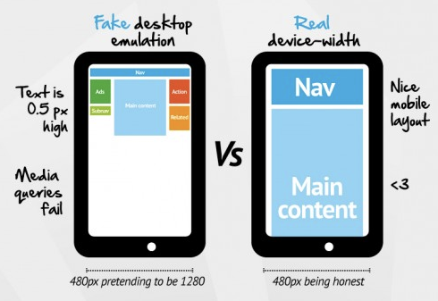
We **don't have to be focused on the device**. If we designed a different screen for every device out there, we would never finish! Instead, we have to think in terms of the **viewport size** (total screen real estate).
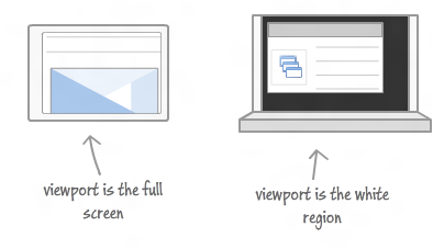
So, instead of having to create a design for the latest iPhone or Samsung device, you have to create a design for a viewport with a width of 680px. Why?
- Making the perfect website for each device would take a super long time and make development super complex. While there are just a few Apple devices, there are [over 24000 Android devices](https://qz.com/472767/there-are-now-more-than-24000-different-android-devices/) on the market.
:::warning
We will discuss the technical aspects of responsive design in depth during the Front-End development portion of the course.
For now, you can visit [viewportsizes.com](http://viewportsizes.com/) to reference the most common screen/viewport sizes.
:::
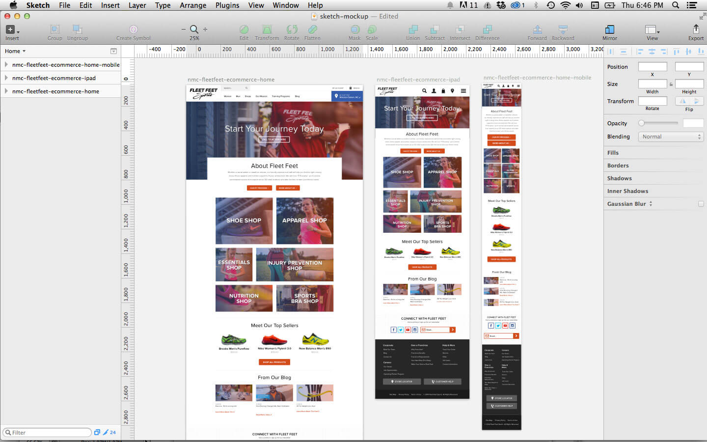
### Responsive Design and Sketch
One of the best features of Sketch is its support for multiple artboards on one canvas. In Sketch, you can see a desktop, tablet, and mobile mockup all in one view. This allows you to work on all of the mockups simultaneously.
All you have to do is set up the artboards with the corresponding screen sizes, or create a new document using the **Web Design** template.

This will provide you with all the different screen sizes you need so that you can start designing right away!

<br>
This way, when editing symbols, text styles, and colors, you can see how changes affect all of the mockups at once. Seeing this also helps the designer to remain conscious of content flow and interactions going from desktop to mobile.
<br>
:::success
:+1: **Pro Challenge**: If you are up to the challenge, Sketch has even more advanced ways to design responsively.
<br>
- [Group Resizing](https://www.sitepoint.com/responsive-design-in-sketch-its-finally-here/) and also [This Article](https://medium.com/sketch-app-sources/exploration-of-responsive-design-in-sketch-part-1-1af4cf415a82)
- [The Auto Layout Plugin](https://animaapp.github.io/Auto-Layout/?ref=sketchtogether)
- Great plugin to start understanding how fluid and responsive design will work in real life!
- :warning: This plugin is cool, but it doesn't take into consideration context, and mostly works to resize one layout fluidly. You can use this as a starting point, but put some thought into the UX and screen real estate and edit as needed.
{%youtube v393LgriWCs%}
- [The Fluid Plugin](https://medium.com/sketch-app-sources/how-to-make-a-content-based-auto-resizing-layout-in-sketch-using-fluid-c0323fd50ea0)

:::
## Planning your responsive design
:exclamation: Don't forget everything you've learned so far! Even though sketch provides lots of great tools for responsive design, nothing beats pen and paper for quick ideation and concept sketches before you go into details!
## Additional Resources
- Nielsen Norman Group: [Consistency in the Omnichannel Experience](https://www.nngroup.com/articles/omnichannel-consistency/)
- [Font-Size recommendation](https://www.smashingmagazine.com/2011/10/16-pixels-body-copy-anything-less-costly-mistake/). Smashing Magazine article about font-sizes recommendation for body copies.

# Desirability Testing
## Learning Goals
After this lesson, you will be able to:
- Explain what Desirability Testing is.
- Apply Branding Personality Framework.
- Create and execute Questionnaires & Interviews.

## Introduction
Visual elements produce an emotional response from users. Understanding these emotional reactions help designers to influence users appropriately. The problem is figuring out how to obtain these responses from users.
You might think the quickest approach is to show users a visual design, i.e., a landing page, and ask them if they like the colors. However, this simplistic approach only scratches the surface of the vast amount of feelings users might have. A user could answer *"I like the landing page because its blue background makes me feel calmed"*. While this statement might be truthful, it doesn't allow designers to assess the entire emotional impact of the design.
## The Microsoft Reaction Card
In 2002, Microsoft developed one of the most used techniques of Desirability Testing, the Microsoft Reaction Card. This method is used to check the emotional response and desirability of a design or product.
The goal with the Reaction Card method is to measure people's attitudes toward a user interface by a controlled vocabulary test.
### Performing Microsoft Reaction Card Method
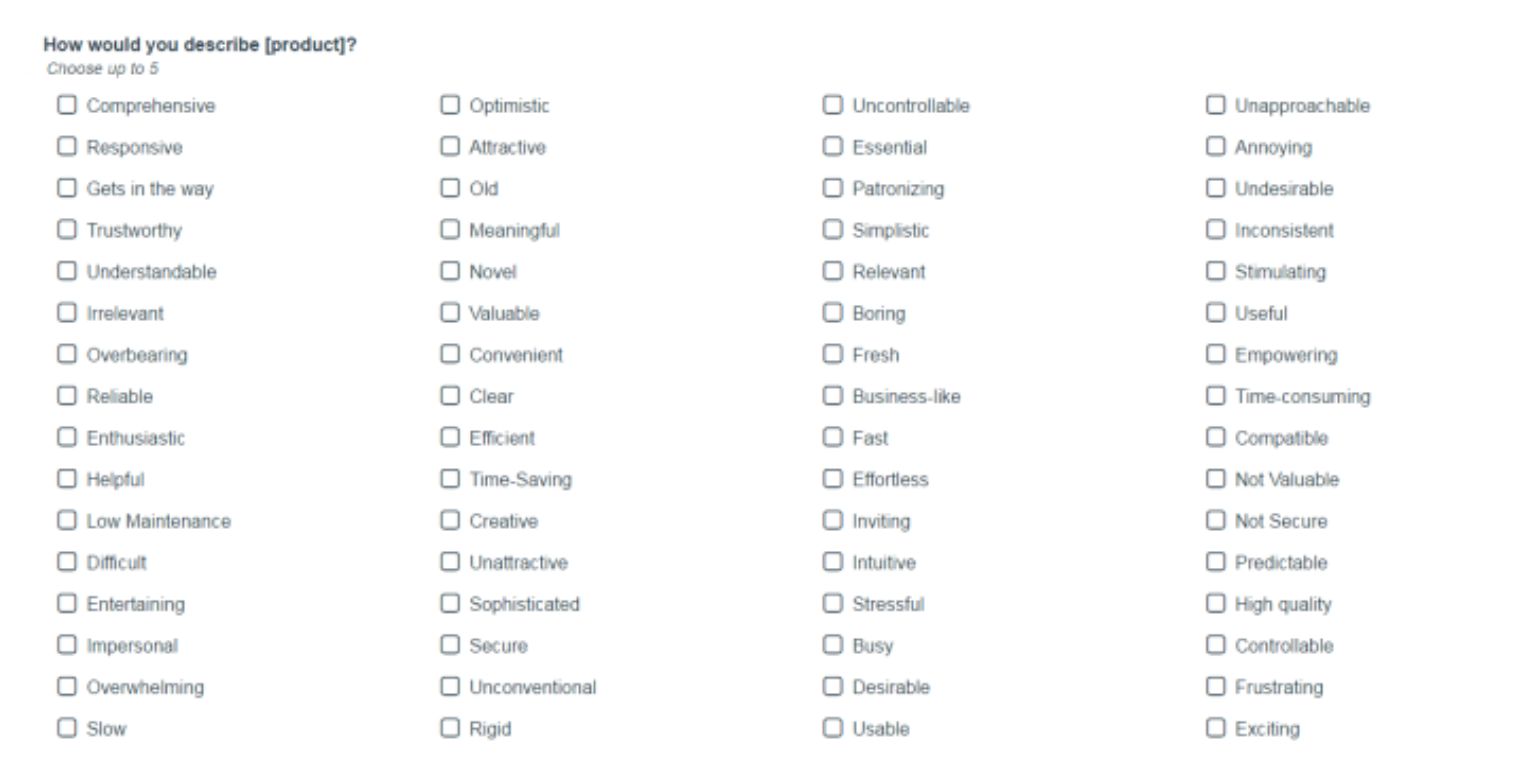
You should give users the list of product reaction words and asks them to select those that best describe the design.
These adjectives represent a mix of descriptions that people might consider positive or negative. Designers should show participants a user interface, then ask them to select the three to five of these adjectives that best describe it.
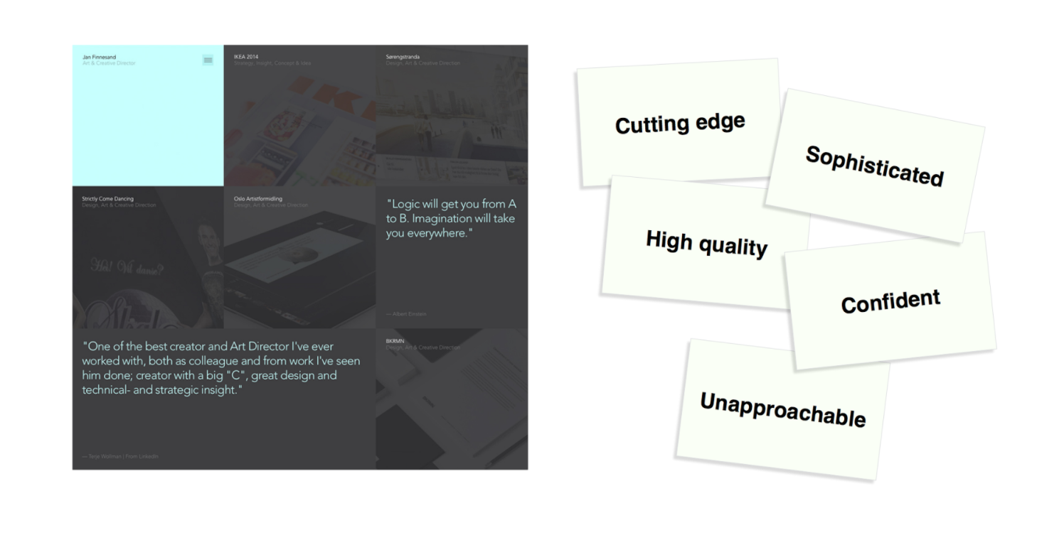
|CARD|COMMENTS|
|----|--------|
|Cutting edge|Seems up-to-date with the latest technology and trends|
|Sophisticated|Looks slick, clean, modern and stylish|
|High quality|I believe the product they sell is desirable and expensive|
|Confident|Testimonials and work show they are capable and experiences|
|Unapproachable|Might be too highbrow for me|
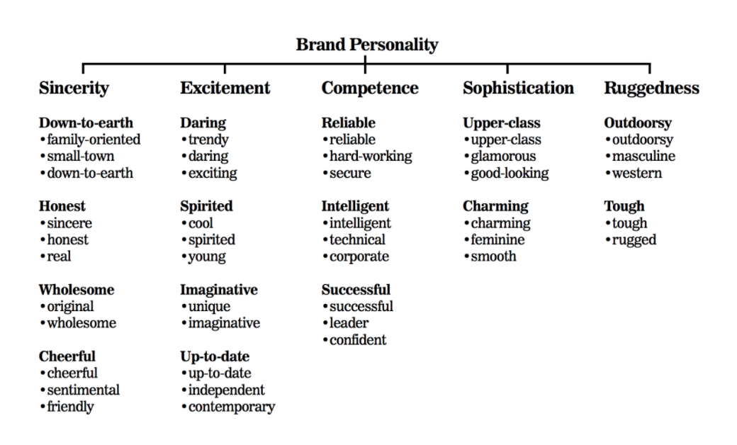
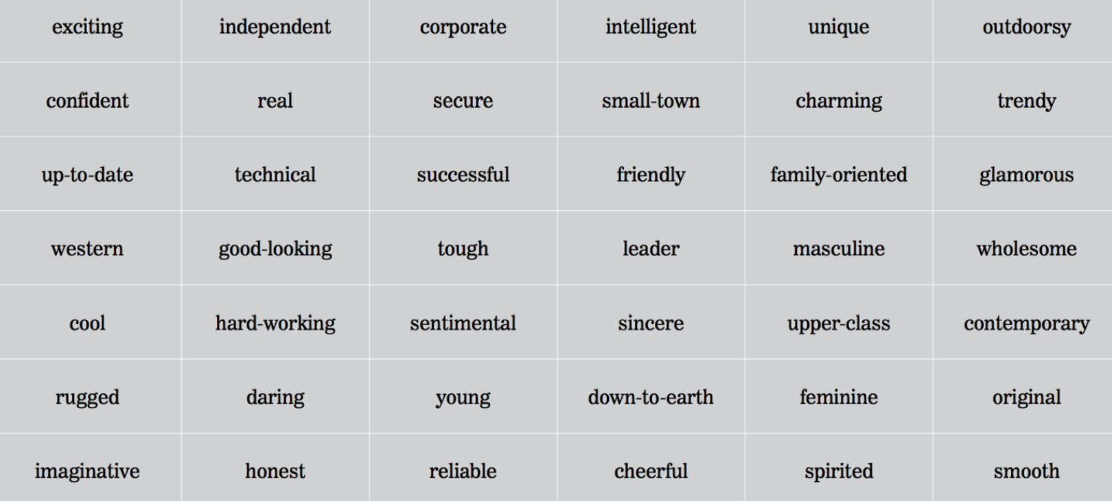
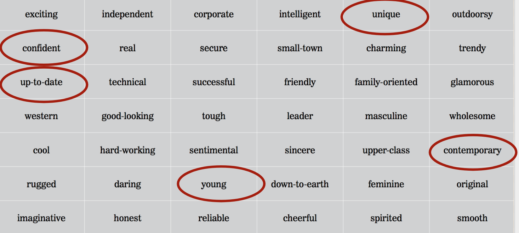
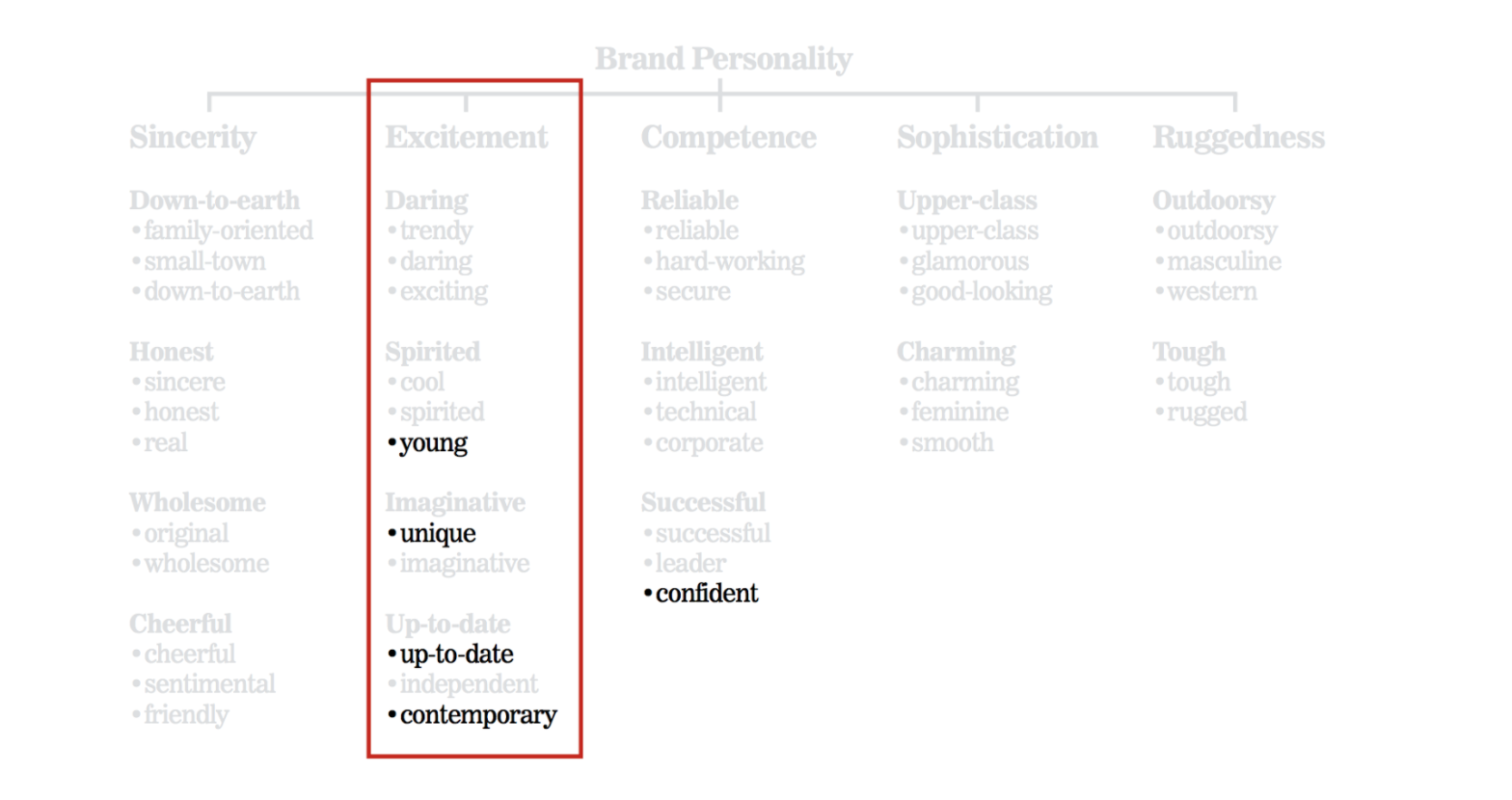
## Brand Personality Framework
The Five Dimensions of Brand Personality by Jennifer Aaker is a framework to describe and measure the “personality” of a brand in five core dimensions, each divided into a set of facets. It is a model to describe the profile of a brand by using an analogy with a human being.
## Summary
- Visual elements produce an emotional response. Understanding these emotional reactions help designers to influence users appropriately. The problem is figuring out how to obtain these responses from users.
- In 2002, Microsoft developed one of the most used techniques of Desirability Testing, the Microsoft Reaction Card. This method is used to check the emotional response and desirability of a design or product.
- The Five Dimensions of Brand Personality by Jennifer Aaker is a framework to describe and measure the “personality” of a brand in five core dimensions, each divided into a set of facets.
## Additional Resources
- [Rapid Desirability Testing](https://www.uxmatters.com/mt/archives/2010/02/rapid-desirability-testing-a-case-study.php) - A Case Study
- [Product Reaction Cards](https://s3-eu-west-1.amazonaws.com/ih-uxui-resources/ProductReactionCards.doc) - Microsoft
 Sign in via Google
 Sign in via Facebook
 Sign in via X(Twitter)
 Sign in via GitHub
 Sign in via Dropbox
 Sign in with Wallet
Connect another wallet
Sign in with Wallet
Connect another wallet