
# Clase 15 - iOS vs Material Design
## Learning Goals
After this lesson, you will:
- Understand the design differences between Android and iOS.
- Learn that Android and iOS sometimes use different UI elements for the same thing.
- Understand the differences in both operative systems.
## Why is this important?
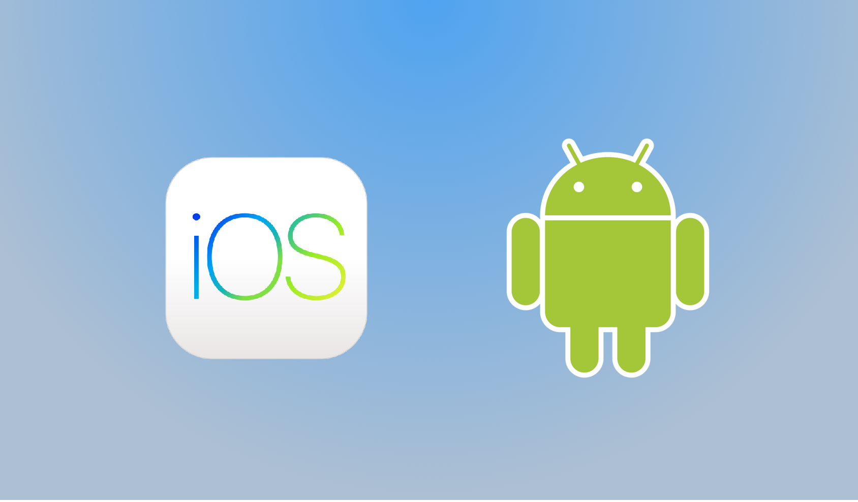
It’s important to understand that while they are very similar competitors, iOS and Android are two distinct operative systems. They each have their own standards, features, and user expectations.
The difference between these operating systems and their related devices isn’t just aesthetic. Just as your MacBook won’t run a Windows application, an Android phone can’t run an app built for iPhone.
When designing mobile apps, it is very important to consider the differences between Android and iOS operating systems. These differences, if not taken into account, may drag us into products with a bad user experience. Take a look at the graphic below where they try to describe users by their smartphones' Operative System:

## A little bit of history
To understand the differences between iOS and Android, it would be a good exercise to take a look at the history of each Operative System in its context.
In 2005 when first envisioning of the iPod came to life, two different teams were asked to scale down the Mac and create iOS. For Steve Jobs, it was mandatory to start with a strong foundation. Jobs took notice of two things:
1) Mac OS was already completed with features such as *sound* and *animations*. They just needed to optimize it to fit in a small package.
2) They needed a software inside an application and it was possible to shrink the Mac into a phone
Android, on the other hand, was an experiment upon release. It was originally built to be a camera manager software. However, they wanted it to be open source and in 1997 they released the first open standard for mobile devices. In 2008 HTC was released.
## What is a Native App?
A native application is an application that has been developed for use on a particular platform or device. Because native apps are written for a specific platform, they can interact with and take advantage of operating system features and other software that is typically installed on that platform.

### Advantages
- Fastest, most reliable and most responsive experience to users.
- Ability to tap into the wider functionality of the device, including the camera, microphone, compass, accelerometer and swipe gestures.
- Publishers can make use of push-notifications, alerting users every time a new piece of content is published or when their attention is required.
- This is a key method of engagement. You get the opportunity to continually bring your audience back for more.
### Disadvantages
- Won’t work with other kinds of devices.
- Building for multiple platforms can get expensive.
- Developers usually specialize in one platform so you might need 2 different developers or teams.
- Any update or change in the design must be implemented in both platforms. This is twice the amount of work, and twice the cost!
## Apps
A few years ago, developers released their apps for iOS first. Android users would have to wait a while before they could get the same apps.
Now, aside from a few rare exceptions, apps are available on both platforms and typically there’s no wait for the Android version. The app selection is now excellent on both.


Whether you’re working as a contractor or for an agency, companies will need to cater applications for the devices they use. Often that means a new app for both Android and iPhones at the same time.
In an ideal world, we’d spend months designing two apps. But in reality, you will have time constraints. If you are designing an app in this way, it’s important to understand the difference between the two platforms early on, and the quick ways that you can make the experience feel native to each.
In the next lessons, you will learn more about how to design for both of them.
## Summary
- iOS was a version of an Operative System initially created for Mac computers.
- Android was intended to be open source, so users can customize and bend their operative systems better than iOS users.
- It’s important to understand the difference between the two platforms to be able to design in a way that feels native to each platform.
## Additional Resources
- [iOS vs Android infographics](http://www.androidguys.com/wp-content/uploads/2017/06/id192407_1.jpg)
- [A Tale of Two Platforms: Designing for Both Android and iOS](https://webdesign.tutsplus.com/articles/a-tale-of-two-platforms-designing-for-both-android-and-ios--cms-23616)

# Material Design
## Learning Goals
After this lesson you will be able to:
- Represent how a design system is created
- Explain what is Material Design
- Apply Material Design guidelines for components
## Google Evolution Overview
Some time ago all Google products looked different. Even one product on different platforms might look inconsistent.

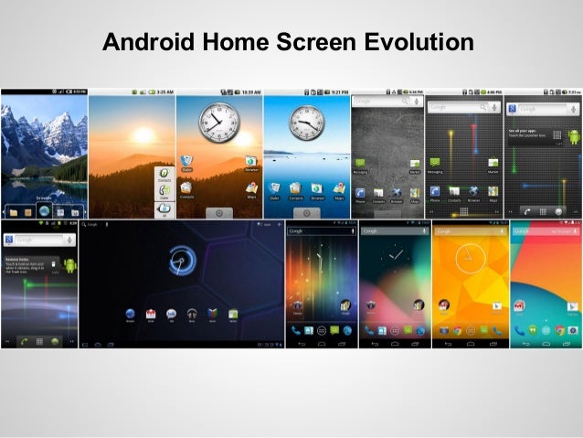
On September 23, 2008, Google officially released the first version of the Android OS. Since the release of the first version of the platform, the visual part of it changed until 2014, when Google created a new language and style. It is well known as **Material Design**, with its original metaphor of a *flat sheet of paper in 3D space*.

Take a look at the Android 7.1 Nougat home screen based on Material Design Guidelines:

Besides becoming the essential look and feel of Android interfaces, Material Design is also a visual language of the classic principles of good design for cross-platform. It works for Web, Watch and other screens.
Recently, Material Design was updated. Take a look to 2018 redesign using the same guidelines. This is the power of Desig Systems.
{%youtube XGH7xQpgt-U %}
> Take a look at [I/O 2018: Our Definitive Guide to Design](https://design.google/library/io-2018-our-definitive-guide-design/) by Google's team to learn about how to create beatiful Material Design Apps, theming and components.
[The official guide](https://material.io/guidelines/) is by far **the best** and most important source of information about Material Design. It is very well structured and has excellent illustrations. Clear examples support every paragraph , including do’s and don'ts.
## Material Design Overview
The ultimate goal, according to the official guide is to *develop a single underlying system that allows for a unified experience across platforms and device sizes. Mobile precepts are fundamental, but touch, voice, mouse, and keyboard are all first-class input methods.*
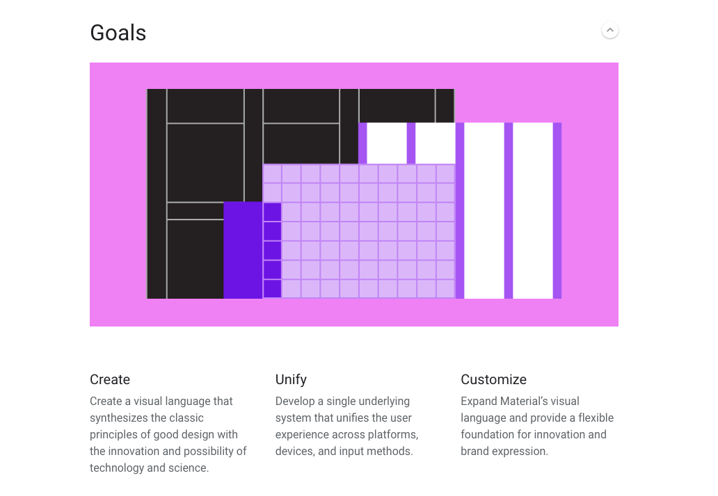
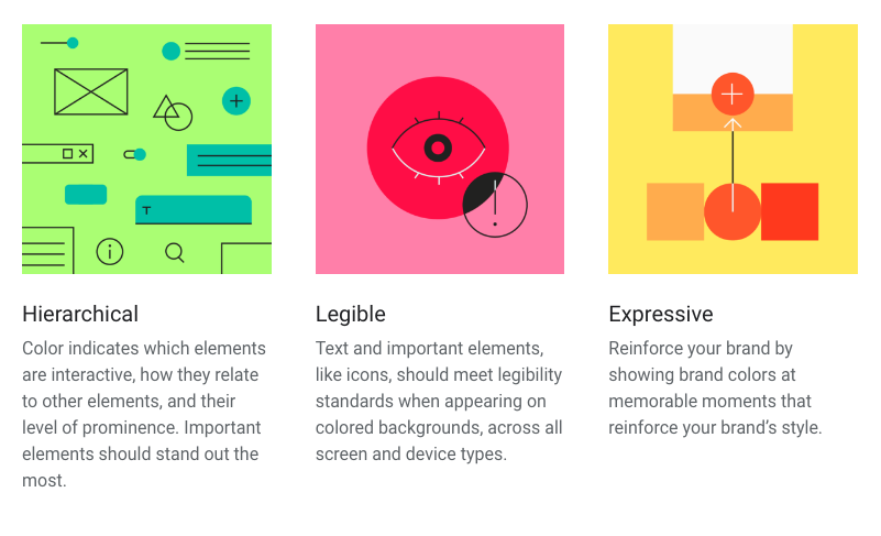
**Three core principles** of Material Design are :
- Material is the Metaphor.
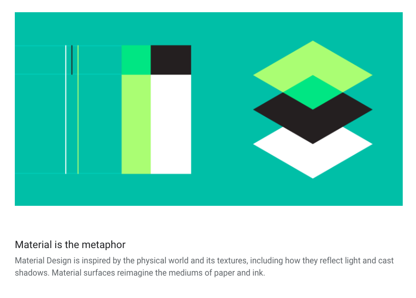
The principle of *“material is the metaphor”* advocates providing visual cues that are grounded in reality like natural light and motion to create common attributes that users can quickly understand.
- Motion provides meaning
- Bold, graphic, intentional
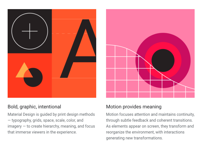
The principles of *“material is the metaphor”* and *“provide meaning with motion”* aim to appropriate things from the natural world. However, these principles look in nature to create meaning instead of incorporating design from human-made objects. This approach can be subtly seen in the leaf reference in Google Map’s interface.
The principle of [*“provide meaning with motion”* ](https://material.io/guidelines/motion/material-motion.html#) states that a motion should flow in a way that resembles objective reality and retain the feeling of physicality.
> [source: Andrew Coyle](https://medium.com/designed-thought/googles-material-design-24af1f50a816)
>
Finally, Material Design is thought for customization, scalability and cross-platform optimization.
# Material Guidelines
Let´s take a brief overview of Material Design Guidelines to understand this systems' main components.
Design and build with new tools for customizing Material and sharing work, find inspiration in the Material studies, and express your product’s unique identity with Material Theming.
You can review [Material Theaming](https://material.io/design/material-theming/#) in the new guidelines.
## Material Color
Review the complete article on [Material Color](https://material.io/design/color/#)
Use [Material Palette](https://www.materialpalette.com/) or [Material Palette Generator](https://material.io/design/color/the-color-system.html#tools-for-picking-colors) to play around and discover the endless possibilities of Material Design.
### Principles
### Colors and theming
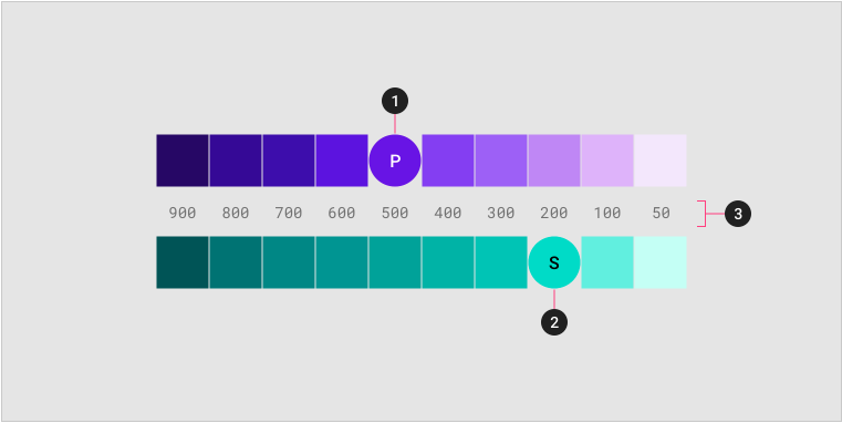
> A sample primary and secondary palette
> 1. Primary color indicator
> 2. Secondary color indicator
> 3. Light and dark variants
## Spacing Methods
[Material Spacing Methods](https://material.io/design/layout/spacing-methods.html#) use baseline grids, keylines, padding, and incremental spacing to affect ratios, containers, and touch targets.
### 8dp Grid
Most systems use 8dp or px grid to ensure scalability to different screens and devices. Handling a 8dp grid will enable our products to render well on about any pixel density. If you want to learn more about this, consult [Pixel Density, Demystified](https://medium.com/@pnowelldesign/pixel-density-demystified-a4db63ba2922).
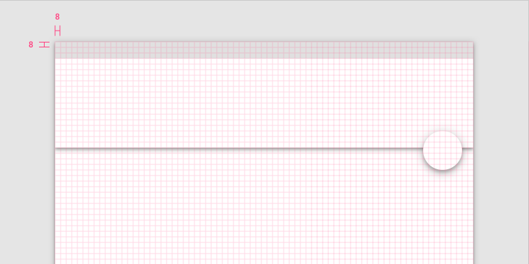
> The app bar and floating action button align to the 8dp grid.
>
### 4dp Baseline Grid
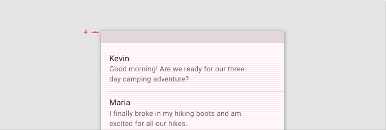
> Type aligns to the 4dp baseline grid.
>
Typography can be placed outside of the 4dp grid when it’s centered within a component, such as a button or list item.
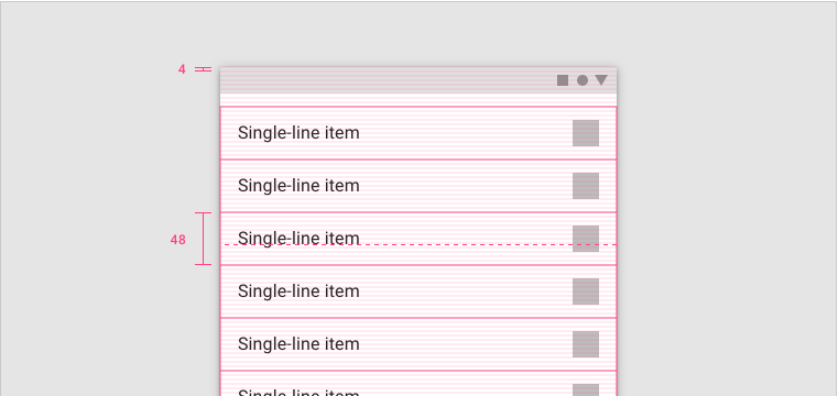
> The text appears vertically aligned in the center of the list item, even though the type isn’t resting on the 4dp grid.
>
Review the full [Material Spacing guidelines](https://material.io/design/layout/spacing-methods.html#spacing) for more information on how to craft material grids.
## Layout
For more information, review the complete article on [Material Layout and responsive grid system](https://material.io/design/layout/responsive-layout-grid.html#).
The Material Design responsive layout grid adapts to screen size and orientation, ensuring consistency across layouts.
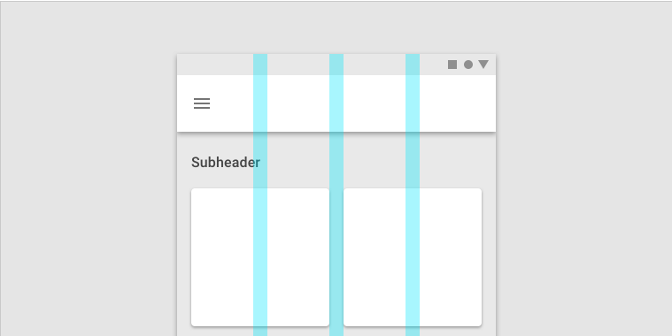
Generally, layout is contructed taking into account three main functional elements: Columns, gutters, and margins
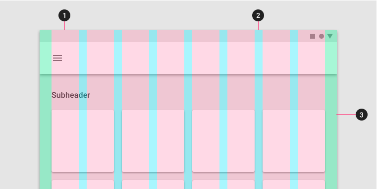
> 1. Columns
> 2. Gutters
> 3. Margins
>
### Columns
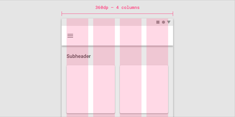
> On mobile, at a breakpoint of 360dp, this layout grid uses 4 columns.
>
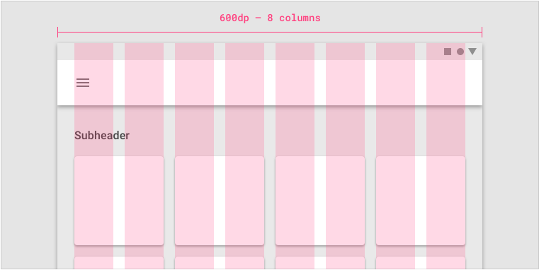
> On tablet, at a breakpoint of 600dp, this layout grid uses 8 columns.
>
### Gutters
Gutters are the spaces between columns. They help separate content.
Gutter widths are fixed values at each breakpoint range. To better adapt to the screen, gutter width can change at different breakpoints. Wider gutters are more appropriate for larger screens, as they create more whitespace between columns.
> On mobile, at a breakpoint of 360dp, this layout grid uses 16dp gutters.
>
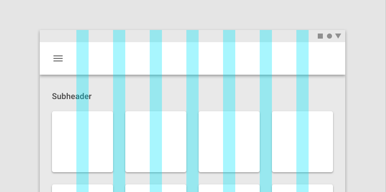
> On tablet, at a breakpoint of 600dp, this layout grid uses 24dp gutters.
>
### Margins
Margins are the space between content and the left and right edges of the screen.
Margin widths are defined as fixed values at each breakpoint range. To better adapt to the screen, the margin width can change at different breakpoints. Wider margins are more appropriate for larger screens, as they create more whitespace around the perimeter of content.
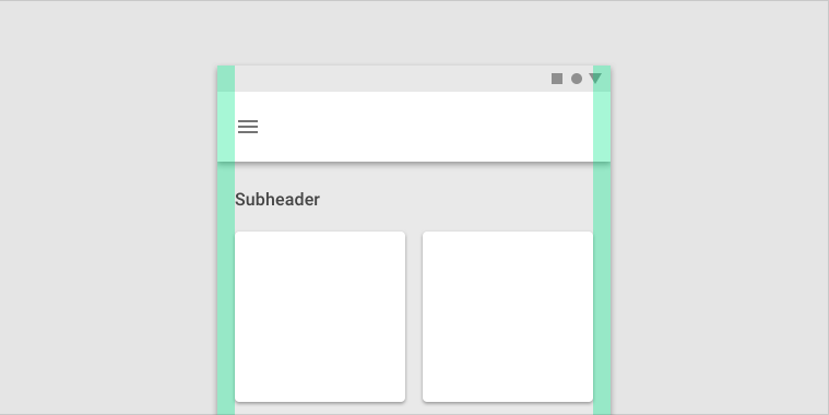
> On mobile, at a breakpoint of 360dp, this layout grid uses 16dp margins.
>
> On a small tablet, at a breakpoint of 600dp, this layout grid uses 24dp margins.
>
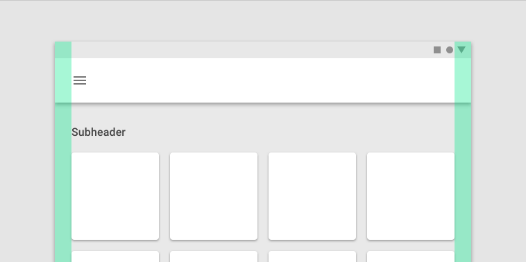
### Grid Customization
The layout grid can be adjusted to meet the needs of both your product and various device sizes.
Follow [Grid Customization guidelines and examples](https://material.io/design/layout/responsive-layout-grid.html#grid-customization) to learn more details on how to apply Material Design to your projects.
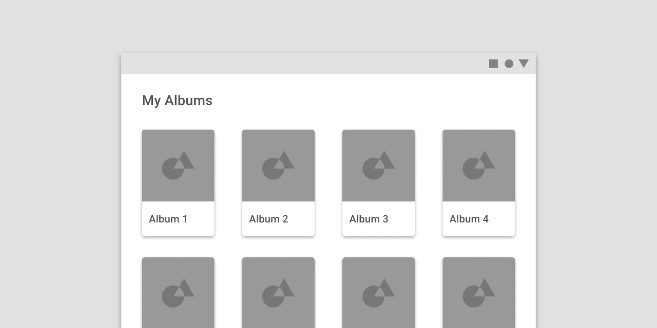
> This layout grid uses 8dp gutters. The tighter spacing may suggest the images are closely related to one another, so that they are perceived as part of a collection.
>
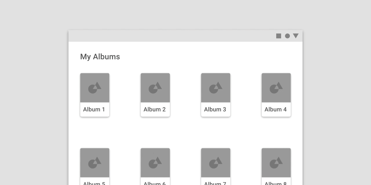
> This layout grid uses larger, 32dp gutters to create more separation between columns. The extra space helps each album to be perceived as an individual entity within a collection.
>
:::danger
**DON'T**
Don’t make gutters too large, such as the same width as the columns. Too much space doesn’t leave enough room for content and prevents it from appearing unified.
:::
## Navigation
Navigation is the act of moving between screens of an app to complete tasks. It’s enabled through several means: dedicated navigation components, embedding navigation behavior into content, and platform affordances.
### Navigational directions
Material supports three different types of navigation. Based on your app’s information architecture, a user can move in one of three navigational directions:
- **Lateral navigation** refers to moving between screens at the same level of hierarchy. An app’s primary navigation component should provide access to all destinations at the top level of its hierarchy.
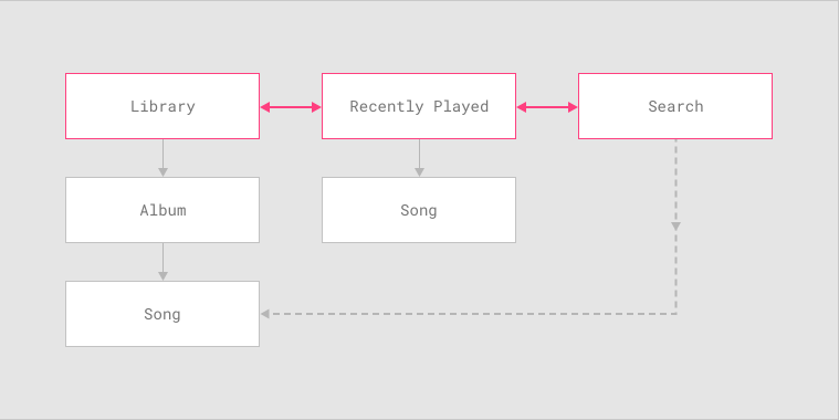
> Lateral navigation allows movement between the top-level screens of this music app’s information architecture.
>
- **Forward navigation** refers to moving between screens at consecutive levels of hierarchy, steps in a flow, or across an app. Forward navigation embeds navigation behavior into containers (such as cards, lists, or images), buttons, links, or by using search.
> Users of this music app can use forward navigation to access a song in one of two ways:
> 1. Navigating hierarchically from a music album to a particular song
> 2. Searching for the song and navigating directly to it, bypassing screens in the hierarchy above the song (Library and Album)
>
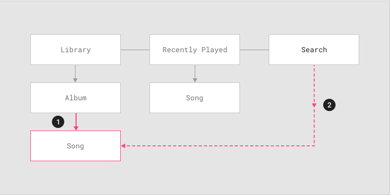
- **Reverse navigation** refers to moving backwards through screens either chronologically (within one app or across different apps) or hierarchically (within an app). Platform conventions determine the exact behavior of reverse navigation within an app.
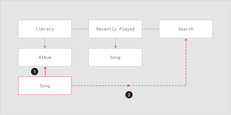
> From a song screen, users may navigate in reverse in one of two ways:
> 1. Upward in the hierarchy to the song’s parent, in this case the album containing the song
> 2. Chronologically, to a search results screen, but only if the user just navigated to the song from that screen.
>
Review the full guidelines on [Material Navigation](https://material.io/design/navigation/understanding-navigation.html#) for deeper understandment of the subjet.
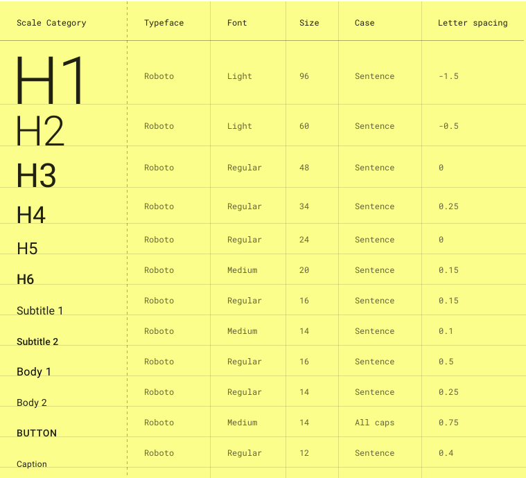
## Typography
Review [Material Type System](https://material.io/design/typography/the-type-system.html#) and learn about how to scale your Fonts to create hierarchies in your product.
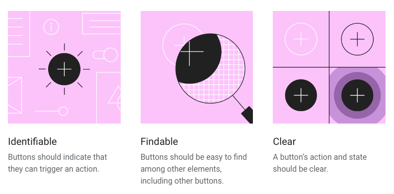
## Buttons
Buttons allow users to take actions, and make choices, with a single tap. Material design has developed [Material Buttons](https://material.io/design/components/buttons.html#) to express different actions the user may take.
### Principles
### Usage
Buttons communicate actions that users can take. They are typically placed throughout your UI, in places like:
- Dialogs
- Modal windows
- Forms
- Cards
- Toolbars
### Types of buttons
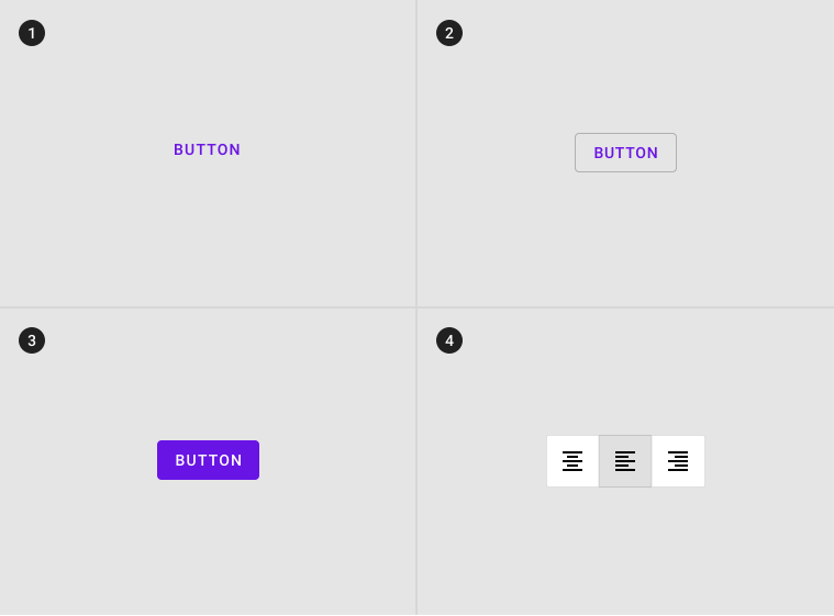
1. **Text button** (low emphasis): Text buttons are typically used for less important actions.
2. **Outlined Button** (medium emphasis): Outlined buttons are used for more emphasis than text buttons due to the stroke.
3. **Contained button** (high emphasis): Contained buttons have more emphasis, as they use use a color fill and shadow.
4. **Toggle button**: Toggle buttons group a set of actions using layout and spacing. They’re used less often than other button types.
### Hierachy usign multiple buttons
You should always strive for **a single, prominent button** that reflects the ``Golden rule of UX: 1 TASK per SCREEN.``
A layout should contain a single prominent button that makes it clear that other buttons have less importance in the hierarchy. This high-emphasis button commands the most attention.
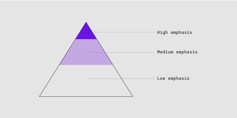
> A button’s level of emphasis helps determine its appearance, typography, and placement.
>
In case you have sub-tasks or accesory actions to take, you can use **other types of buttons**.
An app can show more than one button in a layout at a time, so a high-emphasis button can be accompanied by medium- and low-emphasis buttons that perform less important actions. When using multiple buttons, ensure the available state of one button doesn’t look like the disabled state of another.
to learn more on how to design proper [Material Buttons](https://material.io/design/components/buttons.html#) go back to the complete guidelines.
## Components
Read [Material component behaviour](https://material.io/design/layout/component-behavior.html#) to understand the different possisbilities of Android OS and material components.
You can find information on how to design any material component in the complete guidelines.
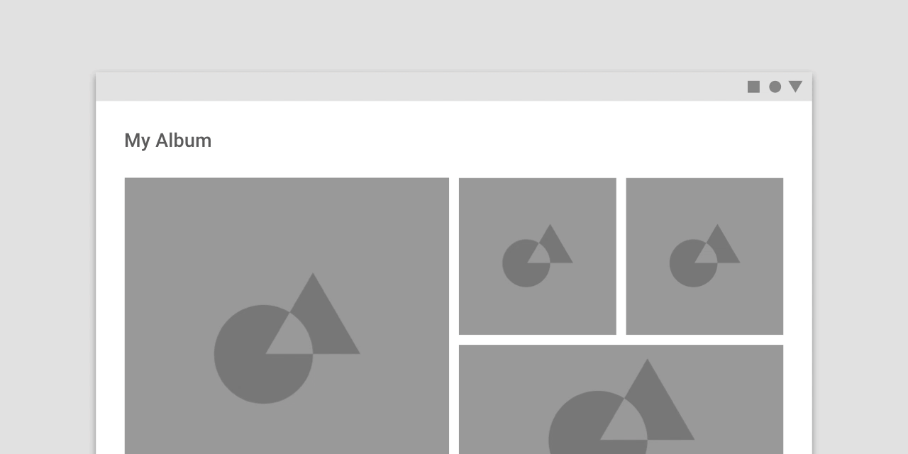
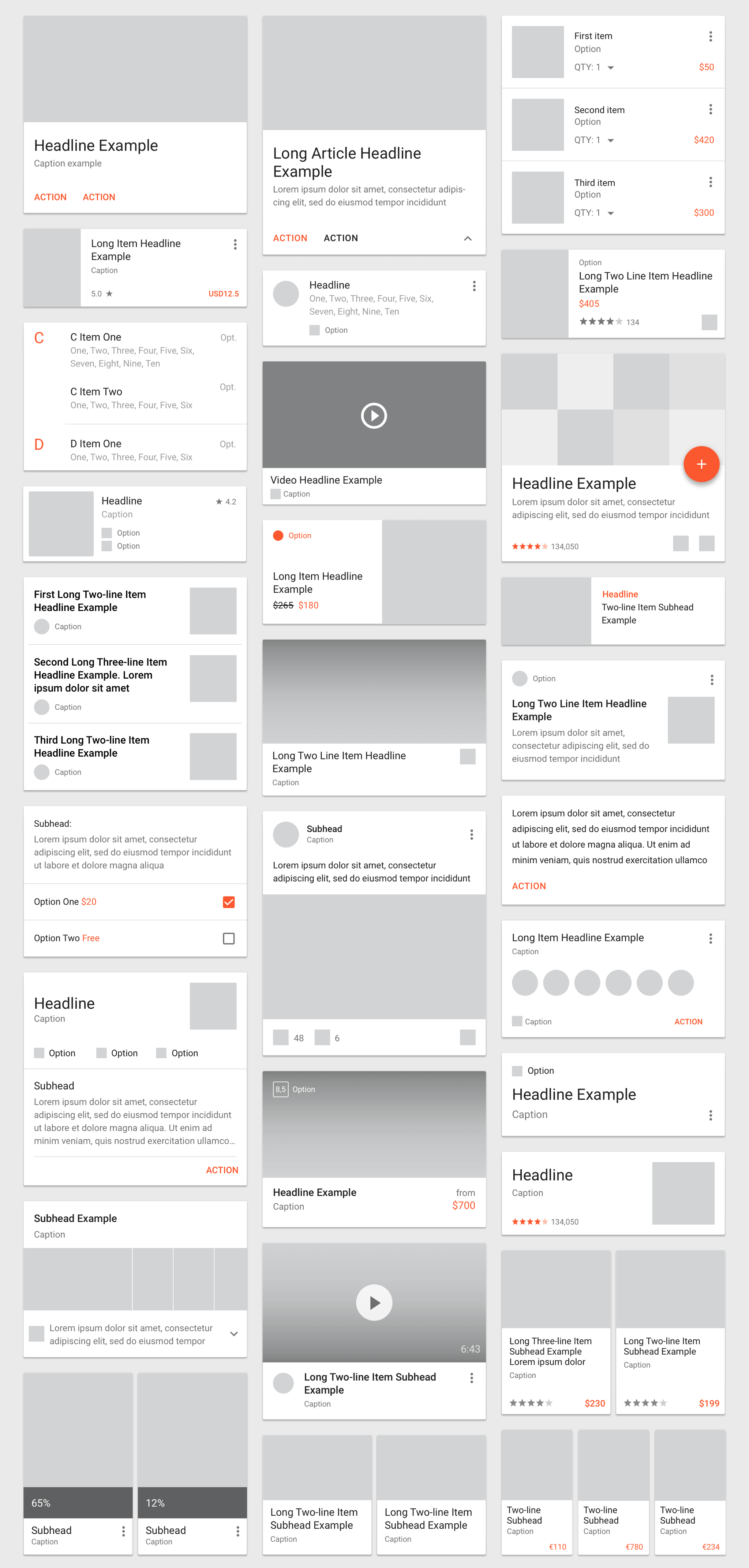
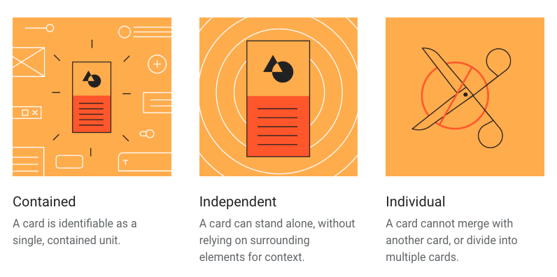
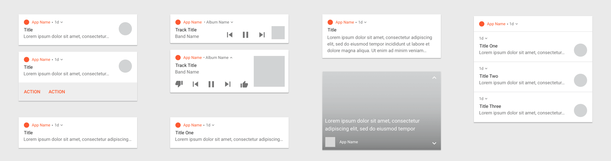
### Cards
[Cards](https://material.io/design/components/cards.html) have been a huge success of interaction and UI design over the past years. Cards were an innovation powered by Google's material design, thus they are very representative of the style.
> Cards for the past few years, looked like this
>
#### Principles
#### Usage
Cards are surfaces that display content and actions on a single topic.
They should be easy to scan for relevant and actionable information. Elements, like text and images, should be placed on them in a way that clearly indicates hierarchy.
#### Anatomy
The card container is the only required element in a card. All other elements shown here are optional.
Card layouts can vary to support the types of content they contain. The following elements are commonly found among that variety.
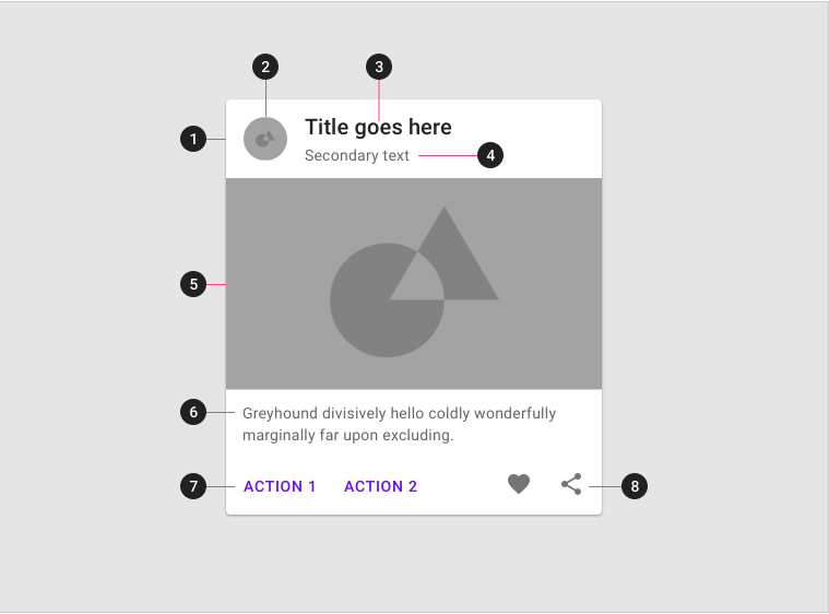
1. **Container**
Card containers hold all card elements, and their size is determined by the space those elements occupy. Card elevation is expressed by the container.
2. **Thumbnail** [optional]
Cards can include thumbnails to display an avatar, logo, or icon.
3. **Header text** [optional]
Header text can include things like the name of a photo album or article.
4. **Subhead** [optional]
Subhead text can include text elements such as an article byline or a tagged location.
5. **Media** [optional]
Cards can include a variety of media, including photos, and graphics, such as weather icons.
6. **Supporting text** [optional]
Supporting text include text like an article summary or a restaurant description.
7. **Buttons** [optional]
Cards can include buttons for actions.
8. **Icons** [optional]
Cards can include icons for actions.
Each card is made up of content blocks. All of the blocks, as a whole, are related to a single subject or destination. Content can receive different levels of emphasis, depending on its level of hierarchy.
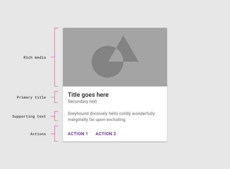
> Cards contain rich media, primary title, supporting text, and actions.
>
## Examples
Here are some examples of material design applied using Sketch templates. If you want to consult the [previous guidelines set](https://material.io/archive/guidelines/), you can easily see how all components should be treated. Remember you can always **import material design libraries to Sketch** in order to have a symbols page with all needed assets.
### Bottom patterns
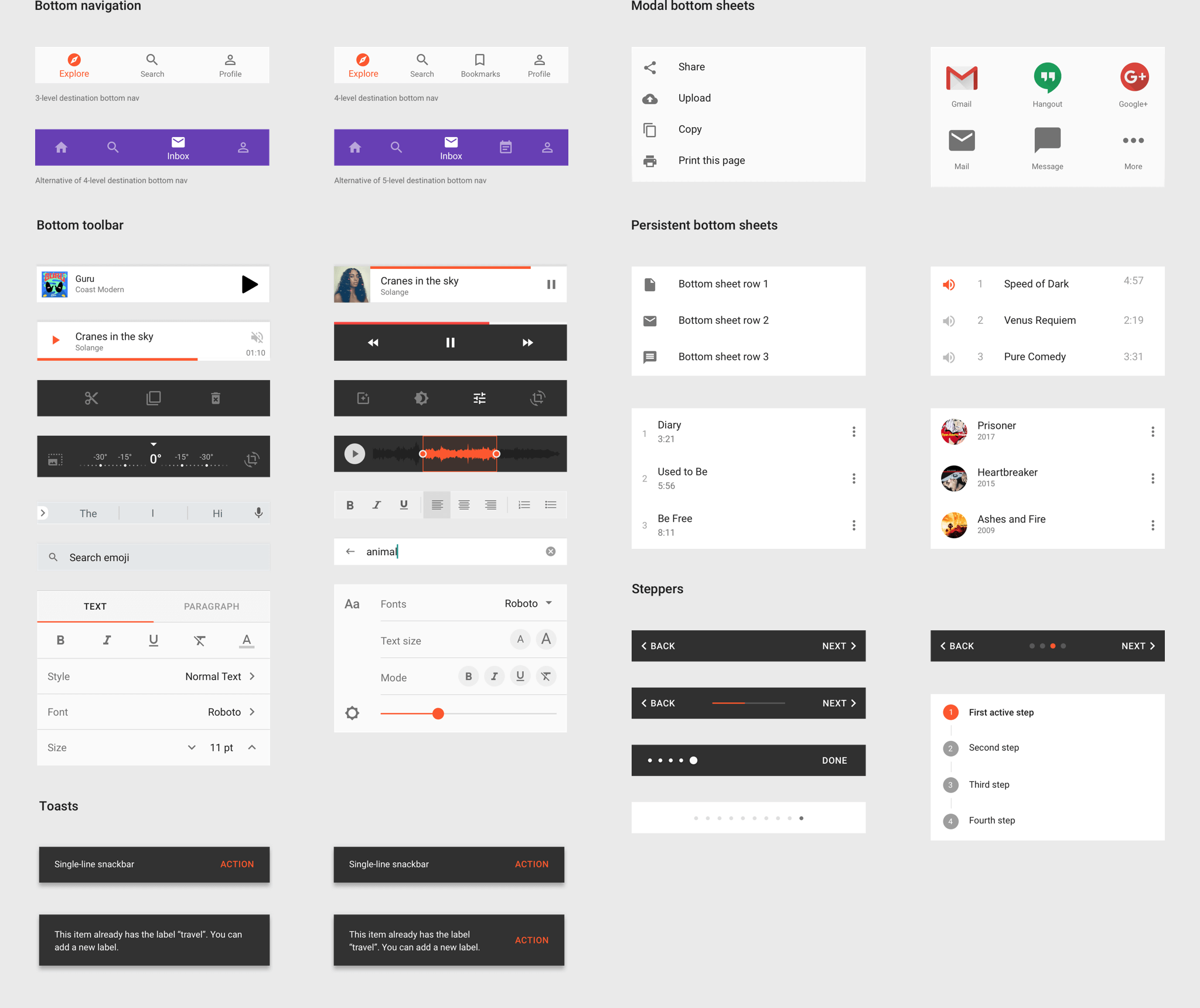
### Keyboards
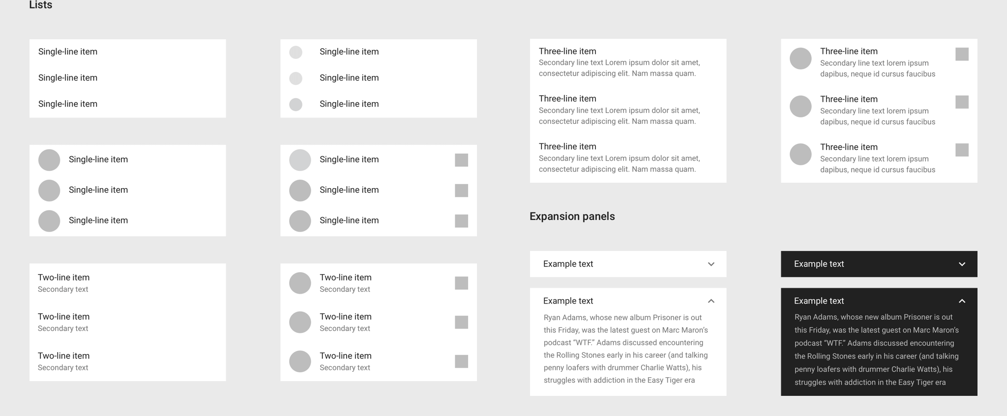
### Lists and Expansion Panels
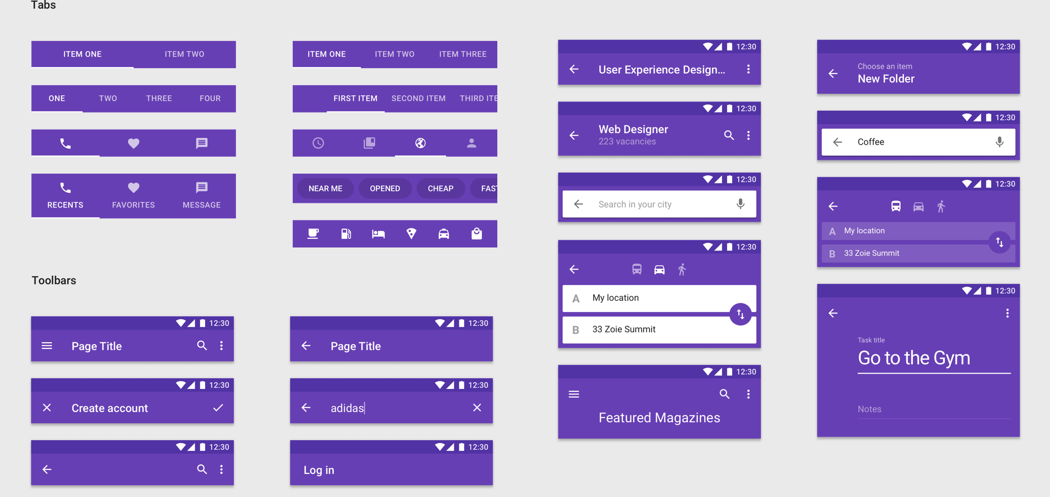
### Tabs and Toolbars
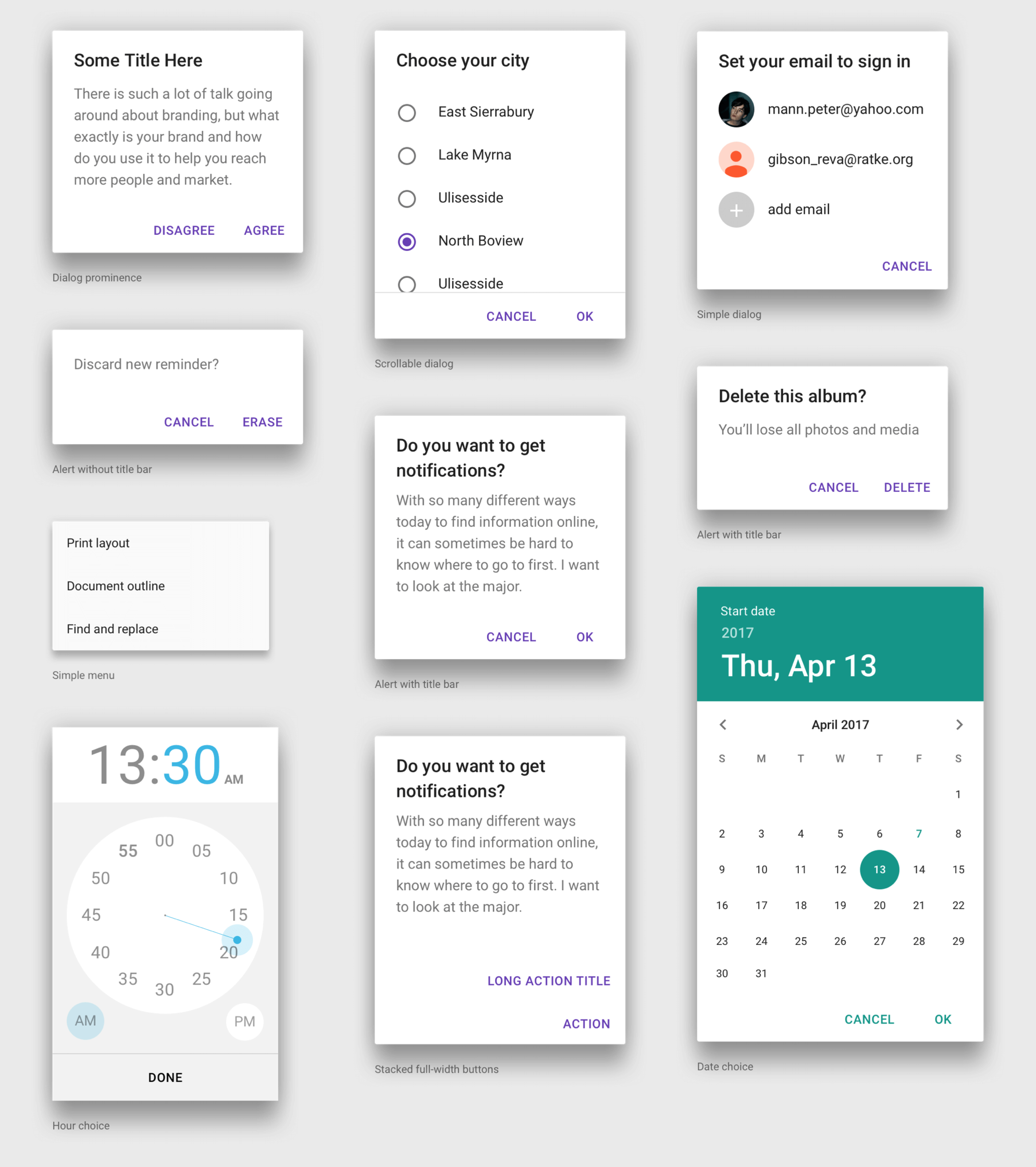
### Dialogs
### Notifications
# Material Studies
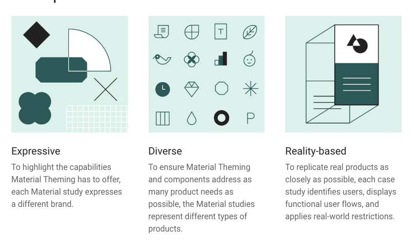
See how products apply Material Design Guidelines for their own branding, customizing Material Design. [Material Studies](https://material.io/design/material-studies/#) is a collection of articles with descriptive annotations and process iteractions that will help you embrace Material Design for Android native.
### Principles
## Additional Resources
- [Material Design Lite](https://www.youtube.com/watch?v=iNI8IkBAmgs)
- [The official guide](https://material.io/guidelines/)
- [Material Design Wearables Guide](https://www.google.com/design/spec-wear/)
- [Designing for Google Cardboard](https://www.google.com/design/spec-vr/designing-for-google-cardboard/a-new-dimension.html)
- [Android TV](https://www.google.com/design/spec-tv/android-tv/introduction.html)
- [Google Design](https://design.google.com)

# iOS Human Interface Guidelines
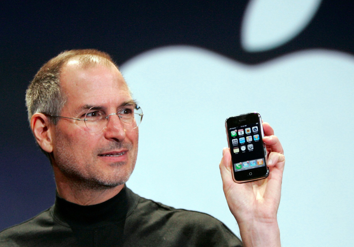
> Steve Jobs presents the first iPhone.
## Learning Goals
- Gain basic knowledge of the current IOS Guidelines for Designers.
## IOS Overview
Apple's Steve Jobs introduced the iPhone to the world on January 9th, 2007. In the years since then, the iPhone, iPad, and iPod Touch have redefined the entire world of mobile computing.
Apple uses adaptive layouts to make designs work well on different devices.

> Picture ref: designcode.io
### Adaptive layout and multitasking
With the increase in the total number of display resolutions, it is important to ensure the adaptability of the layout. You will need to create a design in such a way that the screen size does not affect the comfort of using the interface. If necessary you could show additional menus. One way to do this is by using tools like Xcode or Sketch Constraints.
### San Francisco Font
After the release of El Capitan and iOS 9, San Francisco became the standard font.

> Picture ref: designcode.io

>Unlock screen in IOS 10 with the new fonts
### 3D Touch

> Picture ref: designcode.io
One of the main innovations in the functionality of iOS is 3D Touch. It gives people the ability to quickly access functions inside and outside. Users can access the most popular options from the program's icon. Inside the program, you can see the links and emails before the full-screen opening.
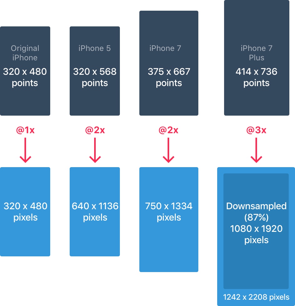
### Pixels and dots
Developers work with point values, so it is extremely important to understand their difference with pixels. When the iPhone was first introduced, the two units were the same. That is, 1pt was equal to 1px.
> Picture ref: designcode.io
:::info
:warning: With the advent of Retina displays, `1pt` became `2px`. So think of points as values on the iPhone, and pixels as special points in the full dependence on the density of pixels.
:::
### iPhone Resolutions
The iPhone has these main resolutions:
- 320 x 568 pt (iPhone 5)
- 320 x 480 pt (iPhone 4)
- 375 x 667 pt (iPhone 6)
- 414 x 736 pt (iPhone 6 Plus)
- 375 x 667 pt (iPhone 7)
- 414 x 736 pt (iPhone 7 Plus)
(More about resolutions can be found here http://iosres.com)

> Picture ref: designcode.io
The layout does not scale. It expands based on permission. For example, the navigation bar adjusts only to the width but always has the same height. The components inside the panel remain the same.
### IPad Resolutions
The iPad has two main resolutions: 1024 x 1366 pt (iPad Pro) and 768 x 1024 pt (iPad).

> Picture ref: designcode.io
On the latest iPad in iOS, there were two new options: Split View and Slide Over. Slide Over is an overlay that appears on the right side of the display without changing the layout of the open application.

> Picture ref: designcode.io
Split View gives users the ability to use multitasking, working in two applications simultaneously in portrait mode next to each other.

> Picture ref: designcode.io
### Application icon
The application icon is used for application branding. This is the first thing that the user sees. The icon always appears on the home display, in Spotlight, in the App Store, and in the Settings menu.

> Picture ref: designcode.io
Icons of the application currently have two resolutions: @2x and @3x. There are three types: App Icon, Settings, and Spotlight. For the iPad, @1x and @2x permissions apply. Take a look at the table below for more information about application icons resolutions.

> Picture ref: designcode.io
:::success
:bulb: **Icon Grid**
Apple uses a golden section for some of its icons. This improves the proportionality of the elements. Although this is an excellent rule for following, it is not necessary.

> Picture ref: designcode.io
:::
### Colors
IOS uses bright colors for the buttons. These shades work better than black or white backgrounds. Note that colors should be used sparingly for minimal areas of branding and call-to-action items, such as the navigation bar.

> Picture ref: designcode.io
Only 10-20% of the design should be represented in these colors. Otherwise, the design will compete with the content.

> Picture ref: designcode.io
iOS often applies neutral colors as menu or background areas. Black text on a white background is used for comfortable readability. A pastel blue tint is used to highlight the buttons.
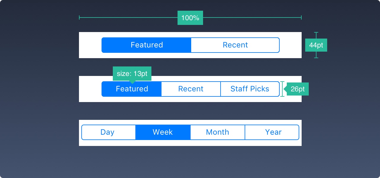
### Font size and buttons
The general rule for font size is as follows.
- 12pt for small text
- 44pt for buttons
- 17pt for body text
- 20pt + for headings.

> Picture ref: designcode.io
### Alignment and indentation
The general rule here is a minimum indentation or 8pt boundaries. This creates the necessary space around the elements, makes it easier to perceive the layout, and creates more accessible text. All interface elements must be aligned. The text should also be aligned on the baseline.

> Picture ref: designcode.io
### Status bar

> Picture ref: designcode.io
It is advisable to include the status bar in as many screens as possible. Users very often turn to the status bar for important information about signals, time, and battery charge. Icons and text can be white or black, but the background can be changed to almost any shade, and can also be combined with the navigation bar.
### Navigation panel

> Picture ref: designcode.io
The navigation bar in iOS is used for quick information about the screen. The left side can be used for the Profile, Back, and Menu buttons. The right side can be used for the action buttons like Edit, Add, and Done. If you met any of these system icons, then you do not need to create source code for them.
Just like for the status bar, the background can be changed to any color. As a rule, include a small blur to ensure that the text is always readable. When a status line is present, both backgrounds are combined.
### Search bar
If you have a lot of content, it is desirable to organize a search for the required item.

> Picture ref: designcode.io
### Toolbar

> Picture ref: designcode.io
If you need more space for full placement of all action and status buttons, you need to use the toolbar.
### Tab bar
The tab bar is the main way to navigate between screens. Avoid the *hamburger menu* if you only have a few items. In addition, it's better to accompany the icons with text. Most people do not immediately recognize the necessary symbols, especially if they are not well known.

> Picture ref: designcode.io
In the inactive state, all icons will have a path instead of a fill. So they attract much less attention.

> Picture ref: designcode.io
### Table view
Table view is a fairly popular kind of interface for content. In the vast majority of applications, a tabular form is used. This is due to the fact that this species can be different.

> Picture ref: designcode.io
At the basic level, you can use many pre-installed accessories and styles.

> Picture ref: designcode.io
Cells can be grouped, with a header at the top and a small description below them.

> Picture ref: designcode.io
### Collection
When you have columns and rows in the trellis view, you need to represent the content in the form of a collection. This presentation also gives the opportunity to create almost any layout.

> Picture ref: designcode.io
Layouts in the form of a collection can look like those presented on the image or in the form of their combination. The possibilities are endless.

> Picture ref: designcode.io
### Modal windows
The **alert dialog** is used to provide quick hints or critical information. Alerts, or notifications, should be minimized. The output from them should be well marked in the layout.

> Picture ref: designcode.io
The Activity dialog allows you to share content with various functions of iOS, such as Bookmarks and Favorites. Also, with applications like Facebook, Twitter, and Mail you can share content. While the view cannot be changed in any way, the functions can.

> Picture ref: designcode.io
When the submitted data is not short, you can create a modal window in full size, which will appear through the fade, slide, flip, or page animation. It is necessary to realize the possibility of easily canceling them. Dimensions should be kept as small as possible.

> Picture ref: designcode.io
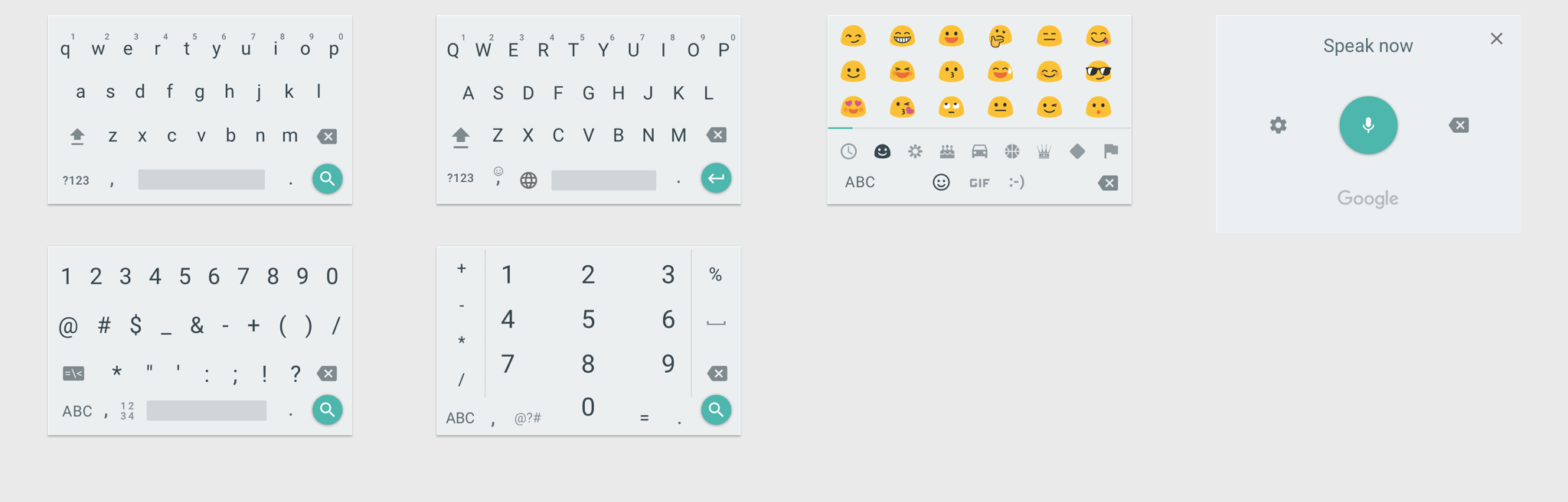
### Keyboards
The keyboard is used to enter data in text fields such as search, login or chat. It can be changed to suit your needs, to enter URLs, phone numbers, email addresses and Emojis. You can choose between a dark and a light theme. In addition, you can change the name of the button for the action. By default it is called return.

> Picture ref: designcode.io
There is a Keyboard Kit for Sketch, which you can download.
### Picker
When you have several functions to choose from, you can use the Picker tool. Selectors are quite convenient for selecting dates because they allow you to select values for three fields in one action.

> Picture ref: designcode.io
### Segmented control
Whereas the tab bar provides navigation to the main sections, the segmented controller is used to access various sub-sections.
> Picture ref: designcode.io
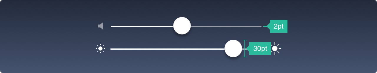
### Sliders
Sliders are interactive controls that provide a slightly less accurate selection but are very convenient for settings like brightness, volume, or video rewind.
> Picture ref: designcode.io
### Progress Bar
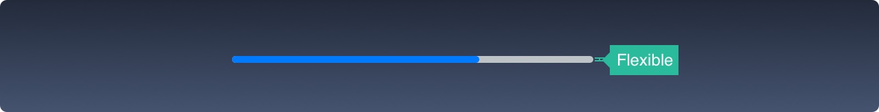
> Picture ref: designcode.io
A progress bar is an indicator that shows the duration of the action or the level of the setting. For example, you can use it to display the process of downloading something on the web. The height of this panel can be changed.
### Switch
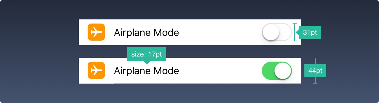
> Picture ref: designcode.io
Use this item to quickly switch between different states. Do not use them for anything other than on and off.
### Stepper
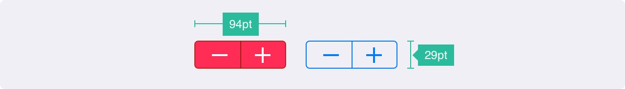
> Picture ref: designcode.io
Stepper provides a slow, but more precise control in comparison with the slider. You can decrease or increase the setting value by incrementing by one. The background and borders of these controls can be adjusted.
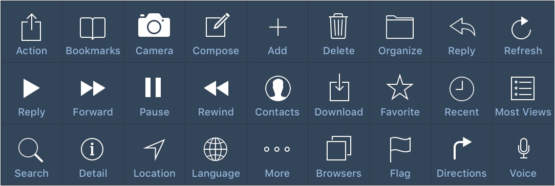
### IOS icons
These are standard iOS 9 icons. Since they are used by the standard, their purpose is perfectly recognizable by users. The use of these icons for other purposes can confuse the user. It is important to understand how a particular icon is used in iOS.
> Picture ref: designcode.io
When you are working on creating new icons, it is very important to use well-known symbols. You should accompany them with at least 10pt text.
## Resources
- [Official iOS Human Interface Guidelines](https://developer.apple.com/design/human-interface-guidelines/guidelines/overview/)
- [Design Code](https://designcode.io/ios11-iphone-x) - Another great guideline solution for iOS documentation
- [IOS Guidelines](http://ivomynttinen.com/blog/ios-design-guidelines)
- [IOS Guidelines History](https://www.theverge.com/2011/12/13/2612736/ios-history-iphone-ipad)
- [Learning Sketch+Xcode](https://designcode.io)
 Sign in via Google
 Sign in via Facebook
 Sign in via X(Twitter)
 Sign in via GitHub
 Sign in via Dropbox
 Sign in with Wallet
Connect another wallet
Sign in with Wallet
Connect another wallet