
# Clase 13 - Guías de Estilo
## Learning Goals
After this lesson you will:
- Understand what a style tile is.
- Learn how to make a style tile.
## What are Style Tiles
Style Tiles are a design deliverable consisting of fonts, colors and interface elements that communicate the essence of a visual brand **for the web**.
- They’re a quick and easy way to determine a design direction early on in a project before investing time and energy into creating hi-fidelity mockups.
- They help form a common visual language between the designers and the stakeholders and provide a catalyst for discussions around the preferences and goals of the client.
- Similar to the paint chips and fabric swatches an interior designer gets approval on before designing a room.
- They focus on aesthetics, which let you keep them separate from structure and layout. this is what mockups are for
I know what you must be thinking... **Isn't that what a **mood board** is?** :confused:
The main difference between Style Tiles and Moodboards is Style tiles take the concept of generating several design ideas quickly for clients, and adds the relationships of elements within a design.
>Whereas the word “mood” is often associated with brand and identity design, the word “style” was chosen to mirror “cascading stylesheets” and reinforce that Style Tiles are **specific to Web design**.
- Moodboards are usually used when you are creating a whole new brand or identity for your client
- Often you will have clients that already have an established brand, and they are just looking to transition this brand into a digital product
> What makes a style tile unique from other tools is that it is specifically a method for establishing a visual vocabulary between the designer and the client, rather than setting a ‘mood’ or defining elements that will ultimately be included in a full layout.
> -- Samantha Warren, Design Lead at Adobe
A style Tile provides a bit of more emphasis on individual component details (like typography, font size, and button styles) while still capturing elements of the overall look and feel.
In the real world, you will probably end up using EITHER a **mood board** OR a **Style Tile**, but for the purpose of this course, it is important that you familiarize yourself with both deliverables.
Now that you have learned about colors, typography, and icons, and have a design direction created by your mood board, you can use these to create a Style Tile to communicate what your final visual identity direction will be.
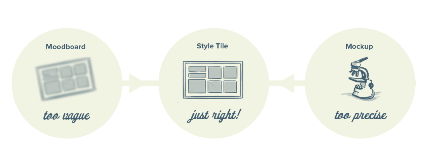
## When to use Style Tiles
> Style tiles are for when a mood board is too vague and a comp is too literal. Style tiles establish a direct connection with actual interface elements without defining the layout.
>-- styletil.es
They work well for clients who have established brands and need them to translate smoothly to the web.
The style tile will aid in an easier adopted design direction for the project using a combination of textures, icons, logos, and content containers.
In personal projects, this is a great way to have a preliminary idea of how your typography, color palette, and element style decisions will work together.
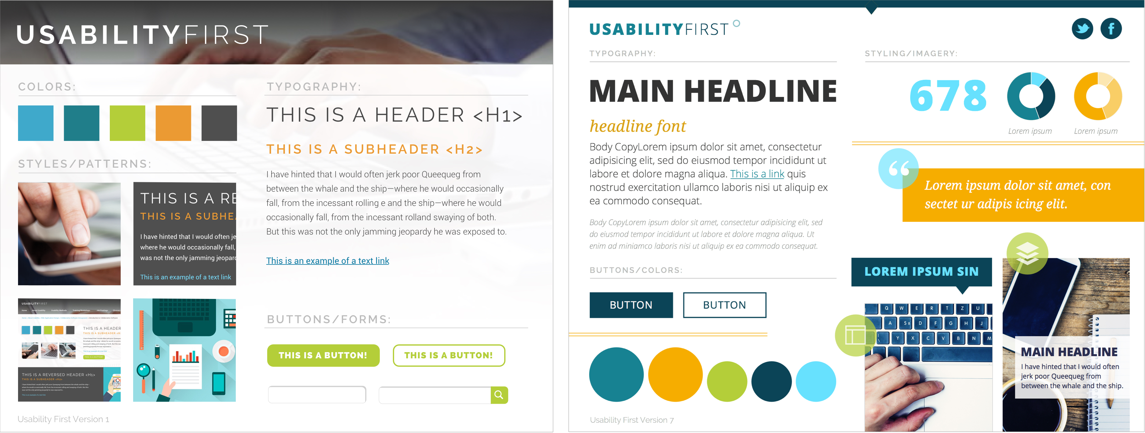
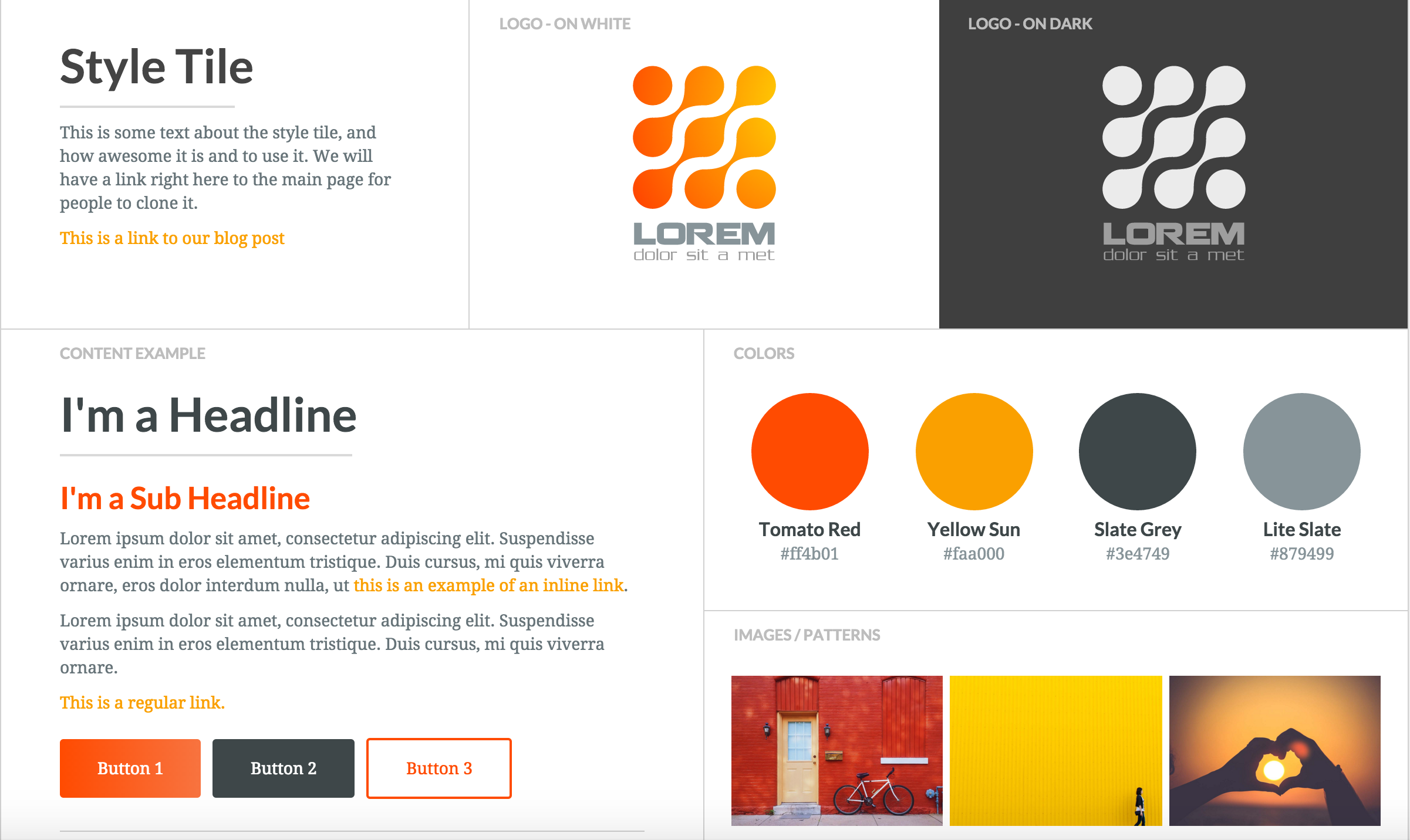
## How to build a Style Tile
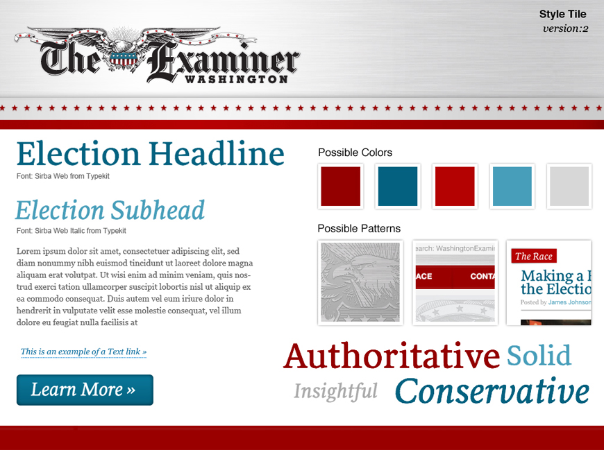
Style Tiles can be laid out however you want, but they should include the core elements of your visual design:
- Typography
- Example of Header, Subheader, Body text
- Font names, sizes, colors
- Examples of Button styles
- Color Swatches (with Hex Codes)
- Example of Text Link
- Any other assets that are relevant to your product
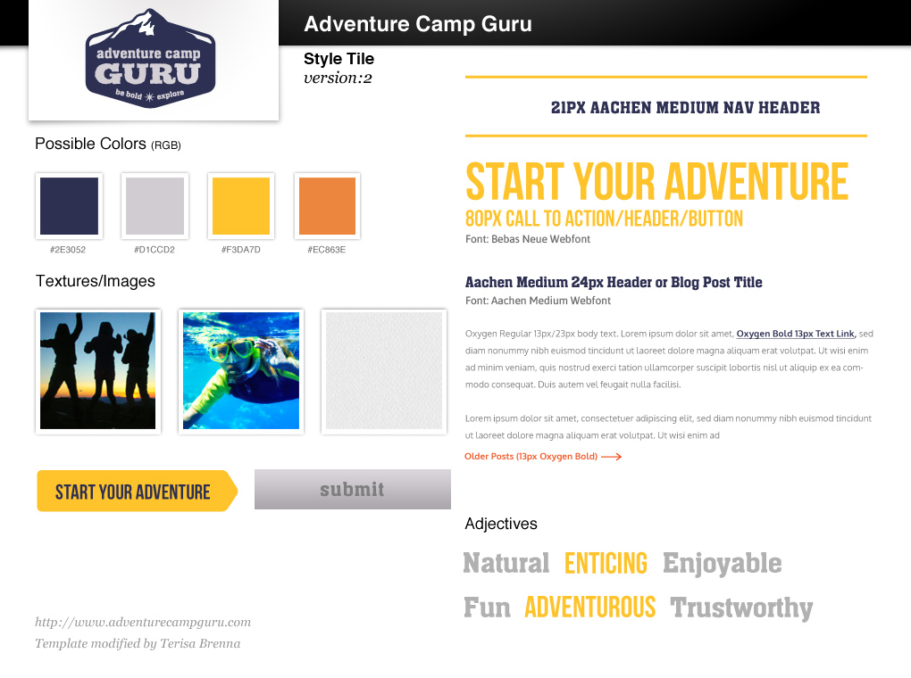
- If there are specific icons or elements that are crucial to the product, you might want to include examples of these
:::info
:book: In this example, the designer included icons, callout links, and even the navigation bar with hover states.
:::
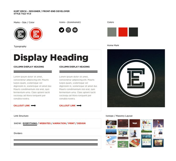
Here is a template you can follow to begin building your Style Tile:
## Summary
- Style Tiles are a design deliverable consisting of fonts, colors and interface elements that communicate the essence of a visual brand **for the web**.
- The main difference between Style Tiles and Moodboards is that Style tiles take the concept of generating several design ideas quickly for clients and **adds the relationships of elements within a design**.
- A style tile is unique from other tools because it is specifically a method for establishing a visual vocabulary between the designer and the client.
- Style tiles are for when a mood board is too vague and a comp is too literal.
- In personal projects, this is a great way to have a preliminary idea of how your typography, color palette, and element style decisions will work together.
## Additional Resources
- [Style Tiles: An Alternative to Full Design Comps](https://webdesign.tutsplus.com/articles/style-tiles-an-alternative-to-full-design-comps--webdesign-7232)
- [Style Tiles](http://styletil.es/)
# Designing Multistate Screens
## Why is important to design not for one state?
In the early days of the web, there was only **static content**.
We used to open a web page, scroll down, see the images and maybe click on a link but that was all. There wasn't a lot of complexity in the interaction. Nowadays, web pages are native apps. They have loading states and error states. You can search, upload, and download content. The complexity of the design has really evolved.
:::success
:eyes: Designing isn't only about the ideal case, the ideal workflow, or the ideal user. It's also about thinking about all the possible states your user is going to interact with.
:::
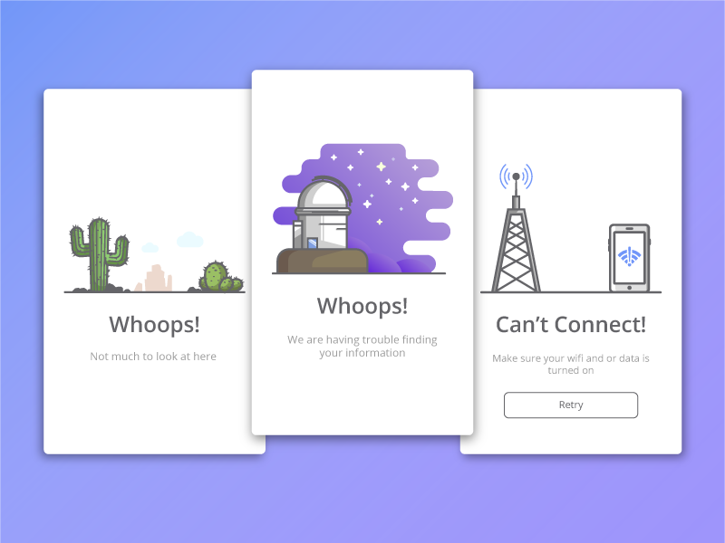
What's the point of crafting a beautiful design for the perfect flow, if when the user encounters an error, the error is shown like the one below? **That's a User Experience too**, we should take care of that.
This learning unit is all about the different states that you need to think of when designing a website/app/whatever.
:::info
:bulb: Every project has its own requirements. We don't need to craft all possible states for all projects. But it's important that our design process is not only focused on the ideal state.
:::
## What is the best method to design Multistates Applications?
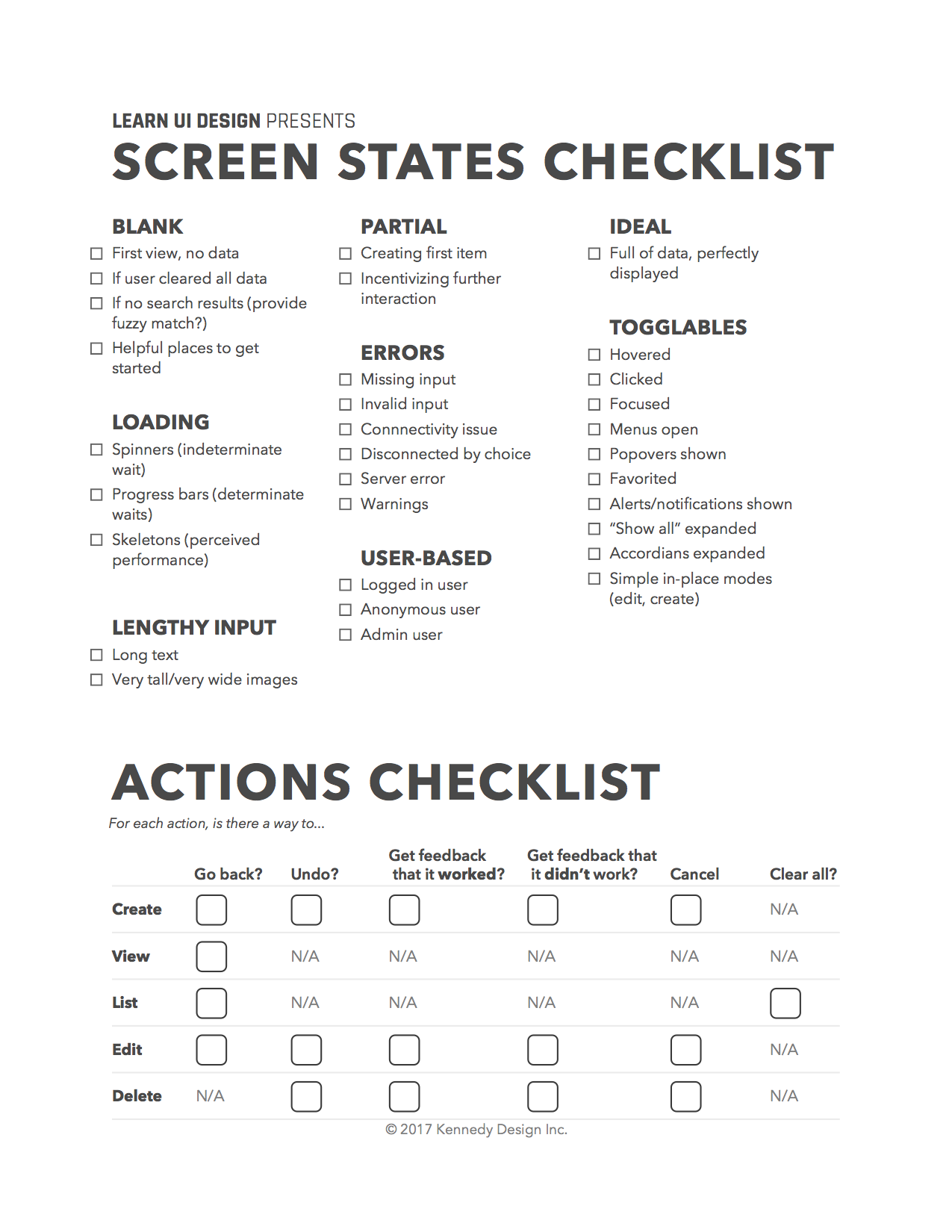
**Checklists and order**.
You are not going to remember all the possible states and all the possible actions your user can take with your design.
That's where checklist and order come in. They help you remember all the possible states, without having to remember it all day.
Here is a checklist example.
Now, we will explain all of these different states and how to take advantage of them.
### Ideal state
This is the state we usually design and think of.
The user is normally logged in. We have plenty of data to show. The information populates the interface in the way that most benefits the design. There are no errors and everything works perfectly. 🦄
Most of the time we spent in an app will be on this screen and this state will be the base of the other states of your app/web.
:::danger
❌ The ideal state is not going to be the only state in your app.
:::
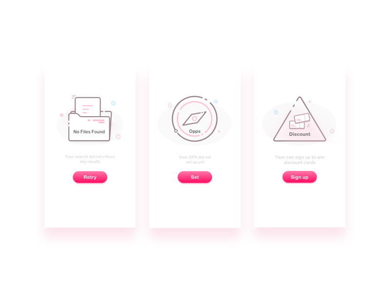
### Blank/empty state
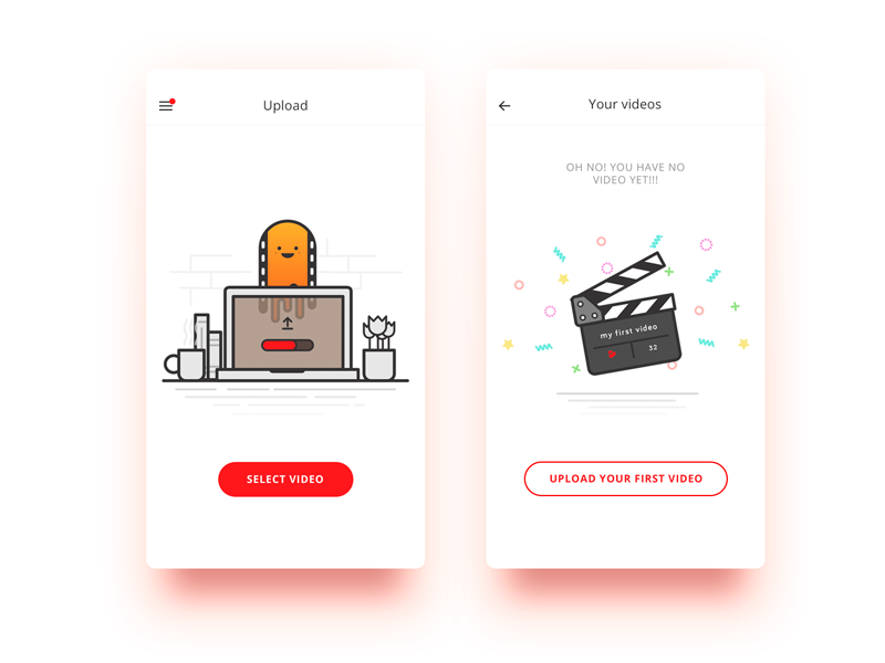
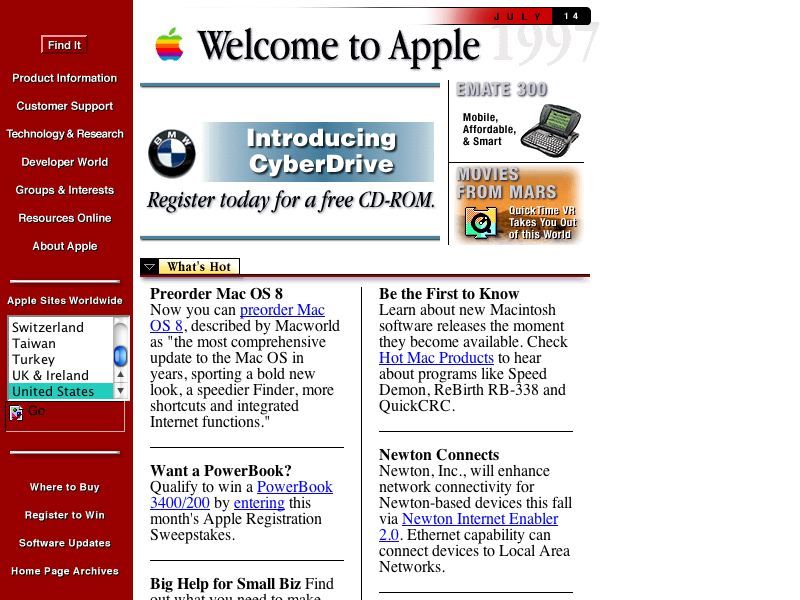
The blank/empty states refer to screens without any data in it. This will be the first impression your user will have of the site or app. Normally, it would be shown only one time.
But remember that it's the **first impression**, so it's full of potential to drive engagement, delight, and retain users.
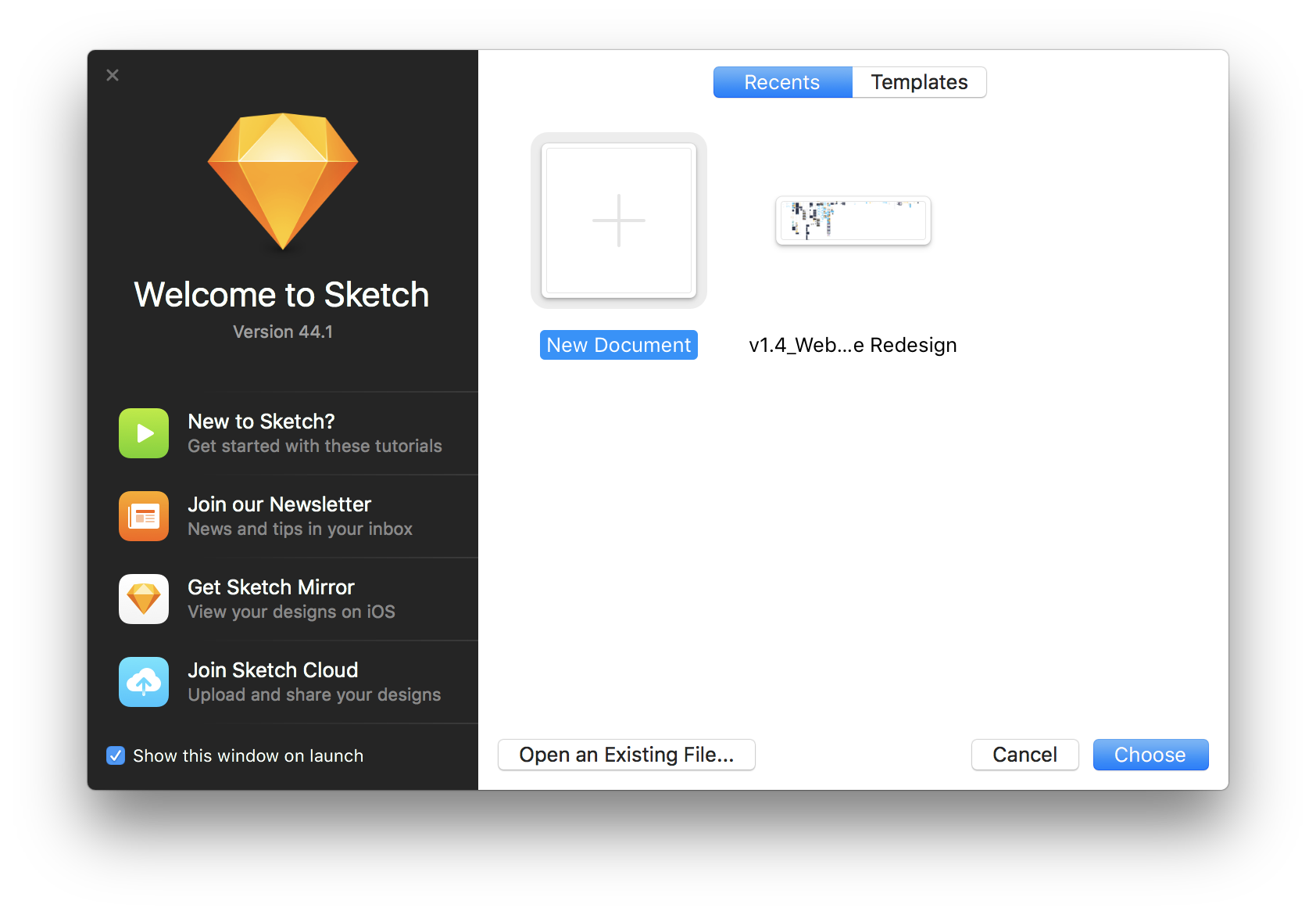
> Here is another example of a blank state in Sketch App.
**What should a blank state do?**
A blank state should **provide orientation and help the user get started**.
This is the perfect screen to:
- Explain how the interface works.
- Recommended actions.
- Provide tutorials.
- Offer tips & tricks.
- Prompt the user to start filling the screen with data.
:::info
🔍 Blank states are also shown when you performed a search but it does not return any results.
In this case, we can show something that might be useful for the user, maybe some "fuzzy" result. Maybe they have misspelled the search they really wanted. Don't only show "There are no results" and provoke a dead end.

:::
:::success
📖 [Here](http://emptystat.es) is a useful resource for finding blank/empty states.
:::
### Partial state
This is the least common state when our users are in the process of using your app, you want them to involve more, add more data and maybe interact more. It's not a necessary state, not all apps/web should have a partial state.
With partial states, we want to **encourage further interaction as the user gets started with the functionality of our app.**
> An example of a partial state in Linkedin
### Loading state
Loading states appear when a user performs an action and there is some delay in the results. For example, the app needs to contact the server to validate the user credentials.
There are three major loading states designs:
- **Skeleton** improves perceived performance over short loading times.

> Here is an example of how Facebook deals with loading screens.
- **Spinners**, normally with loop animations, are most used with indeterminate wait times.

- **Progress bars** show the actual progress of the loading state. Use them to determinate wait times.

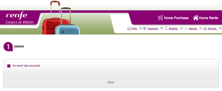
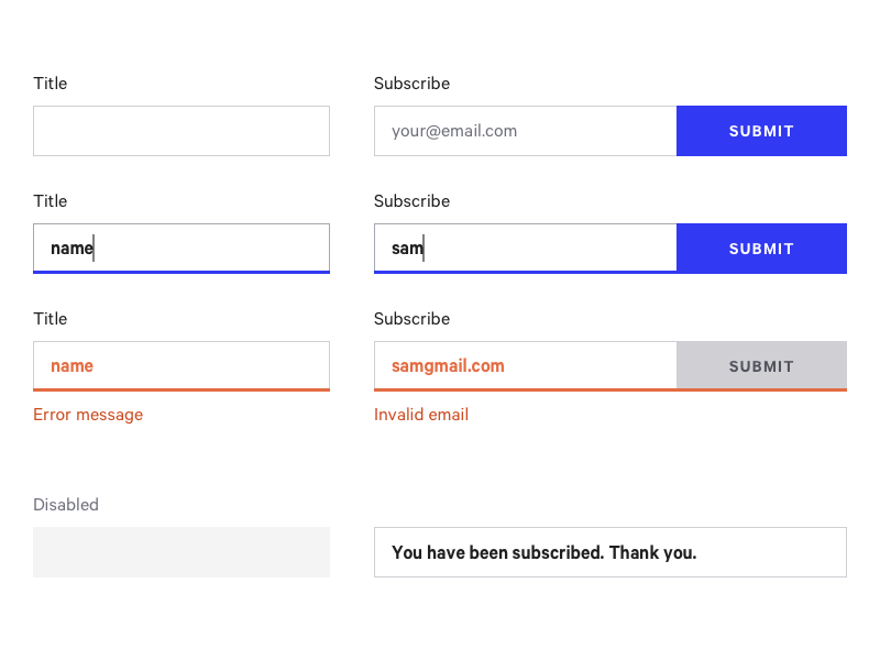
### Error states
Error states are where our users tend to be most frustrated. This is where our app tells a user they can't do something, or the interaction they just did didn't work.
Avoid kicking your user when they're already down. Instead, **make errors friendly and help the user get back on track**, not focusing on failure or errors.
### Toggle states
We have to consider that our components will have many toggle states:
- Hover, clicked, disabled
- Menus open/closed
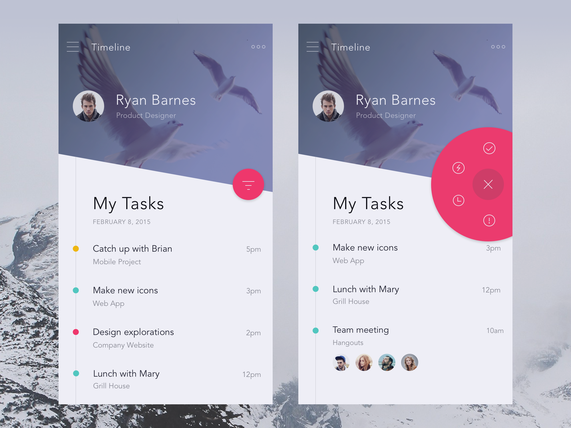
> Here is a great example from Anton Aheichanka.
- Popovers are shown
> Example from Nielsen Ramon.
- Elements favorited/starred
- Alerts, notifications, or new items
- Expanded tabs, expanded text, and their different states.
:::info
🔛 Try to always **stretch** your design, don't design for the ideal state only of text, forms, and other design elements. Try to see what happened with other possible cases.
Design for extra-long and extra-small text in the titles, body content, etc. Consider extremely tall, wide, big or small images.
:::
## Additional Resources
- [Exploring loading screens in app design](https://1stwebdesigner.com/loading-screens-mobile-app-design/)
- [Designing empty states](https://www.uxpin.com/studio/blog/ux-best-practices-designing-the-overlooked-empty-states/)
- [Why empty states deserve more time](https://www.invisionapp.com/blog/why-empty-states-deserve-more-design-time/)
# Style Guides
## Intro to Style Guides
> If you look at companies like Dropbox, Google, and Twitter you’ll notice that they each have their own unique aesthetic. Across all of their products, both mobile and the web, there is a sense of consistency and uniformity in their design.
The way that companies and products achieve consistency is through Style Guides.
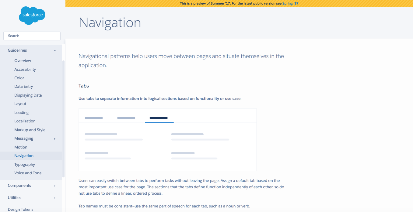
> SalesForce official Style Guide preview Navigation section.
A **Style Guide** is a set of standards that communicate design instructions to a team or organization. Style Guides align designs with a company’s voice and mission.
In a general sense, it is a mature set of guidelines and visual references of a whole digital product that includes not only fonts, colors, style and other UI elements but also much more info that companies may need to carry out a consistent brand strategy.
- Well-known companies, like [Facebook],(https://facebookbrand.com/wp-content/uploads/2016/08/facebook_brandassetsguide.pdf) post their style guides online for everyone to see.
- *Material Design* and *IOS Human Guidelines* are also examples of Style Guides.
- Companies like Shopify and Intercom are even building in-house teams focused on designing systems.
:::info
A thorough Style Guide establishes a common language for **designers, developers, product managers, marketing and external agencies**.
:::
There are many facets to any good design system, starting with company culture/vision/mission and trickling all the way down to branding, copywriting, component libraries, and other.
## **So what should it consist of at a minimum?**

A useful Style Guide should consist of unified UI elements for the brand identity.
- **Color palette**
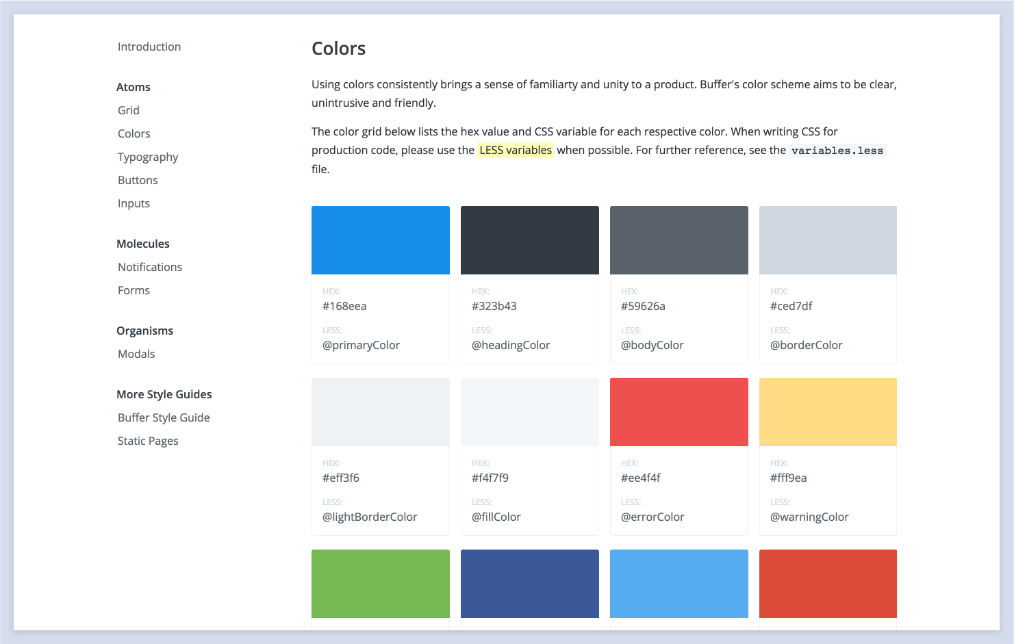
Colors are the most apparent style property. You should have a primary brand color, secondary brand color, and any other colors used in the user interface. Also, include an explanation of the hierarchy and appropriate usage.
- **Logo**
The logo is the face of our product. We have to explain the story behind our brand and explain the constraints.
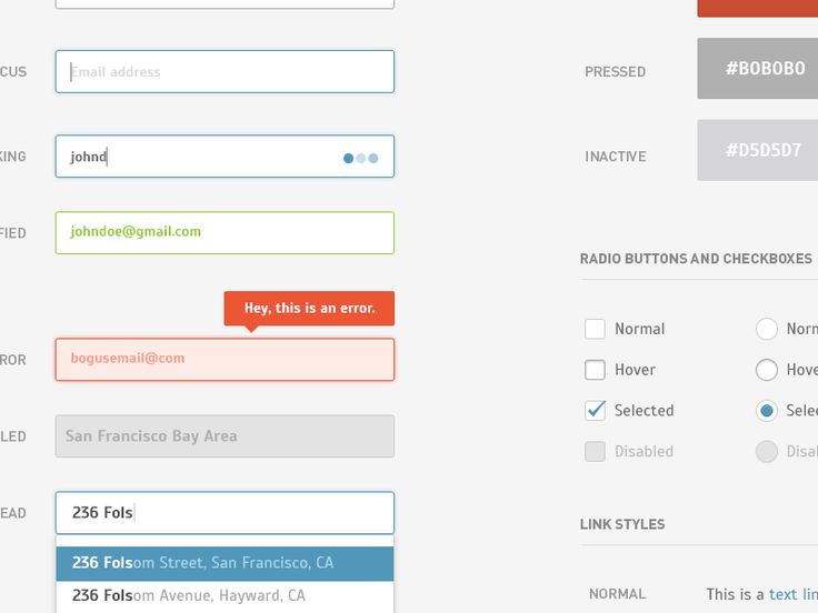
- **Buttons**
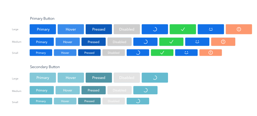
- **Forms**
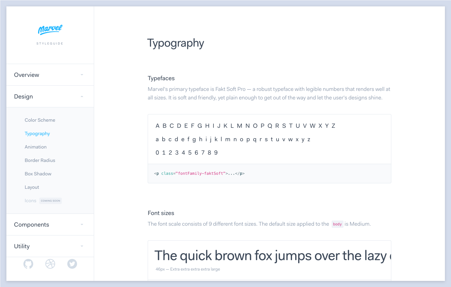
- **Typography**
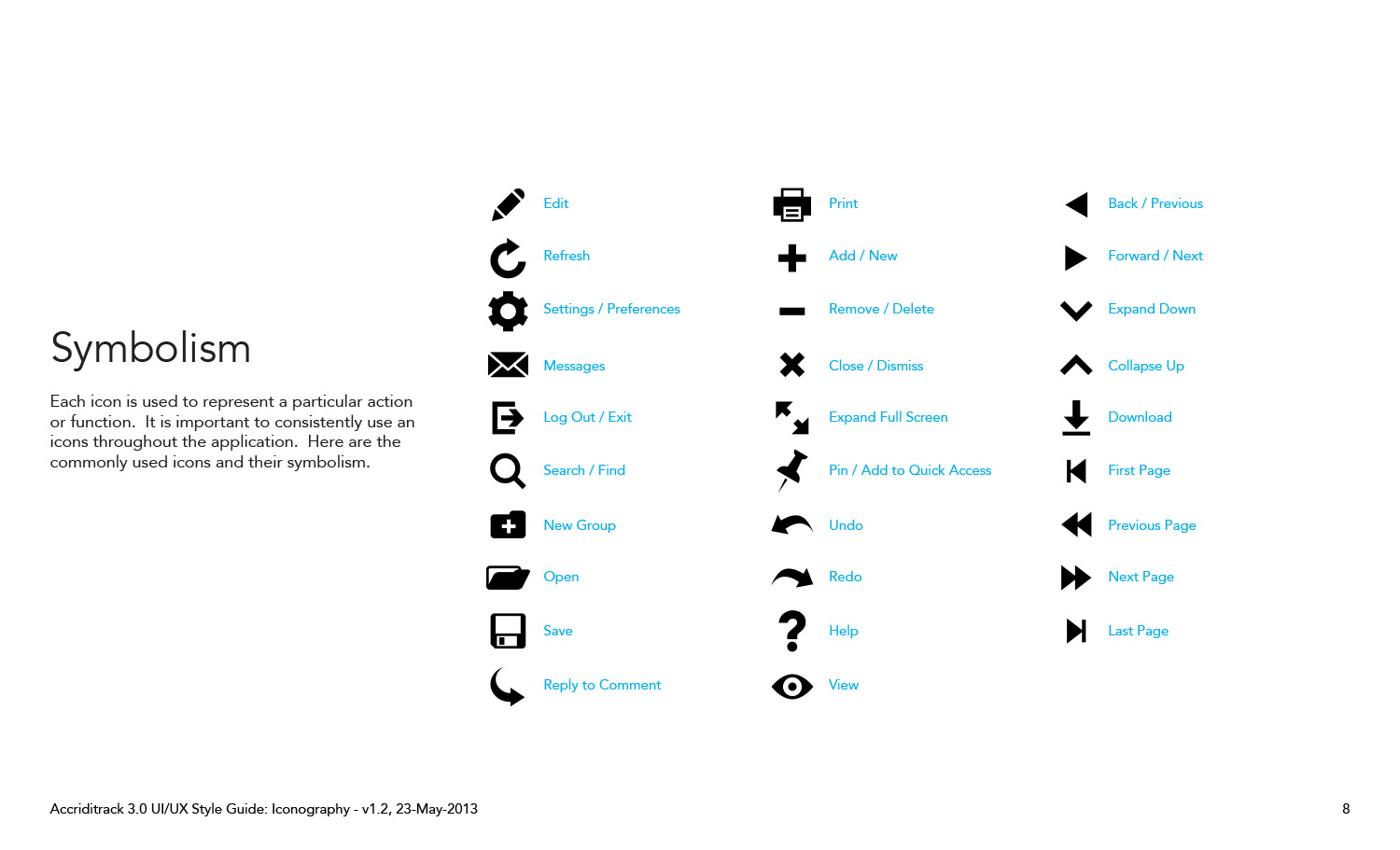
- **Iconography**
- **Dos and Don’ts**
:::success
Check out some other things included in Style Guides in [this Medium article.](https://medium.freecodecamp.org/designing-a-styleguide-elements-that-go-into-functional-and-beautiful-products-ff1621e00a0e)
:::
## Why we need to create Style Guides
**Moodboards** will inspire the design direction. **Style tiles** will translate the mood, feel, and tone of our website or app based on what we learned from the needs of our client and user. But as an internal tool for our design, marketing, content, and development teams, we need a more robust document with specific guidelines.
Here are the three top reasons for us as Designers, to create and maintain Style Guides:
**It maintains the consistency**
With Style Guides, we can keep the appearance consistent by creating a set of rules that follow the design. The process becomes flexible, easily maintained and coordinated.
**It helps us use our time efficiently **
Designing our Style Guide will cut out the time we spend making design decisions. We don't have to reinvent the wheel every time we add a new page or new feature.
**It helps us promote reuse**
Developers will be able to reuse components that they code regardless of the context where they are.
*For example, instead of coding a blue button on the login page and providing it with CSS classes such as "Button-login," they will see this blue button in the Style Guide and give it a "Button-blue" class reused on the website. Reusing the component saves a lot of time for developers. It also ensures that no matter how many devs are working on the code, the CSS labeling remains consistent*
## The ROI of Style Guides and Design Systems

Let's think of Style Guides from the business point of view. Having a Design system will help us:
**Increase velocity and time to market**
A component-based toolkit accessible in one place allows for a more chunked-out Agile process, speeding up releases without compromising quality.
**Increase product value**
Reusable components build upon each other. This creates a consistent look, feel, and behavior of the product. When consistency increases, so do user efficiency.
**Increase collaboration and knowledge sharing**
Because the shared design system includes approved assets and conventions, designers and developers are more autonomous without closing off into silos.
**Less time and money wasted**
Because designers and developers aren’t caught up in redundant questions or repetitive work, they’re freed up for projects that deliver more business value.
## Style Guides Best Practices Examples
## [Salesforce's Lightning Design System](https://www.lightningdesignsystem.com/)
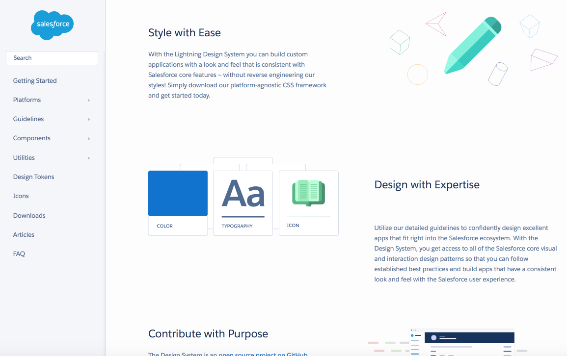
At Salesforce they have developed *Salesforce Lightning principles*. The mission, as they say, is *Rather than focusing on pixels, developers can focus on application logic, while designers can focus on user experience, interactions, and flows*.
Salesforce's Style Guide is an example of an advanced guide with a range of resources for designers and developers, which includes:
- Components
- CSS styles
- Icons, font, and design guidelines
## [GooglePlay](http://googleplay.flatata.com/?ref=mybridge.co)
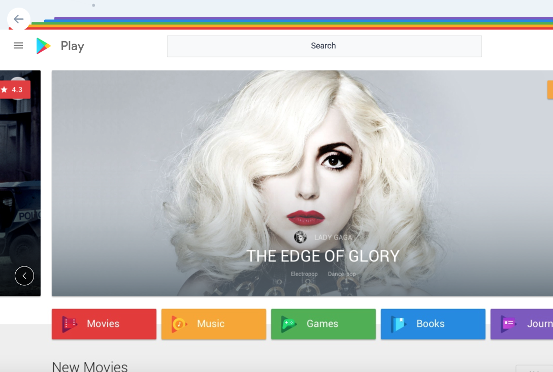
There is no need to introduce **Google** and their products. We've seen and used already style guides of **Material Design**, that is used by millions of Designers Daily.
Let's see another example by Google - A Play Market platform. When the platform was redesigned a unique guide document was created.
A document describes:
- **UX and Design Principles**, which includes elements such as colors, typography, brand iconography, grid systems and etc.
- **Design**, which basically states their main products:
- Store, Play Movies & TV
- Play Music
- Play Apps & Games
- Play Books
- Play Newsstand.
It's an example of a brand and product guided Design System.
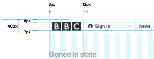
## [BBC Global Experience Language](http://www.bbc.co.uk/gel)
Created for web designers building websites for the BBC, their style guide starts by laying out the philosophy behind the rules.
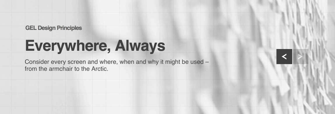
From then on, this document dives deep into the details. We will find information covering the pixel widths of column gutters, grid layout rules, logo positioning guidelines, and everything else we could possibly think of when it comes to creating online content.
## [Shopify](https://polaris.shopify.com/)
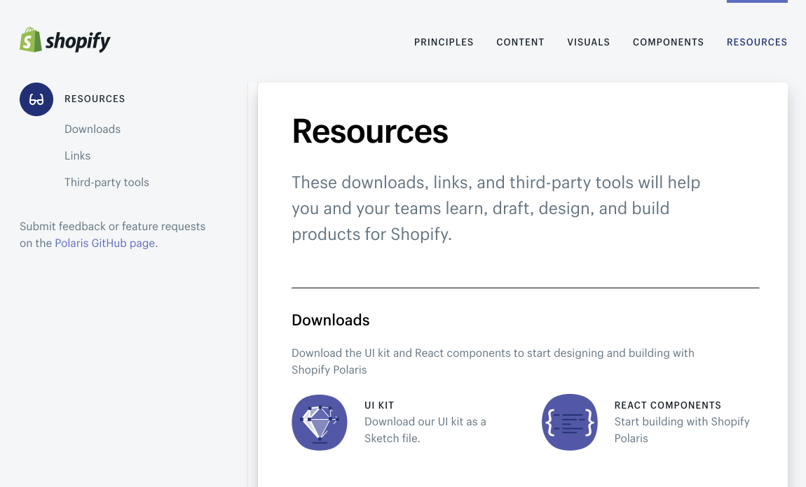
Shopify build products for e-commerce globally. One of the biggest e-commerce platforms split their guides into the following logical chunks:
- Principles
- Content
- Visuals
- Components
- Resources
With this guide, they focus on transmitting and spreading their vision and mission as a product, that helps millions. They have developed their unique principles.
Core elements are placed in Visuals and they use *Do's and Don'ts* and *Problem-Solution* way of explaining the components.
They also provide kits and resources for third parties.
## [MailChimp](http://ux.mailchimp.com/patterns/)
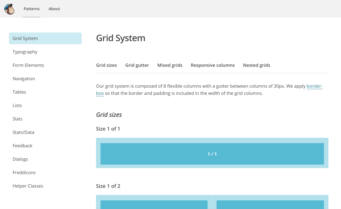
MailChimp is one of the most popular email marketing services around and they’ve made their style guide publically available.
This online document is nicely formatted too, making it one of the easier web design style guides to follow. They have included in mix&match way items such:
- Grid System
- Typography
- Form Elements
- Navigation
- Tables
- Lists and more
As everything is covered here, from grid layouts and typography, through to icons and dialogue boxes, no matter what platform we are designing for, we should be able to get some pointers from the MailChimp style guide.
Web designers and email marketers alike will find the MailChimp style guide a good source of inspiration when it comes to enforcing consistency in their projects.
## Tips in Sketch to create our first Design System
There is a popular Plugin called **Craft** and it lets us generate a custom style in Sketch, including color palette, fonts, and text styles.
:::info
There is a hotkey that creates colors, fonts, and text styles really quickly. Just open your latest and the most completed design, be sure you marked all the necessary elements in symbols and styles and press **SHIFT + COMMAND + C**. You will have a new file created with some guides generated.
:::
 Sign in via Google
 Sign in via Facebook
 Sign in via X(Twitter)
 Sign in via GitHub
 Sign in via Dropbox
 Sign in with Wallet
Connect another wallet
Sign in with Wallet
Connect another wallet