
# Clase 14 - Sistemas de Diseño
## Learning Goals
- Learn what a Design System is.
- Understand the role Design Systems serve in UI/UX.
- Identify the core and additional components of Design Systems.
## What are the Design Systems?
>Design has always been largely about systems, and how to create products in a scalable and repeatable way... These systems enable us to manage the chaos and create better products... A unified design system is essential to building better and faster; better because a cohesive experience is more easily understood by our users, and faster because it gives us a common language to work with.
>-- Airbnb
**Design Systems** (also known as design languages, style guides, or visual identities) are documents that help companies develop superior user experiences and strengthen their brand.
>A design system contains a blueprint of how it all works together, and details how the pieces work, look, and interact. A design system contains many components such as colors, interface elements, animation definitions, technology considerations, and scenarios.
The core components of a Visual Design Systems include *typography, layout, styling, and color*. Having a set of rules on how to use these allows for a consistent user experience that creates a single feeling across all elements. But when you are designing an overall experience, there are more things to consider beyond the visuals.
:::info
:book: **Common types of Design Systems:**
<br>
- **Static style** or **visual identity guides** illustrate how a brand should be presented and how its assets should be used across media. These are often published in PDF format.
- **Voice and tone guides** define a brand’s personality through the way it speaks to it's customers.
- **Front-end code guidelines**, for developers, stipulating coding standards to encourage better collaboration across development teams.
- **Component or pattern libraries** contain examples of how to style the atoms, molecules, organisms, and templates. * Brad Frost describes these in [Atomic Web Design](http://atomicdesign.bradfrost.com/)*)
:::
## Why Design Systems are Important
### Responsive Design
The importance of Design Systems can be especially appreciated in [Responsive Design](https://en.wikipedia.org/wiki/Responsive_web_design).
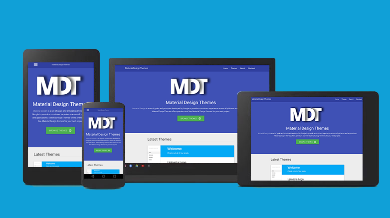
We need to create rules that help us decide which elements will stay constant, and which will be changed around when adapting the design to the different layouts.
### Scalability
As products grow, new functionality, features, and pages, are added to the original design. Additionally, new designers join the team, or outside contractors get thrown into the mix to deliver product additions on a deadline. The software is often built by teams. Sometimes it is built by incredibly large teams of people.
>The challenge to create coherent experiences multiplies exponentially as more people are added to the mix. Also over time, no matter how consistent or small a team is, different people will contribute new solutions and styles, causing experiences to diverge.
>-- Airbnb
Without a design system, a product can lose its identity and start looking like a patchwork quilt really fast! Creating a disjointed user experience.
> Airbnb has experienced a lot of growth over the years. Currently, our design department consists of nearly a dozen functions and outcome teams. It became clear that we needed more systematic ways to guide and leverage our collective efforts.
Having a solid design system in place ensures that the brand and visual language stay consistent, no matter how many features, or team members, are added to the project.
## Components and Content
**Components that stay constant across views:**
- Typeface
- Base unit (pixels, points, percentages, etc.)
- Color
- Styling
**Components that can change across views:**
- Grids
- Layout
- Font size
- Element size
- Leading (line height)
:::info
**Contents must always be the same**
The goal of a design system is to ensure that content is displayed in the most effective manner across all devices on the platform. As such, it is critical that the content is held constant throughout the platform.
:::
## Core visual components
The following section details the most important components of an effective Design System
### **1. Typography**

Since excessive text can negatively impact the user experience, the most important component to begin with a Design System is to set the typography. This allows for a consistent visual tone of the design across all viewport widths.
In setting the typography, it is best to choose one or two typefaces to use throughout the entire system. Pair these with the most legible font sizes, most comfortable measures, and the appropriate viewport widths.
### **2. Grids and layouts**
Grids and Layouts create a flexible, yet solid basis for the overall layout of the design system. The grid layout will change according to the viewport, so it is important to have a system on how these changes will take effect.
- ex: Content that is in 4 columns on a desktop site might have to be redesigned to fit into 1 column for a mobile viewport.

These grid decisions are critically important to maintain the consistency of the design template. Deciding the grid settings leads to simpler decision-making in the future while giving the product a uniform feel regardless of the device.
### **3. Styling**
Styling, in terms of shape and form, allows for a strong, consistent look and feel.
Since [CSS border-radius](https://developer.mozilla.org/en/docs/Web/CSS/border-radius?v=example) has become widely supported by browsers, a lot of designs feature circle themes. These themes are very distinctive and can be used across viewport widths giving them the same united feel regardless of whether or not they’re used in the same way.
This concept also applies to border styles, consistent shadows, and any number of decorative details and textures.

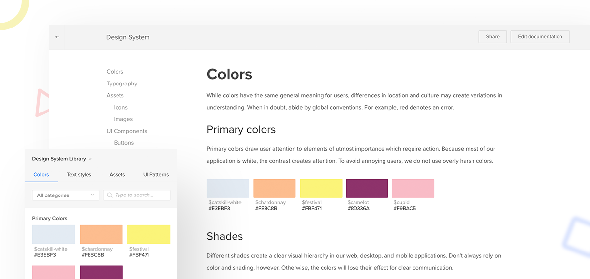
### **4. Color**
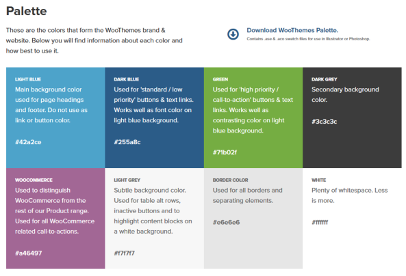
The color is the most basic way to reinforce a brand and unite experiences across viewports. The same hex color should be used across an entire product as this allows for the consistent feel that is instantly recognizable regardless of the platform the product is being viewed on.
## Summary
- Design systems (also known as design languages, style guides, and visual identities) are documents that help companies build better user experiences and a stronger brand.
- The core components are Typography, Grids and Layout, Styling, and Color.
- Design Systems can illustrate a brand's personality and lay out how it should speak to its customers.
- Front-end code guidelines can help provide tips for developers and define the pattern library with all necessary components.
## Additional Resources
- [More Meaningful Typography](https://alistapart.com/article/more-meaningful-typography)
- [Style Guide Best Practices](http://bradfrost.com/blog/post/style-guide-best-practices-at-beyond-tellerrand/?ref=mybridge.co)

# Atomic Design
## Learning Goals
- Understand what Atomic Design is.
- Understand the levels of Atomic Design.
- Understand why Atomic Design is useful.
- Learn how to apply the Atomic Design Principles.
- Learn advanced Sketch concepts.
## What is Atomic Design
Fields such as industrial design and architecture have developed smart modular systems for manufacturing immensely complex objects like airplanes, ships, and skyscrapers.

Inspired by this, Atomic Design was proposed as a system which involves breaking down a website or web application into it's basic components so that they can be reused throughout the site.

The term and methodology were coined by **Brad Frost**, a web designer, speaker, and writer. He’s the author of [Atomic Design](http://atomicdesign.bradfrost.com/).
Atomic Design, introduces a methodology for creating scalable systems and reusable components, instead of the limited "pages" metaphor inherited from the early days of the web. It is also a methodology for creating design systems. There are five distinct levels in *atomic design*:
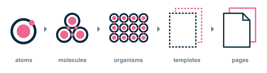
- **Atoms**
- Abstract, basic styles.
- components, colors, fonts, animations, single images.
- **Molecules**
- Combinations of atoms.
- Smallest fundamental units of an interface.
- **Organisms**
- Combinations of molecules.
- Complex, standalone, reusable sections of an interface.
- **Templates**
- Groups of organisms arranged together to form a page layout.
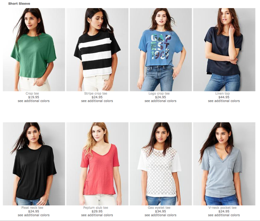
- **Pages**
- Specific instances of templates with real content in place.
*Each of the five stages plays a key role in the hierarchy of an interface design system.*

## Why should we use Atomic Design?
- **Mix and match components**
By breaking down our components into basic atoms, it's easy to see what parts of the site can be mixed and matched to form other molecules or organisms.
- **Style guide creation becomes very simple**
If a site is created according to the Atomic Design principles from the get-go, all the atoms and molecules that are created before the site is built can serve as a basic style guide.
Even for sites that haven't been built atomically, it isn't difficult to extrapolate the basic components and put them together to construct more pages.
- **Easy-to-read code**
The code of "atomically" designed website is typically much easier to read than one created a more traditional way. This is true not only during the time of creation, but also in the future when a site is being looked back on for reference or small tweaks.
- **The code is more consistent**
With Atomic Design, you use predefined atoms to create the site layout. It is easy to see which components are being used for different parts of the site. This reduces the likelihood of writing duplicate code for developers.
- **No need to focus on pixel-perfect designs**
As the idea behind Atomic Design is to use atoms as the building blocks for site creation, it is less likely that a web developer will create many atoms for a similar thing.
Instead, they can simply look through the list of existing atoms, and tweak them to create new atoms if required.
- **Quicker prototyping**
Having a list of atoms before site creation begins means you can mock up pages quickly and easily. All that is required is to pick and combine the required elements for the page. The mockup can then be customized and refined for the final site.
- **Easier to update and remove parts of the site**
Only one atom, molecule or organism is changed at a time. This makes it easy to ensure that any updates to a component are carried out across to all other instances. Similarly, unwanted components can easily be removed.
## Levels of Atomic Design
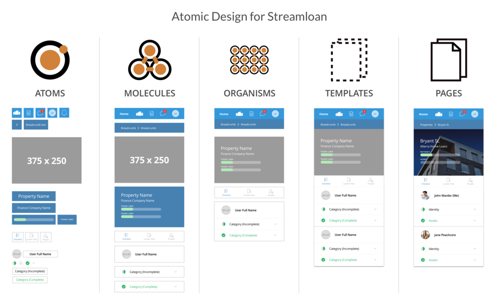
1. **Atoms**
Atoms in interfaces serve as the foundational building blocks that comprise all our user interfaces.

These atoms include basic HTML elements like form labels, inputs, buttons, and others that can’t be broken down any further without ceasing to be functional.
2. **Molecules**

In chemistry, molecules are groups of atoms bonded together that take on distinct new properties.
**In interfaces, MOLECULES are relatively simple groups of UI elements functioning together as a unit.**
For example, a form label, search input, and button can join together to create a search form molecule.

3. **Organisms**

Organisms are relatively complex UI components composed of groups of molecules and/or atoms and/or other organisms.
These organisms form distinct sections of an interface.

While some organisms might consist of different types of molecules, other organisms might consist of the same molecule repeated over and over again.
For instance, go to a category page of almost any e-commerce website and you’ll see a listing of products displayed in some form of the grid.
4. **Templates**

Templates are page-level objects that place components into a layout and articulate the design’s underlying content structure.

5. **Pages**
Pages are specific instances of templates that show what a UI looks like with real representative content in place.
<br>
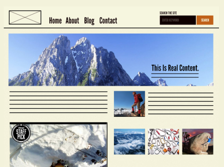
::: info
**Class exercise:**
Let's see how a [demo made by Patternlab](http://demo.patternlab.io/) demonstrates a large-scale Design System in which *Atomic* classification is applied.
:::
:::danger
Atomic Design, like any valuable tool, resource, or concept, doesn’t have to be an all-or-nothing proposition. It’d be a shame to dismiss Atomic Design because every part didn’t instantly fit your situation. Likewise, it’d be a shame to blindly adopt all parts without taking on the task of working through what works best for the team.
:::
## Using **Nested Symbols** in Sketch to design *Atomically*
There are several functionalities in Sketch that help us optimize our designs in a clean and well-organized manner. These are also helpful if you apply Atomic principles.
The main option is working with **symbols**.
:::info
Let's review:

- To create a **nested Symbol**, we need to place an instance layer inside any other Symbol’s master **Artboard**.
- Any updates we make to the Symbol’s master will see the changes multiplying throughout our design. It doesn't matter if they’re inside another Symbol or not.
- :exclamation: There’s no limit to how deep you can nest Symbols, but please note a **Symbol** cannot contain an instance of itself.
- **Nested Symbols** can also be overridden, along with images and text in a Symbol’s instance.

Overriding a nested Symbol will allow you to swap out any Symbols contained in an instance with any other Symbol that is the same size.
<br>

Say you had a Symbol of a toolbar that contains a Symbol of an icon. With the overrides, you could swap out the **icon** Symbol with a Symbol of another icon, or nothing at all.
The change would only occur in that specific instance (copy of the symbol) and not across all the times you have used the symbol throughout the design.
This gives you control over individual screens/artboards while keeping your symbols consistent. If you change what the Library symbol looks like, it will still be updated everywhere.
These nested overrides mean that you can have fewer Symbols that are similar and have more power and control over individual instances.
:::
This video will help you understand how nested symbols work
{%youtube 7HaeAy31-_Q%}
:::info
**Discussion Question**
Can you see how Nested Symbols can help you implement Atomic Design?
:::
## Summary
- Atomic Design is a metaphoric framework for building Design Systems.
- Atomic Design consists of Atoms, Molecules, Organisms, Templates, and Pages.
- Atomic Design is good for creating extremely clean design guides, and scalable systems.
## Additional resources
- [The author of the concept Brad Frost speaks about Atomic Design](https://www.youtube.com/watch?v=84LZyZsTiaA)
- [Atomic UI kits](https://www.sketchappsources.com/free-source/2160-atomic-design-template-sketch-freebie-resource.html)
- [10 reasons to use Atomic Design](http://www.creativebloq.com/web-design/10-reasons-you-should-be-using-atomic-design-61620771)
 Sign in with Wallet
Connect another wallet
Sign in with Wallet
Connect another wallet