---
lang: ja
title: FramerXでデザインと実装をシンクさせる
description: FramerXを開発リポジトリに乗せ、CodeComponentを活用してデザインと実装を常にシンクさせる例をまとめました。内容はこちら→ 1.FramerXを開発用gitリポジトリで差分管理する / 2.デザインと実装のフロー /3.State Manager(状態管理)を混ぜてみる
image: https://i.imgur.com/J77QrvO.png
tags: UIデザイン, UI設計, Framer, FramerX, GUI, ソフトウェアデザイン, ソフトウェア設計, フロントエンド, frontend, TypeScript, JavaScript, React, Mobx, 状態管理, デザインツール, Sketch, Figma, AdobeXD, デザイナー, Designer, UIデザイナー, UI Designer, フロントエンドエンジニア, エンジニア, front-end engineer, engineer
disqus: hackmd
---
# FramerXでデザインと実装をシンクさせる

<br /><br />
デザイナーの使うツールとエンジニアの実装は往々にして距離は遠く、イニシャルの開発の時はある程度足並み揃えられるものの、開発が進み実装とデザインデータが乖離していくなんてことはよくある話です。
その乖離をなるべく解消できないかと思っていたところにFramerXという良いツールが出てきたので、今回はデザイナーとエンジニアの開発フローとも照らし合わせながらそのツールの使い方についてまとめてみようと思います。
:::success
この記事のサンプルはこちら
[https://github.com/tyshgc/framerx-mobx-hooks-example](https://github.com/tyshgc/framerx-mobx-hooks-example)
:::
<br /><br />
### FramerXとは
[FramerX](https://www.framer.com/) はFramer社が開発しているデザインツールです。
SkecthやFigma、Adobe XDのようなツールの様な基本はデザイナーが使うGUIツールです。
オフィシャルサイトには以下のように書かれています。
:::info
Bring your creative ideas to life with Framer X, the best tool for interactive design. Create responsive layouts, design realistic prototypes, and bring everything closer to production—all in one place.
:::
説明ではインタラクティブに最適なデザイン制作のためのツールといったところで、グラフィックだけのDesign ComponentやReactコンポーネントで書けるCode Componentでデザインを構成していかかとが出来るツールです。
詳しいツールの使い方やpros/consは色々なところで言及されているので端折りますが、このFramerXを使うと実際に開発で使われるコードやAPIなどのデータを活用することが容易くなります。
今回は大きく以下の内容で、実際に開発で利用する場合の一例を軽くまとめてみようと思います。
1. **FramerXを開発用gitリポジトリで差分管理する**
2. **デザインと実装のフロー**
3. **State Manager(状態管理)を混ぜてみる**
<br /><br />
---
## FramerXを開発用gitリポジトリで差分管理する
### FramerXプロジェクトの作成
FramerXはまずプロジェクトを作るところから始まります。

普通にプロジェクトを作成すると`{プロジェクト名}.framerx` というバイナリーファイルが生成されます。
###### VSCodeで見ると中身は見えません。

この詳細な中身は以下のようにライブラリフォルダ下にあるキャッシュフォルダに置かれます。
```shell
/Macintosh HD/ユーザ/{ユーザー}/ライブラリ/Caches/com.framer.x/Autosave-{プロジェクトのハッシュ}/container/
```
###### フォルダの中身
<img src="https://i.imgur.com/9rugtFS.png" style="width:20.0em; border-radius: 12px;" /><br /><br />
中身を見ると `package.json` や `tsconfig.json` などパッケージやTypeScriptのコンフィグが用意されています。
また `/code` フォルダには自作したCode Componentが置かれ、`/design` には `document.json` が置かれ、デザインデータをjsonファイルで管理していることがわかります。
つまりこれらは全てgitで管理可能ですので開発のリポジトリにデザインデータを載せることが可能になります。
### gitリポジトリへ移す
そのままプロジェクトを作成してもライブラリフォルダ下に自動で配置されてしまうため保存先を変更しなくてはなりません。
この説明があまりツールの目立ったところにないのはちょっと如何かと思うんですが… FrameXのサイトを見ていくと以下の様に書いてありました。
:::info
Creating a folder-backed project
================================
To create a folder-backed project, create a new Framer X project or open an existing project. With your project open:
<br />
1. Hold the option key on your keyboard
2. In the menu, select **File > Save As**
3. In the save window, use the **File Format** dropdown menu to select **Framer X (folder)**.
You can open a **.framerfx** folder in Finder by right-clicking and selecting "Show Package Contents".
:::
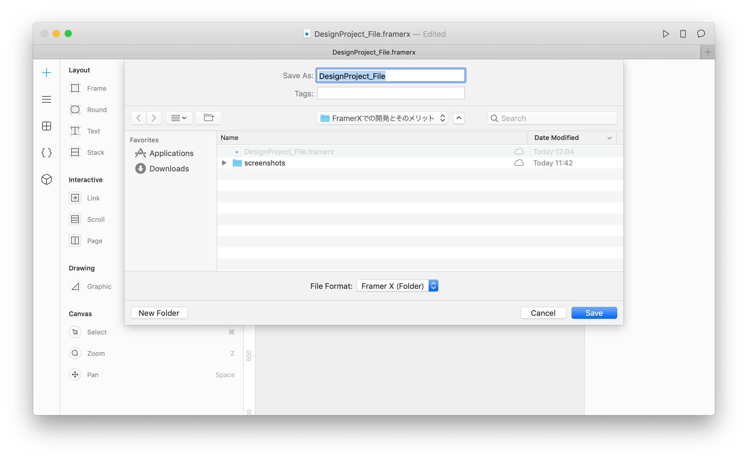
既存プロジェクトでも新規プロジェクトでも、==optionキーを押したままファイル== をクリックするとメニューに`Save As`が表示されます。
==さらにoptionキーを押したままSave Asを選択する== と以下のように `File Formart` が選択できるようになり `Framer X(Folder)` を選択すると `{プロジェクト名}.framerfx` というフォルダプロジェクトに変更できます。
<br /><br />
このフォルダを開発中のリポジトリフォルダ以下に置けばgitで差分管理することが可能になります。
###### 例)creat-react-appで作ったプロジェクト以下に置いた例
<img src="https://i.imgur.com/vodxR0g.png" style="width:20.0em; border-radius: 12px;" /><br /><br />
例として、FramerX側で画面やButtonをDesign Componentとして作ると…

差分として以下のファイルたちが変更されました。
<img src="https://i.imgur.com/Tc6oXaE.png" style="width:40.0em; border-radius: 12px;" /><br /><br />
初回のコミットなので諸々全部含まれていますが、`document.json` でプロジェクトファイルの状態を保存しこれを基本的に自動でアップデートしてきます。
<br /><br />
### Design ComponentをCode Componentにimportする
さきほどの差分に `canvas.tsx` というものがありました。このファイルはDesign Componentをexportできるように自動で定義してくれるものです。
###### DesignProject_File.framerfx/code/canvas.tsx
```javascript=
// WARNING: this file is auto generated, any changes will be lost
import { createDesignComponent, CanvasStore } from "framer"
const canvas = CanvasStore.shared(); // CANVAS_DATA;
export const Gui_parts_Button = createDesignComponent<{parentSize?:{width:number|string,height:number|string},width?:number|string,height?:number|string,label?:string}>(canvas, "id_OZWJeNvcz", {label:"string"}, 237,80);
```
<br /><br />
### Code Componentをつくる
例としてButtonコンポーネントにフラグを渡して角丸の有無をコントロールできるようにしてみましょう。
###### DesignProject_File.framerfx/code/CodeButton.tsx
```typescript=
import * as React from "react";
import { addPropertyControls, ControlType } from "framer";
import { Gui_parts_Button } from "./canvas";
export function CodeButton(props: IProps) {
const { hasRadius, label } = props;
const style = {
// hasRadius値をコンパネから受け取って角丸の有無を判別する
borderRadius: hasRadius ? 999 : 0,
width: "100%",
height: "100%"
};
// styleやlabelのテキストをDesign Componentにpropsで渡す
return <Gui_parts_Button {...{ style, label }} />;
}
interface IProps {
label?: string;
hasRadius: boolean;
}
// addPropertyControlsでFramerのコンパネに任意の値を入力できるようにします。
addPropertyControls(CodeButton, {
hasRadius: {
type: ControlType.Boolean,
title: "角丸つける?"
},
label: {
type: ControlType.String
}
});
```
###### Design Component

Design Componentの`Button` コンポーネント を`CodeButton` コンポーネントに差し替えてみるとこうなります。
###### Code Component

Design Componentではテキストと画像くらいしかpropsとして渡せませんが、Code Componentの場合は `addPropertyControls()` で色々なものを渡すことが可能になります。
[FramerX - Property Control](https://www.framer.com/api/property-controls/)
<br />
このようにReact.jsをある程度理解し、TypeScriptを書くことができることが前提ではありますが… それさえできれば如何様にでもできるのがFramerXの素晴らしいところです。
<br /><br />
### FramerXの可能性
FramerXはReactで開発する際に実装できることはほとんどできるといって過言ではないです。
1. **JavaScriptのライブラリを導入できる**
- 当然UIライブラリなどのReact Componentも使えます。
2. **インタラクションをほぼ実際と同様に表現できる**
- ユーザの入力に対しての表示やアニメーションなどの表現も細かく作れる
- プロトタイピングとしてはより実際のものと同様の動きを体験してもらいやすくなる
- ただし今の所React.js/React Nativeに限る
4. **開発した既存のReact Componentが使える**
- これがおそらく一番大事。
5. **ReduxやMobXなどのState Managerを導入できる**
- unstatedは使ってないので出来るかどうか知らないです。typelessはContextの制約が多かったので試しましたがやめました。
6. **実際のデータをデザインに反映できる**
- これはSketchやFigmaなど他のツールでもAPIやjsonがあればできます。
これまではいくらデザインシステムを頑張って粒度の分解を行ってもデザインデータと実装されたものは真に混ざることはありませんでした。
開発はより多くの共通言語を持つ事でスピードも品質も高まります。その可能性を秘めているものの一つがFramerXだと思います。
<br /><br />
---
## デザインと実装のフロー
デザイナーとエンジニアの協業でFramerXを良さそうということはわかってきました。しかし問題はFramerXでコード扱う場合に ==「デザイナーがコードをかけない」== ことがネックになります。
FramerXはちょっと複雑なことをやろうとするとCode Componentを書かなければなりませんし、Code Componentをエンジニアが書くというのはそれはそれで無駄です(開発には必要ないものですから)。
そこで自分が考える方法としては2つ。
<br />
1. **デザイナーもコード書けるようにがんばる**
2. **デザイナーとエンジニアの役割分担をする**
<br />
1番は今がんばれるくらいなら前からがんばってたのでは?という話になりそうなので置いておいて…。
2番もCode Componentをエンジニアが書くんでしょ?って思うかもしれませんが、Code ComponentはFramerXのためのContainerコンポーネントとして考えて、詳細なコンポーネントはFramerXを見ながら実装してしまえば良いと思います。
:::warning
ちなみにVueやFlutter、Nativeアプリの開発の場合はそもそもFramerXの利点が生かせないので他のツールでいいんじゃないでしょうか。
Framer社が頑張るか早めにOSS化すればワンチャン他のフレームワークや言語で同じことができるようになるかもしれませんが今の所予定はなさそうです。
:::
<br /><br />
### Button Componentを本実装してFramerXに返す
というわけで、エンジニアとしてさきほどのCodeButtonコンポーネントを開発用に実装してみます。
実装といってもCodeComponentでほぼ出来上がっていますが、細かいスタイルなどはDesign Componentを活用していたので残りの部分を実装して調整する感じです。
###### src/components/gui/parts/Button.tsx
```typescript=
import * as React from "react";
import styled from "@emotion/styled";
export function Button(props: IProps) {
const { label, hasRadius, width, height } = props;
return (
<SButton {...{ hasRadius, width, height }}>
<SLabel>{label || "Label..."}</SLabel>
</SButton>
);
}
interface IProps extends IStyleProps {
label?: string;
}
type ICSSSizeProperty = string | number;
interface IStyleProps {
hasRadius: boolean;
width?: ICSSSizeProperty;
height?: ICSSSizeProperty;
}
const SButton = styled.button<IStyleProps>`
width: ${props => (props.width ? `${props.width};` : `100%`)};
height: ${props => (props.height ? `${props.height};` : `100%`)};
border-radius: ${props => (props.hasRadius ? 999 : 0)};
display: flex;
flex-direction: row;
justify-content: center;
background-color: #059bff;
border-radius: 87px;
border: none;
box-shadow: 0px 5px 15px 0px rgba(20, 161, 255, 0.25);
outline: none;
`;
const SLabel = styled.span`
display: block;
height: 34px;
font-family: "Noto Sans JP", sans-serif;
color: #ffffff;
font-size: 29px;
letter-spacing: 0px;
line-height: 1.4;
font-weight: 700;
font-style: normal;
text-align: center;
`;
```
StyleとDOM要素の名付けをしやすいように `@emotion/styled` を使っていますが、基本的にはCodeButton.tsxから実装しています。
次に、CodeButton.tsxにButton.tsxをimportします。
###### DesignProject_File.framerfx/code/CodeButton.tsx
```typescript=
import * as React from "react";
import { addPropertyControls, ControlType } from "framer";
// - import { Gui_parts_Button } from "./canvas";
import { Button } from "../../src/components/gui/parts";
export function CodeButton(props: IProps) {
// - return <Gui_parts_Button {...{ style, label }} />;
return <Button {...props} width="237px" height="72px" />;
;
}
interface IProps {
label?: string;
hasRadius: boolean;
}
addPropertyControls(CodeButton, {
hasRadius: {
type: ControlType.Boolean,
title: "角丸つける?"
},
label: {
type: ControlType.String
}
});
```
尚、Design ComponentのStyle情報はFramerXの右のコンパネにある `Layout | Handoff` のタブで ==Handoff== を選ぶとCSSをコピーできます。
<br />
<img src="https://i.imgur.com/kLulb92.png" style="width:15.0em; border: 1px solid rgba(0,0,0,.2); border-radius: 6px; overflow: hidden;" />
<span style="font-size: 0.8em;">※Styleは多少調整が必要な場合もあります🙇</span>
##### React App(code)
以下は先ほどのButton.tsxを開発中のReactに加えたコードです。
###### src/App.tsx
```typescript=
import React from "react";
import styled from "@emotion/styled";
import { Button } from "./components/gui/parts";
export default function App() {
return (
<SScreen>
<Button
{...{
label: "Click!",
hasRadius: true,
width: "237px",
height: "72px"
}}
/>
</SScreen>
);
}
const SScreen = styled.main`
background: #fff;
display: flex;
flex-direction: column;
justify-content: center;
align-items: center;
min-height: 100vh;
`;
```
#### Preview
FramerXとReact Appをそれぞれプレビューしてみるとこんな感じになります。
- FramerXはPreviewボタンで独自のブラウザ起動
- React AppはiOS SimulatorのSafariでlocalhostにアクセス
###### FramerX
<img src="https://i.imgur.com/ZXzvXxc.png" style="width: 24em;" />
###### React App
<img src="https://i.imgur.com/QrPhYGd.png" style="width: 24em;" />
<br /><br />
### アニメーション
表示や演出によりユーザに適切な情報をフィードバックするところもUIデザインの重要な要素です。マイクロインタラクションとしてのアニメーションをデザインができる方が良いのですが、FramerXはこちらもページ遷移以外はコードで表現するか、FramerXのパッケージを追加してなんとかするしかありません。
ただ、幸いにもFramerMotionというReactアニメーションライブラリがあります(FramerXにも内包されている)。これで実装していくとアニメーションもデザインデータと本実装との共有ができて良いと思います。
<a href="https://www.framer.com/motion/" target="_blank"><img src="https://i.imgur.com/LAG2HR6.png" style="border-radius: 16px; margin-bottom: 12px;" /></a>
[https://www.framer.com/motion/](https://www.framer.com/motion/)
:::warning
ちなみにライブラリは利用できるので、[Lottie](https://airbnb.design/lottie/) や [react-spring](https://github.com/react-spring/react-spring) など他のアニメーションライブラリを活用しても問題ありません。
アイコンなどのアニメーションはLottie + [Haiku](https://www.haikuforteams.com/) の方が圧倒的に良いです。
:::
<br /><br />
### ボタンタップ時にアニメーションをいれてみる
では、FramerMotionでタップ時のアニメーションをいれてみます。
```typescript=
<motion.button whileTap={{ scale: 0.9 }}>
...
</motion>
```
簡単すぎる。。
`motion` のAPIなど詳しくはこちら [https://www.framer.com/api/motion/](https://www.framer.com/api/motion/)
次のコードは実際に実装してみたButtonコンポーネント。
###### src/components/gui/parts/Button.tsx
```typescript=
import * as React from "react";
import styled from "@emotion/styled";
// 以下を追加
import { motion } from "framer-motion";
export function Button(props: IProps) {
const { label, hasRadius, width, height } = props;
// <SButton /> に `whileTap={{ scale: 0.9 }}` を追加
return (
<SButton {...{ hasRadius, width, height }} whileTap={{ scale: 0.9 }}>
<SLabel>{label || "Label..."}</SLabel>
</SButton>
);
}
interface IProps extends IStyleProps {
label?: string;
}
type ICSSSizeProperty = string | number;
interface IStyleProps {
hasRadius: boolean;
width?: ICSSSizeProperty;
height?: ICSSSizeProperty;
}
// styled.button -> styled(motion.button)
// FramerMotionの<motion.button />をemotion/styledでラップ
const SButton = styled(motion.button)<IStyleProps>`
//...略
`;
const SLabel = styled.span`
//...略
`;
```
プレビューするとこんな感じです。

左がReactとしてローカルサーバ立ち上げて実行した様子。右がFramerXのプレビューモードです。同じですね。
<br /><br />
### デザイナーとエンジニアのフロー
ここまでに説明したようにDesign Componentを作成し画面を模したFrameに配置するところまでがデザイナー担当。
その差分をpullしてきて、そのままDesign Componentのpropsやstyleを参照し、React Componentを実装しCode Componentとしてラップする。
最後はFramerXのDesign ComponentのインスタンスをCode Componentに差し替える流れです。これならデザイナーがコードをかけなくてもエンジニアもそれほど負荷にならずに進められると思います。
###### FramerXでのデザインと実装のフロー図

<br /><br />
---
## State Manager(状態管理)を混ぜてみる
ところで、アプリケーションを開発するとGUIなどの状態(State)を扱わなければなりません。
またプロトタイピングで状態を扱えるようになるとわざわざエラー有無の画面を作ったりなどの手間も減ります、それらを作ることをうっかり忘れるなんてことも減ります。
この状態のデータを扱い安くするためにも集約するStoreが欲しくなります。
FramerXで状態をStoreを持たせるには Framerが用意している `Data()` にオブジェクトを渡すことで可能になります。
###### DesignProject_File.framerfx/code/store.ts
```typescript=
import { Data, Override } from "framer";
// Data Store
const data = Data({
count: 0
});
// Override関数
export const Count: Override = () => {
return {
count: data.count,
countUp() {
data.count += 1;
}
};
};
```
<br />
DataはOverride定義したイベントをCode ComponentやDesign ComponentにFramerXの右コンパネのOverrideから渡すことでpropsを上書きして渡すことができます。
<img src="https://i.imgur.com/0ol9D3s.png" style="width:15.0em; border: 1px solid rgba(0,0,0,.2); border-radius: 6px; overflow: hidden;" />
<br /><br />
### DataからState Manager(状態管理)にする
本記事では本実装のコードを共用できることを生かし、State Manager(状態管理)もFramerX上で利用できるようにします。これでいちいちFramerX用にStoreを実装しなくても良くなります。
サンプルでは[MobX](https://mobx.js.org/) + React Hooksを採用してContext ProviderなしでStoreの参照とActionを渡しています。
:::warning
MobXを採用した理由は、当初Typelessで試みましたがContext Provider周りでうまくいかず、かといってReduxは本記事にしては冗長的になるのでUnstatedと悩んでMobXにしました。あと個人的にMobX好きなのも理由(FlutterやReactNativeでの採用実績も海外では多いため)。
:::
#### MobX
まずはMobXの準備をします。MobXはStateインスタンスを用意すればどこからでもimportで参照できます。これは良い点・悪い点がありますがその辺は長くなるので端折ります。
##### Counter Storeの定義
1づつカウントアップしていくだけの単純なやつ。
###### src/mobx/CounterStore.ts
```typescript=
import { observable, action } from "mobx";
export default class CounterStore {
@observable count: number = 0;
@action countUp() {
this.count += 1;
}
}
export type ICounterStore = CounterStore;
```
このあとContext周りをHooksにまとめます。
[参考: MobX と hooks でプレーンな書き味の React コンポーネントを書く](https://qiita.com/kazuma1989/items/16f68cf835031b03fb61)
###### src/mobx/useStore.ts
```typescript=
import { useContext } from "react";
import { useObserver } from "mobx-react";
export type ISelector<TStore, TSelection> = (store: TStore) => TSelection;
export default function useStore<TStore, TSelection>(
context: React.Context<TStore>,
selector: ISelector<TStore, TSelection>
) {
const store = useContext(context);
if (!store) throw new Error("need to wrapp context!!");
return useObserver(() => selector(store));
}
```
諸々インスタンス化します。
###### src/mobx/index.ts
```typescript=
import { createContext } from "react";
import useStore, { ISelector } from "./useStore";
import CounterStore from "./CounterStore";
const Stores: IStores = {
Counter: new CounterStore()
};
const context = createContext(Stores as IStores);
const StoreProvider = context.Provider;
function useGUIStore<TSelection>(selector: ISelector<IStores, TSelection>) {
return useStore(context, selector);
}
export { Stores, useGUIStore, StoreProvider };
export interface IStores {
Counter: CounterStore;
}
```
このindex.tsをimportすればインスタンス化されたCounterStoreの持つ `@action countUp()` を叩けるようになりますが、Storeを直接叩きにいくと後々複数のStoreを一つのイベントで扱う際に重複されるコードがでてくるのでActions Classを作ってそこにまとめます。
###### src/mobx/Actions.ts
```typescript=
import { Stores } from "./index";
const { Counter } = Stores;
class Actions {
countUp() {
Counter.countUp();
}
}
export default new Actions();
export type IActions = Actions;
```
ここまできたら後はHoFなContainer Componentを作ってStoreのStateを渡せるようにします。
```typescript=
import * as React from "react";
import { useGUIStore } from "../../mobx/";
import { ICounterStore } from "../../mobx/CounterStore";
import Actions, { IActions } from "../../mobx/Actions";
export function CounterContainer(render: IComponent) {
const [count] = useGUIStore(stores => [stores.Counter.count]);
const action = Actions.countUp;
return <>{render({ count, action })}</>;
}
type IComponent = (render: IRenderProps) => React.ReactNode;
interface IRenderProps {
count: ICounterStore["count"];
action: IActions["countUp"];
}
```
ここまでがReact App側の実装です。このStoreやActionをFramerX側でも使えるようにします。
<br />
### FramerXでカウンターをつくる
さきほどまでFramerX上ではButtonしかつくっていませんのでカウンターの数字を表示するコンポーネント `NumberView` をつくります。

このままではStoreのデータをもってこれないのでCode Componentを作成します。ついでにNumberViewとButtonを一緒したCode Componentにします。
###### DesignProject_File.framerfx/code/CodeDomainCounter.tsx
```typescript=
import * as React from "react";
import styled from "@emotion/styled";
import { CounterContainer } from "../../src/components/containers";
import { CodeButton } from "./CodeButton";
import { Gui_parts_NumberView } from "./canvas";
export function CodeDomainCounter() {
return CounterContainer(({ count, action }) => {
const countString = `${count}`;
return (
<>
<SNumberView value={countString} />
<CodeButton label="Click!" hasRadius={true} onClick={action} />
</>
);
});
}
const SNumberView = styled(Gui_parts_NumberView)`
position: relative;
margin-bottom: 40px;
`;
```
:::danger
##### 注意するポイント
- DesignComponentのpropsはString型なので `const countString = `${count}`;` で文字列にしています。
- `SNumberView` でstyleに `position: relative;` をいれているのはDesign Componentはそのままだと `absolute` になっているため明示的に変更しています(absoluteだとレイアウトがくずれる)。
<br />
:::
<br />
あとは `CodeDomainCounter` コンポーネントを画面のFrameに配置して完了です。

ただカウントアップしているだけなのでそもそもState Managerなんて必要性ないですが…。
Hooksでロジックや状態を切り分けておいて、必要なプレゼンテーションに組み込むことでReact上でもFramerX上でも同じロジックや状態を使うことができます。
<br /><br />
---
## まとめ
FramerXをうまく使うことによってデザインデータはイニシャル開発でもリリース後でも最終アウトプットである実装されたコードに寄り添うことができます。
またほぼ実際と同じインタラクションをプロトタイピングとして活用できるので ==ユーザによるレビューもこれまでのプロトタイピングツールのそれより遥かに精度の高いものに== できます。
少なくともReact.js / React Nativeでの開発の場合はFramerXを使わない手はないと思います。
 Sign in via Google
 Sign in via Facebook
 Sign in via X(Twitter)
 Sign in via GitHub
 Sign in via Dropbox
 Sign in with Wallet
Connect another wallet
Sign in with Wallet
Connect another wallet