---
title: Astro課程 0729 - CSS(Day9)
tags: astro, css, bootstrap
---
## 時間軸
10:47 幻燈片
10:50 bootstrap components navs "JavaScript behavior"/01.html
11:08 bootstrap components Tooltips/02.html
11:21 bootstrap components Popovers
11:40 改視覺外觀
12:08 bootstrap components Dropdowns 要自己看
12:14 麵包屑/03.html
12:20 bootstrap components List group
12:26 bootstrap components Pagination 分頁導覽
13:40 sizing
13:53 bootstrap components Cards
# 幻燈片的套件
[Owl carousel](https://owlcarousel2.github.io/OwlCarousel2/)
[Swiper](https://swiperjs.com/)
# Nav - javascript
[Nav - JavaScript behavior](https://getbootstrap.com/docs/4.5/components/navs/#javascript-behavior)
- 通常會再使用`div`把這段包起來模組化
- 可以自行增加分頁
```
<li class="nav-item" role="presentation">
<a class="nav-link" id="contact-tab" data-toggle="tab" href="#amos" role="tab" aria-controls="contact" aria-selected="false">Amos</a>
</li>
...
<div class="tab-pane fade" id="amos" role="tabpanel" aria-labelledby="contact-tab">Amos</div>
```
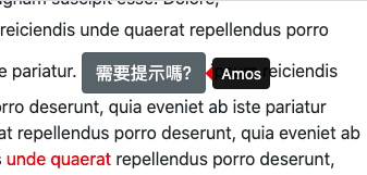
# Tooltips 工具提示
[Tooltips](https://getbootstrap.com/docs/4.5/components/tooltips/)
Eg. 密碼提示使用者該如何填寫
先把js貼在最底下才能啟用此功能
```
<script>
$(function () {
$('[data-toggle="tooltip"]').tooltip()
})
</script>
```
html
```
<button type="button" class="btn btn-secondary" data-toggle="tooltip" data-placement="right" title="Amos">
需要提示嗎?
</button>
<span data-toggle="tooltip" data-placement="right" title="這是工具提示,用的是span標籤">unde quaerat</span>
```
# Popovers
[Popovers](https://getbootstrap.com/docs/4.5/components/popovers/)
Eg. 增加超連結
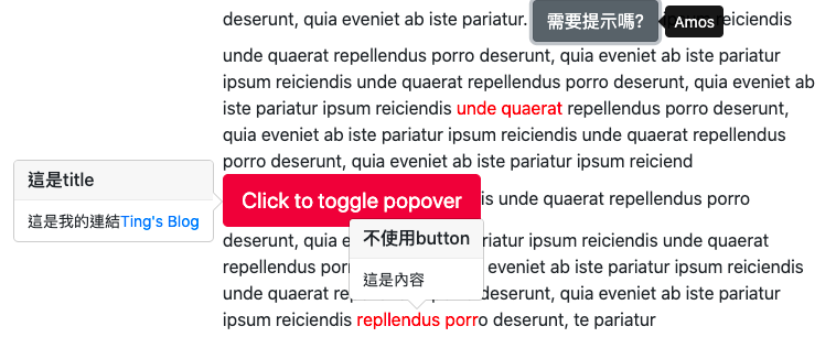
- 加上` data-placement="left"` 可以控制顯示資料的位置
- 跟tooltips類似,但可以增加標籤和內文
```
<button type="button" class="btn btn-lg btn-danger" data-toggle="popover" data-placement="left" title="這是title" data-content="這是內容">Click to toggle popover
</button>
<span data-toggle="popover" data-placement="top" title="不使用button" data-content="這是內容">repllendus porr</span>
```
- 在內文增加超連結
注意:要先在js把超連結啟用
```
$('[data-toggle="popover"]').popover({
html: true
});
```
html
```
<button type="button" class="btn btn-lg btn-danger" data-toggle="popover" data-placement="left" title="這是title" data-content="這是我的連結<a href='https://tingtinghsu.github.io/blog/'>Ting's Blog</a>">Click to toggle popover
</button>
```
## 修改`tooltip`和`popover`的視覺外觀
### 1. tooltip
當移動到設定tooltip的地方時,開發者工具會出現
```
<div class="tooltip fade bs-tooltip-right show" role="tooltip" id="tooltip484416" style="position: absolute; transform: translate3d(808px, 91px, 0px); top: 0px; left: 0px; will-change: transform;" x-placement="right"><div class="arrow" style="top: 8px;"></div><div class="tooltip-inner">Amos</div></div>
```
利用`.bs-tooltip-right`在boostrap原始碼尋找朝左的三角形(右邊框線)
```
.bs-tooltip-right .arrow::before, .bs-tooltip-auto[x-placement^="right"] .arrow::before {
right: 0;
border-width: 0.4rem 0.4rem 0.4rem 0;
border-right-color: #000;
}
```
覆寫顏色
```
.bs-tooltip-right .arrow::before {
border-right-color: red;
}
```
### 2. popover
修改三角形的原始碼
```
.bs-popover-left>.arrow::after {
right: 1px;
border-width: .5rem 0 .5rem .5rem;
border-left-color: pink;
}
```
修改背景色
```
.popover {
background-color: pink;
}
.popover-header {
background-color: yellow;
}
```

# 麵包屑
[breadcrumb](https://getbootstrap.com/docs/4.5/components/breadcrumb/)
把斜線`/`改成`>`
```
.breadcrumb-item+.breadcrumb-item::before {
display: inline-block;
padding-right: .5rem;
color: #6c757d;
content: ">";
}
```
# listgroup
[listgroup](https://getbootstrap.com/docs/4.5/components/list-group/)
# pagination
Q:要思考視覺外觀要怎麼改?
A:背景顏色、間距、外框線、滑鼠移過去要改變顏色(在page-link)......等
[pagination](https://getbootstrap.com/docs/4.5/components/pagination/)
# Card
[Card](https://getbootstrap.com/docs/4.5/components/card/)
放listgroup要放在`card-body`之外,因為`card-body`有設padding,list的字折行會很醜
要學會修改外框色和背景色
# Image
`card-img-top`和`card-img-bottom`圓角的位置不同
文字漸層出現的效果
在指定的圖片外面包一層`div`,以免影響其他的圖片
```
.amos-card .card-img-overlay {
/* display: none; */
opacity: 0;
transition: 1s;
}
.amos-card:hover .card-img-overlay {
opacity: 1;
}
```
# Form 表單
[Form](https://getbootstrap.com/docs/4.5/components/forms/)
分成兩類: `form-group`和 `input-group`
```
<div class="form-group">
<label for="exampleInputEmail1">Email address</label>
<input type="email" class="form-control" id="exampleInputEmail1" aria-describedby="emailHelp">
</div>
```
## form-control
讓欄位吃bootstrap的設定
## form-row
[form-row](https://getbootstrap.com/docs/4.5/components/forms/#form-row)
eg.信用卡輸入欄位
表單的間距不會太大,比較好看
比較容易理解的結構 (格線歸格線)
```
<div class="form-row">
<div class="col">
<div class="form-group">
<label>Amos</label>
<input type="text" name="" id="" class="form-control">
</div>
</div>
<div class="col">
<div class="form-group">
<label>Amos</label>
<input type="text" name="" id="" class="form-control">
</div>
</div>
<div class="col">
<div class="form-group">
<label>Amos</label>
<input type="text" name="" id="" class="form-control">
</div>
</div>
</div>
```
## `col-form-label`
給label用的(所以寫在label裡比較清楚),讓label垂直置中
```
<div class="form-group row">
<div class="col-3">
<div class="col-form-label">文字垂直
置中</div>
</div>
<div class="col-9">
<input type="text" class="form-control">
</div>
</div>
```
如果要文字靠右:`text-right`
## form-inline
inline的話,間距用mr調整
```
<div class="form-inline">
<label class= "mr-5">000</label>
<input type="text" class="form-control">
</div>
```
# form-check
有checkbox 和 radio兩種
結構類似,只是type不同
```
<div class="form-check">
<input class="form-check-input" type="checkbox" value="" id="defaultCheck1">
<label class="form-check-label" for="defaultCheck1">
Default checkbox
</label>
</div>
<div class="form-check">
<input class="form-check-input" type="radio" value="" id="defaultCheck1">
<label class="form-check-label" for="defaultCheck1">
Default radio
</label>
</div>
```
## `form-check-inline`
橫向排列
## custom checkbox
`custom checkbox`比較大 XD

```
<div class="form-check">
<input class="form-check-input" type="checkbox" value="" id="defaultCheck1">
<label class="form-check-label" for="defaultCheck1">
Default checkbox
</label>
</div>
<div class="custom-control custom-checkbox">
<input type="checkbox" class="custom-control-input" id="customCheck1">
<label class="custom-control-label" for="customCheck1">Check this custom checkbox</label>
</div>
```
# Button 按鈕
```
<div>
<a href="#" class="btn btn-warning">link</a>
<div class="btn btn-success">div</div>
<span class="btn btn-info">span</span>
<button class="btn btn-danger">button</button>
<input class="btn btn-primary" type="button" value="input button">
</div>
```
## btn-block
## btn-group
# 使用font-awoesome
[4.7版icon](https://fontawesome.com/v4.7.0/icons/)
[unicode table](https://www.tamasoft.co.jp/en/general-info/unicode.html)
[Amos寫的snippet套件](https://packagecontrol.io/packages/iconfont%20snippets)
CDN
```
https://cdnjs.cloudflare.com/ajax/libs/font-awesome/4.7.0/css/font-awesome.min.css
```
```
.fa-facebook-official:before {
content: "\f230";
}
```
 Sign in via Google
 Sign in via Facebook
 Sign in via X(Twitter)
 Sign in via GitHub
 Sign in via Dropbox
 Sign in with Wallet
Connect another wallet
Sign in with Wallet
Connect another wallet