# 金魚也能學會寫網頁-框架篇
###### tags: `金魚也能學會寫網頁`
> 據說金魚只有七秒的記憶力,那有沒有辦法讓金魚也能快速建置個人網頁呢? 答案是有的!!
> **Bootstrap**是一個前端的網頁框架,框架內有各種已寫好的網頁元件,你只要做3件事,複製、貼上、拼拼圖(Component),就能做出一個基本的前端網頁。:thumbsup:
:::info
**:bulb:Hint:** 文章內所使用的版本是 Bootstrap v4.6.x
:::

## :hourglass_flowing_sand: Setting Environment
> 如果你已經有用習慣的網頁編寫工具,可以選擇略過此部分,下面以VS Code為例

### :bulb: Step 1: 下載並安裝 VS Code
[Download VS Code](https://code.visualstudio.com/)
:point_right:基本上按照預設一直點下一步就行
### :bulb: Step 2: 設定 VS Code 環境
1. 設定Ctrl+滑鼠滾輪的程式碼縮放功能、自動儲存


2. 安裝Live Server套件

### :bulb: Step 3: 使用快捷鍵建立基本架構
1. 開啟欲存放檔案的資料夾
2. 右鍵新增.html檔案
3. 在檔案內輸入 !+Enter 或 !+Tab 自動生成基本架構(如下方程式碼區塊)

```
<!DOCTYPE html>
<html lang="en">
<head>
<meta charset="UTF-8">
<meta http-equiv="X-UA-Compatible" content="IE=edge">
<meta name="viewport" content="width=device-width, initial-scale=1.0">
<title>Document</title>
</head>
<body>
</body>
</html>
```
### :bulb: Step 4: 使用 Live Server 檢視網頁
1. 點擊右下角 Go Live,此時瀏覽器應自動開啟並顯示網頁

:::info
:bulb: **Hint:** 1.若在右下角沒看到 Live Server,請在程式碼區塊內按滑鼠右鍵,點擊 Open with Live Server。 2.網頁預設路徑: 127.0.0.1:5500。
:::

----

----

---
#### :point_down: 檢視你的網頁!

> 成功完成基本環境設定! :laughing:
---
## :memo: Getting Started
### :bulb: Step 1: 複製Bootstrap Template到你的編輯器中
#### [Starter template](https://getbootstrap.com/docs/4.6/getting-started/introduction/)
```
<!doctype html>
<html lang="en">
<head>
<!-- Required meta tags -->
<meta charset="utf-8">
<meta name="viewport" content="width=device-width, initial-scale=1, shrink-to-fit=no">
<!-- Bootstrap CSS -->
<link rel="stylesheet" href="https://cdn.jsdelivr.net/npm/bootstrap@4.6.0/dist/css/bootstrap.min.css" integrity="sha384-B0vP5xmATw1+K9KRQjQERJvTumQW0nPEzvF6L/Z6nronJ3oUOFUFpCjEUQouq2+l" crossorigin="anonymous">
<title>Hello, world!</title>
</head>
<body>
<h1>Hello, world!</h1>
<!-- Optional JavaScript; choose one of the two! -->
<!-- Option 1: jQuery and Bootstrap Bundle (includes Popper) -->
<script src="https://code.jquery.com/jquery-3.5.1.slim.min.js" integrity="sha384-DfXdz2htPH0lsSSs5nCTpuj/zy4C+OGpamoFVy38MVBnE+IbbVYUew+OrCXaRkfj" crossorigin="anonymous"></script>
<script src="https://cdn.jsdelivr.net/npm/bootstrap@4.6.0/dist/js/bootstrap.bundle.min.js" integrity="sha384-Piv4xVNRyMGpqkS2by6br4gNJ7DXjqk09RmUpJ8jgGtD7zP9yug3goQfGII0yAns" crossorigin="anonymous"></script>
<!-- Option 2: Separate Popper and Bootstrap JS -->
<!--
<script src="https://code.jquery.com/jquery-3.5.1.slim.min.js" integrity="sha384-DfXdz2htPH0lsSSs5nCTpuj/zy4C+OGpamoFVy38MVBnE+IbbVYUew+OrCXaRkfj" crossorigin="anonymous"></script>
<script src="https://cdn.jsdelivr.net/npm/popper.js@1.16.1/dist/umd/popper.min.js" integrity="sha384-9/reFTGAW83EW2RDu2S0VKaIzap3H66lZH81PoYlFhbGU+6BZp6G7niu735Sk7lN" crossorigin="anonymous"></script>
<script src="https://cdn.jsdelivr.net/npm/bootstrap@4.6.0/dist/js/bootstrap.min.js" integrity="sha384-+YQ4JLhjyBLPDQt//I+STsc9iw4uQqACwlvpslubQzn4u2UU2UFM80nGisd026JF" crossorigin="anonymous"></script>
-->
</body>
</html>
```
#### :point_down:複製貼上模板程式碼後,網頁畫面如下:

>接下來就是發揮拼圖的實力啦~XD ((ps.純白地獄真D可怕:fearful:
### :bulb: Step 2: 將適合的Bootstrap Component原始碼放入你的網頁中
:point_right: [你的拼圖底加(Bootstrap Components)](https://getbootstrap.com/docs/4.6/components)

#### :point_down: 1. 以網頁導覽列 (nav bar) 為例

<br>

```
<nav class="navbar navbar-expand-lg navbar-light bg-light">
<a class="navbar-brand" href="#">Navbar</a>
<button class="navbar-toggler" type="button" data-toggle="collapse" data-target="#navbarNavAltMarkup" aria-controls="navbarNavAltMarkup" aria-expanded="false" aria-label="Toggle navigation">
<span class="navbar-toggler-icon"></span>
</button>
<div class="collapse navbar-collapse" id="navbarNavAltMarkup">
<div class="navbar-nav">
<a class="nav-link active" href="#">Home <span class="sr-only">(current)</span></a>
<a class="nav-link" href="#">Features</a>
<a class="nav-link" href="#">Pricing</a>
<a class="nav-link disabled" href="#" tabindex="-1" aria-disabled="true">Disabled</a>
</div>
</div>
</nav>
```
:::info
:bulb:**Hint:** Bootstrap 已經預先定義元件的屬性,所以我們可以不用list-based的形式建立導覽列。
<br>
> **Because we use classes for our navs, you can avoid the list-based approach entirely if you like. ---Bootstrap**
:::
#### :point_down: 2. 複製到template

#### :point_down: 3. Component在瀏覽器的外觀

> 相信做到這邊,你已經迫不及待的想開始拼出一個網頁了吧!<br>接下來我將介紹Bootstrap的Layout配置。:smile:
---
## :memo: Layout
> Components and options for laying out your Bootstrap project, including wrapping containers, a powerful grid system, a flexible media object, and responsive utility classes. --- Bootstrap
:::info
**:bulb:Hint:** 在Bootstrap裡,Container是用來放置Components的容器,同時它也關係到網頁在不同尺寸裝置上的外觀。
:::
### :star: 主要有3種不同的Container (CSS Class) :
* .container
* 根據螢幕寬度利用媒體查詢 (Media Query) ,設定變化的斷點,階段性的改變寬度,當改變瀏覽器的大小,頁面將一個階段一個階段變化。
```
<div class="container">
<!-- Content here -->
</div>
```
* .container-fluid
* 不考慮螢幕寬度,始終將寬度設定為auto,當縮放瀏覽器時,保持全屏大小(100%的寬度)。
```
<div class="container-fluid">
...
</div>
```
* .container-{breakpoint}
* 透過Bootstrap寫好的 Media Query 調整頁面
* 如: .container-sm
```
<div class="container-sm">100% wide until small breakpoint</div>
<div class="container-md">100% wide until medium breakpoint</div>
<div class="container-lg">100% wide until large breakpoint</div>
<div class="container-xl">100% wide until extra large breakpoint</div>
```
#### :point_down: .container-{breakpoint} 細節

> 介紹完Container後,緊接著介紹Bootstrap的欄位配置 --- Grid System :wink:
---
## :memo: Grid System
> Use our powerful mobile-first flexbox grid to build layouts of all shapes and sizes thanks to a twelve column system, five default responsive tiers, Sass variables and mixins, and dozens of predefined classes. --- Bootstrap
:::info
**:bulb:Hint:** Bootstrap 以 Grid System 規範網頁的版面配置 (列 - 欄) ,而1列在Bootstrap中被預設劃分為12欄。
:::
### :star: Setting Row & Column
#### :point_down: 不設定的col-size情況下,3欄均分12個欄位大小 (3 X 4)

```
<div class="container">
<div class="row">
<div class="col">
One of three columns
</div>
<div class="col">
One of three columns
</div>
<div class="col">
One of three columns
</div>
</div>
</div>
```
### :star:More Details
#### :arrow_down: 兩種主要col設定方式 (full size: 12):
* col-size 主動配置欄位大小

```
<div class="container">
<div class="row">
<div class="col">col</div>
<div class="col">col</div>
<div class="col">col</div>
<div class="col">col</div>
</div>
<div class="row">
<div class="col-8">col-8</div>
<div class="col-4">col-4</div>
</div>
</div>
<!-- 只寫.col時,會根據.col的數量均分12欄 -->
```
* col-{breakpoint}-size 根據螢幕大小調整欄位配置

```
<div class="container">
<div class="row">
<div class="col-sm-8">col-sm-8</div>
<div class="col-sm-4">col-sm-4</div>
</div>
<div class="row">
<div class="col-sm">col-sm</div>
<div class="col-sm">col-sm</div>
<div class="col-sm">col-sm</div>
</div>
</div>
```
:::info
**:bulb:Hint:** 關於breakpoint的設定,請參照上方的 .container-{breakpoint} 細節。
:::
> 最後,讓我們動手拼出一個網頁吧! GOGOGO~ :punch:
---
## :memo: Web Page Implementation
### :bulb: Step 1: 尋找要用到的[Component](https://getbootstrap.com/docs/4.6/components/)放到Starter Template
#### 我的規劃:
* Nav Bar

```
<nav class="navbar navbar-expand-lg navbar-light bg-light">
<a class="navbar-brand" href="#">Navbar</a>
<button class="navbar-toggler" type="button" data-toggle="collapse" data-target="#navbarTogglerDemo02" aria-controls="navbarTogglerDemo02" aria-expanded="false" aria-label="Toggle navigation">
<span class="navbar-toggler-icon"></span>
</button>
<div class="collapse navbar-collapse" id="navbarTogglerDemo02">
<ul class="navbar-nav mr-auto mt-2 mt-lg-0">
<li class="nav-item active">
<a class="nav-link" href="#">Home <span class="sr-only">(current)</span></a>
</li>
<li class="nav-item">
<a class="nav-link" href="#">Link</a>
</li>
<li class="nav-item">
<a class="nav-link disabled" href="#" tabindex="-1" aria-disabled="true">Disabled</a>
</li>
</ul>
<form class="form-inline my-2 my-lg-0">
<input class="form-control mr-sm-2" type="search" placeholder="Search">
<button class="btn btn-outline-success my-2 my-sm-0" type="submit">Search</button>
</form>
</div>
</nav>
```
* Carousel (原版沒有圖片,可以自行設定)

```
<div id="carouselExampleCaptions" class="carousel slide" data-ride="carousel">
<ol class="carousel-indicators">
<li data-target="#carouselExampleCaptions" data-slide-to="0" class="active"></li>
<li data-target="#carouselExampleCaptions" data-slide-to="1"></li>
<li data-target="#carouselExampleCaptions" data-slide-to="2"></li>
</ol>
<div class="carousel-inner">
<div class="carousel-item active">
<img src="https://picsum.photos/1200/300?random=18https://picsum.photos/1200/300?random=18" class="d-block w-100" alt="...">
<div class="carousel-caption d-none d-md-block">
<h5>First slide label</h5>
<p>Some representative placeholder content for the first slide.</p>
</div>
</div>
<div class="carousel-item">
<img src="https://picsum.photos/1200/300?random=19" class="d-block w-100" alt="...">
<div class="carousel-caption d-none d-md-block">
<h5>Second slide label</h5>
<p>Some representative placeholder content for the second slide.</p>
</div>
</div>
<div class="carousel-item">
<img src="https://picsum.photos/1200/300?random=20" class="d-block w-100" alt="...">
<div class="carousel-caption d-none d-md-block">
<h5>Third slide label</h5>
<p>Some representative placeholder content for the third slide.</p>
</div>
</div>
</div>
<a class="carousel-control-prev" href="#carouselExampleCaptions" role="button" data-slide="prev">
<span class="carousel-control-prev-icon" aria-hidden="true"></span>
<span class="sr-only">Previous</span>
</a>
<a class="carousel-control-next" href="#carouselExampleCaptions" role="button" data-slide="next">
<span class="carousel-control-next-icon" aria-hidden="true"></span>
<span class="sr-only">Next</span>
</a>
</div>
```
* Breadcrumb

```
<nav aria-label="breadcrumb">
<ol class="breadcrumb">
<li class="breadcrumb-item"><a href="#">Home</a></li>
<li class="breadcrumb-item"><a href="#">Library</a></li>
<li class="breadcrumb-item active" aria-current="page">Data</li>
</ol>
</nav>
```
* List Group

```
<ul class="list-group">
<li class="list-group-item active" aria-current="true">An active item</li>
<li class="list-group-item">A second item</li>
<li class="list-group-item">A third item</li>
<li class="list-group-item">A fourth item</li>
<li class="list-group-item">And a fifth one</li>
</ul>
```
* Image Gallery (自行設計的Component)

```
<div class="col-12 col-md-9">
<h1>title</h1>
<p>List groups are a flexible and powerful component for displaying a series of content. Modify and extend them to support just about any content within.</p>
<div class="row item-group">
<div class="col-12 col-md-3">
<div class="item">
<img class="img-fluid" src="https://picsum.photos/300/200?random=8">
<h3>title</h3>
<p>List groups are a flexible and powerful component for displaying</p>
</div>
</div>
<div class="col-12 col-md-3">
<div class="item">
<img class="img-fluid" src="https://picsum.photos/300/200?random=2">
<h3>title</h3>
<p>List groups are a flexible and powerful component for displaying</p>
</div>
</div>
<div class="col-12 col-md-3">
<div class="item">
<img class="img-fluid" src="https://picsum.photos/300/200?random=4">
<h3>title</h3>
<p>List groups are a flexible and powerful component for displaying</p>
</div>
</div>
<div class="col-12 col-md-3">
<div class="item">
<img class="img-fluid" src="https://picsum.photos/300/200?random=5">
<h3>title</h3>
<p>List groups are a flexible and powerful component for displaying</p>
</div>
</div>
<div class="col-12 col-md-3">
<div class="item">
<img class="img-fluid" src="https://picsum.photos/300/200?random=38">
<h3>title</h3>
<p>List groups are a flexible and powerful component for displaying</p>
</div>
</div>
<div class="col-12 col-md-3">
<div class="item">
<img class="img-fluid" src="https://picsum.photos/300/200?random=32">
<h3>title</h3>
<p>List groups are a flexible and powerful component for displaying</p>
</div>
</div>
<div class="col-12 col-md-3">
<div class="item">
<img class="img-fluid" src="https://picsum.photos/300/200?random=34">
<h3>title</h3>
<p>List groups are a flexible and powerful component for displaying</p>
</div>
</div>
<div class="col-12 col-md-3">
<div class="item">
<img class="img-fluid" src="https://picsum.photos/300/200?random=35">
<h3>title</h3>
<p>List groups are a flexible and powerful component for displaying</p>
</div>
</div>
</div>
</div>
```
* Pagination

```
<nav aria-label="Page navigation example">
<ul class="pagination justify-content-center">
<li class="page-item">
<a class="page-link" href="#" aria-label="Previous">
<span aria-hidden="true">«</span>
</a>
</li>
<li class="page-item"><a class="page-link" href="#">1</a></li>
<li class="page-item"><a class="page-link" href="#">2</a></li>
<li class="page-item"><a class="page-link" href="#">3</a></li>
<li class="page-item">
<a class="page-link" href="#" aria-label="Next">
<span aria-hidden="true">»</span>
</a>
</li>
</ul>
</nav>
```
* Footer (自行設計的Component)

```
<div class="container-fluid main-footer text-center">
© copyright by QI-XIANG 2021
</div>
```
### :bulb: Step 2: 將 Component 依序放進 [Starter Template](https://getbootstrap.com/docs/4.6/getting-started/introduction/)
#### :point_down: 結果如下:

> 看起來還不錯,但還可以再做些調整,讓網頁更加美觀。:smirk:
### :bulb: Step 3 (Optional): 網頁細部調整
#### :point_down: 請將下方程式碼複製到新檔案中
```
<!doctype html>
<html lang="en">
<head>
<!-- Required meta tags -->
<meta charset="utf-8">
<meta name="viewport" content="width=device-width, initial-scale=1, shrink-to-fit=no">
<!-- Bootstrap CSS -->
<link rel="stylesheet" href="https://cdn.jsdelivr.net/npm/bootstrap@4.6.0/dist/css/bootstrap.min.css" integrity="sha384-B0vP5xmATw1+K9KRQjQERJvTumQW0nPEzvF6L/Z6nronJ3oUOFUFpCjEUQouq2+l" crossorigin="anonymous">
<title>Hello, world!</title>
</head>
<body>
<nav class="navbar navbar-expand-lg navbar-light bg-light">
<a class="navbar-brand" href="#">Navbar</a>
<button class="navbar-toggler" type="button" data-toggle="collapse" data-target="#navbarTogglerDemo02" aria-controls="navbarTogglerDemo02" aria-expanded="false" aria-label="Toggle navigation">
<span class="navbar-toggler-icon"></span>
</button>
<div class="collapse navbar-collapse" id="navbarTogglerDemo02">
<ul class="navbar-nav mr-auto mt-2 mt-lg-0">
<li class="nav-item active">
<a class="nav-link" href="#">Home <span class="sr-only">(current)</span></a>
</li>
<li class="nav-item">
<a class="nav-link" href="#">Link</a>
</li>
<li class="nav-item">
<a class="nav-link disabled" href="#" tabindex="-1" aria-disabled="true">Disabled</a>
</li>
</ul>
<form class="form-inline my-2 my-lg-0">
<input class="form-control mr-sm-2" type="search" placeholder="Search">
<button class="btn btn-outline-success my-2 my-sm-0" type="submit">Search</button>
</form>
</div>
</nav>
<div id="carouselExampleCaptions" class="carousel slide" data-ride="carousel">
<ol class="carousel-indicators">
<li data-target="#carouselExampleCaptions" data-slide-to="0" class="active"></li>
<li data-target="#carouselExampleCaptions" data-slide-to="1"></li>
<li data-target="#carouselExampleCaptions" data-slide-to="2"></li>
</ol>
<div class="carousel-inner">
<div class="carousel-item active">
<img src="https://picsum.photos/1200/300?random=18" class="d-block w-100" alt="...">
<div class="carousel-caption d-none d-md-block">
<h5>First slide label</h5>
<p>Some representative placeholder content for the first slide.</p>
</div>
</div>
<div class="carousel-item">
<img src="https://picsum.photos/1200/300?random=19" class="d-block w-100" alt="...">
<div class="carousel-caption d-none d-md-block">
<h5>Second slide label</h5>
<p>Some representative placeholder content for the second slide.</p>
</div>
</div>
<div class="carousel-item">
<img src="https://picsum.photos/1200/300?random=20" class="d-block w-100" alt="...">
<div class="carousel-caption d-none d-md-block">
<h5>Third slide label</h5>
<p>Some representative placeholder content for the third slide.</p>
</div>
</div>
</div>
<a class="carousel-control-prev" href="#carouselExampleCaptions" role="button" data-slide="prev">
<span class="carousel-control-prev-icon" aria-hidden="true"></span>
<span class="sr-only">Previous</span>
</a>
<a class="carousel-control-next" href="#carouselExampleCaptions" role="button" data-slide="next">
<span class="carousel-control-next-icon" aria-hidden="true"></span>
<span class="sr-only">Next</span>
</a>
</div>
<nav aria-label="breadcrumb">
<ol class="breadcrumb">
<li class="breadcrumb-item"><a href="#">Home</a></li>
<li class="breadcrumb-item"><a href="#">Library</a></li>
<li class="breadcrumb-item active" aria-current="page">Data</li>
</ol>
</nav>
<div class="container">
<div class="row">
<div class="col-12 col-md-3">
<div class="list-group">
<a href="#" class="list-group-item list-group-item-action active" aria-current="true">The current link item</a>
<a href="#" class="list-group-item list-group-item-action">A second link item</a>
<a href="#" class="list-group-item list-group-item-action">A third link item</a>
<a href="#" class="list-group-item list-group-item-action">A fourth link item</a>
<a href="#" class="list-group-item list-group-item-action disabled" tabindex="-1" aria-disabled="true">A disabled link item</a>
</div>
</div>
<div class="col-12 col-md-9">
<h1>title</h1>
<p>List groups are a flexible and powerful component for displaying a series of content. Modify and extend them to support just about any content within.</p>
<div class="row item-group">
<div class="col-12 col-md-3">
<div class="item">
<img class="img-fluid" src="https://picsum.photos/300/200?random=8">
<h3>title</h3>
<p>List groups are a flexible and powerful component for displaying</p>
</div>
</div>
<div class="col-12 col-md-3">
<div class="item">
<img class="img-fluid" src="https://picsum.photos/300/200?random=2">
<h3>title</h3>
<p>List groups are a flexible and powerful component for displaying</p>
</div>
</div>
<div class="col-12 col-md-3">
<div class="item">
<img class="img-fluid" src="https://picsum.photos/300/200?random=4">
<h3>title</h3>
<p>List groups are a flexible and powerful component for displaying</p>
</div>
</div>
<div class="col-12 col-md-3">
<div class="item">
<img class="img-fluid" src="https://picsum.photos/300/200?random=5">
<h3>title</h3>
<p>List groups are a flexible and powerful component for displaying</p>
</div>
</div>
<div class="col-12 col-md-3">
<div class="item">
<img class="img-fluid" src="https://picsum.photos/300/200?random=38">
<h3>title</h3>
<p>List groups are a flexible and powerful component for displaying</p>
</div>
</div>
<div class="col-12 col-md-3">
<div class="item">
<img class="img-fluid" src="https://picsum.photos/300/200?random=32">
<h3>title</h3>
<p>List groups are a flexible and powerful component for displaying</p>
</div>
</div>
<div class="col-12 col-md-3">
<div class="item">
<img class="img-fluid" src="https://picsum.photos/300/200?random=34">
<h3>title</h3>
<p>List groups are a flexible and powerful component for displaying</p>
</div>
</div>
<div class="col-12 col-md-3">
<div class="item">
<img class="img-fluid" src="https://picsum.photos/300/200?random=35">
<h3>title</h3>
<p>List groups are a flexible and powerful component for displaying</p>
</div>
</div>
</div>
</div>
</div>
</div>
<nav aria-label="Page navigation example">
<ul class="pagination justify-content-center">
<li class="page-item">
<a class="page-link" href="#" aria-label="Previous">
<span aria-hidden="true">«</span>
</a>
</li>
<li class="page-item"><a class="page-link" href="#">1</a></li>
<li class="page-item"><a class="page-link" href="#">2</a></li>
<li class="page-item"><a class="page-link" href="#">3</a></li>
<li class="page-item">
<a class="page-link" href="#" aria-label="Next">
<span aria-hidden="true">»</span>
</a>
</li>
</ul>
</nav>
<div class="container-fluid main-footer text-center">
© copyright by QI-XIANG 2021
</div>
<!-- Optional JavaScript; choose one of the two! -->
<!-- Option 1: jQuery and Bootstrap Bundle (includes Popper) -->
<script src="https://code.jquery.com/jquery-3.5.1.slim.min.js" integrity="sha384-DfXdz2htPH0lsSSs5nCTpuj/zy4C+OGpamoFVy38MVBnE+IbbVYUew+OrCXaRkfj" crossorigin="anonymous"></script>
<script src="https://cdn.jsdelivr.net/npm/bootstrap@4.6.0/dist/js/bootstrap.bundle.min.js" integrity="sha384-Piv4xVNRyMGpqkS2by6br4gNJ7DXjqk09RmUpJ8jgGtD7zP9yug3goQfGII0yAns" crossorigin="anonymous"></script>
<!-- Option 2: Separate Popper and Bootstrap JS -->
<!--
<script src="https://code.jquery.com/jquery-3.5.1.slim.min.js" integrity="sha384-DfXdz2htPH0lsSSs5nCTpuj/zy4C+OGpamoFVy38MVBnE+IbbVYUew+OrCXaRkfj" crossorigin="anonymous"></script>
<script src="https://cdn.jsdelivr.net/npm/popper.js@1.16.1/dist/umd/popper.min.js" integrity="sha384-9/reFTGAW83EW2RDu2S0VKaIzap3H66lZH81PoYlFhbGU+6BZp6G7niu735Sk7lN" crossorigin="anonymous"></script>
<script src="https://cdn.jsdelivr.net/npm/bootstrap@4.6.0/dist/js/bootstrap.min.js" integrity="sha384-+YQ4JLhjyBLPDQt//I+STsc9iw4uQqACwlvpslubQzn4u2UU2UFM80nGisd026JF" crossorigin="anonymous"></script>
-->
</body>
<style type="text/css">
.main-footer{
padding: 20px 0;
background-color: #000;
color: white;
}
.item-group .item img{
width: 100%; /* 在螢幕小的裝置上讓圖片滿版 */
}
.item-group .item{
text-align: center;
}
</style>
</html>
```
#### :point_down: 結果如下:

> 調整後是不是變得有點專業呢? :smiley:
---
## :memo: Conclusion
### :bulb: 小結論
:::success
**Bootstrap**可以節省設計每個網頁區塊的時間,藉由**Bootstrap**預先定義的 **.class**,我們可以很快的調整區塊的一些屬性。但如果想要更客製化網頁的話,還是要套用到自己寫的**CSS**,此時要注意不要**過度**使用 **!important** 強制更改**Bootstrap**預先定義的**CSS**。<br>
在學完 **框架 (Framework)** 的基礎知識後,相信你對寫網頁開始有那麼一點感興趣吧?:joy:在網頁的世界裡充斥著非常豐富的技術知識,例如: **SEO**、**AJAX**、**Web Security**等...,網頁這片無盡的大海,正在前方等著各位去探索!
:::
---
## :rocket: BONUS 1: Lorem Picsum ( 產生假圖 )
> 說明:
> 寫網頁有時會遇到需要測試圖片的狀況,這時候假圖/隨機圖產生器就很重要了。Lorem Picsum 這個網站提供各式測試用圖片,你可以透過修改網址的方式,產生不同大小、外觀的圖片。
### :bulb: [Lorem Picsum](https://picsum.photos/)

---
## :rocket: BONUS 2: CSS Box Model ( 盒子模型 )
> 定義:
> The CSS box model describes the rectangular boxes that are generated for elements in the document tree and laid out according to the visual formatting model.
> 簡單來說平常寫的`<p>lorem...</p>`,就可以看做是一個Box,而Box Model則規範Box在瀏覽器上的長相。
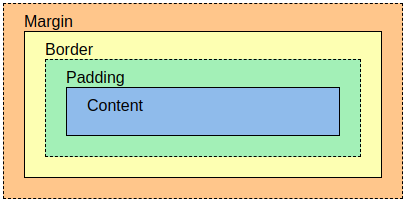
> 在Chrome裡滑鼠右鍵 檢查 (F12),可以在右方(Styles)看到如下畫面

* Margin: box 的外部距離區域
* Border: box 的邊界
* Padding: box content 外的填充區域
* Content: Content實際的寬 X 高
:::info
**:bulb:Hint:** Chrome提供的檢查功能可以提升我們在網頁設計上的效率,比如:你寫出的網頁在不同尺寸的裝置上顯示的版面差異,方便我們做進一步的RWD (Responsive Web Design) 規劃。
:::
###### Last updated 2021/05/31 by Qi Xiang
 Sign in via Google
 Sign in via Facebook
 Sign in via X(Twitter)
 Sign in via GitHub
 Sign in via Dropbox
 Sign in with Wallet
Connect another wallet
Sign in with Wallet
Connect another wallet