# [FE101] 前端基礎:HTML 與 CSS
###### tags:`Frontend`
[TOC]
搭配 [MTR05]、青蛙遊戲
* Zeplin 介紹
設計師跟前端工程師溝通的介面,可以直接取得原始素材、設計稿,**取得素材圖片之後記得要丟去 "tinypng"之類的壓縮網站**,有些寬高不是設計死的,可以自己參考修改。
* 盡量使用有語意的標籤
semantics,用 h1, h2 比 div 好
## HTML 基礎
HTML 是網頁的骨幹,但在瀏覽器裡面還是有一些基本樣式(h1, h2, h3...)
網頁的背後就是純文字檔,並且這個純文字檔是可以被瀏覽器看懂。
基本結構:
```htmlembedded=
<!DOCTYPE HTML>
<html></html>
<head>
<meta charset="utf8" />
<!--反斜線,用來關住自己,等同於<meta></meta>-->
<title></title>
</head>
<body></body>
```
HTML 最早存在的意義:顯示文章
### HTML tag
#### 分組的概念
1. `<div>` division,區塊、領地的概念,會換行
1. `<span>`,區塊、領地的概念,單行存在
* `<img src="來源" title="滑鼠移動到圖片上才會顯示出來" alt="替代之意,當圖片不能顯示時,作為文字替代的使用">`
* `<ul>`、`<ol>`,列表
* `<pre>`,preformated tag,在 tag 之間的內容,不會顯示換行等格式,用這個 tag 可以按照程式碼內的排版來顯示
* `<br>`,line break,換行
* `<tr>`, `<td>`, `<th>`,顯示表格用的 tag,可以對照原始 md
<table>
<tr> <!--row, 一橫排的意思-->
<th>姓名</th><!--data,head(粗體的標題) 這個橫排內的內容-->
<th>國文分數</th>
<th>數學分數</th>
</tr>
<tr> <!--row, 一橫排的意思-->
<td>姓名</td><!--data, 這個橫排內的內容-->
<td>國文分數</td>
<td>數學分數</td>
</tr>
</table>
* `<a href='' target='_self'></a>`,'_self' 會直接連到新網頁
* `<a href='' target='_blank'></a>`,'_blank' 會開新網頁
* `<a href='#p1'>` 連結到網頁內的特定 tag
<a href='#p1'>帶我到p1</a>
### semantic elements
這三個 tag 和 div tag 都有區塊、領地的概念,單純用 div tag 沒辦法讓人看得懂事要做甚麼用的,只知道它是一個區塊,但使用 semantic elements 的話就可以==從 tag 就知道這些 tag 是在做甚麼用的而不是從內容判斷==。
1. `<main>` 把網頁主要的地方包起來
1. `<nav>` 導覽列
1. `<footer>` 最下方的導覽列
> [semantic](https://developer.mozilla.org/en-US/docs/Glossary/Semantics)、[HTML Semantic Elements](https://www.w3schools.com/html/html5_semantic_elements.asp)
* `<iframe src=''>` 把別的網頁嵌入進來,但如果對方的 server 禁止被存取的話,就不會正常顯示,大部分網頁都會檔所以不太常用
#### 表單系列
可以藉由 `type=''` 來更改內建樣式(?),type 的種類有 text, password, email, date, checkbox
radio(可以用 `name=''` 來把不同選項群組化;用`<label>`搭配`id=''`, 來把框框(?)和文字群組化),
```htmlembedded=
帳號: <input type='text' />
<input type='submit' value='送出'/>
密碼: <input type='password' />
<input type='submit' />
email: <input type='mail' />
<input type='submit' />
生理性別:
<input type='radio' name='gender' id='male'/><label for='male'>男</label>
<input type='radio' name='gender' />女
<input type='submit' />
```
[更多 input 種類](https://developer.mozilla.org/en-US/docs/Web/HTML/Element/input)
### SEO 搜尋引擎的優化
(搜尋引擎跟爬蟲做的事情類似)
* `<meta name='keywords' >`
* `<meta name='description'>`
* `<meta property='og******'`, open graph protocal,通常是給 FB看的協定,用來說明網頁上的資料內容
* `<script type="application/ld+json">`,JSON-ld,通常是給 google 看的,用 google 搜尋之後會有優化。
* robots.txt : 給網頁爬蟲看得,通常放在網頁的跟目錄底下,說那些可以爬那些不要爬,[例如](https://www.tripadvisor.com.tw/robots.txt)
* sitemap.xml : 把網頁上所有連結輸出出來,告訴搜尋引擎
* 可以從 google 看到相關數據,[這裡](https://search.google.com/search-console/welcome?utm_source=about-page)
### Escape : 在網頁內顯示純文字的<標籤>
```htmlembedded=
& => &
< => <
> => >
```
## CSS 基礎:Selector
### connect CSS / HTML
1. `<div style='//selector' >`
2. `<style> //放 selector </style>`
3. `<link rel='stylesheet' href='path'`,放在一個單獨的檔案裡面,最常用
### selector
基本構造:
```
selector {
attribuct: value;
}
```
注意這邊的 id 可以是數字也可以是文字,沒有說一定要是數字,一個 element 只能有一個 id,跟身分證差不多概念
```
#idname {
}
```
一個 element 可以有一個 複數個 class,class name 可以共用
```
.classname {
}
```
多重篩選 selector,**div.gender之間不能有空格,要連在一起**
```htmlembedded=
<style >
div.gender {
background:red;
}
</style>
<div class='gender' id='999'>生理性別1:</div>
<p class='gender' id='99'>生理性別2:</p>
```
複數元素的篩選:`,`
### 選取底下的元素
1. `div > div {}`,使用">"選取下一層的 element,**只有選下一層**,下下層、下下下層...並沒有選取到,比如圖案中的藍色框框。
2. `div div {}`使用"(空格)"選取底下層的所有 element,**下一層,下下層、下下下層...都會被選取到**,比如圖案中的黃色框框。

### 旁邊的元素
1. `.a + span {}`,使用"+"選取右邊第一個的 element,**只有第一個**,會被選取到,比如圖案中的黃色框框。

2. `.a ~ span {}`使用"~"選取右邊所有 element,**右邊所有符合篩選條件的都會被選到**,比如圖案中的藍色框框。

### Pseudo-classes
用 Devtool 的時候可以分別對每個要 hover 的 element 做直接顯示的設定,但要每一個 element 自己慢慢設定就是。

> :active 滑鼠按下的樣式
:focus 鍵盤聚焦的樣式
:hover 滑鼠滑過的樣式
:link 還沒被訪問的樣式
:visited 被訪問過的樣式
### ==nth-child()==
1. `.wrapper .bg-pink:nth-child(2){ }`,選取`.wrapper`下一層的第 2 個 element,並且必須是`.bg-pink`,**這邊的篩選順序並非單純從左到右**,而是從 綠色 - 黃色 - 藍色 的順序,比如:

2. `.wrapper .bg-pink:nth-child(3) { }`,使用"(3)"選取底下層的的第 3 個 element,藍色框框。
3. `.wrapper div:nth-child(2n+1) { }`,使用"(2n+1)"選取底下層的的第 1, 3, 5, 7 ... 奇數個 element,箭頭處。

4. `.wrapper:not(first-child) { }`
5. **注意空格的存在與否,在CSS裡面是有意義的**,例如在 CSS dinner lv15,`plate :first-child`、`plate:first-child` 是不一樣的結果
### Pseudo-element
用 CSS 來在 HTML 裡面產生一些(偽)元素。
範例:
```htmlembedded=
<div class='wrapper'>123
<div id='999' class='a price'>3800</div>
<span class='b'>9999</span>
<div class='c price'>5200</div>
<span class='d'>9999</span>
<div class='e price'>1980</div>
<span class='f'>9999</span>
</div>
```
1. 在選取到的 element 前面加上一個(偽)元素
```css=
.wrapper .price::before {
content: '$';
color: orange;
}
```
2. 在選取到的 element 後面加上一個(偽)元素
```css=
.wrapper .price::after {
content: 'NTD';
color: red;
}
```
最後會得到結果:

3. 把選取到的 element 的屬性取出來,當成是(偽)元素放進去 HTML 內容,也可以把自訂的屬性放在 HTML 裡面,然後再取出來
```css=
.wrapper .price::before {
content: attr(class);
}
```
最上面的範例會變成這樣:

### CSS Selector 的權重
1. 
2. inline style`,權重會比 id 還要高,1,0,0,0
3. `!important` 會蓋掉所有權重,盡量少用基本不用,1,0,0,0,0
> [補充](https://muki.tw/tech/css-specificity-document/)
> [補充2](https://juejin.cn/post/6844903608199151630)
## CSS 基礎:各種裝飾
示範的 HTML:
```htmlembedded=
<body>
<div class="wrapper">
LoremLoremLoremLoremLoremLoremLoremLoremLoremLoremLoremLoremLoremLoremLoremLoremLoremLoremLoremLoremLoremLoremLoremLoremLoremLoremLoremLoremLoremLoremLoremLoremLoremLoremLoremLoremLoremLoremLoremLoremLoremLorem.
</div>
<div class="wrapper2">
123
<div id="999" class="a price" data-id="sell for">3800</div>
<span class="b">9999</span>
<div class="c price">5200</div>
<span class="d">9999</span>
<div class="e price">1980</div>
<span class="f">9999</span>
</div>
</body>
```
### background
```css=
.wrapper {
background: url("https://www.networkcomputing.com/sites/default/files/clouds-shutterstock.jpg") no-repeat center center;
background-size: cover;
/*其它 property values: contain, 50%*/
}
```
上面使用的設定是 CSS 的簡寫,也可以使用完整的設定來設定 CSS,例如(從 devtool 看):

### border
```css=
.wrapper {
background-size: cover;
border: 20px solid green; /*會往裡面擠*/
/*
border-top:
border-bottom: ;
border-left: ;
border-right: ;
*/
border-radius: 5px;
outline:5px solid blue /*不會往裡面擠*/
}
```
### 邊距: padding, margin
padding 相當於一個國家把國界線往外推(國土 = content 變大了),margin 則相當於一個國家把國界線之外的人趕走。
```css=
body {
margin:0; /*browsr 預設加上得 margin*/
}
.wrapper {
background-color: aquamarine;
width: 100px;
height: 100px;
padding: 50px;
/*內邊距,往外撐*/
/*用來做多行置中*/
}
.wrapper2 {
background-color: blueviolet;
width: 100px;
height: 100px;
margin: 50px; /*外邊距,距離外面的距離*/
}
```
### 文字相關
```css=
.wrapper {
background-color: aquamarine;
width: 300px;
height: 300px;
color: white;
font-size: 30px;
font-weight: bold;
font-family: '123';
letter-spacing: 1px;/*字元間距*/
line-height: 1.5em;
/*em : 1.5倍 font-size,行高可在不同比例內固定*/
/*單行置中:單行置中:跟 height 相比來決定置中後的大小*/
}
```
釐清 line-height , font-size 的差別:
所以如果把 line-height 大小射程跟高度一樣,在單行文字的時候,就會有置中的效果

### ==文字相關2==
```css=
.wrapper {
background-color: aquamarine;
width: 300px;
height: 300px;
color: #6d4242;
font-size: 21px;
font-weight: bold;
font-family: '123';
letter-spacing: 1px;
line-height: 24px;
word-break: break-word;
/*在文字噴出 width 的時候使用,會把單字做換行的動作*/
white-space: nowrap;
/*在文字本來就有空白的時候,瀏覽器不要預設把它們做換行的動作*/
// 使用三胞胎生出單行文字的省略符號
/* 第一步:先禁止斷行 */
white-space: nowrap;
/* 第二步:超過部份隱藏 */
overflow: hidden;
/* 第三部:表示文字溢出時,顯示省略符號(...) */
text-overflow: ellipsis;
}
```
word-break 在一大串文字,文字沒有空白的時候會很好用
多行省略的話做法比較 TRICKY[參考](https://zi.media/@carlos-studiocom/post/Wgeq4A)、[參考2]()
WTO
```css
white-space: nowrap;
/* 單一空白單行顯示,會噴出畫面 */
white-space: pre;
/* 顯示原始內容和原始空白數量,不會自動換行 */
white-space: pre-line;
/* 顯示原始內容但複數空白會被合而為一,噴出畫面的部分會自動換行\n符號 */
white-space: pre-wrap;
/* 顯示示原始內容和原始空白數量,噴出畫面的部分會自動換行\n符號 */
```
```css
word-wrap: break-word;
```

```css
word-break: break-all;
```

### overflow
```css=
.wrapper {
background-color: aquamarine;
width: 300px;
height: 300px;
color: #6d4242;
font-size: 21px;
font-weight: bold;
font-family: '123';
letter-spacing: 1px;
line-height: 24px;
overflow: hidden;
/* overflow: scroll; */
/* overflow: auto; */
text-overflow: ellipsis;
/* 只針對文字 overflow 的情況,
通常要搭配overflow: hidden; white-space: nowrap; 一起使用 */
}
```
### transition
```css=
.wrapper {
background-color: blueviolet;
width: 100px;
height: 100px;
margin: 50px;
transition: all 1s;
/*不是放在 :hover*/
}
.wrapper:hover {
background-color: aquamarine;
width: 100px;
height: 100px;
margin: 50px;
}
```
### transform 的妙用
> 搭配 transition 會很生動
依照原本的位置(元素本身的寬高)偏移,偏移量跟數學的XY軸一樣,不會影響到其他元素,也可以用來置中,可以去 position 那邊看
```
transform:scale()
transform: trasnslate(50px, 0px)
```
## CSS 基礎:盒模型(box model)
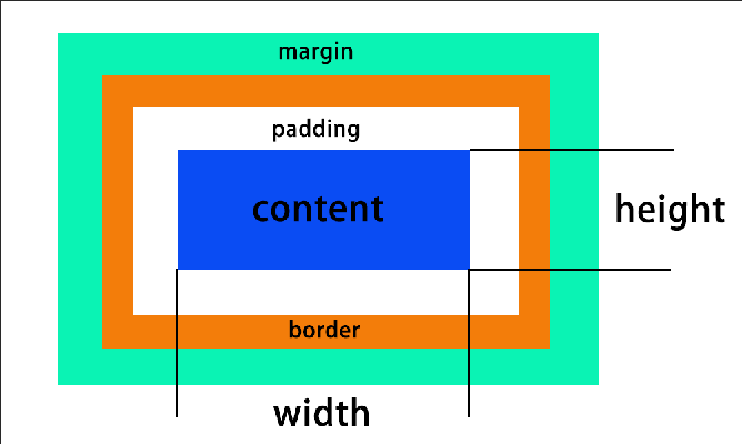
* 在設定` width`, `height` 的時候設定的都是 content 的寬高(上圖中的 height, width)
* padding, border 都是往外擴張的,所以 box 的最終寬高不會等於 ` width`, `height`
為了避免這種麻煩的設計困擾,可以用 `box-sizing: border-box;` 來設定寬高想要設定的 box(?)。像是變成設定寬高是設定紅色箭頭的部分↓

### display 的形式
* block
* 例如:div, h1, p
* 佔據一整行(佔地為王),甚麼都可以調
* inline
* 例如:span, a
* 可以併排,==調寬高、上下邊距(padding)沒有用==,上下邊距(padding)沒有用是指**對 content 沒有用**,實際上的 padding 還是可以被改變,只是元素之間的 padding 可能會重疊。
* ==如果 box content 裡面沒有內容的話,就不會顯現==
* block-inline
* 例如:button, input, select
* 對外像 inline,對內像 block,也就是它是可以被並排的 block。
* none : 隱藏不顯示
* flex : 去 Flexbox Froggy 練習 / 實戰影片 / 下篇有單獨篇章

* grid(沒講到,需要自己去 MTR05 看影片補充)
* float(很舊)
## 定位(position): ==是否跳脫排版流==
1. `position: static;`,block 就按照 block 定位,inline 就按照 inline 定位。
1. `position: relative;`,用 `left right top bottom` 來決定位置,基準點是 selector 原本排版的位置,**不會影響其他元素的位置**
```css=
.wrapper {
background-color: blueviolet;
width: 100px;
height: 100px;
padding: 50px;
border:5px solid black;
box-sizing: border-box;
position: relative;
left:20px;
top:;
right:;
bottom:;
/*left top ... 那些要給值,元素才會真的移動*/
}
```
3. `position: fixed;`,相對於 viewport 來做定位(類似於瀏覽器的視窗)
4. `position: absolute;`,絕對定位,根據某一個基準點來做定位,基準點的決定是「往上層找到的第一個不是 "static" 的元素」,所以上一層通常會設定`position: relative` 來做為參考的基準點,**會影響其他元素的位置**
> 滿多細節不太好用圖片說明,可以複習影片內容
5.`position: sticky;`,有點類似 navigation bar 的功能,比較新的功能
6.
### 這裡說的基準點,通常是指左上角,例如:
```css=
.wrapper2 {
background-color: aquamarine;
width: 300px;
height: 300px;
color: #6d4242;
border: solid black 1px;
position: absolute;
/*top, left 的移動"量"是相對於那個非static 的上層元素*/
left: 50%;
top: 50%;
}
```
實際位移會是這樣(原本在左上角貼合)↓

搭配使用 transform 做位移(基於元素本身來位移)
```css=
position: absolute;
left: 50%;
top: 50%;
/*---把上面改成下面---*/
position: absolute;
left: 50%;
/*要記得設定這些呀,不然相當於沒有用到 absolute,只用 transform 做位移*/
/* absolute 那些沒有設定的話預設就會是他原本要在的位子,也就是不會基於 relative 的位置來做基準點*/
top: 50%;
transform:translate(-50%,-50%);
```
最後變成這樣 ↓

### 影片沒有,待查
* inline 元素的排版: align 系列 (align items 只能用在 flex box 身上),vertical-items用在 inine element身上
* float(最舊) / flexbox / grid
## 決定圖層順序
`z-index:3;`
## CSS 隨意聊加上切板實戰
HTML 先做好 class name,再用 CSS 去切細節
### inline-block 並排時的小陷阱
把 margin 刪除之後,還是有間距的原因?

HTML tag 存在空行的關係:==tag 跟 tag 之間有空格存在==,可以把空格刪掉或是用`<!---->` 註解掉,或是其他方法

```htmlembedded=
<div>
box1
</div>
<div>
box2
</div>
```
### CSS 的命名規則
`content__info-a`,用兩格底線來區分單字
### reset.css VS normalize.css
* reset.css
讓 CSS 在瀏覽器中的==預設樣式都歸零==
* normalize.css
讓 CSS 根據==瀏覽器的預設樣式==來做顯示
## [MTR05]實戰影片實作
> 實作檔案在 week6/實戰實作 裡面
### 開始切板前的判斷
針對每個元素問這4個問題:
12點適用 position, 34適用display

position:

### 不使用開發者工具,直接給每個元素加金色框線
```css=
/*HTML <body class="debug">*/
.debug *, .debug {
outline: 1px solid gold
}
```
outline 屬性是border以外,margin以內的空間(所以不是 border)。

### rem? em?
rem : 跟著根元素的大小做變化
em : 跟著母元素的大小做變化(俄羅斯套娃的概念)
### div 可以用來設定背景圖片
在 HTML 裡面放空的 div 標籤,然後再 CSS 裡面加上背景圖片。
> 參考 week6 補充影片實戰篇
### 使用 flex 的時候,可以先把要排版的內容用 container 包起來
### flex-grow? flex-shrink? flex-wrap?
常常用在做 RWD。
* flex-grow : 內容隨著視窗變大而增大
* flex-shrink : 內容隨著視窗變小而變小
* flex-wrap : 內容跟著視窗大小做換行
> 這邊說的增大增小比例,不是指整個內容的比例 ↓
>


## 補充文章
https://hulitw.medium.com/introduction-mvc-spa-and-ssr-545c941669e9
https://medium.com/hulis-blog/frontend-engineer-guide-297821512f4e
MVC 就是把各種功能混雜在一起,不好維護的程式碼(義大利麵),依照功能分門別類進行程式碼管理(義大利麵 / 番茄醬 / 配料 都分開來),是一種==設計模式==,理想上會是這樣,但實際上也不是這麼權責分明的狀況
https://zh-tw.learnlayout.com/margin-auto.html
[Chrome 網頁除錯功能大解密](https://www.udemy.com/course/chrome-devtools/)
[金魚都能懂的網頁設計入門](https://ithelp.ithome.com.tw/users/20112550/ironman/2072)
 Sign in with Wallet
Connect another wallet
Sign in with Wallet
Connect another wallet