###### tags: `R教學`
**國立中山大學 財管所 陳柏霖**
# R語言簡介
<style>
.red {
color: red;
}
</style>
R是一個整合型的資料處理軟體及<span class="red">**統計**</span>軟體,也具有陣列及<span class="red">**矩陣**</span>的演算能力及展示的<span class="red">**繪圖**</span>工具,及簡單容易的程式設計語言,便於進行資料篩選、反覆演算、匯入/匯出資料及開發自訂程式功能。
[R與Python之比較](https://chrislee0728.medium.com/%E8%B3%87%E6%96%99%E7%A7%91%E5%AD%B8%E8%AA%9E%E8%A8%80-r-%E8%88%87-python%E6%AF%94%E8%BC%83-3c7c07a8aae5)
# R及Rstudio安裝
## R主程式安裝
### 1. google搜尋R並點擊 The R Project for Statistical Computing

### 2. 點 CRAN

### 3. 往下找到台灣,選台大或元智的連結

[台大連結傳送門](https://cran.csie.ntu.edu.tw/)
### 4. 選自己電腦的作業系統

### 5. 選 base

### 6. 下載最新版,並安裝

---
## Rstudio(工作環境) 安裝
### 1. 搜尋Rstudio,並點擊Download Rstudio

### 2. 點 Download

[載點傳送門](https://rstudio.com/products/rstudio/download/#download)
### 3. 選自己電腦的作業系統下載並安裝

## Rstudio介面使用說明
### 介面基本設定
1.開啟Rstudio
2.點選上面的Tools
3.再點Global Options

#### 更改指令顏色
1.點選左邊的Code
2.點選上面的Display
3.勾選Highlight R function calls

#### 更改背景主題
1.點選左邊的Appearance
2.從Editor theme中選擇自己喜歡的背景主題
3.按OK

### 工作環境介紹
點選左上角"+"符號,新增Rscript (或直接快捷鍵輸入ctrl+shift+N)

1.左上:程式編輯區
2.左下:程式執行區
3.右上:變數儲存區
4.右下:圖片、路徑顯示區

### 工作路徑
#### 工作路徑的功能
#### 工作路徑設定
建議可以在電腦裡先設一個資料夾,以便設為工作路徑
右下角的區塊有一個"...",點下去之後找到資料夾按Open,路徑就設定完成

不過每次都要這樣做很麻煩,所以接下來到"More"的地方點"Set as Working Directory"

再到左下角將路徑複製起來貼到左上編輯區,這樣以後只要執行程式碼就可以幫你設定好路徑了

# 基礎R教學
2021 R語言量化投資工作坊 第一週
國立中山大學 財管所 陳柏霖
日期:2021/09/27
[第一週程式碼](https://drive.google.com/file/d/1Hu1lkdgvljqIf2g3lti9-KgLLLe4F6tK/view?usp=sharing)
## 基本介紹
* 加上#字號,輔助說明程式碼,在程式執行過程中不會被執行
* 指令用法查詢:在指令前打"?",或help(指令)
EX:?sum、help(sum)
* 通常開一個新的Rscript後,會先清除變數和記憶體
rm(list = ls()) ; gc()
* 想知道這個指令有哪些參數可以下,在()內按tab
* 左鍵連點2下可以快速選取該文字
## 快捷鍵
* alt + - : <- (賦值)
* ctrl + enter:執行該行程式
* ctrl + shift + m:%>% (pipe)
* ctrl + shift + c:將選取範圍加上(移除)#號
* 在指令的()中按tab:快速查看參數
## 基礎運算
* 加(+) 減(-) 乘(*) 除(/)
* 商(%/%) 餘(%%)
* 平方(**)(^),平方根(sqrt(x))
* 指數(exp(x)),對數(log(x))
## 邏輯運算
* &與&& (AND)
* | 與 || (OR)
* ! (NOT)
* == (等於)
* != (不等於)
* 大於(>),小於(<)
* 大於等於(>=),小於等於(<=)
* %in% (包含於)
## 運算後顯示的值
* NA : 缺失值
* NaN : Not a Number(無意義的數)
* Inf : 正無窮大
* T、TRUE:正確
* F、FALSE:錯誤
## 賦值(定義變數)
* <- (快捷鍵:alt + -)
* =
## 文字類型、格式
| 文字類型 | 轉換函數 |
| -------------- | ------------- |
| character(字串) | as.character()|
|factor(類別變數) | as.factor() |
|numeric(數字) | as.numeric() |
## 指令的參數設定
每個指令都有固定的參數順序,若想調整參數位置,必須先指定參數
```
# 指令參數設定
?rep
rep(x = c(1, 3, 5), times = 2, length.out = 18, each = 3)
rep(c(1, 3, 5), 2, 18, 3)
rep(x = c(1, 3, 5), each = 3, length.out = 18, times = 2)
rep(c(1, 3, 5), 3, 18, 2)
rep(x = c(1, 3, 5), times = 2, each = 3)
# 練習
?seq
seq(1, 9, 2) # (首項, 末項, 公差)
```
## 字串
* 字串可由單引號('')或雙引號("")構成
* 以下為常用字串處理指令
1. gsub():取代文字
2. substring():擷取文字
3. grep():找出字串中的文字
4. strsplit():切割字串
5. paste():將字串黏合,字與字之間有間隔
6. paste0():將字串黏合,字與字之間沒有間隔
7. print():顯示變數或字串
8. cat():將字串黏合,並且顯示出來
```
test1 <- "abc_aabbcc"
test2 <- c("a", "ab", "a", "bc")
# 1.gsub
gsub("_", "", test1)
gsub("a", "A", test2)
# 2.substring
substring(test1, 1, 5)
substring(test1, 3)
substring(test2, 2)
# 3.grep
grep("a", test1)
grep("a", test2)
grep("b", test2)
# 4.strsplit
strsplit(test1, "b")
strsplit(test1, "_")
strsplit("2021/09/27", "/")
# 5.paste
paste(test1, "123", sep = "+++")
paste(test1, "123", "456")
paste(test2, "123")
# 6.paste0
paste0(test1, "123")
paste0(test1, "123", "456")
# 7.print
print(test1)
# 8.cat
cat(test1, "123", "456")
```
[stringr字串處理套件](https://bookdown.org/jefflinmd38/r4biost/stringr.html)
還想對字串做其他處理請再自行google
## 套件安裝及讀取
* 下載及安裝套件:install.package("套件名稱")
若欲使用某套件裡之指令,則需先安裝套件,只需要安裝一次
```
install.packages("tidyverse")
```
* 呼叫套件:library()
安裝之後要呼叫套件之後才能使用裡面的指令,每次重開Rstudio皆須重新呼叫
```
library(tidyverse)
```
* 常用套件:
1. lubridate 日期相關套件
2. tidyverse 資料處理、資料視覺化套件(此套件為很多套件之集合)
[tidyverse官網](https://www.tidyverse.org/packages/)
3. data.table 主要是用到裡面的讀檔指令(fread)
* 注意事項:
若安裝時有報錯,先關掉Rstudio然後以工作管理員執行程式
若還是不行就把錯誤訊息丟GOOGLE找找看解決辦法吧
## 讀檔
* 範例檔案 [stock2330.csv](https://drive.google.com/file/d/1CrMNNOjmcPGCnn-8fRg9u5cmMqn5__hJ/view?usp=sharing)、[stock2330.txt](https://drive.google.com/file/d/1rhIPNbtvgkH2boDpFElF5ZE3MKMgsTwp/view?usp=sharing)
* read.csv()
* read.table()
* fread() #需library(data.table) 推薦使用
## 日期格式轉換
```
library(lubridate)
date <- 20210927
date1 <- ymd(date) #轉為2021-09-27
date1 - 100
#練習1:將date1之格式轉為2021/09/27
#練習2(難):將date1之格式轉為110/09/27
```
# R資料結構

圖片來源:https://kknews.cc/tech/m2lomb2.html
在這裡介紹四種較常用的資料結構
1. 向量(vector)
2. 矩陣(matrix)
3. 資料集(data.frame)
4. 清單(list)
## 向量(vector)
### 基本語法
* c(元素1, 元素2, 元素3)
* seq(首項, 末項, by = 公差)
* rep(x, times = 重複次數, each = x內的元素重複幾次)
* sample(x, size = 抽取數量, replace = T取後放回/F取後不放回 )
### 敘述統計量
* length:計算向量中的元素個數
* mean:算數平均
* var:變異數
* sd:標準差
* max:最大值
* min:最小值
* median:中位數
* sum:相加
* prod:相乘
* cumsum:累積相加
* cumprod:累積相乘
### 向量索引 & 條件篩選
```
x <- c(11, 12, 13)
x[2]
x[4]
x[c(1, 3)]
x[c(3)];x[3]
x[c(1,2,3)];x[1:3]
which(x > 11) # 回傳元素在第幾個位置
x[which(x > 11)] # 取出符合條件的元素
x <- c(11, 12, 13, NA)
x[which(!(is.na(x)))]; x[which(is.na(x)==F)] # 取出非NA值
```
### 排序指令
* sort:數字由小到大排序(也可以由大到小排序)
* rank:顯示每個元素在排序之後的「排序順位」
* order:先將向量的元素由小到大排序,再將排好之後的元素在原來向量的數字指標回傳
```
c <- c(1, 10, 5, 22, 6, 19, 20)
sort(c)
sort(c, decreasing = T)
rank(c)
order(c)
c[order(c)]
c[order(c, decreasing=T)]
```
## 矩陣
### 基本語法
* matrix(data = NA, nrow = 列數, ncol = 欄數, dimnames = 給定列和欄名稱, byrow = 排列元素是否按列排序,預設為FALSE)
* t(A):轉置矩陣
* solve(A):反矩陣
* %*%:矩陣相乘
* diag(A):回傳矩陣A的對角元素
* diag(diag(A)):生成僅有對角元素的對角矩陣
* diag(3):生成單位矩陣
```
A <- matrix(1:20, nrow = 5, ncol = 4)
B <- matrix(21:40, nrow = 5, byrow = TRUE)
nrow(A)
ncol(B)
A*2
A-B
A*B #單純相乘,矩陣相乘是要用%*%
A %*% B #行列不符,無法相乘
t(A)
t(A) %*% B
```
### 矩陣索引
```
A[2,3] #取出第二列第三行之元素
A[2,1:3]
A[c(1,3),1:3]
A[2,]
A[,3]
A[-1,]
```
## 資料表(data.frame)
```
#範例
df <- data.frame(height = c(175, 168, 180, 181, 169),
weight = c(70, 60, 80, 75, 55),
isMale = c(FALSE, TRUE, FALSE, TRUE, TRUE),
name = c("Amy", "Bob", "Cindy", "Danny", "Edward"),
skin_color = factor( c("black", "black", "white", "yellow", "white")))
gender <- c("Female", "male", "female", "male", "male")
#表格合併
df <- cbind(df,gender) #cbind(行合併)、rbind(列合併)
df
#資料索引
df[c(1,2), c(2,3)]
df[c(1,2), ]
df[df$height < 175 & df$isMale, ]
df[df$height < 175 & df$isMale, "name"]
df$name[df$height < 175 & df$isMale]
#df運算
mean(df$height)
sum(df$skin_color == "white" & !df$isMale )
# 回歸 lm(y~x, data)
model1 <- lm(height~weight, data = df)
model1
summary(model1)
model2 <- lm(height~weight+isMale, data = df)
model2
summary(model2)
```
## 清單(list)
```
list_example <- list(a, gender, A, B, df, model1)
list_example[[1]]
list_example[[3]][2,3]
list_example[[6]]
list_example[[6]][[1]][2]
```
# 函數、迴圈、條件判斷式
## 自定義函數
```
square_fn <- function(x){
y <- x**2
return(y)
}
square_fn(2)
square_fn(-3)
```
## for迴圈
```
# 計算 1+2+3+4...+100 的值是多少?
j <- 0
for(i in 1:100){
j <- j + i
}
j
```
## while迴圈
```
# 計算 1+2+3+4...+100 的值是多少?
i <- 1
ww <- 0
while(i < 101){ # 當符合裡面的條件時,就會一直重複括號內的程式碼,直到不符合為止
# 迴圈內重複進行的動作
ww <- ww + i
i <- i + 1
}
ww
```
## if else 條件判斷式用法
```
A=-4
if(A>0){
B=1
}else if(A==0){
B=0
}else{
B=-1
}
# 語法1
if(A>0){
B=1
}
# 語法2
if(A>0){
B=1
}else{
B=-1
}
# 語法3
if(A>0){
B=1
}else if(A==0){
B=0
}else if(...){
B=-1
}else if(...){
...
}
# 語法4 (最常用也最方便)
a <- 1:10
ifelse(a < 6, 1, 0)
ifelse(a < 6, 1,
ifelse(a < 0, 0, -1))
```
# 資料處理1
日期:2021/10/04
[第二週程式碼](https://drive.google.com/file/d/1P3WAqJ3QGOxYGcPBDeT0r_I1O115EOJ8/view?usp=sharing)
## dplyr介紹
dplyr 函數包是處理矩形資料(dataframe、tibble 格式)的利器, 函數大多以 function( 物標物件, 變數 ) 的格式做表達,形式簡潔可讀性高, 且函數間可透過 %>% (pipe) 來做連結,進而輕鬆實現彈性、高效率的資料處理。此為R語言最重要之資料處理套件。
### 安裝並下載
tidyverse中包含了dplyr已在上周請大家安裝過了
這邊只要library(tidyverse)即可,還沒安裝的先install.packages("tidyverse")
### 範例檔案
[stockdata](https://drive.google.com/file/d/1seSo0DXM_cArsjE1Y_-m25RxT82VujCF/view?usp=sharing)
此為2020/01/01至2020/12/31之台股上市公司代碼、產業別、每日調整後開高收低價格及市值。 (資料來源TEJ+台灣經濟新報)
[epsdata](https://drive.google.com/file/d/1X5JvAfB2yJHTdOQXL80DTCI9ztyeCuFc/view?usp=sharing)
此為2020/01/01至2020/12/31之台股上市公司每季每股盈餘(EPS)。(資料來源TEJ+台灣經濟新報)
## dplyr常用指令介紹
### arrange
將資料照所選欄位由小到大排序,若前面加負號為由大到小排序
```
arrange_data <- stockdata %>%
arrange(code, -date)
```
### select
選擇資料中所需欄位
```
select_data1 <- stockdata %>%
select(code, date, close)
select_data2 <- stockdata %>%
select(1, 4, 6:8)
```
移除資料欄位
```
select_data3 <- stockdata %>%
select(-ind, -mkt_value)
select_data4 <- stockdata %>%
select(-5, -8)
```
欄位名稱包含指定字元
```
select_data5 <- stockdata %>%
select(contains("o"))
```
欄位名稱開頭為指定字元
```
select_data6 <- stockdata %>%
select(starts_with("c"))
```
欄位名稱結尾為指定字元
```
select_data7 <- stockdata %>%
select(ends_with("se"))
```
先指定要選的欄位名稱
```
col_list <- c("code", "ind", "date")
select_data8 <- stockdata %>%
select(col_list)
```
### filter
依照條件篩選資料
從資料中篩選出收盤價(close)高於500元者
```
filter_data1 <- stockdata %>%
filter(close >= 500)
```
從資料中篩選出股票代碼(code)為1101,且收盤價(close)大於30元者
```
filter_data2 <- stockdata %>%
filter( (code == 1101) & (close> 30) )
filter_data2 <- stockdata %>%
filter( (code == 1101) , (close> 30) )
filter_data2 <- stockdata %>%
filter(code == 1101) %>%
filter(close > 30)
```
從資料中篩選出股票代碼(code)在特定名單(code_list)內者
```
code_list <- c(1101, 1102, 1103)
filter_data3 <- stockdata %>%
filter(code %in% code_list)
```
從資料中篩選出日期為1日者
```
filter_data4 <- stockdata %>%
filter(date %% 100 == 1)
```
### mutate
將現有資料欄位經過計算後,形成新欄位
將資料中的最高價(high)減去最低價(low),形成最大價差(max_diff)欄位,並將其取log
```
mutate_data1 <- stockdata %>%
mutate(max_diff = high-low,
log_max_diff = log(max_diff))
```
將資料排序序號形成新欄位(n)
```
mutate_data2 <- stockdata %>%
mutate(n = row_number())
```
將收盤價(close)取log後形成新欄位(lClose)
```
mutate_data3 <- stockdata %>%
mutate(log_close = log(close))
```
若欄位名稱與原本相同,會直接取代掉舊有欄位
```
mutate_data4 <- stockdata %>%
mutate(date = ymd(date))
```
### group_by
將資料依照特定欄位內容分組
將資料依照產業(ind)分群,並查詢每群中最低價的收盤價(close)
```
# 分組前
groupby_data1 <- stockdata %>%
filter(close == min(close))
# 分組後
groupby_data2 <- stockdata %>%
group_by(ind) %>%
filter(close == min(close))
```
每公司每月月底資料
```
groupby_data3 <- stockdata %>%
mutate(year_month = date %/% 100) %>%
group_by(year_month) %>%
filter(date == max(date))
```
### summarise
將資料做總結,常搭配group_by()使用
查看每個產業(ind)的收盤價(close)平均數(mean)
```
summarise_data1 <- stockdata %>%
group_by(ind) %>%
summarise(mean_close = mean(close))
```
查看每公司每月的收盤價(close)平均數(mean)
```
summarise_data2 <- stockdata %>%
mutate(year_month = date %/% 100) %>%
group_by(year_month, code) %>%
summarise(mean_close = mean(close))
```
#### 練習:利用epsdata計算每家公司2020年年度EPS(將每季相加)
## 其他常用函數
### lag
將數列往"下"移動一格,計算報酬率時常用
```
ret_data <- stockdata %>%
group_by(code) %>%
arrange(date) %>%
mutate(ret_discrete = (close/lag(close)) -1,
ret_continuous = log(close/lag(close)))
```
### unique
讓每個變數只出現一次,用於向量格式
```
ind_list1 <- unique(stockdata$ind)
```
### distinct
讓每個變數只出現一次,用於data.frame格式
```
ind_list2 <- stockdata %>%
distinct(ind)
```
### pull
將表格拉出變成向量
```
ind_list3 <- stockdata %>%
distinct(ind) %>%
pull()
```
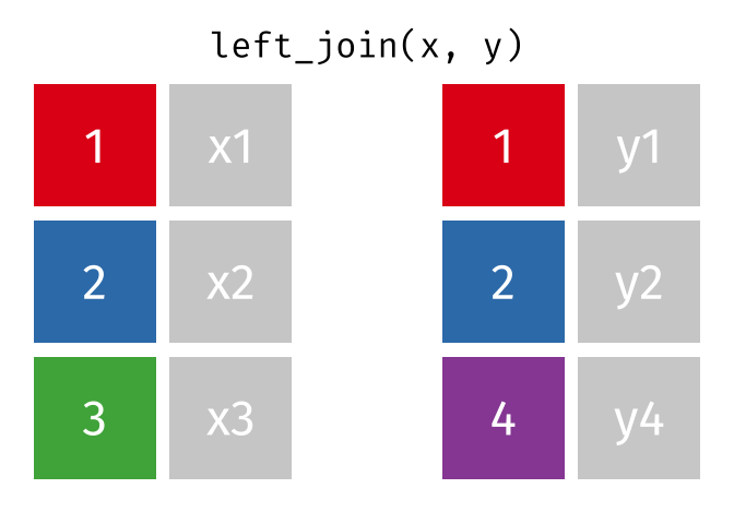
### left_join
合併表格,有一系列函數
[請點這裡](https://github.com/gadenbuie/tidyexplain#relational-data)
```
data1 <- data.frame(x = c(1, 2, 3),
y = c(2, 4, 6))
data2 <- data.frame(x = c(1, 2, 4),
z = c(3, 4, 5))
join_data1 <- data1 %>%
left_join(data2)
join_data1_1 <- data1 %>%
left_join(data2, by = "x")
join_data2 <- data2 %>%
left_join(data1)
join_data2_1 <- data2 %>%
left_join(data1, by = "x")
```
### 輸出檔案
#### 存成Rdata檔
```
save(join_data1_1, join_data2_1, col_list, file = "week2data.Rdata")
rm(list = ls())
load("week2data.Rdata")
```
#### write.csv
```
write.csv(join_data1_1, file = "week2data.csv", row.names = F)
```
### source : 執行其他Rscript
```
# 先建好一個函數並存到Rscript檔中
sq_fn <- function(x){
y <- x**2
return(y)
}
# 開啟另一個Rscript檔並設好路徑後 直接執行此Rscript檔
source("fn.R")
```
#### 計算每家公司的年報酬率,並挑出年EPS>10的公司,計算他們的平均報酬率。再做一個EPS<5的公司來做比較。
# 資料處理2
日期:2021/10/18
[第三週程式碼](https://drive.google.com/file/d/18NO6ZJ0bx_T2qbRilISe6J6HyBv1Zwcp/view?usp=sharing)
## dplyr進階用法
### 上上週回顧
先嘗試用範例檔案做出每家公司的日報酬吧
group_by
mutate
summarise
```
data <- fread("price.csv")
colnames(data) <- c("code", "name", "date", "close", "mktv")
# 每檔股票之每日報酬
data_1 <- stockdata %>%
group_by(code) %>%
mutate(ret = log(close/lag(close)))
# 每檔股票之年化報酬
data_2 <- data_1 %>%
summarise(annual_ret = sum(ret, na.rm = T))
```
### mutate家族
mutate
mutate_all
mutate_at
mutate_if
#### mutate
mutate除了可以新增欄位以外,還可以取代原有欄位
```
data_3 <- data_1 %>%
mutate(date = ymd(date))
```
#### mutate_all
針對表格的所有欄位做某件事(執行某函數)
```
data_4 <- data_1 %>%
mutate_all(as.character)
```
#### mutate_at
針對表格的特定欄位做某件事(執行某函數)
```
data_5 <- data_1 %>%
mutate_at(c("close", "mktv"), as.character)
```
#### mutate_if
針對表格符合條件的欄位做某件事(執行某函數)
```
data_6 <- data_1 %>%
mutate_if(is.numeric, as.character)
```
### select
#### everything()
將所選的欄位挑出來,剩下的依照原順序排。
```
data_select <- data_1 %>%
select(open, close, everything())
```
還有很多好用的函數,剩下的自己去發掘吧
## for 迴圈範例架構
R因為有group_by,summarise等功能,處理資料時可以少寫很多迴圈,但有時候太難處理的東西還是得用迴圈寫
以下為計算各公司日報酬的迴圈寫法範例
```
# 選出迴圈標的
coldlist <- unique(data$code)
# 建立空表
ret_table <- NULL
i = 1
for (i in 1:length(coldlist)){
# 查看迴圈進度
cat("進度:", i, "/", length(coldlist), "\n")
data_7 <- data %>%
filter(code == coldlist[i])
idata <- data_7 %>%
mutate(ret = log(close/lag(close)))
# 存取每次迴圈之資料
ret_table <- rbind(ret_table, idata)
}
```
## tidyr
### 前言
上一堂課已經教過dplyr套件的用法,dplyr在處理乾淨漂亮的結構化資料非常方便,我們稱之為「tidy(整齊)資料」。
[tidyr的pdf講義](https://drive.google.com/file/d/1QdOFSBKnm0NAbSDVAL_v6zGwVcbQ4ujL/view?usp=sharing)
一個tidy資料有三個相互關聯的規則:
* 每個變數(variable)都有自己的欄位(column)。
* 每個樣本(observation)都是一個列(row)。
* 每個值(value)都是一「格(cell)」。
把你的複雜資料整理成tidy資料的好處相當多:
* 可以有一致的邏輯,幫助你理解與處理資料。
* 之後要跑模型可以方便很多。
### 長寬資料轉換
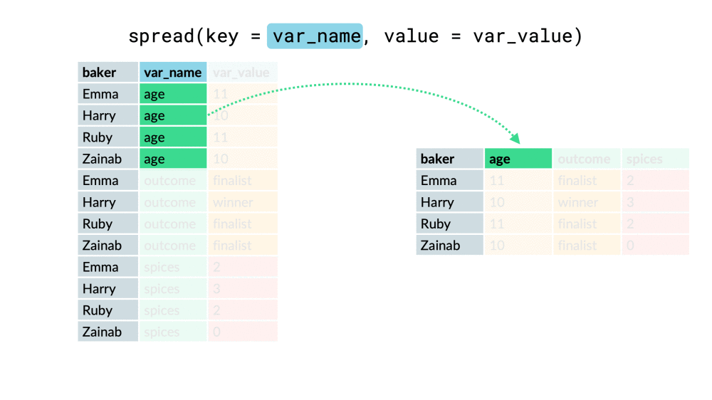
#### spread
將長資料轉成寬資料
以下兩個參數介紹
* key:將轉成col的欄位
* value:新欄位內的值
```
data_8 <- data_1 %>%
select(code, date, ret) %>%
na.omit()
data_spread <- data_8 %>%
spread(key = code, value = ret)
```
#### gather
將寬資料轉成長資料
* key:合併的那些欄位 之欄位名稱
* value:合併的那些欄位下面的值 之欄位名稱
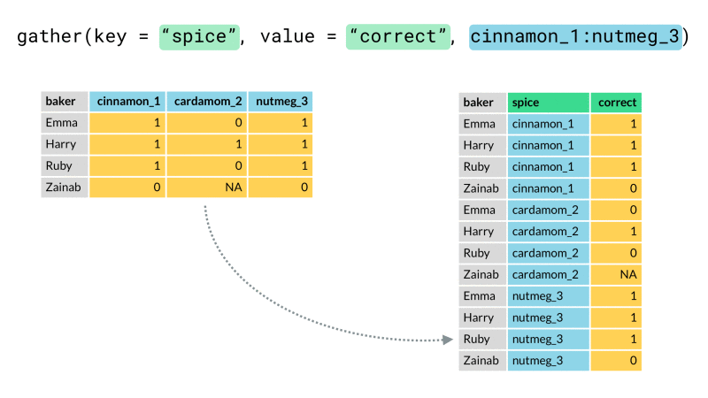
```
data_gather <- data_spread %>%
gather(key = code, value = ret, -date)
```
### 資料合併分割
#### unite
將兩個欄位的資料合併成一個欄位
* col:合成後的欄位名稱
* sep:資料合成時連接的符號
```
data_unite <- data_1 %>%
unite(code, name, col = "codename", sep = "_")
```
#### separate
將一個欄位分割成兩個欄位
* sep:以資料中的某符號當成分割依據
* into:分割後的欄位名稱(兩個以上)
```
data_separate <- data_unite %>%
separate(codename, sep = "_", into = c("code", "name"))
```
### 缺值處理
在處理資料的時候處理缺值是個很重要的課題
如何將缺值填入"合理"的值,需要加以思考,而不是一股腦的omit掉
以下教大家幾種處理缺值的方法
#### na.omit、drop_na

此函數非常方便可以直接把有NA的row都移除掉
"**但**"請慎用!!有時候移掉之後你的資料完整度就不足,在計算某些值的時候會有誤差
```
# 檢查表格是否有缺值
sum(is.na(data_gather))
# na.omit
data_na.omit <- data_gather %>%
na.omit()
# drop_na
data_drop_na <- data_gather %>%
drop_na()
# 查看row數
nrow(data_gather)
nrow(data_na.omit)
nrow(data_drop_na)
```
#### fill

填入上一個值或下一個值
可用來填交易日但暫停交易之股票的收盤價
#### replace_na

將NA填入指定的值
可將交易日但暫停交易之股票的報酬率補0
```
data_replace_na <- data_gather %>%
replace_na(list("ret" = 0))
sum(is.na(data_gather))
sum(is.na(data_replace_na))
data_replace_na_spread <- data_replace_na %>%
spread(key = code, value = ret)
sum(is.na(data_replace_na_spread))
```
## purrr
取代迴圈的利器,非常好用,運算速度比迴圈快
建議大家把map家族或apply家族的其中一個學熟
其中map家族是purrr裡面的函數,apply家族為內建函數
[purrr的pdf講義](https://drive.google.com/file/d/1eoXBMMNTNUQzM0ACPJli34VqE_8fPTtP/view?usp=sharing)
### apply
apply(X, MARGIN, FUN, …)
* X:放入的資料,df或矩陣皆可。
* MARGIN:1代表按row計算,2代表按col計算。
* FUN:使用的函數。
```
data_spread_1 <- data_replace_na_spread %>%
select(-date)
apply(data_spread_1, 1, mean)
apply(data_spread_1, 2, sum)
```
### map v.s lapply
lapply(X, FUN, ...)
map(.x, .f, ...)
* X:放入的資料,df或list皆可。
* FUN:使用的函數。

```
# map
data_map <- map(data_spread_1, mean)
map(c(1, 2, 3, 5, 8, 10), function(x){x^3})
# lapply
data_lapply <- lapply(data_spread_1, mean)
```
### map2
map2(.x, .y, .f, ...)
map的雙變數版本

```
map2(c(1,2,4), c(3,6,8), function(x,y){x+y})
```
### pmap
pmap(.l, .f)
map的多變數版本
.l:list格式

```
pmap(list(c(1,2,3), c(3,1,5), c(2,4,7)), function(x,y,z){x+y+z})
pmap(list(c(1,2,3), c(3,1,5), c(2,4,7)), rnorm)
```
### map_
上述的map都是回傳list格式,若要回傳成別的格式,可利用以下函數:

以下用map_dfr當作範例
```
# 計算報酬率
# 切割資料
data_group_split <- group_split(data, code)
# 自訂函數
ret_fn <- function(x){
y <- x %>%
mutate(ret = log(close/lag(close)))
return(y)
}
# map_dfr
data_map_dfr <- map_dfr(data_group_split, ret_fn)
```
範例檔案
[stock_1101.csv](https://drive.google.com/file/d/1y_6tq-Sz_unK4SJe_y5ZBDnRal_oRnGV/view?usp=sharing)
[stock_1102.csv](https://drive.google.com/file/d/1HPx00CvzKip7uFVHjG2ATUWfmccJh23L/view?usp=sharing)
[stock_1103.csv](https://drive.google.com/file/d/1wpppmYb0ZAiVno5j95EnItnzDXZXIEn-/view?usp=sharing)
```
# 一次讀多個檔案
stock_1101 <- fread("stock_1101.csv")
stock_1102 <- fread("stock_1102.csv")
stock_1103 <- fread("stock_1103.csv")
stock <- rbind(stock_1101, stock_1102, stock_1103)
# 建立讀檔清單
stock_list <- list.files()[grepl("stock_", list.files())]
# 讀檔
stock_map_dfr <- map_dfr(stock_list, fread)
```
#### 練習
從所有上市公司中抽1~100檔,計算他們的共變數矩陣
# 最佳化(求極值、求解)
[數值最佳化](https://bookdown.org/xiangyun/masr/chap-numerical-optimization.html)
## uniroot
用於計算方程的根。
```
fn1 <- function(x, a){(x - a)}
xmin_uni <- uniroot(fn1, c(0, 1), tol = 0.0001, a = 1/3)
xmin_uni
```
## optimize
帶入欲求解的方程式,並給定最佳解的範圍即可。回傳的值包含在給定範圍內的最佳解、以及對應的方程式的變數數值。
```
fn2 <- function(x, a){(x - a)^2}
xmin_opt <- optimize(fn2, c(0, 1), tol = 0.0001, a = 1/3)
xmin_opt
```
Black-Scholes model 求 implied volatility
```
S = 100
K = 100
sigma = 0.8
r = 0.001
days = 30
type = "call"
gBSM <- function(S, K, sigma, r, days, type){
#S = stock price
#K = strike price
#sigma = volatility
#r = risk free interest rate
#days = time to maturity in days
#type = option type
t <- days/365.25
d1 <- (log(S / K) + (r + sigma ^ 2 / 2) * t) / (sigma * sqrt(t))
d2 <- d1 - sigma * sqrt(t)
if(type == "call"){
price <- S * pnorm(d1) - K * exp(-r * t) * pnorm(d2)
}else if (type == "put"){
price <- (K * exp(-r * t) * pnorm(-d2) - S * pnorm(-d1))
}
return(price)
}
gBSM(S = S, K = K, sigma = sigma, r = r, days = days, type = type)
volOptimFun <- function(sigma, price, S, K, r, days, type){
abs(price - gBSM(S, K, sigma, r, days, type))
}
price = 10
optimize(volOptimFun, interval = c(0, 2),
price = price, S = S, K = K, r = r,
days = days, type = type)
```
## optim
[optim](https://rpubs.com/Heyang_Gong/optimization)
## 線性規劃求解
[R 線性規劃教學與範例](https://officeguide.cc/r-linear-programming-tutorial-examples/)
## 非線性最佳化
[nlm: Non-Linear Minimization](https://www.rdocumentation.org/packages/stats/versions/3.6.2/topics/nlm)
[範例](http://www.endmemo.com/r/nlm.php)
## 二次規劃 QP (Quadratic Programming)
[solve.QP: Solve a Quadratic Programming Problem](https://www.rdocumentation.org/packages/quadprog/versions/1.5-8/topics/solve.QP)
## 最佳化求解 nloptr
[nloptr](https://cran.r-project.org/web/packages/nloptr/vignettes/nloptr.pdf?fbclid=IwAR2L9VomL5Ms8RNqBjgOolBf2FkHDHDYNqU-slz4DKfpM_l3gEnevkx3V5k)
## 非線性規劃求解
[Rdonlp2套件](https://r-forge.r-project.org/scm/viewvc.php/*checkout*/pkg/Rdonlp2/inst/doc/rdonlp2.pdf?root=rmetrics)
# 資料視覺化
其實資料視覺化(Data Visualization)就是繪圖,把資料用各式各樣不同的圖形呈現,例如:趨勢圖、長條圖、箱型圖、熱圖等等。
資料視覺化是R的另一個強項,有非常豐富的繪圖套件。等等就帶大家來認識一下吧!
[第四週程式碼](https://drive.google.com/file/d/1hBg3WNlWqARwtaR37bLpSwuNPsSUvTdx/view?usp=sharing)
## 範例資料介紹
1. Iris data set包含了150個樣本,四個特徵分別是三種鳶尾花的花萼和花瓣的長度和寬度。
```
# 預覽資料集iris
library(datasets)
iris <- iris
head(iris,5)
```
```
Sepal.Length Sepal.Width Petal.Length Petal.Width Species
1 5.1 3.5 1.4 0.2 setosa
2 4.9 3.0 1.4 0.2 setosa
3 4.7 3.2 1.3 0.2 setosa
4 4.6 3.1 1.5 0.2 setosa
5 5.0 3.6 1.4 0.2 setosa
```
2. stockdata 第二周課程使用的股價資料
## R內建畫圖指令介紹
### hist 直方圖(Histogram)
```
hist(iris$Sepal.Width, # 資料來源
xlab = "Sepal Width", # x軸名稱
ylab = "Frequency", # y軸名稱
main = "Histogram of Sepal Width") # 圖表大標
```

### boxplot 盒鬚圖
```
boxplot(Sepal.Length ~ Species, #y軸資料~x軸資料,波浪符號代表計算公式
data = iris,
xlab = "Species",
ylab = "Sepal Length",
main = "Iris Boxplot")
```

### barplot 長條圖
```
barplot(table(iris$Species), #資料必須為向量或矩陣的形式
xlab = "Species",
ylab = "Count",
main = "Bar plot of Sepal Length")
```

### Scatter Plot 散布圖
```
plot(x = iris$Sepal.Length, #資料來源(x,y軸皆要指定)
y = iris$Sepal.Width,
xlab = "Sepal Length",
ylab = "Sepal Width",
main = "Sepal Length-Width",
# type = "p", #畫圖類型(預設為"p")
# pch = 1, #點的形狀
# cex = 1, #大小
# col = "blue" #顏色
)
```

## ggplot2 介紹
ggplot繪圖系統不同於以往傳統式的R繪圖方式,使用者不會受限於既有的固定功能,可以依照自己的需求組合各種圖形組件、任意調整圖形,產生各種變化。
* 作圖的文法包含以下兩個要素
1. Aesthetic attributes:指定圖形的資料來源、座標變數,以及顏色、形狀、點的大小與線的粗細等。使用aes(x, y, ...)指定
2. Geometric objects:包括點、線、盒狀圖、直條圖等。常用的包括geom_point()、geom_line()、geom_histogram()、geom_bar()
* ggplot2做圖的一般步驟為:(以+號連結各個圖層)
1. 準備數據,一般為data.frame表格。
2. 使用ggplot()建立一畫布,並設定aesthetics相關參數。
3. 選擇一個合適的圖形類型,函數名以geom_開頭,如geom_point()、geom_histogram()、geom_line()、geom_smooth()。()裡的可調整參數包含shape修改圖形樣式、size修改圖形的大小、col修改顏色等。
4. 設定適當的座標系統,可利用如coord_cartesian()和 scale_x_log10()等設定。
5. 設定標題和圖例位置等,如labs()。

### 網路資源
ggplot能設定的參數太多太多了,這邊沒辦法介紹到全部,我整理了一些寫得不錯的網頁大家可以自己參考。
[ggplot官網](https://ggplot2.tidyverse.org/reference/index.html)
[data to viz](https://www.data-to-viz.com/index.html#dendrogram)
[The R Graph Gallery](https://www.r-graph-gallery.com/)
[第19章 ggplot2之主題設置](https://bookdown.org/wangminjie/R4DS/ggplot2-theme.html)
[經濟資料視覺化處理](https://bookdown.org/tpemartin/ntpu-data-visualization/)
[Ting-Chih Hung R學習筆記](https://bookdown.org/b08302310/R_learning_notes/%E4%BB%A5-ggplot2-%E9%80%B2%E8%A1%8C%E8%B3%87%E6%96%99%E8%A6%96%E8%A6%BA%E5%8C%96.html)
[林茂廷老師 ggplot2介紹](https://bookdown.org/tpemartin/minicourse_ggplot2/#section-1.1)
[R筆記–(4)繪圖-資料視覺化](https://rpubs.com/skydome20/R-Note4-Plotting_System)
[ggplot2散佈圖繪製](https://www.rpubs.com/Logos/252923)
[ggplot2長條圖繪製](https://zhuanlan.zhihu.com/p/25173606)
[ggplot2雙軸繪製](https://jamleecute.web.app/dual-y-axis-plotting-%E9%9B%99y%E8%BB%B8-%E7%B9%AA%E5%9C%96-ggplot2/)
[ggplot2坐標系篇](https://blog.csdn.net/Bone_ACE/article/details/47427453)
[曾意儒 資料視覺化](https://yijutseng.github.io/DataScienceRBook/vis.html)
[顏色與樣式實際使用](https://zhuanlan.zhihu.com/p/32746407)
### 安裝並載入函數包
```
# 第一次使用ggplot2,請先安裝 (tidyverse套件包裡面也含有ggplot2唷!)
# install.packages("ggplot2")
library(tidyverse) #或library(ggplot2)
```
### 盒鬚圖 geom_boxplot
```
# 繪製萼片長度的盒鬚圖
ggplot(iris, aes(x = Species, y = Sepal.Length)) +
geom_boxplot()
```

### 直方圖 geom_histogram
```
ggplot(data = iris, aes(x = Sepal.Width)) +
geom_histogram(binwidth = 0.2) # 寬距
```

```
ggplot(data = iris, aes(x = Sepal.Width)) +
geom_histogram(binwidth = 0.2, color = "black", aes(fill = Species)) # 顏色、塗滿
```

### 長條圖 geom_bar geom_col
* geom_bar(aes(x=...)):只有x軸變數;y軸透過計算,如y為統計x變數分群下的統計值(內定是計數(即數每群有多少“個”),並用y軸長條高度代表。
* geom_col(aes(x=...,y=...)):有x軸變數,也指定y軸變數;x代表類別,y軸代表長條高度。
x為不同職業,y為平均薪資:y也是搜集來的資料。
```
ggplot(data = iris, aes(x = Sepal.Width)) +
geom_bar()
```

```
ggplot(data = iris, aes(x = Species, y = Sepal.Length)) +
geom_col()
```

```
# 與上圖相同
ggplot(data = iris, aes(x = Species, y = Sepal.Length)) +
geom_bar(stat = "identity")
```

```
ggplot(data = iris, aes(x = Sepal.Width)) +
geom_bar(stat = "count", color = "black", aes(fill = Species))
```

```
ggplot(data = iris, aes(x = Sepal.Width, y = Sepal.Length)) +
geom_bar(stat = "identity", color = "black", alpha = 0.2, aes(fill = Species))
```

### 散佈圖 geom_point
```
ggplot(data = iris, aes(x = Sepal.Width, y = Sepal.Length)) +
geom_point()
```

```
ggplot(data = iris, aes(x = Sepal.Width, y = Sepal.Length)) +
geom_point(size = 2, shape = 17, aes(col = Species)) +
geom_smooth(method = "lm", aes(col = Species)) #回歸線
```

```
ggplot(data = iris, aes(x = Sepal.Width, y = Sepal.Length)) +
geom_point(size = 3, shape = 10, color = "red") +
geom_smooth(method = "lm", se = FALSE)
```

```
ggplot(data = iris, aes(x = Sepal.Width, y = Sepal.Length)) +
geom_point(aes(size = Species, alpha = Species))
```

```
ggplot(data = iris, aes(x = Sepal.Width, y = Sepal.Length)) +
geom_point(aes(shape = Species, col = Species))
```

### 文字圖 geom_text
```
ggplot(data = iris, aes(x = Sepal.Width, y = Sepal.Length)) +
geom_text(aes(label = Species))
```

```
ggplot(data = iris, aes(x = Sepal.Width, y = Sepal.Length)) +
geom_point(col = "red") +
geom_text(aes(label = Species), hjust = 0, nudge_x = 0.05)
```

```
ggplot(data = iris, aes(x = Sepal.Width, y = Sepal.Length)) +
geom_point(col = "red") +
geom_text(aes(label = Species, col = Species), vjust = 0, nudge_y = 0.05)
```

### 線形圖(走勢圖) geom_line
#### 資料整理
```
stockdata <- fread("stockdata.csv")
colnames(stockdata) <- c("code", "name", "ind", "date", "open",
"high", "low", "close", "mktv")
stockdata <- stockdata %>%
mutate(date = ymd(date))
plotdata2330 <- stockdata %>%
filter(code == 2330) %>%
mutate(ret = log(close/lag(close))) %>%
na.omit() %>%
mutate(cumret = cumsum(ret))
plot2stocks <- stockdata %>%
filter(code %in% c(2330, 2317)) %>%
mutate(code = as.character(code)) %>%
group_by(code) %>%
mutate(ret = log(close/lag(close))) %>%
na.omit() %>%
mutate(cumret = cumsum(ret))
```
```
ggplot(data = plotdata2330, aes(x = date, y = cumret)) +
geom_line()
```

```
ggplot(data = plot2stocks, aes(x = date, y = cumret)) +
geom_line(aes(col = code))
```

```
ggplot(data = plot2stocks, aes(x = date, y = cumret)) +
geom_line(aes(col = code, linetype = code)) +
geom_point(size = 0.5) +
geom_line(aes(y = 0))
```

### 標籤設置 labs
y = y軸標題
x = x軸標題
title = 主標題
subtitle = 副標題
caption = 附註
```
ggplot(data = plot2stocks, aes(x = date, y = cumret)) +
geom_line(aes(col = code)) +
labs(y = "累積報酬",
x = "日期",
title = "台積電&鴻海累積報酬率",
subtitle = "2020/01/01~2020/12/31",
caption = "資料來源:TEJ")
```

### 兩軸調整 scale
scale_ _continuous 連續型變數
scale_ _discrete 離散型變數
scale_ _date 時間
空格處為x或y
參數:
breaks = 間格
limits = 兩軸數字範圍
labels = 單位或標籤
```
ggplot(data = plot2stocks, aes(x = date, y = cumret)) +
geom_line(aes(col = code)) +
lims(x = c(ymd(20200101), ymd(20200630)),
y = c(-0.5, 0.5))
```
```
ggplot(data = plot2stocks, aes(x = date, y = cumret)) +
geom_line(aes(col = code)) +
scale_x_date(date_breaks = "1 month",
date_minor_breaks = "1 month",
limits = c(ymd(20200101), ymd(20200630)),
date_labels = "%Y%m") +
scale_y_continuous(breaks = seq(-0.5, 0.5, 0.1),
limits = c(-0.5, 0.5),
labels = scales::percent)
```
### 主題設置 theme
plot.background:圖片背景
plot.title:圖片主題
plot.margin:圖片邊界
axis.title.x:x軸標題調整
axis.title.y:y軸標題調整
axis.text.x:x軸文字調整
axis.text.y:y軸文字調整
legend.title:圖標標題
legend.text:圖標文字
panel.grid:背景
[ggplot2 theme 官網](https://ggplot2.tidyverse.org/reference/element.html)
element_blank(): draws nothing, and assigns no space.
element_rect(): borders and backgrounds.
element_line(): lines.
element_text(): text.
參數:
size:字體大小
face:粗細("plain", "italic", "bold", "bold.italic")
family:字型
color:顏色
angle:角度
vjust:鉛直調整
hjust:水平調整
```
margin(t = 0, r = 0, b = 0, l = 0, unit = "pt")
element_blank()
element_rect(
fill = NULL,
colour = NULL,
size = NULL,
linetype = NULL,
color = NULL,
inherit.blank = FALSE
)
element_line(
colour = NULL,
size = NULL,
linetype = NULL,
lineend = NULL,
color = NULL,
arrow = NULL,
inherit.blank = FALSE
)
element_text(
family = NULL,
face = NULL,
colour = NULL,
size = NULL,
hjust = NULL,
vjust = NULL,
angle = NULL,
lineheight = NULL,
color = NULL,
margin = NULL,
debug = NULL,
inherit.blank = FALSE
)
```
mac自型選 "蘋方-繁 中黑體"
```
windowsFonts(A = windowsFont("微軟正黑體"))
ggplot(data = plot2stocks, aes(x = date, y = cumret)) +
geom_line(aes(col = code)) +
labs(y = "累積報酬",
x = "日期",
title = "台積電&鴻海累積報酬率",
subtitle = "2020/01/01~2020/12/31",
caption = "資料來源:TEJ") +
scale_x_date(date_breaks = "1 month",
date_minor_breaks = "1 month",
limits = c(ymd(20200101), ymd(20201231)),
date_labels = "%Y%m") +
scale_y_continuous(breaks = seq(-0.5, 0.5, 0.1),
limits = c(-0.5, 0.5),
labels = scales::percent) +
theme(plot.background = element_rect(fill = "orange", color = "black", size = 10),
plot.title = element_text(hjust = 0.5, size = 25, face = "bold", family = "A", color = "black"),
#上右下左
plot.margin = margin(t = 20, r = 20, b = 20, l = 20, unit = "pt"),
# 大小、加粗、字體、顏色、角度、鉛直平移
axis.title.x = element_text(size = 15, face = "bold", family = "A", color = "purple"),
axis.title.y = element_text(size = 15, face = "bold", family = "A", color = "purple", angle = 0, vjust = 0.5),
axis.text.x = element_text(size = 10, face = "bold", family = "A", color = "blue", angle = 90),
axis.text.y = element_text(size = 10, face = "bold", family = "A", color = "blue"),
legend.title = element_text(size = 15, face = "bold", family = "A", color = "black"),
legend.text = element_text(size = 10, face = "bold", family = "A", color = "red"),
panel.grid = element_blank())
```

### 存檔 ggsave
```
ggsave(file = "plot.png", width = 6, height = 4)
plot2330 <- ggplot(data = plotdata2330, aes(x = date, y = cumret)) +
geom_line()
ggsave(plot = plot2330, file = "plot.png", width = 6, height = 4)
```
### 針對不同類別分別畫圖
[Facets](https://bookdown.org/b08302310/R_learning_notes/%E4%BB%A5-ggplot2-%E9%80%B2%E8%A1%8C%E8%B3%87%E6%96%99%E8%A6%96%E8%A6%BA%E5%8C%96.html#facets)
### 雙y軸繪圖
[雙y軸繪圖](https://jamleecute.web.app/dual-y-axis-plotting-%E9%9B%99y%E8%BB%B8-%E7%B9%AA%E5%9C%96-ggplot2/)
概念:將右y軸資料尺度用+ - * / 調成與左y軸相近
## 互動式繪圖功能
### plotly
Plotly是一個線上分析與視覺化的工具,可以輕鬆建立豐富的互動式資料視覺化。
[Plotly R Open Source Graphing Library](https://plotly.com/r/)
### shiny
Shiny是RStudio推出供R語言使用的網頁應用框架(Web application framework)。
[使用R Shiny設計資料科學應用程式](https://yjtseng.info/shinybook/intro)
```
# install.packages("shiny")
library(shiny)
runExample("01_hello") # a histogram
runExample("02_text") # tables and data frames
runExample("03_reactivity") # a reactive expression
runExample("04_mpg") # global variables
runExample("05_sliders") # slider bars
runExample("06_tabsets") # tabbed panels
runExample("07_widgets") # help text and submit buttons
runExample("08_html") # Shiny app built from HTML
runExample("09_upload") # file upload wizard
runExample("10_download") # file download wizard
runExample("11_timer") # an automated timer
```
[王昭文老師團隊交易策略網站](http://ainvest.cm.nsysu.edu.tw:3838/stock_picker/)
日期:2021/11/01
[第五週程式碼](https://drive.google.com/file/d/1kaw0L7agFMl6xbEdlAJ3O2W5p8sXOu9c/view?usp=sharing)
# 時間處理 lubridate
lubridate為處理時間的套件。
R的時間資料型態分類,可以分為三種:
1. 純日期(Date)
2. 日期+時間(Date+time)
3. 日期+時間+時區(Date+time+ timezone)
不同程式語言系統的時間日期參照個不相同,{R} 是以 UTC 時區(Universal Time, Coordinated) January 1, 1970, 0 時, UTC 0 分 0 秒 為 UTC 以國際原子時為計算基準,修正了一些時間微小的飄移, 而 UTC 與 GMT (格林威治標準時間) 相差不多。
網路資源:
[cheatsheet](https://rawgit.com/rstudio/cheatsheets/master/lubridate.pdf)
[Chapter 12 日期時間處理](https://bookdown.org/jefflinmd38/r4biost/lubridate.html)
[時間資料前處理](https://suipichen.medium.com/%E4%B8%80%E5%A4%A9%E4%B8%80%E9%BB%9Er-4-%E6%99%82%E9%96%93%E8%B3%87%E6%96%99%E5%89%8D%E8%99%95%E7%90%86-4-lubridate%E5%A5%97%E4%BB%B6%E4%B9%8B%E4%B8%80-%E6%8E%A8%E8%96%A6-9a113c9db4ab)
## Date
系統日期
```
# 日期
Sys.Date()
class(Sys.Date())
today()
as.Date("2021/11/01")
# "2021-11-01"
as.Date("2021/11/1")
# "2021-11-01"
as.Date("2021-11-1")
# "2021-11-01"
date <- c(20211101,
"2021-11-01",
"2021 11 01",
"2021-11-1",
"2021-11, 1",
"2021/11/01",
"2021/11/1")
ymd(date)
# "2021-11-01"
dmy("01/11/2021")
# "2021-11-01"
date <- ymd(20211101)
year(date) # 年
month(date) # 月
day(date) # 日
wday(date) # 星期(周日為1)
date + days(2)
# "2021-11-03"
date + 2
# "2021-11-03"
date - months(3)
# "2021-08-01"
```
## Time
POSIXct, POSIXlt 是R系統中DataTimeClasses兩個物件
1. POSIXct代表的是總秒數從1970/1/1開始算起(R裡面的epoch)
2. POSIXlt則是一個列表,裡面有跟時間相關的數值(秒、分、時、日、月、年等)
```
# 時間
Sys.time()
now()
class(Sys.time())
time <- ymd_hms(Sys.time())
second(time)
minute(time)
hour(time)
month(time)
format(time, "%Y %y %m %d %h %M %S %a %b %X")
```
### 範例
找出2000~2020的母親節日期
```
datelist <- seq.Date(from = ymd(20000101), to = ymd(20201231), by = 1) %>%
as.data.frame()
colnames(datelist) <- "date"
```
### 練習
新增一個欄位為該日至近月期貨結算日(每個月的第三個禮拜三,先不考慮國定假日)之天數
# quantmod
## xts資料格式
### 什麼是 xts
xts(eXtensible Time Series)顧名思義是一種用來儲存、操作時間序列資料的類別,它並不是 R 語言的內建資料結構,也不是無中生有、前所未見的自行定義新類別,而是繼承自另一個第三方套件 zoo 所定義的 zoo 類別,並加入其他新功能。
廣受 R 語言使用者歡迎的量化投資套件 quantmod 所回傳的物件類別就是 xts,讓我們來驗證這一點。
### 從yahoo finance抓台積電股價
```
# getSymbols
stock2330 <- getSymbols(Symbols = "2330.TW" , from ="2020-1-1" , src= "yahoo")
stock2330.xts <- get(stock2330) %>% na.omit()
class(stock2330.xts)
str(stock2330.xts)
```
### 解構 xts
呼叫 quantmod 套件的 getSymbols() 函式將會在環境中建立一個以股票代碼為名的 xts 物件,以前述程式碼為例,stock2330.xts 就是一個 xts 物件,其實就是具有日期類別為索引根據的矩陣,表示我們應該可以透過某些函式將 stock2330.xts 解構成兩個部分:
1. 內建的矩陣(matrix)類別
2. 內建的日期類別(Date)類別
利用 zoo 套件的 coredata() 函式可以拆解出矩陣的部分,同樣使用 zoo 套件的 index() 函式可以拆解出日期的部分。從 stock2330.xts 物件中解構出來的矩陣部分是一個具有欄位名稱的矩陣,因此在轉乘data.frame的時候不用輸入欄位名稱。
```
stock2330 <- data.frame(date = index(stock2330.xts),
coredata(stock2330.xts))
str(stock2330)
```
## K棒
### 先科普一下甚麼是K棒吧,等等就來畫技術分析圖形

### K棒全部類型

## 技術分析圖形
```
# data.frame轉xts
plotData <- xts(stock2330[,-1], order.by= stock2330$date) # 轉成xts形式來畫K線圖
# 也可以直接用剛剛的xts格式直接畫
plotData <- stock2330.xts
# 技術分析圖形
chartSeries(plotData,
name = "2330", # 左上圖片標題
subset = "2021::2022", # 畫圖指定期間
theme = chartTheme('white'), # 背景顏色
up.col= "red", # K棒上漲為紅色(與國外相反)
dn.col = "green") # K棒下跌為綠色
```

# TTR
[TTR套件介紹](https://www.rdocumentation.org/packages/TTR/versions/0.23-4)
這邊只介紹SMA、RSI、MACD、stoch(KD),剩下的就留給有興趣的同學自己研究了
## SMA
MA(moving average)移動平均
用於時間序列資料,計算固定期間的平均數
ex: 5MA,五日移動平均,計算連續五期之平均數
[MA指標介紹](https://rich01.com/what-is-moving-average-line/)
```
stock2330 <- stock2330 %>%
mutate(MA5 = SMA(X2330.TW.Close, n = 5), # 新增5日均線
MA10 = SMA(X2330.TW.Close, n = 10), # 新增10日均線
MA20 = SMA(X2330.TW.Close, n = 20)) # 新增20日均線
plotData$MA5 <- SMA(stock2330$X2330.TW.Close, n = 5) # 在plotData 中新增MA5的欄位
plotData$MA10 <- SMA(stock2330$X2330.TW.Close, n = 10) # 在plotData 中新增MA10的欄位
plotData$MA20 <- SMA(stock2330$X2330.TW.Close, n = 20) # 在plotData 中新增MA20的欄位
#在chartSeris中加入技術因子的圖
addTA(plotData$MA5 ,type="l", on = 1, col = "yellow", lwd = 1.5)
addTA(plotData$MA10 ,type="l", on = 1, col = "blue", lwd = 1.5)
addTA(plotData$MA20 ,type="l", on = 1, col = "purple", lwd = 1.5)
```

## RSI
RSI指標(Relative Strength Index , RSI)又稱為相對強弱指標,這個指標主要是透過市場近期漲跌的變化量,衡量近期一段時間內的買盤與賣盤,雙方的相對力量強弱程度。
[RSI指標介紹](https://rich01.com/rsi-index-review/)
```
rsi6 <- RSI(stock2330$X2330.TW.Close, n = 6)
rsi6
```
## MACD
MACD指標(Moving Average Convergnece & Divergence)中文稱為平滑異同移動平均線指標,股票的技術分析中,會用這個指標來判斷股價走勢,確定波段漲幅並找到買賣點,最常用的值為12天、26天、9天,也稱為MACD(12,26,9)。
[MACD指標介紹](https://rich01.com/what-is-macd-indicator/)
```
macd <- MACD(stock2330$X2330.TW.Close)
macd
```
## stoch
KD指標 又叫做隨機指標(英文: Stochastic Oscillator),這邊的「隨機」指的是股價在一段時間內,高低區間的波動範圍。
KD指標是由K和D兩個值組成,用這兩個值來判斷目前價格相對過去一段時間的高低變化。
KD指標,最主要就是用來呈現過去一段時間股價強弱趨勢、許多人會運用這些數字,來作為尋找價格轉折點的交易訊號依據。
KD指標(隨機指標)的主要假設:
股價有上漲趨勢時,當日收盤價會接近近期一段時間內最高價;
股價有下跌趨勢時,當日收盤價會接近近期一段時間內最低價。
[KD指標介紹](https://rich01.com/what-is-kd-indicator/)
```
kd <- stoch(stock2330[,3:5] , 9,3,3)
kd
```
# 自製計時器
```
################## 自製計時器 #################
ptm <- proc.time() # 紀錄現在時間
#..... 等程式碼
proc.time() - ptm # 現在時間 - ptm 所記錄時候的時間
```
## quantmod 抓資料
### for版本
```
################# 用 quantmod 抓取多檔股票 ##################
# 爬取多檔股票
stockCodeList <- c("AAPL","AMZN","GOOG","AAON","ACAD") # 要抓取的股票代號
ETFCodeList <- c("BND","VOO","VTI") # 要抓取的ETF代號
# 抓取股票資料
stockTable <- NULL # 新建一個空表
ptm <- proc.time() # 計時開始
# 用迴圈爬多檔資料
for (i in 1:length(stockCodeList)) {
stock <- getSymbols(Symbols = stockCodeList[i] , from = "2020-01-01", src = "yahoo")
stock.xts <- get(stock) %>% na.omit()
stock.dataframe <- data.frame(date = index(stock.xts), # index 為提取xts檔案的rownames,也就是日期
coredata(stock.xts)) # coredata 就是只取cell裡面的值
colnames(stock.dataframe) <- c("date", "open", "high", "low", "close", "volume", "adjusted") # 重新命名欄位因欄位名稱為股票代號+價格無法 bind_rows
stock.dataframe <- stock.dataframe %>%
mutate(code = stockCodeList[i]) %>% # 原本沒有股票代號欄位,新增股票代號欄位
select(code, everything()) # 欄位排序為先code其餘照原本順序
stockTable <- stockTable %>%
bind_rows(stock.dataframe) # 將下載下來的資料存入table中
}
proc.time()-ptm # 計時結束
# 抓取 ETF資料
ETFTable <- NULL # 新建一個空表
ptm <- proc.time() # 計時開始
# 用迴圈爬多檔資料
for (i in 1:length(ETFCodeList)) {
stock <- getSymbols(Symbols = ETFCodeList[i] , from = "2020-01-01", src = "yahoo")
stock.xts <- get(stock) %>% na.omit()
stock.dataframe <- data.frame(date = index(stock.xts), # index 為提取xts檔案的rownames,也就是日期
coredata(stock.xts)) # coredata 就是只取cell裡面的值
colnames(stock.dataframe) <- c("date", "open", "high", "low", "close", "volume", "adjusted") # 重新命名欄位因欄位名稱為股票代號+價格無法 bind_rows
stock.dataframe <- stock.dataframe %>%
mutate(code = ETFCodeList[i]) %>% # 原本沒有股票代號欄位,新增股票代號欄位
select(code, everything()) # 欄位排序為先code其餘照原本順序
ETFTable <- ETFTable %>%
bind_rows(stock.dataframe) # 將下載下來的資料存入table中
}
proc.time() - ptm # 計時結束
```
### 用 map 的寫法,抓取股票
```
stockDataSpider <- function(stockCodeList){
stock <- getSymbols(Symbols = stockCodeList , from = "2020-01-01", src = "yahoo")
stock.xts <- get(stock) %>% na.omit()
stock.dataframe <- data.frame(date = index(stock.xts), # index 為提取xts檔案的rownames,也就是日期
coredata(stock.xts)) # coredata 就是只取cell裡面的值
colnames(stock.dataframe) <- c("date", "open", "high", "low", "close", "volume", "adjusted") # 重新命名欄位因欄位名稱為股票代號+價格無法 bind_rows
stock.dataframe <- stock.dataframe %>%
mutate(code = stockCodeList) %>% # 原本沒有股票代號欄位,新增股票代號欄位
select(code, everything()) # 欄位排序為先code其餘照原本順序
return(stock.dataframe)
}
ptm <- proc.time() # 計時開始
stockTableMap <- map_dfr(stockCodeList, stockDataSpider) # 以data.frame用rbind黏起來
proc.time() - ptm # 計時結束
```
## tidyquant
[shout out to 彥廷學長之tidyquant詳細介紹](https://bap.cm.nsysu.edu.tw/rmarkdown/tidyquan.html)
```
###################### tidyquant ##################
# 載入套件
# library(tidyquant)
stockCodeList <- c("AAPL","AMZN","GOOG","AAON","ACAD") # 要抓取的股票代號
# 下載資料
stockData <- c("AAPL","AMZN","GOOG","AAON","ACAD") %>%
tq_get(get = "stock.price", from = "2020-01-01")
ptm <- proc.time() # 開始計時
stockData1 <- stockCodeList %>%
tq_get(get = "stock.price", from = "2020-01-01")
proc.time() - ptm # 結束計時
```
# 回測
回測,回溯測試 (back test)。
意指運用歷史資料,對你的策略進行測試。
## 回測範例
期間:20100101 ~ 今天
公司:台積電(2330)、鴻海(2317)、聯發科(2454)
資料來源:yahoo finance
策略:5MA > 10MA 且前一天 5MA < 10MA 進場;5MA < 10MA 且前一天 5MA > 10MA 出場
```
####################### 回測部分 #######################
rm(list=ls());gc()
library(tidyquant)
# 下載股價資料(Import)
stockData <- c("2330.TW", "2454.TW", "2317.TW") %>%
tq_get(get = "stock.price", from = "2010-01-01")
colnames(stockData)[1] <- "code"
# 查看每檔股票的開盤天數
check_count <- stockData %>%
group_by(code) %>%
summarise(count = n())
sum(is.na(stockData))
stockData <- stockData %>%
na.omit() %>%
group_by(code) %>%
arrange(code,date) %>%
filter(n() >= 0.8*max(n())) %>% # 篩選資料長度為總長度*0.8以上的公司
mutate(MA5 = SMA(close, 5),
MA10 = SMA(close, 10)) %>%
na.omit() %>%
mutate(buySignal = ifelse((MA5 > MA10) & (lag(MA5) < lag(MA10)), 1, 0), # 進場訊號(黃金交叉)
sellSignal = ifelse((MA5 < MA10) & (lag(MA5) > lag(MA10)), 1, 0)) # 退場訊號(死亡交叉)
#股票個數
codelist <- unique(stockData$code)
i = 1
trade_fn <- function(i){
stockData %>%
filter(code == codelist[i]) %>%
filter(buySignal == 1 | sellSignal == 1) %>%
mutate(ret = (close/lag(close)) - 1,
inDate = ymd(lag(date)),
outDate = ymd(date),
time_d = outDate - inDate) %>%
filter(sellSignal == 1)
}
tradePerformance <- map_dfr(1:length(codelist), trade_fn)
# 交易表績效指標
resultTable <- tradePerformance %>%
group_by(code) %>%
summarise(meanRet = mean(ret), # 平均報酬率
sdRet = sd(ret), # 報酬率標準差
transactionNumbers = n(), # 交易次數
winRate = mean(ret > 0), # 贏率
maxRet = max(ret), # 報酬率最大值
minRet = min(ret), # 報酬率最小值
avgTradePeriod = mean(time_d), # 平均持有天數
cumRet = prod(1+ret)-1) # 累積報酬率
# 將績效表現的數字做整理
resultTable <- resultTable %>%
mutate(meanRet = round(meanRet,4)*100, # 使用round 整理數字
sdRet = round(sdRet,4)*100,
transactionNumbers = transactionNumbers,
winRate = round(winRate,4)*100,
maxRet = round(maxRet,4)*100,
minRet = round(minRet,4)*100,
avgTradePeriod = round(avgTradePeriod),
cumRet = round(cumRet,4)*100)
```
## 來畫個圖
```
# ---chart_Series---
# 繪製的交易樣本(取報酬率最低值畫圖)
plotSample <- which.min(tradePerformance$ret)
inDate <- tradePerformance$inDate[plotSample]
outDate <- tradePerformance$outDate[plotSample]
plotCode <- tradePerformance$code[plotSample]
indData <- stockData %>% filter(code == plotCode)
matchSite <- which(indData$date == inDate)-20 # 可改動scale 的日期
plotStartDate <- indData$date[ifelse(matchSite < 1, 1, matchSite)]
# 繪圖結束日
matchSite <- which(indData$date == outDate)+20 # 可改動scale 的日期
plotEndDate <- indData$date[ifelse(matchSite > nrow(indData), nrow(indData), matchSite)]
# 整理繪製的股價資料期間範圍及欄位資料
plotData <- indData %>% filter(date >= plotStartDate , date <= plotEndDate)
plotData <- plotData %>% group_by() %>% select(date:volume, MA5:MA10) # group_by() = ungroup()
#加入進出場位置
plotData <- plotData %>% mutate(inSite = ifelse(date == inDate,open,NA),
outSite = ifelse(date == outDate,open,NA))
plotData <- xts(plotData[,-1], order.by= ymd(plotData$date))
# 設定K棒顏色
myTheme <- chart_theme()
myTheme$col$dn.col <- c("green") # 跌的K棒顏色
myTheme$col$up.col <- c("red") # 漲的K棒顏色
# 畫出K線圖
chart_Series(x = plotData, name = plotCode, theme = myTheme)
add_Vo()
add_TA(x=plotData$MA5, on=1, col="blue", lwd=3)
add_TA(x=plotData$MA10, on=1, col="black", lwd=2)
# 畫出進出場點
add_TA(x=plotData$inSite, on=1, type="p", col="red", pch=5, cex=3, lwd=5)
add_TA(x=plotData$outSite, on=1, type="p", col="green", pch=6, cex=3, lwd=5)
```

## PerformanceAnalytics 套件
```
################# PerformanceAnalytics ##################
rm(list = ls());gc()
#PerformanceAnalytics套件
library(PerformanceAnalytics)
library(tidyquant)
stock2330 <- c("2330.TW") %>%
tq_get(get = "stock.price", from = "2020-01-01")
stock2330 <- stock2330 %>%
mutate(ret= close/lag(close,1)-1) %>%
na.omit()
# 計算累積報酬率
# 對股票日報酬率轉為xts格式
stockRetXts <- xts(stock2330 %>% select(ret), order.by = ymd(stock2330$date))
# 年化報酬率
annualRet <- Return.annualized(stockRetXts) %>% as.vector()
# 夏普比率
sharpeRatio <- SharpeRatio(stockRetXts, FUN = c("StdDev"), annualize = T) %>% as.vector()
# 最大回撤率
mdd <- maxDrawdown(stockRetXts) %>% as.vector()
K <- charts.PerformanceSummary(stockRetXts,
main = "股票累積報酬率走勢圖")
```

# 機器學習
日期:2021/11/15
[第六週程式碼](https://drive.google.com/file/d/1Wyy3udZvviiqGsJlKi2s-iiHsamzl3Bj/view?usp=sharing)
## 機器學習簡介
### 甚麼是機器學習?
機器學習,又叫 Machine Learning,簡單來說,機器學習就是透過過往的資料和經驗去進行學習,並找到其運行規則、邏輯,而後有新資料丟入時,機器就會自動幫我們依照學習後的規則、邏輯幫我們做出分類或是預測
### 人工智慧(AI)、機器學習(ML)、深度學習(DL)的差別
他們屬於層級式的關係,我們以兩張圖來簡單說明。


AI: 計算機模仿人類思考進而模擬人類的能力/行為。
ML: 從資料中學習模型。
DL: 利用多層的非線性學習資料特徵。
### 目前金融領域的運用
目前金融領域在機器學習、深度學習的運用上也十分普及,你應該有聽過「Fintech」,這是目前金融業相當火熱、著重的地方,其中一部分就是在利用機器學習、深度學習等技術去幫公司做預測,像是什麼樣的人較容易買保單、預測股票漲跌等等技術,都是目前金融業相當注重的議題,所以如果現在想要進入金融業,又不想被淘汰的人,學習機器學習跟深度學習對你的未來工作上會有相當大的幫助,但就算並非工作所需,所以學會後要自行使用在投資上也是很有幫助的。
參考網頁:[陳陳的嘉理-【機器學習】1分鐘快速了解什麼是機器學習,以及金融上的應用](https://chenchenhouse.com/machinelearning/)
----
## 機器學習架構
### 機器學習的7大步驟

### 步驟說明
1. **收集資料**
首先,收集資料就是將我們與目標相關聯的資料做一個抓取,以預測股市股價來說,我們所需的資料當然就是開高低收、技術指標、財務指標、籌碼指標等等,根據你所要分析的目標是長中短期,去加入你所需要的數值,這就是收集資料。
2. **準備數據**
當然,資料收集好後,沒那麼簡單就可以拿給機器做學習,我們還需要進行數據的整理,篩選重要的特徵值,分割成訓練集跟測試集(通常為7:3或8:2),如果每個指標的數值範圍都不一,我們還需要進行正規化,正規化又分成了「max-min法(最大最小正規化)」、「z-score法」等等方式。
3. **選擇模型**
當數據都進行整理後,接下來就是要選擇訓練用的模型,像是XGBoost、LSTM、等等都是機器學習中常使用的訓練模型,其中目前較常拿來訓練股市的是「LSTM」,中文叫做長短期記憶,是屬於深度學習中的一個模型。
4. **訓練機器**
選擇好訓練模型後,當然就是要將訓練集資料丟進去模型中做訓練啦!比如說XGBoost,我們需要設學習率、樹的深度等等都會影響模型訓練出來的結果,這部分只能靠經驗跟不度嘗試去學習了,或是上網多爬文看別人怎麼撰寫訓練模型。
5. **評估分析**
當模型訓練完成後,接下來就是判斷該模型是否有過度擬合(overfitting),這裡就是帶入測試集的資料進行評估,也可以嘗試利用交叉驗證的方式進行模型的擬合性判斷,以及利用RESM、MSE等統計計算來判斷模型的準確度。分類資料通常會用混淆矩陣來評估績效。
RMSE(root mean squared error):
混淆矩陣:


6. **調整參數**
到這大致上模型已經完成了90%,最後的一步就是進行參數的微調,我們也稱為「超參數 (Hyperparamters)」,讓整個模型更加的精準,但也不能過度的調整,因為會造成overfitting的結果,這個取捨就只能依照無窮盡的反覆迭帶去尋找了,這部分也是相對較耗時間的地方
7. **預測推論**
到此,模型已經正式完成,但對於全新沒影響過的數據則是一個未知數,由於在上方訓練模型中,我們不論是訓練集或是測試集都是被模型所影響過的,如果過度擬合,那麼未來丟入新的資料就很可能無法那麼精準,這部分就只能不斷丟入新資料來推論我們模型的預測能力是否有泛化。
```
# 下載台積電股價資料(Import)
stock2330 <- c("2330.TW") %>%
tq_get(get = "stock.price", from = "2010-01-01")
colnames(stock2330)[1] <- "code"
data <- stock2330 %>%
mutate(ret = log(close/lag(close))) %>%
mutate(up_down = ifelse(ret >= 0, 1, 0)) %>%
na.omit() %>%
mutate(MA5 = SMA(close, 5),
MA10 = SMA(close, 10),
MA20 = SMA(close, 20),
MA60 = SMA(close, 60),
RSI = RSI(close),
MACD = MACD(close)) %>%
na.omit() %>%
mutate(y_reg = lead(ret),
y_cla = lead(up_down)) %>%
na.omit()
train <- data %>%
filter(row_number() <= round(0.8*n()))
test <- data %>%
filter(row_number() > round(0.8*n()))
RMSE <- function(y_pred, y_real){
sqrt(mean((y_pred - y_real)**2))
}
test_y_reg <- test$y_reg
F1_score <- function(y_pred, y_real){
df <- data.frame(pred = y_pred, real = y_real) %>%
mutate(confu = ifelse(pred == 1 & real == 1, "TP",
ifelse(pred == 1 & real == 0, "FP",
ifelse(pred == 0 & real == 1, "FN", "TN"))))
confu_mat <- data.frame(real_1 = c(sum(df$confu == "TP"),
sum(df$confu == "FN")),
real_0 = c(sum(df$confu == "FP"),
sum(df$confu == "TN")))
precision <- confu_mat[1,1]/sum(confu_mat[1,])
recall <- confu_mat[1,1]/sum(confu_mat[,1])
F1_score <- 2*precision*recall / (precision + recall)
return(list(F1_score, confu_mat))
}
```
### 資料切割

1. 訓練集(training data):用來訓練模型的資料
訓練模型時會將訓練集再拆成訓練集和驗證集(validation data)利用他們來找出最佳參數,通常會使用交叉驗證法(cross validation)

2. 測試集(testing data):用來看模型準度的資料


## 機器學習模型分類
* 監督式學習(SupervisedLearning)
每筆訓練資料都有正確答案,讓機器學習時能夠根據預測錯誤的樣本進行調整,有目標地進行學習。再依照不同的y分為回歸(regression)及分類(classification)
* 非監督式學習(UnsupervisedLearning)
沒有給定事先標記過的訓練範例,自動對輸入的資料進行分類或分群。無監督學習的主要運用包含:分群(cluster analysis)、降維(dimensionality reduce)。
### 監督式學習
常見的監督式學習有:
* 線性回歸(linear regression)
* 羅吉斯迴歸(Logistic Regression)
* 決策樹(Decision Tree)
* 支持向量機(SVM, Support vector machine)
* 單純貝氏(Naïve Bayes)
* 隨機森林(Random Forest)
* 類神經網路(Neural Network)
* 梯度提升決策樹(Gradient Booting Tree)
CatBoost、XGBoost、Light GBM 都是梯度提升模型
#### 線性回歸(linear regression)
```
lm_model <- lm(y_reg ~ RSI + MA5, data = train)
summary(lm_model)
lm_pred <- predict(lm_model, test %>% select(RSI, MA5))
rmse_lm <- RMSE(lm_pred, test_y_reg)
rmse_lm
```
#### 羅吉斯迴歸(Logistic Regression)
```
logistic_model <- glm(y_cla ~ RSI + MA5, family = "binomial", data = train)
summary(logistic_model)
lm_pred <- predict(logistic_model, test %>% select(RSI, MA5))
lm_pred <- ifelse(lm_pred >= 0.5, 1, 0)
F1score_lm <- F1_score(lm_pred, test_y_cla)
F1score_lm
```
#### XGBoost (極限梯度提升)
參數簡介:
* booster [default=gbtree]
供選擇的模型有gbtree和gblinear,gbtree使用基於樹的模型進行提升,gblinear使用線性模型進行提升,默認是gbtree 。
* eta[default=0.3]
學習率,一般設置小一些。
range: [0,1]
* gamma [default=0]
後剪枝時,用於控制是否剪枝,值越大,算法越保守。
range: [0,∞]
* max_depth [default=6]
樹的最大深度
範圍: [1,∞]
* min_child_weight [default=1]
這個參數默認是 1,是每個葉子裏面 h 的和至少是多少,對正負樣本不均衡時的 0-1 分類而言,假設 h 在 0.01 附近,min_child_weight 爲 1 意味着葉子節點中最少需要包含 100 個樣本。這個參數非常影響結果,控制葉子節點中二階導的和的最小值,該參數值越小,越容易 overfitting。
range: [0,∞]
* max_delta_step [default=0]
這個參數在更新步驟中起作用,如果取0表示沒有約束,如果取正值則使得更新步驟更加保守。可以防止做太大的更新步子,使更新更加平緩。
range: [0,∞]
* subsample [default=1]
樣本隨機採樣,較低的值使得算法更加保守,防止過擬合,但是太小的值也會造成欠擬合。
range: (0,1]
* colsample_bytree [default=1]
列採樣,對每棵樹的生成用的特徵進行列採樣.一般設置爲: 0.5-1
range: (0,1]
* objective [default=reg:linear]
定義最小化損失函數類型,常用參數如下:
**reg:linear** -線性回歸
**reg:logistic** -邏輯回歸
**binary:logistic** -使用LR二分類,輸出概率
**binary:logitraw** -使用LR二分類,輸出Logistic轉換之前的分類得分
**count:poisson** -poisson regression for count data, output mean of poissondistribution
max_delta_step is set to 0.7 by default in poisson regression (used tosafeguard optimization) 。
**multi:softmax** –set XGBoost to do multiclass classification using the softmaxobjective, you also need to set num_class(number of classes)
**multi:softprob** –same as softmax, but output a vector of ndata * nclass, whichcan be further reshaped to ndata, nclass matrix. The result contains predictedprobability of each data point belonging to each class.
**rank:pairwise** –set XGBoost to do ranking task by minimizing the pairwiseloss
* eval_metric 評價驗證集的指標,默認根據目標函數設置,默認情況下,最小均方差用於回歸,錯誤率用於分類,平均精確率用於排序。
rmse:均方差
mae:平均絕對值誤差
error :錯誤率
logloss:負的對數損失
auc : roc曲線下的面積
[參考網頁](https://kknews.cc/zh-tw/tech/gaxe6pm.html)
```
#-------------------- XGboost模型(連續) --------------------
# install.packages("xgboost")
library(xgboost)
trainData_x <- train %>% select(open:MACD) %>% as.matrix() # 訓練集的特徵變數
trainData_y <- train %>% select(y_reg) %>% as.matrix() # 訓練集的預測目標
testData_x <- test %>% select(open:MACD) %>% as.matrix() # 訓練集的特徵變數
testData_y <- test %>% select(y_reg) %>% as.matrix() # 測試集的預測目標
# 將訓練期與測試期資料轉為xgboost矩陣格式
trainData <- xgb.DMatrix(data = trainData_x, label = trainData_y) # 將訓練集資料存成XGBoost的Matrix 形式
testData <- xgb.DMatrix(data = testData_x, label = testData_y) # 將測試集資料存成XGBoost的Matrix 形式
# 建立參數組合表
paramTable <- expand.grid(eta = c(0.05, 0.1),
max_depth = c(3:10),
subsample = seq(0.7, 1, 0.1),
colsample_bytree = seq(0.7, 1, 0.1))
# 隨機抽取10個參數組合
paramTable <- paramTable[sample(c(1:nrow(paramTable)), 10),]
# 進行交叉驗證挑選最佳參數
cvOutput <- NULL
for(iy in c(1:nrow(paramTable))){
params <- list(booster = "gbtree",
eta = paramTable$eta[iy],
max_depth = paramTable$max_depth[iy],
subsample = paramTable$subsample[iy],
colsample_bytree = paramTable$colsample_bytree[iy],
objective = "reg:linear", # "binary:logistic",
eval_metric = "mae",# "error",
scale_pos_weight = 9) # 不平衡樣本時使用數字為 (y為0的數量/y為1的數量)
cvResult <- xgb.cv(params = params,
data = trainData_x,
label = trainData_y,
nrounds = 2000,
nfold = 5,
early_stopping_rounds = 20,
verbose = T)
cvOutput <- cvOutput %>%
bind_rows(tibble(paramsNum = iy,
bestIteration = cvResult$best_iteration,
bestCvMeanError = cvResult$evaluation_log$train_mae_mean[bestIteration]))
gc()
}
# 交叉驗證最佳參數
bestCvSite <- which(cvOutput$bestCvMeanError == min(cvOutput$bestCvMeanError))
bestCvMeanError <- cvOutput$bestCvMeanError[bestCvSite]
bestIteration <- cvOutput$bestIteration[bestCvSite]
bestParamsNum <- cvOutput$paramsNum[bestCvSite]
# 最佳參數組合
params <- list(booster = "gbtree",
eta = paramTable$eta[bestParamsNum],
max_depth = paramTable$max_depth[bestParamsNum],
subsample = paramTable$subsample[bestParamsNum],
colsample_bytree = paramTable$colsample_bytree[bestParamsNum],
objective = "reg:linear", # "binary:logistic",
eval_metric = "mae") # "error")
# xgboost模型訓練
xgbModel <- xgb.train(data = trainData,
# watchlist = list(train = trainData),
params = params,
nrounds = bestIteration)
# 模型特徵重要度
xgb.importance(xgbModel,feature_names = colnames(trainData_x))
# Feature Gain Cover Frequency
# 1: volume 0.146939357 0.1460189860 0.119515885
# 2: open 0.110453578 0.0475693331 0.203731720
# 3: RSI 0.110193044 0.1323425231 0.086232980
# 4: ret 0.099231759 0.1257205497 0.127080182
# 5: MACD.macd 0.090063138 0.1142886972 0.074130106
# 6: MACD.signal 0.077196820 0.0895905264 0.056480081
# 7: MA60 0.070268962 0.0634158346 0.050932930
# 8: high 0.054823415 0.0307832273 0.076651538
# 9: MA5 0.050172004 0.0431845129 0.043368633
# 10: low 0.047379280 0.0381509184 0.036812910
# 11: MA20 0.045591701 0.0546611086 0.041351488
# 12: close 0.042085295 0.0446386625 0.030257186
# 13: MA10 0.038184275 0.0459660400 0.038830055
# 14: adjusted 0.016217615 0.0235050224 0.013111447
# 15: up_down 0.001199756 0.0001640579 0.001512859
# 預測結果 Train Data 訓練集資料
predictResult <- predict(xgbModel, trainData_x) %>% as_tibble() # 將訓練集資料代入模型做預測
trainDataPred <- cbind(trainData_y,predictResult) # 將訓練集資料與預測做合併
rmse_xgbtrain_reg <- RMSE(trainDataPred$value, trainDataPred$y_reg)
rmse_xgbtrain_reg
# 預測結果 Test Data 測試集資料
predictResult <- predict(xgbModel, testData_x) %>% as_tibble() # 將測試集資料代入模型做預測
testDataPred <- cbind(testData_y,predictResult) # 將測試集資料與預測做合併
rmse_xgbtest_reg <- RMSE(testDataPred$value, testDataPred$y_reg)
rmse_xgbtest_reg
#-------------------- XGboost模型(連續) --------------------
trainData_x <- train %>% select(open:MACD) %>% as.matrix() # 訓練集的特徵變數
trainData_y <- train %>% select(y_cla) %>% as.matrix() # 訓練集的預測目標
testData_x <- test %>% select(open:MACD) %>% as.matrix() # 訓練集的特徵變數
testData_y <- test %>% select(y_cla) %>% as.matrix() # 測試集的預測目標
# 將訓練期與測試期資料轉為xgboost矩陣格式
trainData <- xgb.DMatrix(data = trainData_x, label = trainData_y) # 將訓練集資料存成XGBoost的Matrix 形式
testData <- xgb.DMatrix(data = testData_x, label = testData_y) # 將測試集資料存成XGBoost的Matrix 形式
# 建立參數組合表
paramTable <- expand.grid(eta = c(0.05, 0.1),
max_depth = c(3:10),
subsample = seq(0.7, 1, 0.1),
colsample_bytree = seq(0.7, 1, 0.1))
# 隨機抽取10個參數組合
paramTable <- paramTable[sample(c(1:nrow(paramTable)), 10),]
# 進行交叉驗證挑選最佳參數
cvOutput <- NULL
for(iy in c(1:nrow(paramTable))){
params <- list(booster = "gbtree",
eta = paramTable$eta[iy],
max_depth = paramTable$max_depth[iy],
subsample = paramTable$subsample[iy],
colsample_bytree = paramTable$colsample_bytree[iy],
objective = "binary:logistic", # ,"reg:linear"
eval_metric = "error",# "mae",
scale_pos_weight = 9) # 不平衡樣本時使用數字為 (y為0的數量/y為1的數量)
cvResult <- xgb.cv(params = params,
data = trainData_x,
label = trainData_y,
nrounds = 2000,
nfold = 10,
early_stopping_rounds = 20,
verbose = T)
cvOutput <- cvOutput %>%
bind_rows(tibble(paramsNum = iy,
bestIteration = cvResult$best_iteration,
bestCvMeanError = cvResult$evaluation_log$train_error_mean[bestIteration]))
gc()
}
# 交叉驗證最佳參數
bestCvSite <- which(cvOutput$bestCvMeanError == min(cvOutput$bestCvMeanError))
bestCvMeanError <- cvOutput$bestCvMeanError[bestCvSite]
bestIteration <- cvOutput$bestIteration[bestCvSite]
bestParamsNum <- cvOutput$paramsNum[bestCvSite]
# 最佳參數組合
params <- list(booster = "gbtree",
eta = paramTable$eta[bestParamsNum],
max_depth = paramTable$max_depth[bestParamsNum],
subsample = paramTable$subsample[bestParamsNum],
colsample_bytree = paramTable$colsample_bytree[bestParamsNum],
objective = "binary:logistic", # "reg:linear",
eval_metric = "error") # "mae")
# xgboost模型訓練
xgbModel <- xgb.train(data = trainData,
# watchlist = list(train = trainData),
params = params,
nrounds = bestIteration)
# 模型特徵重要度
xgb.importance(xgbModel,feature_names = colnames(trainData_x))
# Feature Gain Cover Frequency
# 1: MACD.macd 0.14112623 0.210975668 0.13576642
# 2: volume 0.13401929 0.099461308 0.14598540
# 3: ret 0.12828232 0.106062573 0.13138686
# 4: MACD.signal 0.12296619 0.118543797 0.12992701
# 5: RSI 0.11608877 0.084648192 0.12408759
# 6: MA60 0.09770822 0.136902684 0.07883212
# 7: MA20 0.05194188 0.071677061 0.04233577
# 8: MA10 0.04893955 0.069256156 0.04817518
# 9: open 0.04584949 0.006512864 0.05839416
# 10: adjusted 0.03945679 0.048844246 0.03649635
# 11: MA5 0.03059903 0.022231508 0.02335766
# 12: low 0.01646068 0.005521101 0.01167883
# 13: high 0.01389301 0.008152440 0.01897810
# 14: close 0.01266855 0.011210401 0.01459854
# 預測結果 Train Data 訓練集資料
predictResult <- predict(xgbModel, trainData) %>% as_tibble() # 將訓練集資料代入模型做預測
trainDataPred <- cbind(trainData_y, predictResult) %>%
mutate(value = ifelse(value >= 0.5, 1, 0)) # 將訓練集資料與預測做合併
F1score_xgbtrain <- F1_score(trainDataPred$value, trainDataPred$y)
F1score_xgbtrain
# 預測結果 Test Data 測試集資料
predictResult <- predict(xgbModel, testData) %>% as_tibble()
testDataPred <- cbind(testData_y, predictResult) %>%
mutate(value = ifelse(value >= 0.5, 1, 0)) # 將測試集資料與預測做合併
F1score_xgbtest <- F1_score(testDataPred$value, testDataPred$y)
F1score_xgbtest
```
### 非監督式學習
常見的非監督式學習有:
1. 分群(cluster analysis)
* K-means
2. 降維(dimensionality reduce)
* PCA(Principal components analysis)
#### K-means
K-means有兩個很重要的學習目標:
1. 組內差異小
2. 組間差異大
由於訓練資料集是沒有答案的, 所以沒有對與錯,只要符合上面兩個特點。
```
data <- iris[, -5]
kmeans_cluster <- kmeans(data, centers=3)
data <- cbind(data, cluster = kmeans_cluster$cluster)
```
```
ggplot(data = data, aes(x = Sepal.Width, y = Sepal.Length)) +
geom_point(aes(col = as.factor(cluster)))
```

```
ggplot(data = iris, aes(x = Sepal.Width, y = Sepal.Length)) +
geom_point(aes(col = as.factor(Species)))
```

#### PCA
[PCA 維基百科](https://zh.wikipedia.org/wiki/%E4%B8%BB%E6%88%90%E5%88%86%E5%88%86%E6%9E%90)
在多元統計分析中,主成分分析(英語:Principal components analysis,PCA)是一種統計分析、簡化數據集的方法。它利用正交轉換來對一系列可能相關的變數的觀測值進行線性轉換,從而投影為一系列線性不相關變數的值,這些不相關變數稱為主成分(Principal Components)。具體地,主成分可以看做一個線性方程式,其包含一系列線性係數來指示投影方向。PCA對原始數據的正則化或預處理敏感(相對縮放)。
```
#-------------------- PCA --------------------
data <- iris[, -5]
#將資料標準化
X <- scale(data)
#計算eigenvalue及eigenvector
feature <- eigen(cov(X))
#計算前兩個主成分 W(前兩個eigenvectorr) & Y(主成分1&2)
W = feature$vectors[,1:2]
W
Y = X %*% W
Y
#觀察兩個特徵值有無關係
plot(Y[,1],Y[,2])
```
## 學習資源
[台大李弘毅老師](https://www.youtube.com/channel/UC2ggjtuuWvxrHHHiaDH1dlQ)