# CSS
---
## What is CSS
- **C**ascading **S**tyle **S**heet
- 用來決定html elements在網頁上的長相、位置
----
## What CSS looks like
```css=
body {
background-color: lightblue;
}
h1 {
color: white;
text-align: center;
}
p {
font-family: verdana;
font-size: 20px;
}
```
---
## 與 html 的連結
1. 寫在外部檔案 (styles/main.css)
```htmlembedded=
<head>
...
<link rel="stylesheet" type="text/css" href="./styles/main.css" />
...
</head>
```
----
2. 直接寫在 `<style></style>` tag 裡
```htmlembedded=
<head>
...
<style>
h1 {color: white;}
body {background-color: lightblue;}
</style>
...
</head>
```
----
3. 直接寫在 tag 的 attribute 裡 (Inline CSS)
```htmlembedded=
<body>
...
<h1 style="color:blue; text-align:center;">This is a heading</h1>
<p style="color:red;">This is a paragraph.</p>
...
</body>
```
---
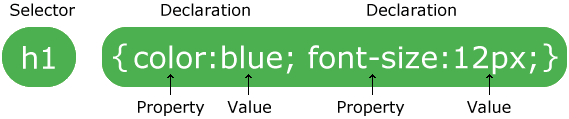
## CSS Syntax
---
## CSS Selectors
### 1. Simple selectors
- base on tag
```css=
/* Example: 所有的 <p> 都會符合受此 CSS 影響 */
p {
text-align: center;
color: red;
}
```
----
- base on id
```css=
/* id 是在 html 中獨一無二的,不該出現兩個有同樣 id 的 tag */
/* 符合此 id 的 tag 都會影響 */
/* ex. <p id="title">我想當標題</p> */
#title {
color: black;
font-size: 36px;
font-weight: bold;
}
```
----
- base on class
```css=
/* 並不唯一, 可以同時對很多有相同 class 的 tag 做調整 */
/* 符合此 class 的都會影響 */
/* ex. <p class="title">我想當標題</p> */
.title {
color: black;
font-size: 36px;
font-weight: bold;
}
/* 可同時滿足多個 class,並用空白隔開 */
```
----
- universal selector
```css=
/* 影響所有 html element */
* {
text-align: center;
color: blue;
}
```
----
- grouping selector
```css=
/* 同時影響多的 element */
h1, h2, p {
text-align: center;
color: red;
}
```
---
### 2. Combinator selectors
- Descendant Selector (space)
```css=
/* 所有在 <div> 裡面的 <p> */
div p {
background-color: yellow;
}
```
- Child Selector (>)
```css=
/* 所有在 <div> 裡面「第一層」(children) 的 <p> */
div > p {
background-color: yellow;
}
```
----
- Adjacent Sibling Selector (+)
```css=
/* 所有 與 <div> 相連的<p> (同一層) */
div + p {
background-color: yellow;
}
```
- General Sibling Selector (~)
```css=
/* <div> 之後的所有 <p> (同一層) */
div ~ p {
background-color: yellow;
}
```
----

---
### 3. Pseudo-class selectors
Define a special state of an element
**語法:**
```css=
selector:pseudo-class {
property: value;
}
```
----
**Example:**
```css=
/* unvisited link */
a:link {
color: #FF0000;
}
/* visited link */
a:visited {
color: #00FF00;
}
/* mouse over link */
/* 必須在 link, visited 之後! */
a:hover {
color: #FF00FF;
}
/* selected link */
/* 必須在 active 之後! */
a:active {
color: #0000FF;
}
```
---
### 4. Pseudo-elements selectors
- Style 某 element 第一個字母、第一行
- 在 element 的前後插入東西
**語法:**
```css=
selector::pseudo-element {
property: value;
}
```
----
**Example:**
```css=
p::first-letter { /* 第一個字母 */
color: #ff0000;
font-size: xx-large;
}
p::first-line { /* 第一行 */
color: #0000ff;
font-variant: small-caps;
}
h1::before { /* 內容之前插入 url */
content: url(smiley.gif);
}
h1::after { /* 內容之後插入 url */
content: url(smiley.gif);
}
::selection { /* 用滑鼠反白的內容 */
color: red;
background: yellow;
}
```
---
### 5. Attribute selectors
以 attribute 來分辨作用對象
**Example:**
```css=
input[type="text"] {
width: 150px;
display: block;
margin-bottom: 10px;
background-color: yellow;
}
input[type="button"] {
width: 120px;
margin-left: 35px;
display: block;
}
```
---
## CSS Comments
```css=
/* */
```
---
## CSS Colors
```css=
div {
color: blue;
background-color: rgba(79, 196, 255, 0.5);
}
```
----
色碼示方法:
```css=
blue /* 內建顏色,有140種 */
rgb(79, 196, 255) /* rgb (紅綠藍) */
#4fc4ff /* HEX (16進位表示 rgb) */
hsl(200°, 100%, 65%) /* HSL (色相、飽和度、亮度)*/
/* 多一個參數 (0~1),意思是透明度 */
rgba(79, 196, 255, 0.3)
hsla(200°, 100%, 0.2)
```
----
如何尋找喜歡的顏色?
Google 搜尋: Color picker
---
## CSS Background
```css=
body {
background-color: rgba(0, 0, 0, 0.8);
background-image: url("http://blog.hostbaby.com/wp-content/uploads/2013/07/scuffedstatic_dark1400x900.jpg");
/* 預設會 repeat 至填滿 */
/* 也可以設定縱向、橫向 repeat 即可 (repeat-y, repeat-x) */
background-repeat: no-repeat;
background-position: left top;
background-attachment: fixed; /* scroll or fixed */
background-size: cover;
}
```
---
## CSS Borders
property: **上 右 下 左** (four values)
property: **上 右左 下** (three values)
property: **上下 左右** (two values)
property: **全部** (one value)
```css=
div.border {
border-style: dotted solid;
border-width: 1px 2px 1px 6px;
border-color: white;
border-radius: 20px;
}
div.border-short {
border: 3px solid lightgray;
}
```
---
## CSS Box Model

----
### Margin
```css=
div.margin {
margin-top: 3px;
margin-right: 6px;
margin-bottom: 9px;
margin-left: 12px;
/* margin: 3px 6px 9px 12px; */
/* margin: 3px 6px 9px; */
/* margin: 3px 6px; */
}
```
----
### Padding
```css=
div.padding {
padding-top: 1px;
padding-right: 2px;
padding-bottom: 3px;
padding-left: 4px;
/* padding: 3px 6px 9px 12px; */
/* padding: 3px 6px 9px; */
/* padding: 3px 6px; */
}
```
----
### Height and Width
```css=
div {
height: 30%;
width: 500px;
}
```
----
### Element's height and width
- 預設是一個element的長寬是 height/width + padding + border
- 所以想要以 width / height 來作為排版用的長寬 `box-sizing: border-box;`
```css=
* {
box-sizing: border-box;
}
```
---
## CSS Text
```css=
p.text {
color: white;
text-align: left; /* left right */
text-decoration: underline; /* none, overline, line-through */
text-transform: uppercase; /* lowercase capitalize */
text-indent: 30px;
letter-spacing: 3px;
line-height: 1.8;
word-spacing: 10px;
white-space: nowrap;
}
```
---
## CSS Font
```css=
p {
font-family: Arial, Helvetica, sans-serif;
font-style: italic; /* normal, oblique */
font-weight: bold;
font-size: 18px;
}
```
也有其他字體,中文也有很多字體,自行 Google~
---
## CSS Display
大多是 element 預設是 block 或是 inline
----
### Block-level elements
會換行,寬度會拉到最寬
```html=
<div>
<h1> - <h6>
<p>
<form>
<header>
<footer>
<section>
...
```
----
### Inline Elements
同行,寬度會是最多他可以的量
```html=
<span>
<a>
<img>
...
```
----
### Display
- 可覆蓋 element 的預設 display
- 可配合 js 做東西的顯示跟隱藏
```css=
.hidden {
display: none; /* block, flex, inline-block ... */
}
li {
display: inline;
}
```
https://www.w3schools.com/cssref/pr_class_display.asp
---
## CSS Position
```css=
div.fixed {
postion: fixed; /* static, relative, absolute, sticky */
}
```
----
### static
- default value
- 不被 top, bottom, left, right 影響
### relative
- 與原本該在的位置做相對的移動
```css=
div.relative {
position: relative;
left: 30px;
border: 3px solid #73AD21;
}
```
----
### fixed
- 鎖定與整個視窗的相對位置
- 就算滑動頁面,也在同樣的位置
```css=
div.fixed {
position: fixed;
bottom: 0;
right: 0;
width: 300px;
border: 3px solid #73AD21;
}
```
----
### absolute
- 與最近一層 position 不是 static 的 element 做相對計算
- 若上層皆沒有設 postion,那就是與整個 body 做相對計算
- 會隨著 scroll 滑動
```css=
div.absolute {
position: absolute;
top: 80px;
right: 0;
width: 200px;
height: 100px;
border: 3px solid #73AD21;
}
```
----
### sticky
- 會跟著滑動,直到到達符合的 postion 位置
```css=
div.sticky {
position: -webkit-sticky; /* Safari */
position: sticky;
top: 0; /* 跟著滑動直到 top = 0, 此時便會黏在最上方 */
background-color: green;
border: 2px solid #4CAF50;
}
```
----
### Overlapping Elements
有東西互相蓋到 -> `z-index`
```css=
img {
z-index: -1;
}
```
---
## CSS Overflow
- visible: 預設,超出頁面的直接就超出去了
- hidden: 超出頁面的直接隱藏看不到
- scroll: 加一個 scroll bar,可以滑到超出的頁面
- auto: 在需要的時候加一個scroll bar
---
## CSS Align
各種把東西擺好的方法
https://www.w3schools.com/css/css_align.asp
---
## CSS Specificity
一個 element 被多個 selector 選擇到而有衝突順位時:
- elements < classes < id < inline styles
`Ex. div < div.hello < div#hi < <div style="color:red">`
- 同樣的設定下面的會覆蓋之上的
```css=
h1 {background-color: yellow;}
h1 {background-color: red;} /* 覆蓋上面的,所以會顯示紅色 */
```
- 越詳細的會越優先
`div#a > #a > div[id=a]`
---
## CSS Units
- Absolute Lengths 絕對長度單位
cm, mm, in(inches), **px(pixels)**, pt, pc
其中 px 會跟顯示器的解析度有關,較常用到
```css=
h1 {
font-size: 50px;
}
```
----
- Relative Lengths 相對
- **em**: 與現在所在的 element 的 font-size 相對
- **rem**: 與 root element (`<html></html>`的 font-size 相對
- vw: viewport(網頁的可視範圍) 寬度的 1%
- vh: viewport 高度的 1%
- **%**: 與上一層的 element 的相對 % 數
----
通常會用相對的單位,這樣支援不同螢幕大小可以有相對的縮放
其中 **em**, **rem** 很適合用作網頁單位,可以支援不同螢幕大小的裝置
```css=
html {
font-size: 16px;
}
h1 {
font-size: 3rem;
}
```
---
其實我們根本也不會記這麼多,都是用到了再去查,所以剩下的有興趣了解也可以自己看喔!
----
## CSS Flex
https://www.w3schools.com/css/css3_flexbox.asp
https://cythilya.github.io/2017/04/04/flexbox-basics/
- 排版神器
- 分外層內層
- 外層是 container,用來排版內層的 item (element)
- container:
- flex-direction: 主軸方向
- row(default), column, row-reverse, column-reverse
- flex-wrap: 是否換行
- wrap, nowrap
- flex-flow: 上面兩個的一行寫法
- [flex-direction], [flex-flow]
- justify-content: 主軸方向上的對齊方式
- center, flex-start, flex-end, space-around, space-between, space-evenly
- align-items: 垂直主軸方向上的對齊
- center, flex-start, flex-end, stretch(default), baseline
- align-content
- item:
- flex-grow: 每一個 item 所佔比例 (數字)
- flex-shrink: 被壓縮的比例 (數字)
- flex-basis: item 的原始長度
- flex: 上面三個的一行寫法 [flex-grow] [flex-shrink] [flex-basis]
- - order: item 的順序 (數字)
- align-self: 覆蓋原本上層的 align-items 屬性
```css=
/* css */
.flex-container {
display: flex;
background-color: DodgerBlue;
flex-direction: row;
flex-wrap: nowrap;
justify-content: center;
align-items: flex-start;
}
.flex-container > div {
background-color: #f1f1f1;
margin: 10px;
padding: 20px;
font-size: 30px;
}
```
```htmlembedded=
<!-- html -->
<div class="flex-container">
<div style="flex-grow: 3;">1</div>
<div>2</div>
<div style="align-self: flex-end">3</div>
</div>
```
## CSS Gradients 顏色漸層
- Linear Gradients
- Syntax
`background-image: linear-gradient(direction(0deg), color1, color2, color3 ...)`
- direction:
- to down (default) (上到下)
- to right (左到右)
- to bottom right (左上右下)
- 要重複的話就用 repeating-linear-gradient
- Radial Gradients
- Syntax
`background-image: linear-gradient(shape size at position, color1, color2, color3 ...)`
## CSS Shadow
- text-shadow 對文字做陰影
```css=
.text-shadow {
text-shadow: 2px 2px 15px blue; /* 橫向,縱向,模糊大小 */
}
```
- box-shadow 對整個 element 做陰影
```css=
.box-shadow {
box-shadow: 2px 2px 15px grey; /* 橫向,縱向,模糊大小 */
}
```
## CSS Transform
- transform:
- translate(x, y) 從原來位置移動 x, y
- rotate(xdeg) 順時針旋轉 x 度
- scaleX(n) x 向放大 n 倍
- scaleY(n) y 向放大 n 倍
- scale(n1, n2) x 向放大 n1 倍, y 向放大 n2 倍
- skewX(xdeg) x 向歪斜 x 度
- skewY(ydeg) y 向歪斜 y 度
- skew(x, y) 歪斜 x , y 度
- matrix(scaleX(),skewY(),skewX(),scaleY(),translateX(),translateY()
- 3D transform
https://www.w3schools.com/css/css3_3dtransforms.asp
## CSS Transition
1. 漸漸地變換 properties
2. 需要給他預計要變換的 property 跟 此效果的持續時間
- transition: property1 [n1]s, property2 [n2]s ...
- 對 property1 的變化持續時間為 n1 秒,property2 的變化持續時間為 n2 秒
- transition-delay: [n]s
- 變化 delay n 秒才開始
- transition-duration:
- 變化持續時間
- transition-property
- 預計變化的 property
- transition-timing-function (https://www.w3schools.com/css/tryit.asp?filename=trycss3_transition_speed)
- ease: 一開始慢,接著快,最後慢
- linear: 一樣的快慢
- ease-in: 一開始慢
- ease-out: 最後慢
- ease-in-out: 一開始跟最後慢
- cubic-bezier(n, n, n, n): 自己設定(https://www.w3schools.com/cssref/func_cubic-bezier.asp)
## CSS Animations
用 CSS 做動畫效果
- @keyframes
- animation-name
- animation-duration
- animation-delay
- animation-iteration-count
- animation-direction
- animation-timing-function
- animation-fill-mode
- animation
```css=
.animation {
width: 100px;
height: 100px;
background-color: red;
position: relative;
animation-name: example; /* 對應的動畫效果 */
animation-duration: 5s; /* 一次動畫的時間 */
animation-timing-function: linear; /* 動畫的變化 */
animation-delay: 2s; /* 開始動畫前的delay */
animation-iteration-count: infinite; /* 動畫循環次數 */
animation-direction: alternate; /* 動畫正轉、倒轉(reverse)、輪流 */
}
@keyframes example {
/* 動畫進展到幾%的時候會呈現的樣子 */
0% {background-color:red; left:0px; top:0px;}
25% {background-color:yellow; left:200px; top:0px;}
50% {background-color:blue; left:200px; top:200px;}
75% {background-color:green; left:0px; top:200px;}
100% {background-color:red; left:0px; top:0px;}
}
```
## CSS Media Query and responsive
可以檢查 device 的 width, height,然後做不一樣的 css,可以對應不同大小的螢幕做不一樣的調整 (Responsive)
```css=
/* 當螢幕寬度小於 600px 時, 背景變成淺藍色 */
@media screen and (max-width: 600px) {
body {
background-color: lightblue;
}
}
```
常用寬度特判:
```css=
/* Extra small devices (phones, 600px and down) */
@media only screen and (max-width: 600px) {...}
/* Small devices (portrait tablets and large phones, 600px and up) */
@media only screen and (min-width: 600px) {...}
/* Medium devices (landscape tablets, 768px and up) */
@media only screen and (min-width: 768px) {...}
/* Large devices (laptops/desktops, 992px and up) */
@media only screen and (min-width: 992px) {...}
/* Extra large devices (large laptops and desktops, 1200px and up) */
@media only screen and (min-width: 1200px) {...}
```
更多 Example: https://www.w3schools.com/css/css3_mediaqueries_ex.asp
## Templates
不想自己寫 CSS,可以去套版,然後做微調
無腦套版: https://html5up.net/
歷時很久的套版網站: https://getbootstrap.com/
長得像Google的東西: https://material.io/design/
有混合其他版型: https://semantic-ui.com/
## Reference
w3schools: 寫得很親民,還可以實作
https://www.w3schools.com/css/default.asp
MDN: 寫的比較詳細,查資料常用
https://developer.mozilla.org/en-US/docs/Learn/CSS
css tricks: 好像很多炫砲的東西
https://css-tricks.com/
cheatsheets:
https://websitesetup.org/css3-cheat-sheet/
https://htmlcheatsheet.com/css/
---
### HOMEWORK
把剛剛你的網頁用CSS變漂亮吧!
---
{"metaMigratedAt":"2023-06-15T12:42:29.777Z","metaMigratedFrom":"YAML","title":"CSS","breaks":true,"slideOptions":"{\"theme\":\"night\",\"transition\":\"slide\"}","description":"Cascading Style Sheet","contributors":"[{\"id\":\"6481d9e0-6e73-40e2-a4a1-176b5f31f0bf\",\"add\":6,\"del\":0},{\"id\":\"3283cada-956a-4fe4-adfc-dbde9b910191\",\"add\":637,\"del\":1454},{\"id\":\"7092aa1b-8b34-4092-b91b-a2aa74b2e662\",\"add\":15470,\"del\":962},{\"id\":\"a4f7cec5-0d48-4d7e-bc83-4dfab3030445\",\"add\":280,\"del\":87}]"}