# Interactive Data Visualization
D3.js is a very popular javascript framework for creating data visualizations. You can create a lot of basic graphs and figures, but it also has the power to create novel and customizable interactive figures.
Here is an example of a data visualization that Nadieh Bremer made. She started with a chord diagram, but fiddled with it to make a very cool *bat diagram*.
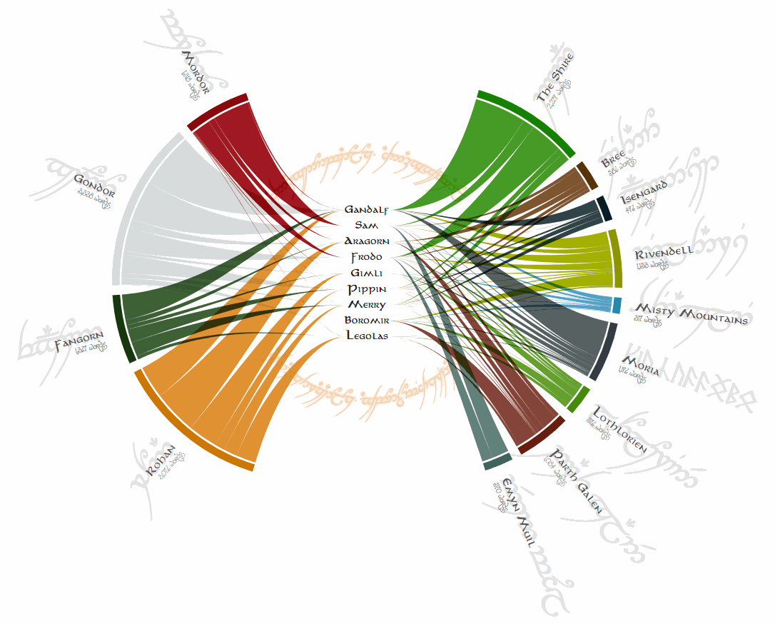
She took the scripts for the LOTR movies and wanted to visualize who spoke in what locations, and how much they spoke. Here is the [link](https://www.visualcinnamon.com/2017/08/d3-loom/) to her blog where she describes the process of making this viz.
From the basic [chord diagram](https://observablehq.com/@d3/chord-diagram), she:
- fiddled with the curves connected the two sides so that they all ran through the middle points, as well as made them "smoother"
- had to code blank space so that the top and bottoms of the chord diagram were empty
- included fun facts about the script for each character, to be displayed when they are hung over. (Her favorite is that Boromir spoke more lines in one movie than Legolas did in all three.)
One of Nadieh's key pieces of advice for new coders is
> don't start from scratch.
There are *a lot* of examples available on line, and you can almost aways start with something close to what you want to make and fiddle with it enough to get your final product.
Food science and Global Hunger