---
tags: anna
---
# Infographics & Visualizing Literary Data (Slavic 132 Mini-Assignment)
For this week’s mini-assignment, you will be tasked with creating a character map or other infographic or data visualization based on the two Chekhov plays that we are reading: “Uncle Vanya” and “The Cherry Orchard.”
As we’ve talked about with each form that we’ve had you try, it’s important to think about why you’re using the specific medium and what you are doing with it that you couldn’t (or wouldn’t want to) do in written text alone. How can visualizing an aspect of a text help us learn more? As you consider the following models, think about how they help you understand the text, what moves they are making, whether you find them to be effective (you don’t have to!), and what moves the medium allows for.
What questions could these visualizations answer, and what further questions could they pose? Usually, they’d be accompanied by some analysis in writing, which we will ask you to do as well.
#### Example 1: Visualizing color

This is a visualization of the colors that Chekhov uses in the first volume of his stories! If you click on it, you can also see a visualization of his use of the color green across volumes:

Both were accompanied by text. You can see more on the (unfinished!) [site](https://chekhovcolor.weebly.com/the-stories.html)
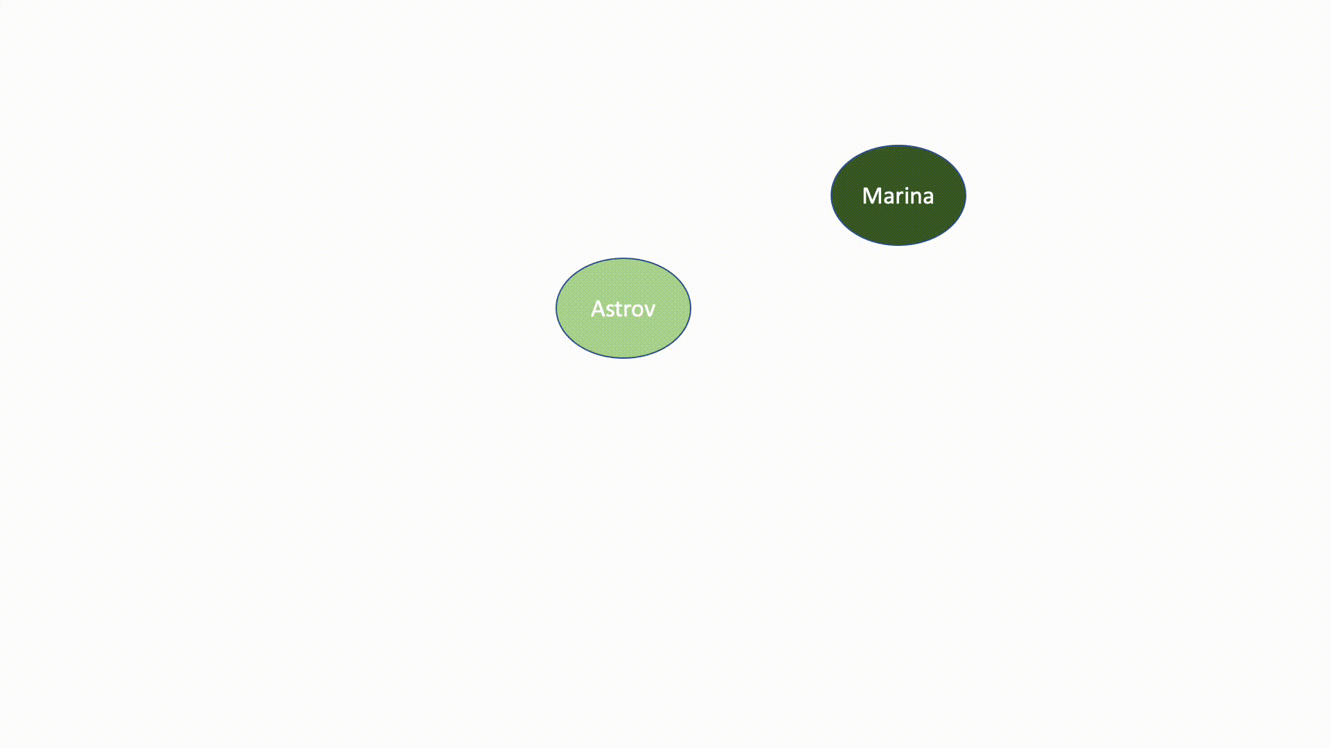
#### Example 2: Character mapping
You can visualize how characters interact or are connected with each other. You can visualize just one scene, or scenes over time, and you can think of "interact" in a variety of ways. Who speaks? Who loves whom? Who is on stage at the same time?
Here's a very basic visualization of characters on stage at the same time in *Uncle Vanya*. You'd want to add a key and a short analysis.
#### Example 3: Happiness in War and Peace (created by Paige Lee

The line chart below covers all 17 parts of War and Peace across the 4 volumes and Epilogue. The height of the line corresponds to the count of instances in the part where a character's name occurs in conjunction with any one of the happiness keywords - schast'ye (happiness), radost', (joy) and vostorg (rapture/delight) in any form. Each individual line corresponds to one character: (Andrei, Pierre, & Natasha). Click on the circles in the legend on the right to show/hide certain lines for less clutter. Note that low points in the graph do not necessarily mean that a character is sad or depressed during that part - the graph only indicates the presence or absence of the words schast'ye, radost', and vostorg.
For more examples and explanation, visit Paige's site [here](https://eelegiap.github.io/warandpeaceandhappiness/#visualizations).
### Other infographics & data visualization
As you can see from the examples above, visualizing literature can take many forms! You are welcome to try something new, using the tools below or other tools that you may already know.
### Your task
You will create a data visualization, infographic, or other visual display of some aspect of one of the two plays you are reading this week. Your visual (or visuals, if you feel that your data points or aspects of the text would be better displayed with multiple visuals) should be accompanied by a couple of paragraphs of accompanying description.
You will upload your visualization (or a link to it, if it is hosted elsewhere) in the Discussion board on Canvas called "Chekhov Data Visualizations."
### Tools and techniques
Literary data can take many forms. Think about the types of data you might visualize, and why! You may also want to think about which types of data you are able to access and to visualize. You don't have to visualize an entire piece of text, nor do you have to do any statistical analysis! If you look at the character mapping above, that was done entirely by hand, by writing down which characters appear in which scenes and visualizing them. There are many types of visualization that you can create in a similar process! Depending on your process, you may want to use one of the following tools:
If you are unsure where to start with getting data from a piece of literature, then [Voyant tools](https://voyant-tools.org/) are a great place to start. We don't want you to just submit a visualization made by Voyant, but it could be a good starting place! Plus, they're good tools to know about.
Canva: We've talked about Canva a bit before. It has great templates for making infographics. If you search their templates for "chart" or "infographic," or the specific type of visualization you're looking for, you'll certainly find one!
PowerPoint: The character mapping gif above was made in PowerPoint, by adding circles to each slide and then exporting it as an animated GIF. Even if you don't make something animated, PowerPoint (or any other presentation tool) can be very useful for visualizing!
Coding, statistical computing, data processing etc: You are welcome to use any tools you are already familiar with (R, Python, Java, Tableau, Gephi, even Excel, etc), though this could be a chance to learn a new tool!
 Sign in with Wallet
Connect another wallet
Sign in with Wallet
Connect another wallet