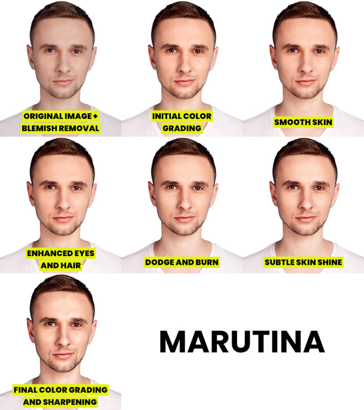
# How to retouch in Affinity or Affinity Photo v2.
Author: **Marutina** | Twitter/X: [Marutina](https://x.com/marutina98) | e-mail: marutina.designer@gmail.com
This guide is aimed at new users learning to retouch in Affinity who know the basics of the program and for former/current Photoshop users looking to migrate.
NB. There might be a few grammar errors here and there because I am a non-native English speaker. I should've caught the majority of them but I apologize in advance.
For the former/current Photoshop users, I'll indicate where the process is identical (or close to) in both programs and/or where they differ.
NB. Every retouch is different, and at times I might skip some of these steps or be even more aggressive with my editing. It's a general guide.
There are a few optional steps (or alternative methods) where I use G'MIC (a free plugin suite for multiple photo editors). Download it [here](https://gmic.eu/download.html).
[](https://postimg.cc/p5PmchQn)
## Step 1: Remove the blemishes.
*This process is virtually identical in both programs. Feel free to skip this.*
If I notice the presence of blemishes that I believe smoothing the skin texture won't remove, this is how I proceed:
1) I create a new layer to keep the process as non-destructive as possible. I never modify the original subject layer and always keep backups.
2) With the Healing Brush Tool sourcing the current layer and the ones below it and a soft round brush, I remove the blemishes sourcing the surrounding areas with similar texture.
[](https://postimg.cc/9451F2G2)
[](https://postimg.cc/d7PntF8h)
## Step 2: Initial Color Grading.
*In Photoshop, that's where I would convert the original layer and the "blemish removal" layer into a smart object and proceed with smoothing the skin in Camera RAW Filter and then color grade. Because of the way Affinity works, I've swapped the two steps. More on how I'd smooth the skin in Photoshop in the next step.*
In Photoshop, I play with various sliders but the ones I *almost* always change are: Exposure, Contrast, Highlights, Shadows, Whites, Blacks and Vibrance. This is the same thing done with Affinity's adjustment layers instead. I like to group these adjustment layers in their own group (called "initial color grading"). Affinity has its own answer to Photoshop's Camera RAW Filter, but it only works on RAW files.
1) Increase the exposure with Exposure.
2) Increase the contrast with Brightness/Contrast.
3) Increase the shadows strength and decrease the highlights strength with Shadows/Highlights (found in Live Filters and not among the Adjustment Layers).
4) Raise the white point and lower the black point with a Level adjustment layer (can be done with Curves instead).
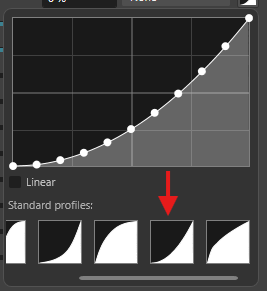
5) Increase the vibrance with the combination of two adjustment layers (Affinity's built-in Vibrance is not as strong as Photoshop's).
1) Create a Vibrance adjustment layer and set it to 100%.
2) Increase *slightly* the saturation with a HSL Shift adjustment layer and set its blend mode to Luminosity.
If you don't mind a more destructive approach (I prefer non-destructive editing), the plugin G'MIC has a Vibrance filter that should be closer to Photoshop's own Vibrance.
## Step 3: Skin texture smoothing.
*In Photoshop, I smooth the skin playing with the sliders Textures and Noise Reduction in Camera RAW Filter and by masking the areas I don't want to smooth in the Smart Filter mask. I'd then reconvert the smart object into a new smart object and proceed with the initial color grading. In Affinity, I don't need to nest smart objects inside other smart objects because of the way Live Filters work.*
There are multiple methods to do this. This is just my preferred one.
1) Add a Clarity filter set to -100%.
2) Mask out the areas that don't need to be smoothened (virtually anything that isn't skin).
If you are experiencing performance issues, this filter causes Affinity to lag. Just hide the filter while working on the rest of the thumbnail and turn it on before exporting it.
## Step 4: Making the skintone more consistent.
*There is no big difference between Photoshop and Affinity when making the skintone more consistent with gradient maps. Feel free to skip it.*
This is an optional step, if the skintone of the subject is already consistent I won't do any of this.
1) Remove any present redness or red patches with a HSL Shift adjustment layer.
2) Add a gradient map picking from the skin of the subject at least three colors (representing highlights, midtones and shadows) and mask out the areas that are not skin.
3) Set the gradient map's blending mode to Color and/or Hue and adjust its opacity (I often duplicate the gradient map and set one to Color and one to Hue).
4) Adjust the colors of the gradient map until they look right.
I often add other adjustment layers (Selective Color, Vibrance etc.) to enhance the skin because I'm not often satisfied with solely using a gradient map.
If the subject has a short beard and a lot of skin is visible, I often play with the Blending Range of the layer (Affinity's equivalent of Photoshop's Blend If) to hide it from the beard but still retouching the skin around.
Virtually speaking, Affinity's Blending Ranges and Photoshop's Blend If work the same but one is curve-based and the other is level-based.
These are a few tutorials that helped me when learning how to do this:
PixImperfect's tutorial about removing red patches: https://www.youtube.com/watch?v=xJLF4VuJHQA
PixImperfect's tutorial about using gradient maps to make the skintone more consistent: https://www.youtube.com/watch?v=jxch6CzBfAI
Technically Trent's tutorial about Blending Ranges in Affinity: https://www.youtube.com/watch?v=-YRpKKpU5RQ
## Step 5: Enhance the eyes, teeth and hair.
*This is virtually identical between the two programs. Feel free to skip this.*
1) Desaturate teeth and scleras with a HSL Shift adjustment layer or using a Fill Layer with a white/black/grey color set to Color.
2) Brighten teeth and scleras with a Brightness/Contrast, Curves or Level adjustment layer.
3) Optional: lower the opacity of the desaturation layer to make it more natural.
The method I use to enhance the hair changes for each retouch. I might dodge and burn it, sharpen it or even recolor it.
## Step 6: Desaturate and change the color of the clothing.
*This is also virtually identical between the two programs but Affinity splits the former's Hue/Saturation adjustment layer into two: HSL Shift and Recolor. Recolor is the equivalent of Photoshop's Colorize option in Hue/Saturation. Feel free to skip this.*
This is an optional step and it depends (as most of these steps) from the original image. I won't delve on this much but this is more or less what I generally do.
1) Select and desaturate the clothing with a HSL Shift adjustment layer.
2) Slightly darken the clothing in the same adjustment layer.
3) Change the color with Recolor adjustment layer.
4) Enhance the color with a Curve or Level adjustment layer.
I will continue enhancing the now recolored clothing in the next step by dodging and burning, this will make it look less cartoony.
## Step 7: Non-destructive Dodge and Burn using Curves.
*Again, virtually identical between the two programs. Feel free to skip this.*
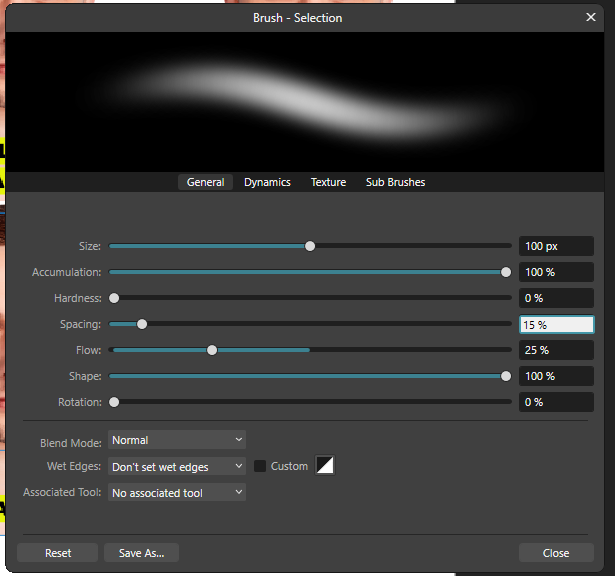
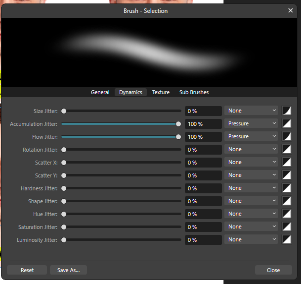
Having a graphics tablet will make this step easier but it's not needed. Playing around with the flow and accumulation (opacity) should work just as well.
1) Create two curves with inverted masks (aka a black mask that hides everything to paint into them).
1) One where the midtones are increased (our dodge curve). This curve will be used to brighten.
2) One where the midtones are decreased (our burn curve). This curve will be used to darken.
2) Choose a soft round brush with a low flow and/or with its pressure dynamics activated for both flow and accumulation (accumulation is the equivalent for opacity in Photoshop).
3) The general rule is to darken the dark areas and brighten the light areas, basically enhancing the shadows and highlights that are already present.
These are the brush settings I use.
[](https://postimg.cc/1ghM5SpX)
[](https://postimg.cc/v1FXHyWB)
[](https://postimg.cc/rdXgFTSK)
Two tips to make this easier:
1) Remove the color from the image using a layer over the two curves filled with grey (or white/black) set to color. This will only show the value of the image.
2) Create a "shading map" to put under the two curves, basically a layer filled with grey set to normal. I keep it hidden until I want to check how my dodge and burning is going.
## Step 8: Add shine to the skin.
*This step is identical between the two programs. If you know how to do this in Photoshop, feel free to skip this.*
This process adds a healthy shine to the skin. You can make it as subtle or as extreme as you want. I use an Exposure adjustment layer but it can also be done with Curves or Layers.
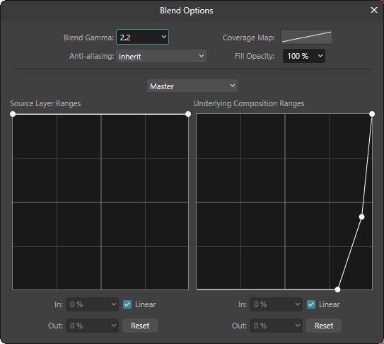
1) Create an Exposure adjustment layer with a value between .25 and .5, invert its mask and show it only on the skin of the subject.
2) In the Blending Range, in the Underlying Composition Ranges curve, remove it from the shadows to show it only in the highlights.
This will enhance the dodged areas in the previous step.
This is how I've set up the curve in the example.
NB. In the example I've masked out the neck because the shine was too extreme after the final color grading.
[](https://postimg.cc/sBdKDzpQ)
## Step 9: Final Color Grading.
*In Photoshop, I'd do this applying a Camera RAW Filter on a flattened copy of the entire thumbnail (minus the text, boxes and anything of the sort). I'd play with the various sliders (generally Color Mixer and Color) but the ones I universally always add at the end are Grain, Texture and Sharpen.*
This should be done **under** any text layer or anything you don't want to sharpen or add texture to (apart from the grain, which can be added to everything).
1) Add grain (the two methods have their own paragraph under this explanation) and set its blending mode to Soft Light.
2) Sharpen the thumbnail with a High Pass (set to Soft Light) and an Unsharp Mask Filter.
3) Add two Clarity filters.
1) The first with a strength of around 25% with its blending mode set to Normal.
2) The second with a lower strength (of around 10%) with its blending mode set to Luminosity (to kind of emulate the Texture setting present in Camera RAW).
4) Add any eventual adjustment layers to enhance the colors if needed (Color Balance or Selective Color are what I generally use).
To create the grain, I've used these two methods before:
Method A (Affinity):
1) Create a new layer filled with a midgrey (#808080) set to Soft Light.
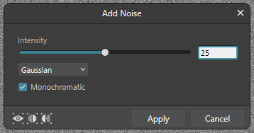
2) Use the filter Noise to add some noise to the level. I've used these settings:
[](https://postimg.cc/Z9tjKmr4)
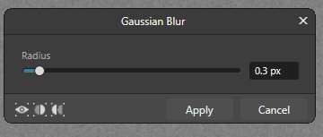
3) Add a Gaussian Blur to the level and you're done. I've used these settings:
[](https://postimg.cc/67Jz5Kd5)
Method B (G'MIC, it gives the best result):
1) Create a new layer filled with a midgrey (#808080) set to Soft Light.
2) Use G'MIC's Add Grain filter under Degradation with these settings:
[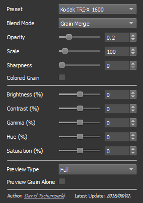](https://postimg.cc/9451F2GV)
## Step 10: Chromatic Aberration (optional).
*In Photoshop, I do this on a flattened copy of the thumbnail by hiding the Red channel in the Advanced Blending options of the layer and moving it 1px to the left.*
Not retouching-related but it's something I do on every thumbnail after the final color grading.
1) Create a new layer with the flattened thumbnail and add a Chromatic Aberration glitch with G'MIC using these settings.
[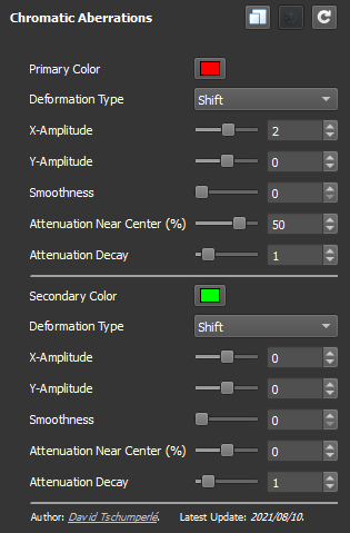](https://postimg.cc/wt8FTzh9)
 Sign in with Wallet
Connect another wallet
Sign in with Wallet
Connect another wallet