# (1) Feature and attribute data
###### tags: `session-2-chunkified`
## Types of attribute data
* **Review: Attribute data tell us “what” is happening.** This kind of data describes things like household income, air quality, or unemployment rates—things you can’t see with your naked eye.
* For attribute data to be legible to computers, we have to store it in predetermined forms that computers can understand.
* The two most basic of these forms are **strings** and **numbers**. Strings are combinations of letters: humans can read strings as words or codes. Numbers record countable observations and values.
###### A map...

###### ...and its attribute table

<hideable title = "On your own time">
Let’s revisit this unemployment map we looked at last session.

###### Local Area Unemployment Statistics Map, US Bureau of Labor Statistics
The attribute data behind this map look like this:

###### Screenshot of the attribute table behind the BLS unemployment map.
Attribute data tell us “what” is happening. This kind of data describes things like household income, air quality, or unemployment rates—things you can’t see with your naked eye.
As we discussed last time, an essential part of the mapmaking process is making information legible to a computer. Remember: computers aren’t smart. They need information structured in very specific ways in order to process it. So when we record observations about the world, we have to arrange them in established conventions that computers can understand.
There are two basic forms of attribute data: **strings** and **numbers**. Strings are combinations of letters: humans can read strings as words or codes. Numbers record countable observations and values. What form of data do you think is in the unemployment data table?
</hideable>
## Types of feature data
* **Review: Feature data describe “where” something is happening.** Feature data are things we can see in the world, like roads, state boundaries, and waterways.
* There are two types of feature data: **raster** and **vector**. Raster data are used to make maps of continuous, like types of land cover or air temperature. Vector data are used with phenomena that have discrete spatial boundaries, like election results or building value.
* There are three types of “shapes” within vector data: **points**, **lines**, and **polygons**.
###### Example of a map using raster data

###### Example of a map using vector data
<hideable>
We have many ways to describe physical features of the world around us: a road can be narrow, wide, winding, straight, rocky, dirt, paved. We understand, inherently, that the boundary between ocean and dry land is not a perfect line: it changes over the course of the day. But computers can’t handle all of this complexity. They need us to simplify all of the nuance and intricacy of the physical world so they can interpret and represent it.
There are just two ways that computers can see the world and make shapes to represent it. We, in turn, have to create data in these two forms. On one hand, there is **raster data**, which represent the world like a vast mosaic, dividing up into a grid of tiles of equal size. On the other hand, **vector data** represent the world like a stained glass window, with shards of glass cut into different shapes and sizes and soldered together.
One type of geospatial data is not better than the other: each is suited to certain types of mapping exercises. Raster data are often used to make maps that describe phenomena that are continuous across space, such as types of land cover (forest, marsh, swamp, desert, etc) or air temperature. On the other hand, vector data are used with phenomena that have discrete spatial boundaries, like election results, which hew to election district boundaries, or building value, which hew to tax parcels.

###### A map from Penn State researchers showing the changes in nitrogen dioxide concentrations in the northeast United States between April 2020 and the previous four years. Oranges and reds indicate higher concentrations and greens and blues showing lower concentrations. Notice how the data are represented in a mosaic style, with a grid of equal-sized squares covering the whole area of the map.
Notice how in this map, the colors don’t change from state to state: Pennsylvania is not orange and Delaware is not blue. Rather, the whole area is divided up into a grid of squares, and each square has a color associated with a numerical value. This is an example of a map made with raster data.
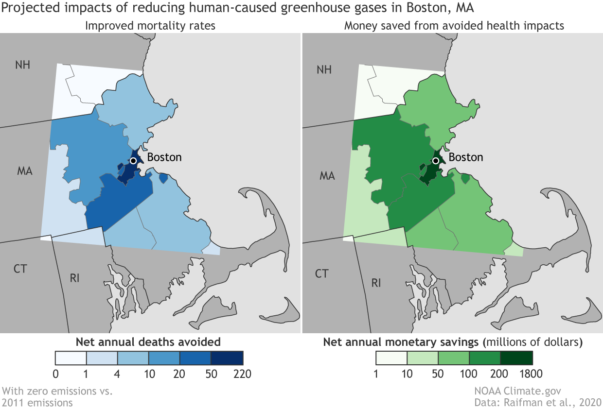
Let’s see how raster data compares to these maps that show the positive health effects of reduced greenhouse gasses. In this map, the space is divided up by county, and the color of each county corresponds to a numerical value. You can almost imagine someone cutting the shapes of each county from a sheet of glass, and soldering them together to make this stained glass window.

###### A map from the NOAA showing positive health effects of reduced greenhouse gasses in the Boston area.
In the stained-glass-world of vector data, there are three types of shape: the point, the line, and the polygon. The **point** is a single location. The **line** connects two or more points. The **polygon** is a two-dimensional shape that has an area. In the NOAA maps of Boston, the counties are polygons, and the symbol that represents Boston is a point. Can you think of an example of a kind of spatial feature might be represented with a line?
</hideable>
---
## Comprehension check: identify types of data
Can you identify which types of geospatial data are used in this map of hazardous sites and poverty in Massachusetts? Be specific: identify each element you see on the map and define what shape it is.

###### Massachusetts income and hazardous sites.
<hideable title = "Check your answers">
The towns (colored yellow, orange, and red according to the share of population below the poverty line) are polygons. The hazardous site dots are points. Bonus points if you got this one: the highways, shown in white in the surrounding states are lines!
</hideable>
What type of vector data are used to represent the supermarkets in this map of Boston? What about the parks?

###### Open space and supermarkets in Boston.
<hideable title = "Check your answers">
The parks are polygons. The supermarkets are points, but the points are styled to look like shopping carts!
</hideable>
 Sign in with Wallet
Connect another wallet
Sign in with Wallet
Connect another wallet