# PHS Seminar Resource: Graphic Design and Powerful Presentations
This document provides a recap of our recent workshop, along with supplemental resources to enhance your visual and oral communication skills for presentations.
## Recap
During the workshop, we discussed the importance of **story and structure** in presentations. When presenting research, connecting it to a broader narrative helps engage the audience. We discussed Nancy Duarte's TED Talk on how great presentations follow a storytelling structure.
<iframe width="560" height="315" src="https://www.youtube.com/embed/1nYFpuc2Umk?si=Z_NBrctBOzV7tcUo" title="YouTube video player" frameborder="0" allow="accelerometer; autoplay; clipboard-write; encrypted-media; gyroscope; picture-in-picture; web-share" referrerpolicy="strict-origin-when-cross-origin" allowfullscreen></iframe>
We explored how presentations often follow a **tension-to-resolution** structure, similar to classic storytelling. Just like in movies, research presentations can frame a problem (tension) and guide the audience toward a resolution.
### Graphic Design in Slides
We then covered **basic graphic design principles**. Just as in writing, visuals should guide the audience through an argument with clarity and purpose.
We saw a playful graphic design card trick, highlighting how contrast, repetition, alignment, and proximity shape effective design.

#### One Idea at a Time
Avoid overwhelming your audience with too much information at once. Instead of displaying multiple graphs or complex visuals on a single slide, reveal **one idea at a time**. This approach allows your audience to absorb and process key information before moving on to the next point.
#### Establish a Visual Home Base
A **visual home base** helps maintain consistency throughout your presentation. This could be a repeated graphic, a simple structure, or a layout that provides continuity between slides. A great example of this is Steve Jobs introducing the iPad, where his **three-part layout** serves as a home base, keeping the audience oriented while the center section evolves to introduce new information.
Watch how he does it here:
<iframe width="560" height="315" src="https://www.youtube.com/embed/OBhYxj2SvRI?si=KLfnSLXKOmPjFI7a" title="YouTube video player" frameborder="0" allow="accelerometer; autoplay; clipboard-write; encrypted-media; gyroscope; picture-in-picture; web-share" referrerpolicy="strict-origin-when-cross-origin" allowfullscreen></iframe>
#### Highlight Key Ideas
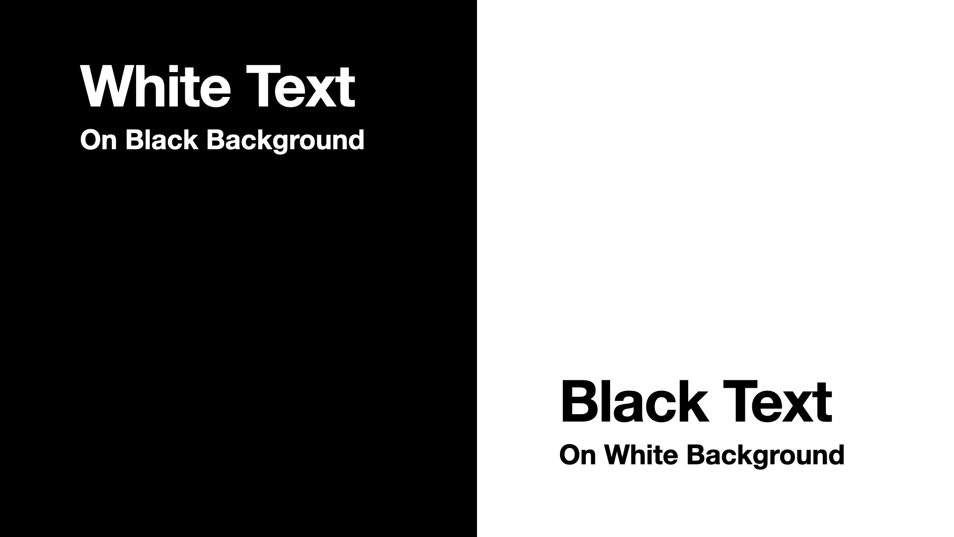
Another thing to consider is using white text on a darker background instead of black text on a lighter, image-based background. The bonus of white text is that your words/ideas remain the brightest thing on the screen.
### Integrating Visual and Oral Communication
Finally, we examined how to integrate **visual and oral communication**, ensuring that slides support—not compete with—the speaker. We emphasized the importance of concise text, intentional use of visuals, and moments where no visuals might be the most impactful.
Every design choice plays a functional role in communicating your ideas. Here's how to harmonize visuals with your speech:
1. **Your visuals are your support:** Think of yourself as the main character and your visuals as the supporting cast. Ensure your visuals enhance your message without overshadowing you. Sometimes, a blank screen can refocus attention solely on your words.
2. **Text should be more iconic:** Avoid overcrowding slides with text. Use keywords or labels to complement your speech. If extensive text is necessary, read it aloud to synchronize visual and auditory information.
For an in-depth exploration of multimedia communication principles, consider Richard Mayer's 12 Principles of Multimedia Learning. These principles provide a framework for designing effective multimedia instructional materials.
[Read about Mayer's 12 Principles of Multimedia Learning](https://www.digitallearninginstitute.com/blog/mayers-principles-multimedia-learning)
## Helpful Resources
### Graphic Design Resources
**Books Available Through HOLLIS:**
- Duarte, N. (2008). *Slide:ology: The Art and Science of Creating Great Presentations*. O'Reilly Media.
- Frankel, F., & DePace, A. H. (2012). *Visual Strategies: A Practical Guide to Graphics for Scientists & Engineers*. Yale University Press.
**Online Resources:**
- [Adobe Color Contrast Analyzer](https://color.adobe.com/create/color-contrast-analyzer)
- [Graphic Design Foundations: Layout and Composition](https://www.linkedin.com/learning/graphic-design-foundations-layout-and-composition/introducing-the-foundations-of-layout-and-composition)
### Oral Presentation Resources
- [Designing a Presentation](https://www.linkedin.com/learning/designing-a-presentation-14176816/designing-a-presentation)
- [Presenting Data Effectively](https://www.linkedin.com/learning/presenting-data-effectively-to-inform-and-inspire/presentations-with-greater-impact)
- [Presenting Technical Information with Stories](https://www.linkedin.com/learning/presenting-technical-information-with-stories/storytelling-for-technical-presentations)
- [Speaking Confidently and Effectively](https://www.linkedin.com/learning/speaking-confidently-and-effectively/great-speaking-skills-are-a-must-have)
### Software Resources
**PowerPoint:**
- [PowerPoint Essential Training](https://www.linkedin.com/learning/powerpoint-essential-training-microsoft-365/deliver-a-powerful-message-with-a-powerful-presentation)
- [PowerPoint Tutorials](https://support.microsoft.com/en-us/office/powerpoint-for-windows-training-40e8c930-cb0b-40d8-82c4-bd53d3398787)
- [Easy Ways to Make Your Presentation Stand Out](https://www.linkedin.com/learning/powerpoint-eight-easy-ways-to-make-your-presentation-stand-out/go-the-extra-mile)
- [PowerPoint for Scientists Video Series](https://www.youtube.com/watch?v=c4tsCXR_B3Y&list=PLaX2vrGncQxhg79Iz5mlXCA22_-HD6hny)
**Keynote:**
- [Keynote Tutorials](https://support.apple.com/guide/keynote/welcome/mac)
- [Powerful Presentations with Apple Keynote](https://www.linkedin.com/learning/create-powerful-presentations-with-apple-keynote/the-power-of-visual-storytelling)
**Canva:**
- [Canva Tutorials](https://www.canva.com/designschool/tutorials/)
- [Canva LinkedIn Learning](https://www.linkedin.com/learning/learning-canva-2)
- [Canva Presentation Design Course](https://www.youtube.com/playlist?list=PLATYfhN6gQz8i3xh0cmSBjFjzRmQTkDDE)
**Google Slides:**
- [Google Slides Essential Training](https://www.linkedin.com/learning/google-slides-essential-training-2022/create-powerful-presentations-quickly)
- [Google Slides: Design and Deliver Great Presentations](https://www.linkedin.com/learning/google-slides-design-and-deliver-great-presentations/get-creative-with-your-presentation)
**Adobe Illustrator:**
- [Adobe Illustrator Tutorials](https://helpx.adobe.com/illustrator/tutorials.html)
- [Illustrator Essential Training](https://www.linkedin.com/learning/illustrator-2022-essential-training)
- [Illustrator for Scientists Video Series](https://www.youtube.com/watch?v=z2bcqyRxFrI&list=PLhKpKEPEAauYIsyjnIN2YXztNo7BrZVxQ)
**Inkscape:**
- [Inkscape Tutorials](https://inkscape.org/learn/tutorials/)
- [Inkscape LinkedIn Learning](https://www.linkedin.com/learning/inkscape-essential-training-9975138)
- [Inkscape for Scientists Video Series](https://www.youtube.com/watch?v=eyqH0IrzYLc&list=PLxtauMB7RON_2tg-mRQTuieFUr29IOKzW)
 Sign in with Wallet
Connect another wallet
Sign in with Wallet
Connect another wallet