# Color Correction Challenge
Color correction can seem a bit daunting, but in truth, it's a relatively simple science -- cameras can only understand color in its relationship to true, 50% gray. The gray that you find halfway between totally unsaturated white and unsaturated black. In-camera, this is known as the "white balance", which determines where this unsaturated middle ground is.
Before we dive deep into this subject, it's important to note that this guide is meant to walk you through **Correcting** your footage. These tools, and all the vast number of other tools you'll run into along the way, can also be used for **Grading** your footage. Which is the process of styling your footage to a certain Look. To start grading a Look, you're going to first have to correct your footage, that way you're working on a solid basis.
We'll mostly be talking and thinking about **color**, **exposure**, and **contrast** in this guide.
## Color Spaces
Before we get into the world of color correction, we have to touch on one important, however highly complex topic -- color spaces -- these are the physical capabilities of the device or screen you're looking at. You can think of them as "glasses" that help you see the footage for the way it is. On occasion, these glasses are mismatched with the way the footage was recorded.
The most common mismatch, and the most significant in our studio, is that **some of our devices record in Rec2020**, while virtually all of the ways we'd like to send our footage out, **display in Rec709**. So often, the footage will look highly saturated, or unusually warm.
To dive deeper in this than I'm willing to in the guide, feel free to [read this article](https://blog.frame.io/2020/02/03/color-spaces-101/#:~:text=A%20color%20space%20describes%20a,device%20to%20reproduce%20color%20information.), it does a pretty good job of explaining the math behind.
The most important thing to take away from this guide is that your footage may not look the way it's intended to. You'll likely have to change the Color Space interpretation to Rec709 before ever applying a color correction. There are links at the bottom of this guide that will show how to do so in each of the editors!
## White Balance Correction
Since cameras only understand colors in relation to middle grey, it's very easy for them to interpret colors incorrectly. These problems tend to most frequently arise along two color axes: From Orange to Blue and from Magenta to Green.

These are the **Temperature** and **Tint** values, if you're correcting your footage back to it's "true" form, you'd want to use to these two tools as frequently as you can.
There are other wheels and curves tools in your editor that can achieve something similar, but often these make extraneous changes that you might not want, in addition to the adjustments you're looking for. These are better suited to use in grading.
# Reading Scopes
Now that you have a sense of what tools will assist with your changes, there's a number of ways of representing color and exposure mathematically. Some are better used to manage one aspect or the other.
## Vectorscopes
Vectorscopes are representations of all the pixels in an image, mapped on a color wheel, where the center is 0% saturation and the edge is 100% saturation.
Often these also come with a toggleable line on the graph, somewhat inflammatorily called the "skin tone" line. This is actually the pigment of blood, which shows through skin. It's definitely not accurate all the time, but it functions as a rough guide on where the hue range of "human skin" often lands.

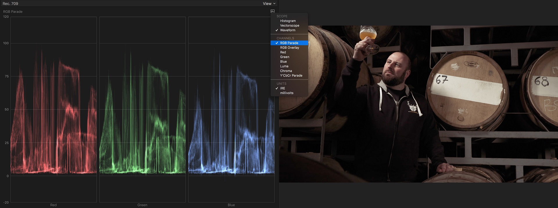
## Waveforms and Parades
Waveforms and waveform parades are representations of the exposure of each pixel in an image. The Y axis is how Bright they are, and the X axis is where they're located along the horizontal axis.
So, in the photo below of a waveform, you can see the white, diagonal spike of the laptop screen. The waveform shows that it's reading as the brightest object in the shot. When you're capturing images, with most shots, you'd want to make sure your brightest and darkest parts of your image to land between 10% and 90%. If you keep within that range, you'll ensure that you haven't lost any details to over or underexposures.
When you're correcting your shot, you can then treat 0% and 100% as accents, pushing your darkest corners and brightest highlights almost to the edges, this will introduce contrast.

Parades behave almost exactly the same way as waveforms, except that they break up red, green, and blue into separate readings. This can be helpful in more fine-tuned grading moves.
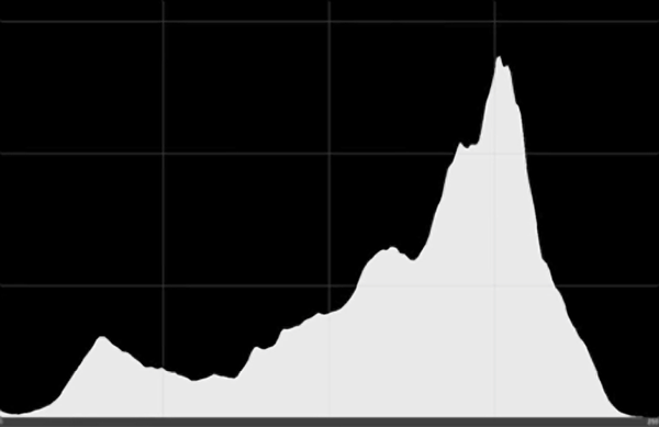
## Histogram
Histograms are easily mixed up with waveforms, but have a distinct difference. It doesn't indicate location information, instead the X axis ranges from white to black, and the Y axis indicates how many pixels are within that level of brightness.
A high contrast image will show a full range of represented pixels, where a low contrast image will just have one concentration where the exposure lies.
# The Challenge
[Premiere Basic Correction Tool](/oZ-gdwPLSG-uTADkbOPwCw)
 Sign in with Wallet
Connect another wallet
Sign in with Wallet
Connect another wallet