---
tags: cd
---
# cd scene analysis storyboard/comics project
Notes on prototyping a two-page graphic storyboard that analyzes a notable scene from a film, producing a "reverse storyboard" of that scene.
Rather than planning out a shot or sequence in a film that has yet to be captured like a standard storyboard does, a reverse storyboard produces an outline of a scene or sequence from a film that has already been shot. This is a useful step to take in the revising stage of a project: Ideally, creating a reverse storyboard allows you to break down the components of a shot's composition and cast them in relief using the comic book frame. This highlights the structure of the film's shots, isolating them in order to illuminate their aesthetics and how that influences our perception of their form, narrative, etc. In this sense, the reverse storyboard also could be used at a point in a course when students are developing their analytical skills. In isolating a series of shots, editing them to bring out their tones, color, contrast, etc., and finally inserting them into frames, students spend a significant amount of time with a small selection of images, coming to a deeper understanding of them than they would if they were watching the film and taking notes on it during playback.
### tools
Adobe Illustrator
InDesign
Final Cut
Photoshop
### models
Scott McCloud's *Understanding Comics*
An example of a kind of "reverse storyboard": [Get Out storyboard of "Sunken Place" sequence](https://youtu.be/2FGA4jZcifA)
Some examples of [film storyboards](https://www.studiobinder.com/blog/storyboard-examples-film/)
### experiments
**Illustrator**:
I started by importing raster images to Adobe Illustrator artboards and applying Image Trace to the image (the default tracing setting). I created individual image boxes for each image, applying stroke to the outside to achieve the visual effect of a comic book frame. Then, I used the rectangle and circle tools to create text boxes and speech bubbles, respectively. I played around with the Type tool a bit in order to create a vertical title for the comic (the green title seen below).
What's helpful about this kind of low-stakes exercise is that it uses already-existing media assets (or media assets you could easily capture with your phone, including using a tool like AdobeCapture). Manually creating the speech bubbles from basic shapes, while producing an imperfect result, familarizes the user with some of the basic functions in Illustrator. And it's a good reminder that basic shapes are the basis of all objects, whether 2D or 3D!

The images are pretty dark, so they'd need to be lightened up in Lightroom or Photoshop. I also need to think about how to actually organize these boxes into a spread since right now they're floating in space on two artboards in Illustrator. What I learned by way of this exercise: Making a comic book cover could be a good intro tutorial in Illustrator (or InDesign).
**InDesign**:
As a way of developing a workflow with different tools, I made a simple compare/contrast spread (inspired by the Activity Ideas doc for AFVS 70) using an image from *Snowpiercer* (2013) and *Parasite* (2019), two films directed by Bong Joon-ho. First, I used Final Cut to take stills from each film. Then, I used Photoshop to apply filters to the images, giving them a comic book aesthetic. Using InDesign, I put the images into a very basic two-panel layout. This helped me develop a process for getting stills from the films and into a comic book-like layout. Next, I'll storyboard my actual comic (which I want to be a scene analysis, maybe about line motifs and class in one of these two films).
**Photoshop**
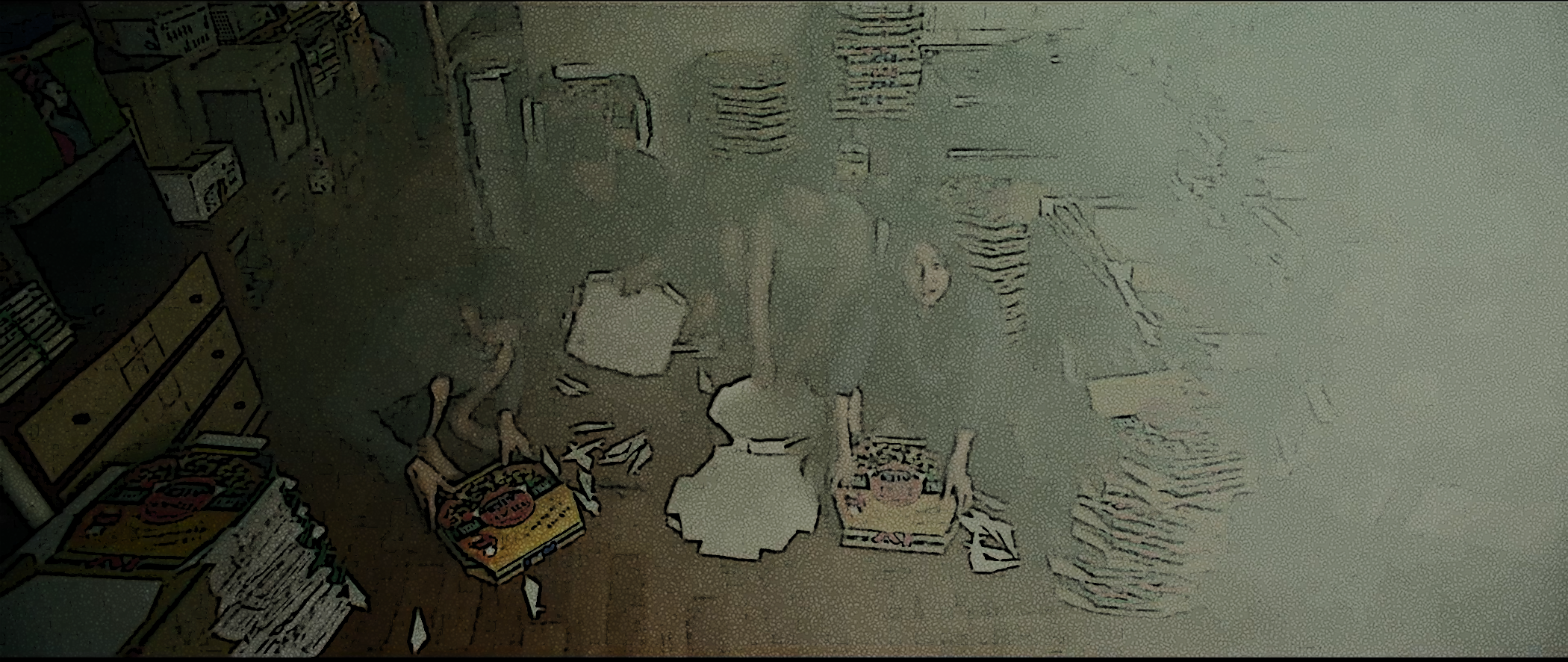
One of the challenges I'm having is with filters in Photoshop. In the image below (from *Parasite*) the light color of the fumigation smoke is hard to capture with the filters I used in Photoshop (poster edges and reticulation). What's interesting about this challenge, though, is that it forced me to notice the shift in color between the first several shots in this scene (much more vibrant, a much more diverse color palette) and this shot. Ultimately, it still encourages the maker to see compositional elements in the film scene, even if the comic book aesthetic isn't necessarily as effective. This is essentially a "deep looking" practice, even if it doesn't produce a great result aesthetically.
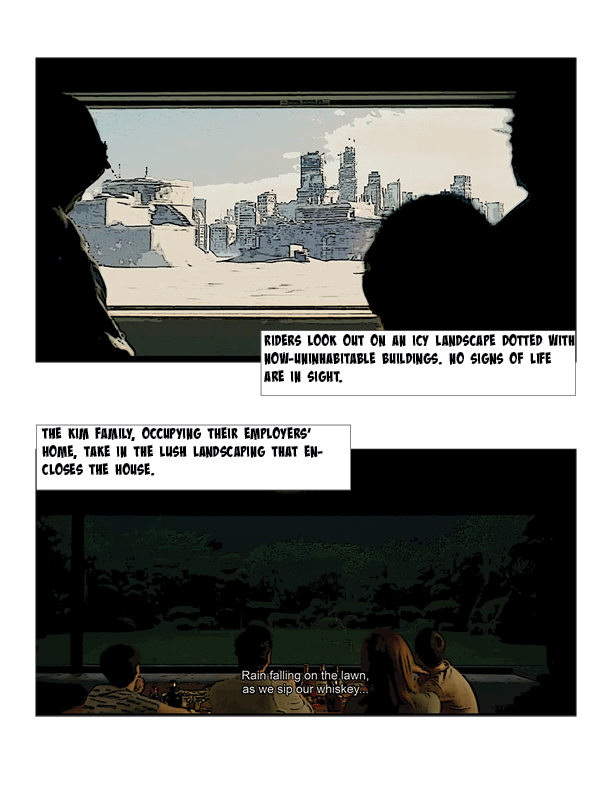
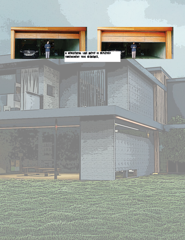
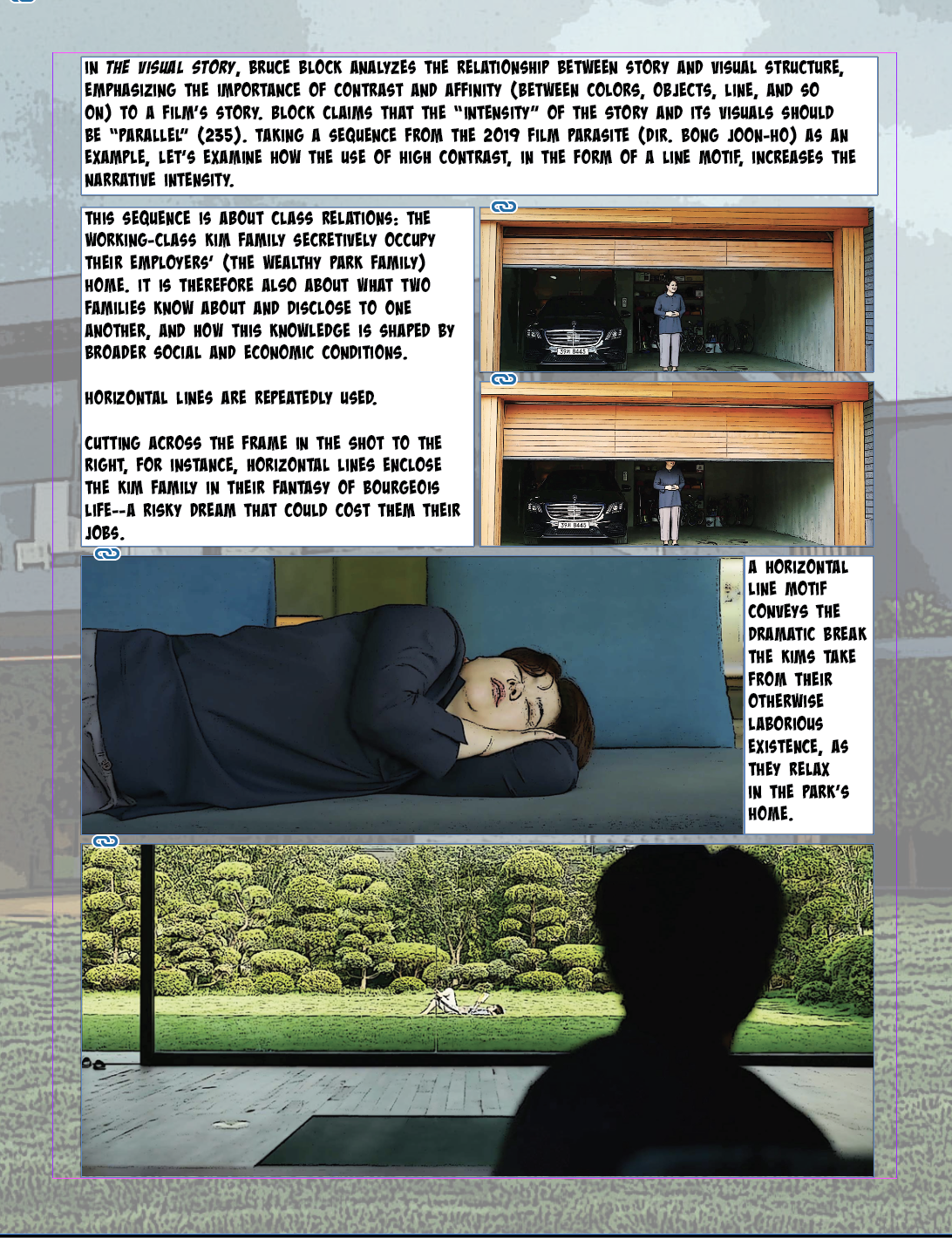
Given the challenges I was having with: 1.) the static nature of the previous sequence I was planning to analyze (i.e., basic shot-reverse-shot structure); 2.) the dark color palette and obscuring effect of the fumigation smoke, I have embarked on a somewhat different path, though still motivated by Block's theoretical work on visual composition and story. I'm going to examine a sequence that implements horizontal and vertical line motifs (when the proletarian/protagonist family occupies the bourgeois family's home as a kind of weekend getaway/fantasy of bourgeois life). This also allowed me to use images of the two family homes as backgrounds, which was a goal I was having some trouble achieving using images from the previous sequence. Here's what I came up with during my first round of editing and placing in iD:
**page one**
**page two**
Here's a screenshot of my draft of page one, which has too much text (and the text/analysis makes no sense!) but at least is starting to look more like a comic.
**Drafting and Revising**
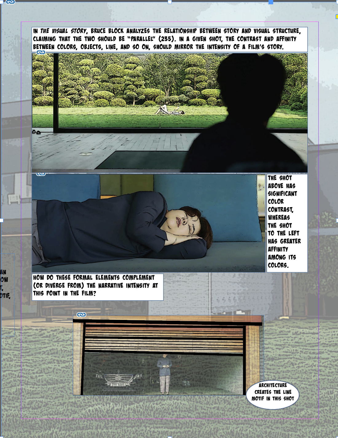
I started a second version of this spread so that I could tinker with the form and simplify the analysis/use of Bruce Block's theory. I'm discovering in doing this that a major challenge of this assignment is knowing *where* to draft, revise, etc. - sometimes it works quite well to kind of play around in InDesign, but this has only really worked for me when I've already created/edited my assets in Photoshop (so I'm more or less just moving them around within InDesign). But doing some kind of a hand-drawn visualization first might be really useful insofar it might help keep me on track. In looking this closely at this sequence from *Parasite*, I have so many different ideas about how to talk about the composition of the shots, points to connect between the shots and a bigger claim about them, and how to relate this to Bruce Block (whose work I'm new to and really enjoying). I thought I wanted to work on line motifs, but looking at these images and editing them, adjusting their contrast, etc., made me realize that I'm actually talking more about contrast/affinity more broadly. Had I planned this out a bit more, I might have seen that framing from the outset and structured the spread in a different way.
I think in Version 1, I was still privileging text, too, which is an interesting challenge to keep in mind when prototyping a comic book assignment: How do you use the textual mode, as is conventional in the comic book form, without relying on it too much, reducing the images to supplements?
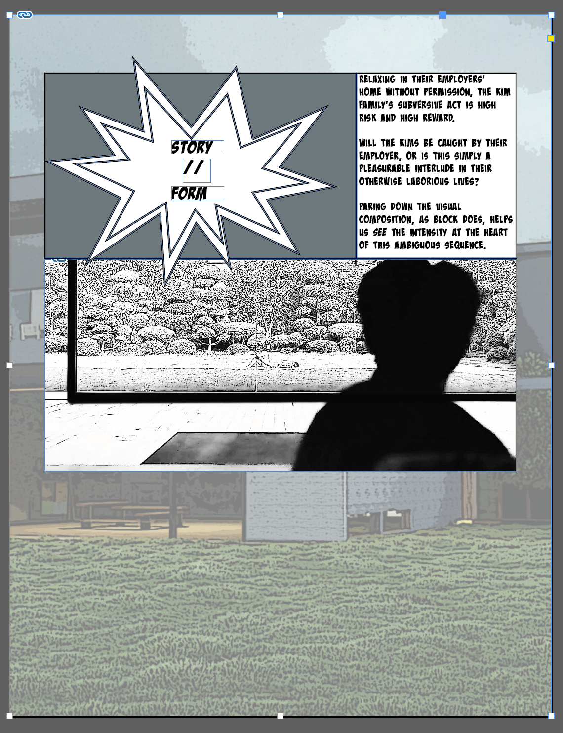
In an attempt to do more with the visuals of the comic, I made an explosion graphic in Illustrator as a way to visually signal that p. 2 would move further into analysis of the film's imagery/composition/etc. Then, I went back to Photoshop and brought up the contrast and exposure of one of the shots as a gesture to Bruce Block's style. I'm not sure if this quite works as a way to illustrate my point about the composition actually being pretty visually intense (even though, on the surface, everything looks quite placid/clean).
### workflow
It seems important to develop a workflow that makes sense given the genre of comic one aims to produce. For my comic, I'm essentially remediating a sequence from a film, abstracting the original source text (i.e., the film) to several still images that are meant to be representative (rather than duplicative) of the film scene.
To begin this process, I take stills from the film using Final Cut, a film editing tool.

### planning
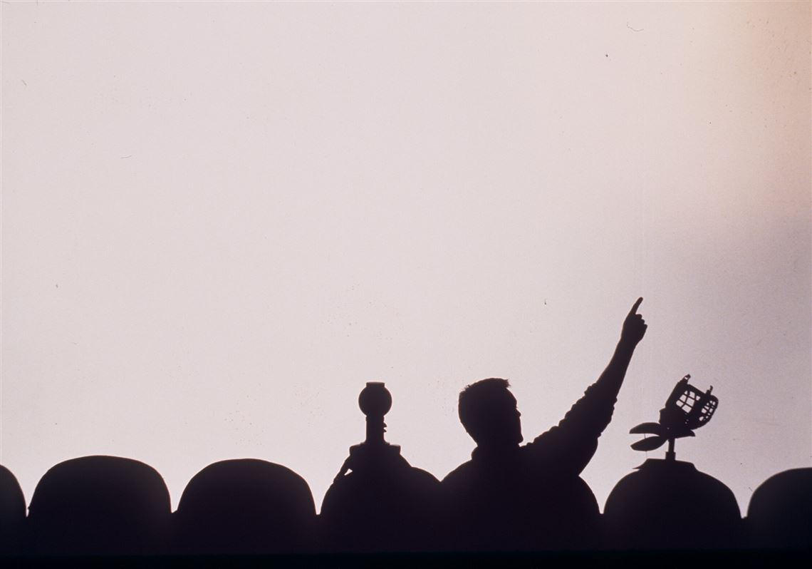
* How to make sure it's clear a film is being analyzed in the comic. MK mentioned the McCloud style - McCloud is part of the frame, frequently looking at and speaking to the viewer or standing on one side of the frame as he presents/explains an array of images/concepts; other ideas: Mystery Science Theatre 3000 silhouettes looking at the film screen while talking about it:
* Some kind of a border around/within/overlapping/connecting the film frame(s) (e.g., film reel)
* Jordan had some awesome ideas for threading film reel throughout and across the spread.
* How do I create graphics in something like Illustrator? Go back to the LinkedIn tutorials to see if anything there is useful - maybe follow that camera tutorial again but make a clapperboard instead? Seems like a similarly straightforward design?
* Using a layout that is conventional in comics (e.g., large image as a background with smaller frames overlaid)
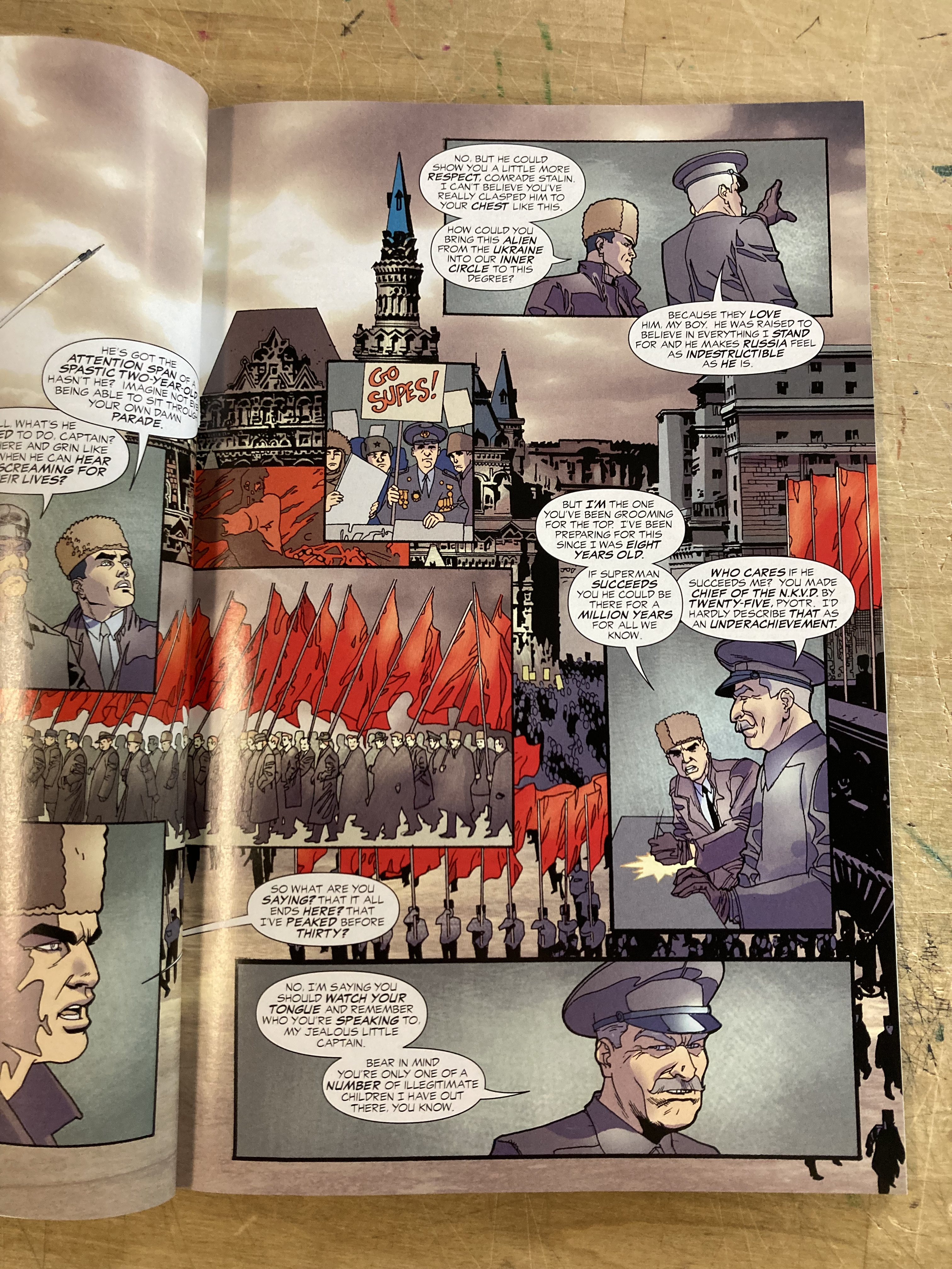
* In the image below, taken from *Superman Red Son*, architecture functions as a background, almost like an establishing shot in a film. The narrative sequence unfolds in the panels that are set on top of the background frame.
### useful concepts + ideas
"The fundamental function of comics art to communicate ideas and/or stories by means of words and pictures involves the movement of certain images (such as people and things) through space. To deal with the *capture* or encapsulation of these events in the flow of the narrative, they must be broken up into sequenced segments. These segments are called panels or frames. They do not correspond exactly to cinematic frames. They are part of the creative process, rather than a result of the technology" (Will Eisner, *Comics and Sequential Art* 39).
 Sign in with Wallet
Connect another wallet
Sign in with Wallet
Connect another wallet