## Lab 1: Dark and Light Mode
Overview
In this lab, you learn how to add a button to an Android application that toggles the app between two themes using the `Jetpack Compose` library.
`Jetpack Compose` is Android's new framework for building UI. It simplifies and accelerates UI development and makes Android development a lot more enjoyable, even for beginners.
## 🎯 Goals
In this lab you will learn:
- how `Jetpack Compose` works
- how to use composable functions to build your app UI (e.g adding buttons)
- how to use Material theming to theme your app
- how to use view models to seperate business logic from the UI
- how to use states to re-render your UI
## Resources
https://developer.android.com/jetpack/compose/mental-model
## Lab Instructions
Required Features
### Step 0: Create a new project using Android Studio.
In this step, we’ll create a new project using Android Studio. Click on ```File -> New Project```. You should see a dialog pop up that offers you a list of templates to start your project with. Go ahead and choose ```Empty Compose Activity```. The name of our app will be ```themeSwitcher``` and ```minSdkVersion``` will be API 27. MinSDK is the minimum version of the Android operating system required to run your application. As you may already be familiar, Android operating system has been released in 2008 and since then, there has been lots of different versions released for public.
In the left pane, you should see a list of project files:
<img width="334" alt="left" src="https://user-images.githubusercontent.com/16856287/190260233-46ea58c5-5c05-43ee-a127-41d766af0aa2.png">
Click on the MainActivity.kt file.
This is the main screen of our app. You can think of an activity as the window in which the app draws its UI such as buttons, images, etc.
We have a class called ```MainActivity``` which inherits from ```ComponentActivity```. ```ComponentActivity``` is provided to us by the ```Android``` framework and exposes list of APIs and lifecycle methods for us to use. In Android, your acitivity will have a lifecycle. For example, when you launch your app, your activity is first created. When you close your app, your activity is detroyed. There are many other lifecycle method tied to an activity which will cover in other labs.
We see that our ```MainActivity``` overrides a function called ```onCreate()```. This means whenever we launch this activity, this function is executed. As a result, this is where we should setup our UI such as adding buttons, images, etc.
<img width="768" alt="mainActivity" src="https://user-images.githubusercontent.com/16856287/190260242-8f5918f8-0371-4112-9c22-a454504fc0be.png">
### Step 1: …
In this step, we’ll setup our UI. We will be using modern UI library called Jetpack Compose.
Jetpack Compose allows you to create your app's UI programmatically using composable functions. To create a composable function, you just add the @Composable annotation to the function name. Each function will represent parts of your app's UI. You can think of your functions as different components of your UI. This ```Greeting``` composable function takes name as function parameter and renders this text on the screen. Compose library provides other commonly used composable functions such as Button, Text, InputField, etc so you don't have to create them from scratch. You can simply call them inside your composable function. In our example, we are calling ```Text``` composable function inside our ```Greeting``` function to render text.
<img width="425" alt="Screen Shot 2022-09-14 at 2 57 16 PM" src="https://user-images.githubusercontent.com/16856287/190270244-8b1c3a98-7329-426b-9949-08d62568161d.png">
For example, to create this UI, you will break the UI into components (i.e composable functions).
<img alt="mainActivity" src="https://res.cloudinary.com/practicaldev/image/fetch/s--1pxUtPXv--/c_limit%2Cf_auto%2Cfl_progressive%2Cq_auto%2Cw_880/https://dev-to-uploads.s3.amazonaws.com/i/1gr7arw4ccr6jfs84dzb.png">
You can start with a bottom up or top down approach to break your UI into composable function (or components). If we start top down here's a list of components (i.e composable functions) we need to have:
- The whole sign in form (red)
- SubmitButton (green):
- Label (pink)
- Input (orange)
- PasswordInput (light blue)
If we were to build this UI in our Android app, we create 5 seperate composable functions that render different views such as inputBox, label, button.
Now that you have an idea on how Jetpack Compose UI works, let's go back to our MainActivity.kt and modify our Greeting function to render a single button instead. Instead of using Text, we will use Button function provided to us by Compose library.
<img width="287" alt="Screen Shot 2022-09-14 at 3 11 12 PM" src="https://user-images.githubusercontent.com/16856287/190271941-601f4e49-687a-4730-9ad8-d57479f44cfd.png">
We can hover over the Button or ```cmd + left mouse click```(on Mac) to see what parameters ```Button``` function takes.
<img width="416" alt="Screen Shot 2022-09-14 at 3 09 34 PM" src="https://user-images.githubusercontent.com/16856287/190271764-cc00ab75-f5f1-486e-89b1-02da1d7876a0.png">
It takes bunch of parameters but for now, all we need is first and last parameter. The first parameter of the function is ```onClick```. This mean you can tell the button what to do whenever it's clicked. The type of this ```onClick``` parameter is an anonymous function. Anonymous functions (lambdas) can be passed to other functions as parameters. They are denoted just like regular function in this format: ```(params) -> Return Type```; hence ```onClick: () -> Unit``` takes a function that takes no parameters and returns nothing. For example, we can pass it this anonymous function as argument. Just like regular Kotlin functions, we have the body of our anonymous function inside curly brackets.
<img width="498" alt="Screen Shot 2022-09-14 at 3 19 48 PM" src="https://user-images.githubusercontent.com/16856287/190273084-dad7cb0e-46ef-4f1c-b9e0-22c108b9de36.png">
Now, we need to pass one more argument to Button. The last parameter our button takes is content. If we look at the type of the content, it's also anonymous function but has to be composable function. This means we can call other composable functions inside our Button to display text or images. Let's call Text function and pass it "Switch theme" as parameter.
<img width="490" alt="Screen Shot 2022-09-14 at 3 28 06 PM" src="https://user-images.githubusercontent.com/16856287/190274053-e17c34dc-2b0f-4994-8fcd-0bd65c1edde0.png">
Finally, we now have button that says "Switch theme". You should now be able to run the app using the run icon on the top right. You can click on the button. After you click, you can check the logcat for ```Button is clicked``` log which we added to `onClick` as an argument.
<img width="395" alt="Screen Shot 2022-09-14 at 3 30 55 PM" src="https://user-images.githubusercontent.com/16856287/190274383-50b2b8fa-36e6-4560-80e2-39e544b249df.png">
### Step 2: Theming in Compose
Now that you are comfortable with creating composable functions, let's look back at the content of `onCreate` method in `MainActivity`. As mentioned above, we set the UI of our component inside `onCreate` by calling our composable functions. To be able to call our composable function inside non-composable function (i.e onCreate), we have to use `setContent { }` provided to us by the Compose library.
<img width="625" alt="Screen Shot 2022-09-14 at 3 51 59 PM" src="https://user-images.githubusercontent.com/16856287/190276738-de6eeda4-7470-47a2-a41d-184f1c75a6db.png">
You can see that the first composable function we are calling is `ThemeSwitcherTheme`. This composable function was generated when we created the project and it gives default theme, styling, colors, and appearance to our app. We can ```cmd+left mouse click (mac)``` on its name and look at the function content.
<img width="463" alt="Screen Shot 2022-09-14 at 3 42 37 PM" src="https://user-images.githubusercontent.com/16856287/190275682-fcb7b57f-54c4-407a-a07e-a22b4e0638e8.png">
As you see, this function takes 2 parameters. The first parameter is `darkTheme` which is basically a Boolean that tells whether we should be using dark theme or light mode colors. The second parameter is content that takes composable anonymous function as argument similar to previous Button example. If we look at the body of the function, it chooses color light/dark color palletes based on the ```darkTheme``` parameter and uses MaterialTheme as our default app theme. Material Theming is design system library provided to us by Android which provides default theming for our app. You can create your own theme from scratch but it's out of the scope of this lab.
<img width="625" alt="Screen Shot 2022-09-14 at 3 51 59 PM" src="https://user-images.githubusercontent.com/16856287/190276738-de6eeda4-7470-47a2-a41d-184f1c75a6db.png">
Now, looking back, we can see that we are calling ```Surface``` composable inside the content of our `ThemeSwitcherTheme` composable. You can think of `ThemeSwitcherTheme` as parent and all the children will inherit the appearance of the parent. ```Surface``` is another composable function provided to us by Android library which gives its content some elevation and few other properties such as backround. We finally call our `Greeting` composable inside ```Surface``` to render our Button. This is how our entire UI is rendered.
### Step 3: States and Recomposition
Our goal is to switch back between light/dark mode whenever we click on `Switch mode` button. We know that our parent `ThemeSwitcherTheme` function takes `darkTheme` boolean argument. But, how do we pass this argument to `ThemeSwitcherTheme` from `Greeting`. Isn't `Greeting` function a child of `ThemeSwitcherTheme` composable?
This is where the states come in. In Jetpack compose, each composable function can have some state. In real world, you could have a light bulb with 2 states: on or off and your normally turn it on/off every day. Whenever you turn it on, your lightbulb lights go on or else lights go off.
In a similar fashion, composable functions can have a state and when that state changes, they automatically re-run (or recompose) to update the UI.
To create mutable state in Android, we can use `MutableStateFlow` provided to us by Android coroutines library. To make sure our business logic is seperated from our UI logic, we will use a viewmodel class. Go ahead and create a new file called `MainViewModel.kt`
<img width="617" alt="Screen Shot 2022-09-14 at 4 19 59 PM" src="https://user-images.githubusercontent.com/16856287/190279534-36383783-3a2d-43a4-8ecb-6a34a3a6286b.png">
We created mutable `isDarkModeEnabled` state which we will pass to our composable function. In your `MainActivity.kt`, go ahead and initialize your viewmodel.
<img width="517" alt="Screen Shot 2022-09-14 at 4 48 50 PM" src="https://user-images.githubusercontent.com/16856287/190282084-7e083fa6-f113-4110-851d-482ea19be787.png">
To tell our composable function about this new state, we will use this helper method called `collectAsState` and then pass the state to our `ThemeSwitcherTheme` as argument.
<img width="611" alt="Screen Shot 2022-09-14 at 4 24 21 PM" src="https://user-images.githubusercontent.com/16856287/190279911-24f76740-f57e-410b-b828-cf1721af4db8.png">
The default value of our `darkModeEnabled` state is `False`. We need to change the state whenever we click the button. How do we do that?
We can change simply change the state inside `onClick` parameter of the button. First, we can get rid of `Greeting` function and instead directly call Button inside Surface function.
<img width="601" alt="Screen Shot 2022-09-14 at 4 33 40 PM" src="https://user-images.githubusercontent.com/16856287/190280731-4d8db45a-a3bf-4825-a520-7391c71851c1.png">
Now, instead of logging a message to Logcat, we can call `viewModel.enabledDarkMode()` or `viewModel.disableDarkModel()` depending on the current theme of the app. We can do a simple if-else check:
<img width="382" alt="Screen Shot 2022-09-14 at 4 36 29 PM" src="https://user-images.githubusercontent.com/16856287/190280994-02b50b0a-d1cc-491b-9ea9-6ee755dbe073.png">
Now, whenever we click the button, the state will change which causes our UI functions to re-run. Since we are passing dark mode state value to `ThemeSwitcherTheme` as argument, `ThemeSwitcherTheme` will use dark mode color palletes whenever the our `darkModeEnabled` state is set to `True`.
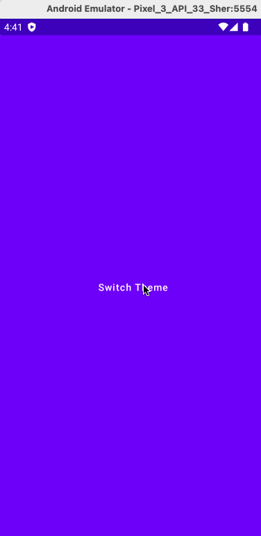
Let's run the app and observe:
 Sign in with Wallet
Connect another wallet
Sign in with Wallet
Connect another wallet