# CSS筆記
## CSS Flexbox
### Flexbox Intro
Flex vs grid
* flex 用於 one dimension --> row or column
* grid 用於 two dimension --> row and column
在 Flexbox module 之前有四種module
1. Block : 針對網頁中的區塊
2. Inline : 針對文字
3. Table : 針對二維表格的資料
4. Positioned : 針對元素的明確位置
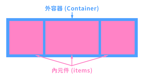
Flexbox 和 grid 的組成包含:
* container : 父元素(容器) <div>元素
* items : container <div>中的項目
要有flex佈局,父容器就要將`dispaly`屬性設為`flex`,而內部第一層的子元素就會自動成為flex items
example:
* .flex-container{}
* flex container的類別(class)選擇器。
* `display:flex;`使用flex前要先宣告。
* .flex-container > div
* 是 CSS 子選擇器,它的作用是選擇 .flex-container 內的直接子元素 <div>,並對它們應用樣式。
* ==>(子選擇器)==:表示「直接子元素」,只會選擇 .flex-container 內第一層的 <div>,而不影響更深層的 <div>。
```html=
<!DOCTYPE html>
<html>
<head>
<style>
.flex-container {
display: flex;
background-color: DodgerBlue;
}
.flex-container > div {
background-color: #f1f1f1;
margin: 10px;
padding: 20px;
font-size: 30px;
}
</style>
</head>
<body>
<div class="flex-container">
<div>1</div>
<div>2</div>
<div>3</div>
</div>
</body>
</html>
```

:::spoiler [補充]flex能跟float與position共用嗎?
* float 主要是讓元素浮動在某側
* in flex container:不需要,flex有`justify-content`、`align-items`和`flex-grow`屬性能精確控制排列
* in flex items:通常會被flex無視,除非套用到flex items內的元素(如圖片)
* position 控制定位方式,讓元素相對自身、父元素、視窗或其他元素移動
* in flex container:只影響自身的定位
* in flex items:會使flex items脫離flex的排列控制
:::
### Flex Container
* [設定顯示方向及換行](#flex-flow:-設定顯示方向以及是否換行(為`flex-direction`與`flex-warp`的縮寫))
* [指定顯示方向](#flex-direction:-指定顯示方向)
* [控制是否換行](flex-wrap:-控制超出範圍時是否換行)
* [水平方向對齊](#justify-content:-控制主軸方向的對齊(通常為水平對齊))
* [單行垂直方向對齊](#align-items:-控制交錯軸方向的單行對齊(通常為垂直對齊))
* [整體垂直方向對齊](#align-content:-整體以交錯軸方向對齊)
#### flex-direction: 指定顯示方向
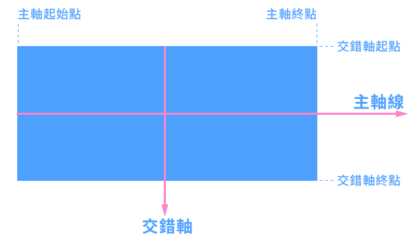
設定flex的軸線(主軸與交錯軸),會影響內元件對齊。
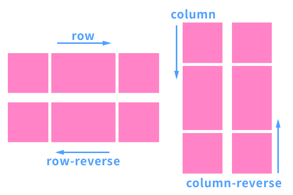
* 下圖是預設軸線方向:
* row - 預設值,讓物件沿左到右水平顯示
* 程式碼
```html=
<html>
<head>
<style>
.flex-container {
display: flex;
flex-direction: row;
background-color: DodgerBlue;
}
.flex-container > div {
background-color: #f1f1f1;
width: 100px;
margin: 10px;
text-align: center;
line-height: 75px;
font-size: 30px;
}
</style>
</head>
<body>
<div class="flex-container">
<div>1</div>
<div>2</div>
<div>3</div>
</div>
</body>
</html>
```
* 結果預覽
<div style="display: flex; flex-direction: row; background-color: DodgerBlue;">
<div style="background-color: #f1f1f1; width: 100px; margin: 10px; text-align: center; line-height: 75px; font-size: 30px;">1</div>
<div style="background-color: #f1f1f1; width: 100px; margin: 10px; text-align: center; line-height: 75px; font-size: 30px;">2</div>
<div style="background-color: #f1f1f1; width: 100px; margin: 10px; text-align: center; line-height: 75px; font-size: 30px;">3</div>
</div>
* row-reverse - 讓物件由右到左水平顯示(水平反轉)
* 程式碼
```css=
.flex-container {
display: flex;
flex-direction: row-reverse;
background-color: DodgerBlue;
}
```
* 結果預覽
<div style="display: flex; flex-direction: row-reverse; background-color: DodgerBlue;">
<div style="background-color: #f1f1f1; width: 100px; margin: 10px; text-align: center; line-height: 75px; font-size: 30px;">1</div>
<div style="background-color: #f1f1f1; width: 100px; margin: 10px; text-align: center; line-height: 75px; font-size: 30px;">2</div>
<div style="background-color: #f1f1f1; width: 100px; margin: 10px; text-align: center; line-height: 75px; font-size: 30px;">3</div>
</div>
* column - 讓物件由上到下垂直顯示(主軸轉為垂直向下)
* 程式碼
```css=
.flex-container {
display: flex;
flex-direction: column;
background-color: DodgerBlue;
}
```
* 結果預覽
<div style="display: flex; flex-direction: column; background-color: DodgerBlue;">
<div style="background-color: #f1f1f1; width: 100px; margin: 10px; text-align: center; line-height: 75px; font-size: 30px;">1</div>
<div style="background-color: #f1f1f1; width: 100px; margin: 10px; text-align: center; line-height: 75px; font-size: 30px;">2</div>
<div style="background-color: #f1f1f1; width: 100px; margin: 10px; text-align: center; line-height: 75px; font-size: 30px;">3</div>
</div>
* column-reverse - 讓物件由下到上垂直顯示(主軸轉為垂直向上)
* 程式碼
```css=
.flex-container {
display: flex;
flex-direction: column-reverse;
background-color: DodgerBlue;
}
```
* 結果預覽
<div style="display: flex; flex-direction: column-reverse; background-color: DodgerBlue;">
<div style="background-color: #f1f1f1; width: 100px; margin: 10px; text-align: center; line-height: 75px; font-size: 30px;">1</div>
<div style="background-color: #f1f1f1; width: 100px; margin: 10px; text-align: center; line-height: 75px; font-size: 30px;">2</div>
<div style="background-color: #f1f1f1; width: 100px; margin: 10px; text-align: center; line-height: 75px; font-size: 30px;">3</div>
</div>
以下是所有選項的示意圖:
[go back to Flex-Container!](#Flex-Container)
#### flex-wrap: 控制超出範圍時是否換行
* nowrap - 預設值,不換行
* 程式碼
```css=
.flex-container {
display: flex;
flex-wrap: nowrap;
background-color: DodgerBlue;
}
```
* 結果顯示
<div style="display:flex; flex-wrap:nowrap; background-color: DodgerBlue;">
<div style="background-color:#f1f1f1; width:100px; margin:10px; text-align:center; line-height:75px; font-size:30px;">1</div>
<div style="background-color:#f1f1f1; width:100px; margin:10px; text-align:center; line-height:75px; font-size:30px;">2</div>
<div style="background-color:#f1f1f1; width:100px; margin:10px; text-align:center; line-height:75px; font-size:30px;">3</div>
<div style="background-color:#f1f1f1; width:100px; margin:10px; text-align:center; line-height:75px; font-size:30px;">4</div>
<div style="background-color:#f1f1f1; width:100px; margin:10px; text-align:center; line-height:75px; font-size:30px;">5</div>
<div style="background-color:#f1f1f1; width:100px; margin:10px; text-align:center; line-height:75px; font-size:30px;">6</div>
<div style="background-color:#f1f1f1; width:100px; margin:10px; text-align:center; line-height:75px; font-size:30px;">7</div>
<div style="background-color:#f1f1f1; width:100px; margin:10px; text-align:center; line-height:75px; font-size:30px;">8</div>
<div style="background-color:#f1f1f1; width:100px; margin:10px; text-align:center; line-height:75px; font-size:30px;">9</div>
<div style="background-color:#f1f1f1; width:100px; margin:10px; text-align:center; line-height:75px; font-size:30px;">10</div>
<div style="background-color:#f1f1f1; width:100px; margin:10px; text-align:center; line-height:75px; font-size:30px;">11</div>
<div style="background-color:#f1f1f1; width:100px; margin:10px; text-align:center; line-height:75px; font-size:30px;">12</div>
</div>
* wrap - 超出範圍就換行,正著排(由上往下)
* 程式碼
```css=
.flex-container {
display: flex;
flex-wrap: wrap;
background-color: DodgerBlue;
}
```
* 結果預覽
<div style="display:flex; flex-wrap:wrap; background-color: DodgerBlue;">
<div style="background-color:#f1f1f1; width:100px; margin:10px; text-align:center; line-height:75px; font-size:30px;">1</div>
<div style="background-color:#f1f1f1; width:100px; margin:10px; text-align:center; line-height:75px; font-size:30px;">2</div>
<div style="background-color:#f1f1f1; width:100px; margin:10px; text-align:center; line-height:75px; font-size:30px;">3</div>
<div style="background-color:#f1f1f1; width:100px; margin:10px; text-align:center; line-height:75px; font-size:30px;">4</div>
<div style="background-color:#f1f1f1; width:100px; margin:10px; text-align:center; line-height:75px; font-size:30px;">5</div>
<div style="background-color:#f1f1f1; width:100px; margin:10px; text-align:center; line-height:75px; font-size:30px;">6</div>
<div style="background-color:#f1f1f1; width:100px; margin:10px; text-align:center; line-height:75px; font-size:30px;">7</div>
<div style="background-color:#f1f1f1; width:100px; margin:10px; text-align:center; line-height:75px; font-size:30px;">8</div>
<div style="background-color:#f1f1f1; width:100px; margin:10px; text-align:center; line-height:75px; font-size:30px;">9</div>
<div style="background-color:#f1f1f1; width:100px; margin:10px; text-align:center; line-height:75px; font-size:30px;">10</div>
<div style="background-color:#f1f1f1; width:100px; margin:10px; text-align:center; line-height:75px; font-size:30px;">11</div>
<div style="background-color:#f1f1f1; width:100px; margin:10px; text-align:center; line-height:75px; font-size:30px;">12</div>
</div>
* wrap-reverse - 超出範圍就換行,倒著排(由下往上)
* 程式碼
```css=
.flex-container {
display: flex;
flex-wrap: wrap-reverse;
background-color: DodgerBlue;
}
```
* 結果預覽
<div style="display:flex; flex-wrap:wrap-reverse; background-color: DodgerBlue;">
<div style="background-color:#f1f1f1; width:100px; margin:10px; text-align:center; line-height:75px; font-size:30px;">1</div>
<div style="background-color:#f1f1f1; width:100px; margin:10px; text-align:center; line-height:75px; font-size:30px;">2</div>
<div style="background-color:#f1f1f1; width:100px; margin:10px; text-align:center; line-height:75px; font-size:30px;">3</div>
<div style="background-color:#f1f1f1; width:100px; margin:10px; text-align:center; line-height:75px; font-size:30px;">4</div>
<div style="background-color:#f1f1f1; width:100px; margin:10px; text-align:center; line-height:75px; font-size:30px;">5</div>
<div style="background-color:#f1f1f1; width:100px; margin:10px; text-align:center; line-height:75px; font-size:30px;">6</div>
<div style="background-color:#f1f1f1; width:100px; margin:10px; text-align:center; line-height:75px; font-size:30px;">7</div>
<div style="background-color:#f1f1f1; width:100px; margin:10px; text-align:center; line-height:75px; font-size:30px;">8</div>
<div style="background-color:#f1f1f1; width:100px; margin:10px; text-align:center; line-height:75px; font-size:30px;">9</div>
<div style="background-color:#f1f1f1; width:100px; margin:10px; text-align:center; line-height:75px; font-size:30px;">10</div>
<div style="background-color:#f1f1f1; width:100px; margin:10px; text-align:center; line-height:75px; font-size:30px;">11</div>
<div style="background-color:#f1f1f1; width:100px; margin:10px; text-align:center; line-height:75px; font-size:30px;">12</div>
</div>
[go back to Flex-Container!](#Flex-Container)
#### flex-flow: 設定顯示方向以及是否換行(為`flex-direction`與`flex-warp`的縮寫)
* 程式碼
```css=
.flex-container {
display: flex;
flex-flow: row wrap;
background-color: DodgerBlue;
}
```
* 結果顯示
<div style="display: flex; flex-flow: row wrap; background-color: DodgerBlue;">
<div style="background-color: #f1f1f1; width: 100px; margin: 10px; text-align: center; line-height: 75px; font-size: 30px;">1</div>
<div style="background-color: #f1f1f1; width: 100px; margin: 10px; text-align: center; line-height: 75px; font-size: 30px;">2</div>
<div style="background-color: #f1f1f1; width: 100px; margin: 10px; text-align: center; line-height: 75px; font-size: 30px;">3</div>
<div style="background-color: #f1f1f1; width: 100px; margin: 10px; text-align: center; line-height: 75px; font-size: 30px;">4</div>
<div style="background-color: #f1f1f1; width: 100px; margin: 10px; text-align: center; line-height: 75px; font-size: 30px;">5</div>
<div style="background-color: #f1f1f1; width: 100px; margin: 10px; text-align: center; line-height: 75px; font-size: 30px;">6</div>
<div style="background-color: #f1f1f1; width: 100px; margin: 10px; text-align: center; line-height: 75px; font-size: 30px;">7</div>
<div style="background-color: #f1f1f1; width: 100px; margin: 10px; text-align: center; line-height: 75px; font-size: 30px;">8</div>
<div style="background-color: #f1f1f1; width: 100px; margin: 10px; text-align: center; line-height: 75px; font-size: 30px;">9</div>
<div style="background-color: #f1f1f1; width: 100px; margin: 10px; text-align: center; line-height: 75px; font-size: 30px;">10</div>
<div style="background-color: #f1f1f1; width: 100px; margin: 10px; text-align: center; line-height: 75px; font-size: 30px;">11</div>
<div style="background-color: #f1f1f1; width: 100px; margin: 10px; text-align: center; line-height: 75px; font-size: 30px;">12</div>
</div>
[go back to Flex-Container!](#Flex-Container)
#### justify-content: 控制主軸方向的對齊(通常為水平對齊)
* center - 置中
* 程式碼
```css=
.flex-container {
display: flex;
justify-content: center;
background-color: DodgerBlue;
}
```
* 結果預覽
<div style="display:flex; justify-content:center; background-color:DodgerBlue;">
<div style="background-color:#f1f1f1; width:100px; margin:10px; text-align:center; line-height:75px; font-size:30px;">1</div>
<div style="background-color:#f1f1f1; width:100px; margin:10px; text-align:center; line-height:75px; font-size:30px;">2</div>
<div style="background-color:#f1f1f1; width:100px; margin:10px; text-align:center; line-height:75px; font-size:30px;">3</div>
</div>
* flex-start - 預設值,讓內元件從 container 的主軸起始位置開始(通常是從左向右)
* 程式碼
```css=
.flex-container {
display: flex;
justify-content: flex-start;
background-color: DodgerBlue;
}
```
* 結果預覽
<div style="display:flex; justify-content:flex-start; background-color:DodgerBlue;">
<div style="background-color:#f1f1f1; width:100px; margin:10px; text-align:center; line-height:75px; font-size:30px;">1</div>
<div style="background-color:#f1f1f1; width:100px; margin:10px; text-align:center; line-height:75px; font-size:30px;">2</div>
<div style="background-color:#f1f1f1; width:100px; margin:10px; text-align:center; line-height:75px; font-size:30px;">3</div>
</div>
* flex-end - 讓內元件從 container 的主軸末尾位置開始
* 程式碼
```css=
.flex-container {
display: flex;
justify-content: flex-end;
background-color: DodgerBlue;
}
```
* 結果預覽
<div style="display:flex; justify-content:flex-end; background-color:DodgerBlue;">
<div style="background-color:#f1f1f1; width:100px; margin:10px; text-align:center; line-height:75px; font-size:30px;">1</div>
<div style="background-color:#f1f1f1; width:100px; margin:10px; text-align:center; line-height:75px; font-size:30px;">2</div>
<div style="background-color:#f1f1f1; width:100px; margin:10px; text-align:center; line-height:75px; font-size:30px;">3</div>
</div>
* space-around - 內元件彼此間距相等,且邊緣留有內元件間距的一半
* 程式碼
```css=
.flex-container {
display: flex;
justify-content: space-around;
background-color: DodgerBlue;
}
```
* 結果預覽
<div style="display:flex; justify-content:space-around; background-color:DodgerBlue;">
<div style="background-color:#f1f1f1; width:100px; margin:10px; text-align:center; line-height:75px; font-size:30px;">1</div>
<div style="background-color:#f1f1f1; width:100px; margin:10px; text-align:center; line-height:75px; font-size:30px;">2</div>
<div style="background-color:#f1f1f1; width:100px; margin:10px; text-align:center; line-height:75px; font-size:30px;">3</div>
</div>
* space-between - 內元件彼此間距相等,且兩端內元件貼齊邊緣
* 程式碼
```css=
.flex-container {
display: flex;
justify-content: space-between;
background-color: DodgerBlue;
}
```
* 結果預覽
<div style="display:flex; justify-content:space-between; background-color:DodgerBlue;">
<div style="background-color:#f1f1f1; width:100px; margin:10px; text-align:center; line-height:75px; font-size:30px;">1</div>
<div style="background-color:#f1f1f1; width:100px; margin:10px; text-align:center; line-height:75px; font-size:30px;">2</div>
<div style="background-color:#f1f1f1; width:100px; margin:10px; text-align:center; line-height:75px; font-size:30px;">3</div>
</div>
* space-evenly - 內元件彼此間距相等,且邊緣空間也和間距一樣大
* 程式碼
```css=
.flex-container {
display: flex;
justify-content: space-evenly;
background-color: DodgerBlue;
}
```
* 結果預覽
<div style="display:flex; justify-content:space-evenly; background-color:DodgerBlue;">
<div style="background-color:#f1f1f1; width:100px; margin:10px; text-align:center; line-height:75px; font-size:30px;">1</div>
<div style="background-color:#f1f1f1; width:100px; margin:10px; text-align:center; line-height:75px; font-size:30px;">2</div>
<div style="background-color:#f1f1f1; width:100px; margin:10px; text-align:center; line-height:75px; font-size:30px;">3</div>
</div>
[go back to Flex-Container!](#Flex-Container)
#### align-items: 控制交錯軸方向的單行對齊(通常為垂直對齊)
* center - 單行置中(高度平均分配)
* 程式碼
```css=
.flex-container {
display: flex;
height: 200px;
align-items: center;
background-color: DodgerBlue;
}
```
* 結果預覽
<div style="display:flex; height:200px; align-items:center; background-color:DodgerBlue;">
<div style="background-color:#f1f1f1; width:100px; margin:10px; text-align:center; line-height:75px; font-size:30px;">1</div>
<div style="background-color:#f1f1f1; width:100px; margin:10px; text-align:center; line-height:75px; font-size:30px;">2</div>
<div style="background-color:#f1f1f1; width:100px; margin:10px; text-align:center; line-height:75px; font-size:30px;">3</div>
</div>
* flex-start - 從 container 的交錯軸起始位置開始(通常是從上到下)
* 程式碼
```css=
.flex-container {
display: flex;
height: 200px;
align-items: flex-start;
background-color: DodgerBlue;
}
```
* 結果預覽
<div style="display:flex; height:200px; align-items:flex-start; background-color:DodgerBlue;">
<div style="background-color:#f1f1f1; width:100px; margin:10px; text-align:center; line-height:75px; font-size:30px;">1</div>
<div style="background-color:#f1f1f1; width:100px; margin:10px; text-align:center; line-height:75px; font-size:30px;">2</div>
<div style="background-color:#f1f1f1; width:100px; margin:10px; text-align:center; line-height:75px; font-size:30px;">3</div>
</div>
* flex-end - 從 container 的交錯軸末尾位置開始(通常是從下到上)
* 程式碼
```css=
.flex-container {
display: flex;
height: 200px;
align-items: flex-end;
background-color: DodgerBlue;
}
```
* 結果預覽
<div style="display:flex; height:200px; align-items:flex-end; background-color:DodgerBlue;">
<div style="background-color:#f1f1f1; width:100px; margin:10px; text-align:center; line-height:75px; font-size:30px;">1</div>
<div style="background-color:#f1f1f1; width:100px; margin:10px; text-align:center; line-height:75px; font-size:30px;">2</div>
<div style="background-color:#f1f1f1; width:100px; margin:10px; text-align:center; line-height:75px; font-size:30px;">3</div>
</div>
* stretch - 預設值(等同於normal),若內元件未設置高度或設為auto,內元件會在交錯軸伸縮以符合 container
* 程式碼
```css=
.flex-container {
display: flex;
height: 200px;
align-items: stretch;
background-color: DodgerBlue;
}
```
* 結果預覽
<div style="display:flex; height:200px; align-items:stretch; background-color:DodgerBlue;">
<div style="background-color:#f1f1f1; width:100px; margin:10px; text-align:center; line-height:75px; font-size:30px;">1</div>
<div style="background-color:#f1f1f1; width:100px; margin:10px; text-align:center; line-height:75px; font-size:30px;">2</div>
<div style="background-color:#f1f1f1; width:100px; margin:10px; text-align:center; line-height:75px; font-size:30px;">3</div>
</div>
* baseline - 內元件依字符底部基準線擺放,用在子元素的字體大小不同時。
* 程式碼
```css=
.flex-container {
display: flex;
height: 200px;
align-items: baseline;
background-color: DodgerBlue;
}
```
* 結果預覽
<div style="display:flex; height:200px; align-items:center; background-color:DodgerBlue;">
<div style="background-color:#f1f1f1; width:100px; margin:10px; text-align:center; line-height:75px; font-size:30px;"><h1>1</h1></div>
<div style="background-color:#f1f1f1; width:100px; margin:10px; text-align:center; line-height:75px; font-size:30px;"><h6>2</h6></div>
<div style="background-color:#f1f1f1; width:100px; margin:10px; text-align:center; line-height:75px; font-size:30px;"><h3>3</h3></div>
<div style="background-color:#f1f1f1; width:100px; margin:10px; text-align:center; line-height:75px; font-size:30px;"><small>4</small></div>
</div>
[go back to Flex-Container!](#Flex-Container)
#### align-content: 整體以交錯軸方向對齊
* center - 整體置中於 container
* 程式碼
```css=
.flex-container {
display: flex;
height: 600px;
flex-wrap: wrap;
align-content: center;
overflow: scroll;
background-color: DodgerBlue;
}
```
* 結果預覽
<div style="display: flex; height: 600px; flex-wrap: wrap; align-content: center; overflow: scroll; background-color: DodgerBlue;">
<div style="background-color: #f1f1f1; width: 100px; margin: 10px; text-align: center; line-height: 75px; font-size: 30px;">1</div>
<div style="background-color: #f1f1f1; width: 100px; margin: 10px; text-align: center; line-height: 75px; font-size: 30px;">2</div>
<div style="background-color: #f1f1f1; width: 100px; margin: 10px; text-align: center; line-height: 75px; font-size: 30px;">3</div>
<div style="background-color: #f1f1f1; width: 100px; margin: 10px; text-align: center; line-height: 75px; font-size: 30px;">4</div>
<div style="background-color: #f1f1f1; width: 100px; margin: 10px; text-align: center; line-height: 75px; font-size: 30px;">5</div>
<div style="background-color: #f1f1f1; width: 100px; margin: 10px; text-align: center; line-height: 75px; font-size: 30px;">6</div>
<div style="background-color: #f1f1f1; width: 100px; margin: 10px; text-align: center; line-height: 75px; font-size: 30px;">7</div>
<div style="background-color: #f1f1f1; width: 100px; margin: 10px; text-align: center; line-height: 75px; font-size: 30px;">8</div>
<div style="background-color: #f1f1f1; width: 100px; margin: 10px; text-align: center; line-height: 75px; font-size: 30px;">9</div>
<div style="background-color: #f1f1f1; width: 100px; margin: 10px; text-align: center; line-height: 75px; font-size: 30px;">10</div>
<div style="background-color: #f1f1f1; width: 100px; margin: 10px; text-align: center; line-height: 75px; font-size: 30px;">11</div>
<div style="background-color: #f1f1f1; width: 100px; margin: 10px; text-align: center; line-height: 75px; font-size: 30px;">12</div>
</div>
* stretch - 預設值,整體一起伸縮以填滿整個 container
* 程式碼
```css=
.flex-container {
display: flex;
height: 600px;
flex-wrap: wrap;
align-content: stretch;
overflow: scroll;
background-color: DodgerBlue;
}
```
* 結果預覽
<div style="display: flex; height: 600px; flex-wrap: wrap; align-content: stretch; overflow: scroll; background-color: DodgerBlue;">
<div style="background-color: #f1f1f1; width: 100px; margin: 10px; text-align: center; line-height: 75px; font-size: 30px;">1</div>
<div style="background-color: #f1f1f1; width: 100px; margin: 10px; text-align: center; line-height: 75px; font-size: 30px;">2</div>
<div style="background-color: #f1f1f1; width: 100px; margin: 10px; text-align: center; line-height: 75px; font-size: 30px;">3</div>
<div style="background-color: #f1f1f1; width: 100px; margin: 10px; text-align: center; line-height: 75px; font-size: 30px;">4</div>
<div style="background-color: #f1f1f1; width: 100px; margin: 10px; text-align: center; line-height: 75px; font-size: 30px;">5</div>
<div style="background-color: #f1f1f1; width: 100px; margin: 10px; text-align: center; line-height: 75px; font-size: 30px;">6</div>
<div style="background-color: #f1f1f1; width: 100px; margin: 10px; text-align: center; line-height: 75px; font-size: 30px;">7</div>
<div style="background-color: #f1f1f1; width: 100px; margin: 10px; text-align: center; line-height: 75px; font-size: 30px;">8</div>
<div style="background-color: #f1f1f1; width: 100px; margin: 10px; text-align: center; line-height: 75px; font-size: 30px;">9</div>
<div style="background-color: #f1f1f1; width: 100px; margin: 10px; text-align: center; line-height: 75px; font-size: 30px;">10</div>
<div style="background-color: #f1f1f1; width: 100px; margin: 10px; text-align: center; line-height: 75px; font-size: 30px;">11</div>
<div style="background-color: #f1f1f1; width: 100px; margin: 10px; text-align: center; line-height: 75px; font-size: 30px;">12</div>
</div>
* flex-start - 整體從 container 的交錯軸起始位置開始(通常為上方)
* 程式碼
```css=
.flex-container {
display: flex;
height: 600px;
flex-wrap: wrap;
align-content: flex-start;
overflow: scroll;
background-color: DodgerBlue;
}
```
* 結果預覽
<div style="display: flex; height: 600px; flex-wrap: wrap; align-content: flex-start; overflow: scroll; background-color: DodgerBlue;">
<div style="background-color: #f1f1f1; width: 100px; margin: 10px; text-align: center; line-height: 75px; font-size: 30px;">1</div>
<div style="background-color: #f1f1f1; width: 100px; margin: 10px; text-align: center; line-height: 75px; font-size: 30px;">2</div>
<div style="background-color: #f1f1f1; width: 100px; margin: 10px; text-align: center; line-height: 75px; font-size: 30px;">3</div>
<div style="background-color: #f1f1f1; width: 100px; margin: 10px; text-align: center; line-height: 75px; font-size: 30px;">4</div>
<div style="background-color: #f1f1f1; width: 100px; margin: 10px; text-align: center; line-height: 75px; font-size: 30px;">5</div>
<div style="background-color: #f1f1f1; width: 100px; margin: 10px; text-align: center; line-height: 75px; font-size: 30px;">6</div>
<div style="background-color: #f1f1f1; width: 100px; margin: 10px; text-align: center; line-height: 75px; font-size: 30px;">7</div>
<div style="background-color: #f1f1f1; width: 100px; margin: 10px; text-align: center; line-height: 75px; font-size: 30px;">8</div>
<div style="background-color: #f1f1f1; width: 100px; margin: 10px; text-align: center; line-height: 75px; font-size: 30px;">9</div>
<div style="background-color: #f1f1f1; width: 100px; margin: 10px; text-align: center; line-height: 75px; font-size: 30px;">10</div>
<div style="background-color: #f1f1f1; width: 100px; margin: 10px; text-align: center; line-height: 75px; font-size: 30px;">11</div>
<div style="background-color: #f1f1f1; width: 100px; margin: 10px; text-align: center; line-height: 75px; font-size: 30px;">12</div>
</div>
* flex-end - 整體從 container 的交錯軸末尾位置開始(通常為下方)
* 程式碼
```css=
.flex-container {
display: flex;
height: 600px;
flex-wrap: wrap;
align-content: flex-end;
overflow: scroll;
background-color: DodgerBlue;
}
```
* 結果預覽
<div style="display: flex; height: 600px; flex-wrap: wrap; align-content: flex-end; overflow: scroll; background-color: DodgerBlue;">
<div style="background-color: #f1f1f1; width: 100px; margin: 10px; text-align: center; line-height: 75px; font-size: 30px;">1</div>
<div style="background-color: #f1f1f1; width: 100px; margin: 10px; text-align: center; line-height: 75px; font-size: 30px;">2</div>
<div style="background-color: #f1f1f1; width: 100px; margin: 10px; text-align: center; line-height: 75px; font-size: 30px;">3</div>
<div style="background-color: #f1f1f1; width: 100px; margin: 10px; text-align: center; line-height: 75px; font-size: 30px;">4</div>
<div style="background-color: #f1f1f1; width: 100px; margin: 10px; text-align: center; line-height: 75px; font-size: 30px;">5</div>
<div style="background-color: #f1f1f1; width: 100px; margin: 10px; text-align: center; line-height: 75px; font-size: 30px;">6</div>
<div style="background-color: #f1f1f1; width: 100px; margin: 10px; text-align: center; line-height: 75px; font-size: 30px;">7</div>
<div style="background-color: #f1f1f1; width: 100px; margin: 10px; text-align: center; line-height: 75px; font-size: 30px;">8</div>
<div style="background-color: #f1f1f1; width: 100px; margin: 10px; text-align: center; line-height: 75px; font-size: 30px;">9</div>
<div style="background-color: #f1f1f1; width: 100px; margin: 10px; text-align: center; line-height: 75px; font-size: 30px;">10</div>
<div style="background-color: #f1f1f1; width: 100px; margin: 10px; text-align: center; line-height: 75px; font-size: 30px;">11</div>
<div style="background-color: #f1f1f1; width: 100px; margin: 10px; text-align: center; line-height: 75px; font-size: 30px;">12</div>
</div>
* space-between - 整體的行間距相等,邊緣貼齊交錯軸始末兩端
* 程式碼
```css=
.flex-container {
display: flex;
height: 600px;
flex-wrap: wrap;
align-content: sapce-between;
overflow: scroll;
background-color: DodgerBlue;
}
```
* 結果預覽
<div style="display: flex; height: 600px; flex-wrap: wrap; align-content: space-between; overflow: scroll; background-color: DodgerBlue;">
<div style="background-color: #f1f1f1; width: 100px; margin: 10px; text-align: center; line-height: 75px; font-size: 30px;">1</div>
<div style="background-color: #f1f1f1; width: 100px; margin: 10px; text-align: center; line-height: 75px; font-size: 30px;">2</div>
<div style="background-color: #f1f1f1; width: 100px; margin: 10px; text-align: center; line-height: 75px; font-size: 30px;">3</div>
<div style="background-color: #f1f1f1; width: 100px; margin: 10px; text-align: center; line-height: 75px; font-size: 30px;">4</div>
<div style="background-color: #f1f1f1; width: 100px; margin: 10px; text-align: center; line-height: 75px; font-size: 30px;">5</div>
<div style="background-color: #f1f1f1; width: 100px; margin: 10px; text-align: center; line-height: 75px; font-size: 30px;">6</div>
<div style="background-color: #f1f1f1; width: 100px; margin: 10px; text-align: center; line-height: 75px; font-size: 30px;">7</div>
<div style="background-color: #f1f1f1; width: 100px; margin: 10px; text-align: center; line-height: 75px; font-size: 30px;">8</div>
<div style="background-color: #f1f1f1; width: 100px; margin: 10px; text-align: center; line-height: 75px; font-size: 30px;">9</div>
<div style="background-color: #f1f1f1; width: 100px; margin: 10px; text-align: center; line-height: 75px; font-size: 30px;">10</div>
<div style="background-color: #f1f1f1; width: 100px; margin: 10px; text-align: center; line-height: 75px; font-size: 30px;">11</div>
<div style="background-color: #f1f1f1; width: 100px; margin: 10px; text-align: center; line-height: 75px; font-size: 30px;">12</div>
</div>
* space-around - 整體的行間距相等,且邊緣(通常為上下)留有內部間距的一半
* 程式碼
```css=
.flex-container {
display: flex;
height: 600px;
flex-wrap: wrap;
align-content: sapce-around;
overflow: scroll;
background-color: DodgerBlue;
}
```
* 結果預覽
<div style="display: flex; height: 600px; flex-wrap: wrap; align-content: space-around; overflow: scroll; background-color: DodgerBlue;">
<div style="background-color: #f1f1f1; width: 100px; margin: 10px; text-align: center; line-height: 75px; font-size: 30px;">1</div>
<div style="background-color: #f1f1f1; width: 100px; margin: 10px; text-align: center; line-height: 75px; font-size: 30px;">2</div>
<div style="background-color: #f1f1f1; width: 100px; margin: 10px; text-align: center; line-height: 75px; font-size: 30px;">3</div>
<div style="background-color: #f1f1f1; width: 100px; margin: 10px; text-align: center; line-height: 75px; font-size: 30px;">4</div>
<div style="background-color: #f1f1f1; width: 100px; margin: 10px; text-align: center; line-height: 75px; font-size: 30px;">5</div>
<div style="background-color: #f1f1f1; width: 100px; margin: 10px; text-align: center; line-height: 75px; font-size: 30px;">6</div>
<div style="background-color: #f1f1f1; width: 100px; margin: 10px; text-align: center; line-height: 75px; font-size: 30px;">7</div>
<div style="background-color: #f1f1f1; width: 100px; margin: 10px; text-align: center; line-height: 75px; font-size: 30px;">8</div>
<div style="background-color: #f1f1f1; width: 100px; margin: 10px; text-align: center; line-height: 75px; font-size: 30px;">9</div>
<div style="background-color: #f1f1f1; width: 100px; margin: 10px; text-align: center; line-height: 75px; font-size: 30px;">10</div>
<div style="background-color: #f1f1f1; width: 100px; margin: 10px; text-align: center; line-height: 75px; font-size: 30px;">11</div>
<div style="background-color: #f1f1f1; width: 100px; margin: 10px; text-align: center; line-height: 75px; font-size: 30px;">12</div>
</div>
* space-evenly - 整體間距相等,且邊緣空間(通常為上下)也和間距一樣大
* 程式碼
```css=
.flex-container {
display: flex;
height: 600px;
flex-wrap: wrap;
align-content: space-evenly;
overflow: scroll;
background-color: DodgerBlue;
}
```
* 結果預覽
<div style="display: flex; height: 600px; flex-wrap: wrap; align-content: space-evenly; overflow: scroll; background-color: DodgerBlue;">
<div style="background-color: #f1f1f1; width: 100px; margin: 10px; text-align: center; line-height: 75px; font-size: 30px;">1</div>
<div style="background-color: #f1f1f1; width: 100px; margin: 10px; text-align: center; line-height: 75px; font-size: 30px;">2</div>
<div style="background-color: #f1f1f1; width: 100px; margin: 10px; text-align: center; line-height: 75px; font-size: 30px;">3</div>
<div style="background-color: #f1f1f1; width: 100px; margin: 10px; text-align: center; line-height: 75px; font-size: 30px;">4</div>
<div style="background-color: #f1f1f1; width: 100px; margin: 10px; text-align: center; line-height: 75px; font-size: 30px;">5</div>
<div style="background-color: #f1f1f1; width: 100px; margin: 10px; text-align: center; line-height: 75px; font-size: 30px;">6</div>
<div style="background-color: #f1f1f1; width: 100px; margin: 10px; text-align: center; line-height: 75px; font-size: 30px;">7</div>
<div style="background-color: #f1f1f1; width: 100px; margin: 10px; text-align: center; line-height: 75px; font-size: 30px;">8</div>
<div style="background-color: #f1f1f1; width: 100px; margin: 10px; text-align: center; line-height: 75px; font-size: 30px;">9</div>
<div style="background-color: #f1f1f1; width: 100px; margin: 10px; text-align: center; line-height: 75px; font-size: 30px;">10</div>
<div style="background-color: #f1f1f1; width: 100px; margin: 10px; text-align: center; line-height: 75px; font-size: 30px;">11</div>
<div style="background-color: #f1f1f1; width: 100px; margin: 10px; text-align: center; line-height: 75px; font-size: 30px;">12</div>
</div>
[go back to Flex-Container!](#Flex-Container)
---
### Flex Items
[The order Property](#The-order-Property:)
[The flex-grow Property](#flex-grow)
[The flex-shrink Property](#The-flex-shrink-Property)
[The flex-basis Property](#The-flex-basis-Property)
[The flex Property](#The-flex-Property)
[The align-self Property](#The-align-self-Property)
在 flex container 中的直接子元素(direct child elements)會自動變成 flex items。
:::info
flex items 的CSS的屬性有 :
* order
* flex
* flex-grow
* flex-shrink
* flex-basis
* align-self
:::
#### The order Property :
* order屬性指定了 flex items 在 flex container 中的順序(由小排到大),==order值必須為整數,預設值為0,可為負值==。
* 程式碼
```html=
<!DOCTYPE html>
<html>
<head>
<style>
.flex-container {
display: flex;
align-items: stretch;
background-color: #f1f1f1;
}
.flex-container > div {
background-color: DodgerBlue;
color: white;
width: 100px;
margin: 10px;
text-align: center;
line-height: 75px;
font-size: 30px;
}
</style>
</head>
<body>
<div class="flex-container">
<div style="order: 2">1</div>
<div style="order: 1">2</div>
<div style="order: 3">3</div>
<div style="order: -1">4</div>
</div>
</body>
</html>
```
* 結果預覽
<div style="display: flex; align-items: stretch; background-color: #f1f1f1;">
<div style="background-color: DodgerBlue;
color: white;
width: 100px;
margin: 10px;
text-align: center;
line-height: 75px;
font-size: 30px;
order: 2">1</div>
<div style="background-color: DodgerBlue;
color: white;
width: 100px;
margin: 10px;
text-align: center;
line-height: 75px;
font-size: 30px;
order: 1">2</div>
<div style="background-color: DodgerBlue;
color: white;
width: 100px;
margin: 10px;
text-align: center;
line-height: 75px;
font-size: 30px;
order: 3">3</div>
<div style="background-color: DodgerBlue;
color: white;
width: 100px;
margin: 10px;
text-align: center;
line-height: 75px;
font-size: 30px;
order: -1">4</div>
</div>
#### flex-grow
* flex-grow 屬性指定了有剩餘空間時一個 flex items相對於其他 flex items可以在主軸方向上擴展的比例,預設值為0,可為小數不可為負值。
* 程式碼
```html=
<body>
<div class="flex-container">
<div style="flex-grow: 0.5">1</div>
<div style="flex-grow: 0.5">2</div>
<div style="flex-grow: 4">3</div>
</div>
</body>
```
* 結果預覽
<div style="display: flex; align-items: stretch; width:550px;background-color: #f1f1f1;">
<div style="background-color: DodgerBlue;
color: white;
margin: 10px;
width: 30px;
text-align: center;
line-height: 75px;
font-size: 30px;
flex-grow: 0.5">1</div>
<div style="background-color: DodgerBlue;
color: white;
margin: 10px;
width: 30px;
text-align: center;
line-height: 75px;
font-size: 30px;
flex-grow: 0.5">2</div>
<div style="background-color: DodgerBlue;
color: white;
margin: 10px;
width: 30px;
text-align: center;
line-height: 75px;
font-size: 30px;
flex-grow: 4">3</div>
</div>
:::spoiler 如何計算擴展比例?
1. 設總寬為550px,內元件三個各先消耗30px,還有內元件兩側的margin長度各為10px,剩餘空間為400px(550-30\*3-10\*6)。
1. 計算flex-grow比例總和(0.5 : 0.5 : 4)得5,400/5=80px,前兩個元件增寬40px(80\*0.5=40),最後的元件增寬320px(80\*4=320)
* 以上算式可參考上方「結果預覽」的詳細尺寸
:::
#### flex-shrink
* flex-shrink 屬性指定了當items超出空間時一個 flex items相對於其他 flex items可以被壓縮的比例,==預設值為1,可為小數,不可為負值,不想被壓縮可設為0==。
* 程式碼
```html=
<div class="flex-container">
<div>1</div>
<div>2</div>
<div style="flex-shrink: 3">3</div>
</div>
```
* 結果預覽
<!--  -->
<div style="display: flex; align-items: stretch; width:550px;background-color: #f1f1f1;">
<div style="background-color: DodgerBlue;
color: white;
margin: 10px;
width: 180px;
text-align: center;
line-height: 75px;
font-size: 30px;
flex-shrink: 1">1</div>
<div style="background-color: DodgerBlue;
color: white;
margin: 10px;
width: 180px;
text-align: center;
line-height: 75px;
font-size: 30px;
flex-shrink: 1">2</div>
<div style="background-color: DodgerBlue;
color: white;
margin: 10px;
width: 180px;
text-align: center;
line-height: 75px;
font-size: 30px;
flex-shrink: 3">3</div>
</div>
:::spoiler 如何計算壓縮比例?
1. 設總寬為550px,內元件三個寬度各為180px,margin都為10px,則超出空間為50px(180\*3+10\*6-550=50)。
1. 計算壓縮權重(1\*180+1\*180+3\*180=900)為900px,將50px/900px=1/18為壓縮比率,前兩個元件壓縮10px(180/18=10),最後的元件壓縮30px(180/18\*3=30)
1. 前兩個元件的寬度為170px(180-10=170),最後的元件為150px(180-30=150)
* 以上算式可參考上方「結果預覽」的詳細尺寸
:::
#### flex-basis
* 指定 flex items (子元素)的初始長度,會因為 flex-direction 的不同而改變指定長度的對象(row->width/column->height),預設值為0
```html=
<div class="flex-container">
<div>1</div>
<div>2</div>
<div style="flex-basis: 200px">3</div>
<div>4</div>
</div>
```

#### The flex Property
* flex 屬性是一個簡寫屬性,用於 flex-grow、flex-shrink 和 flex-basis 屬性。
* 如果 flex 只填了一個數值,預設是調整「flex-grow」的效果。
* not growable (0), not shrinkable (0), 初始長度為 200 pixels:
```html=
<div class="flex-container">
<div>1</div>
<div>2</div>
<div style="flex: 0 0 200px">3</div>
<div>4</div>
</div>
```

#### The align-self Property
* align-self 屬性指定 flex items 在flex container 內的對齊方式(只適用於交錯軸)。align-self 屬性會覆蓋容器的 align-items 屬性設置的預設對齊,因此可個別設定items的值。
* 將第三個項目對齊到container中間
```html=
<html>
<head>
<style>
.flex-container {
display: flex;
height: 200px;
background-color: #f1f1f1;
}
.flex-container > div {
background-color: DodgerBlue;
color: white;
width: 100px;
margin: 10px;
text-align: center;
line-height: 75px;
font-size: 30px;
}
</style>
</head>
<body>
<div class="flex-container">
<div>1</div>
<div>2</div>
<div style="align-self: center">3</div>
<div>4</div>
</div>
</body>
```

* 將第二個items對齊到 container 頂端,第三個items對齊到 container 底端
```html=
<div class="flex-container">
<div>1</div>
<div style="align-self: flex-start">2</div>
<div style="align-self: flex-end">3</div>
<div>4</div>
</div>
```

----------------------------------------------
### Flex Responsive
#### Responsive Flexbox
* 當頁面寬度超過800px時,flex-direction 會由row變成column
```html=
.flex-container {
display: flex;
flex-direction: row;
}
/* Responsive layout - makes a one column layout instead of a two-column layout */
@media (max-width: 800px) {
.flex-container {
flex-direction: column;
}
}
```
* 另外一個方法:更改 flex items 中 flex 的百分比,以產生適合各種螢幕尺寸的佈局,==記得在.flex-container中也要放flex-wrap: wrap==
```html=
.flex-container {
display: flex;
flex-wrap: wrap;
}
.flex-item-left {
flex: 50%;
}
.flex-item-right {
flex: 50%;
}
/* Responsive layout - makes a one column layout instead of a two-column layout */
@media (max-width: 800px) {
.flex-item-right, .flex-item-left {
flex: 100%;
}
}
```
#### Responsive Image Gallery using Flexbox
-------------
## CSS Grid
### Grid Intro
#### grid 基本使用
* 程式碼
```html=
<!DOCTYPE html>
<html>
<head>
<style>
.container {
display: grid; /*設定 grid 屬性*/
grid-template-areas: /*定義佈局*/
"header header" /*header 佔據整行*/
"menu content" /*menu 在左,content 在右*/
"footer footer"; /*footer 佔據整行*/
grid-template-columns: 1fr 3fr; /*第一欄(menu)和第二欄(content),分別占寬度的1:3*/
gap: 5px; /*grid items 間距*/
background-color: #2196F3;
padding: 5px;
}
.container > div {
background-color: rgba(255, 255, 255, 0.8);
padding: 10px;
}
.container > div.header {
grid-area: header; /*將 element 放在 grid-template-areas 定義的 header 區域*/
text-align: center;
}
.container > div.menu {
grid-area: menu;
}
.container > div.content {
grid-area: content;
}
.container > div.footer {
grid-area: footer;
}
</style>
</head>
<body>
<div class="container">
<div class="header"><h2>My Header</h2></div>
<div class="menu"><a href="#">Link 1</a><br><a href="#">Link 2</a><br><a href="#">Link 3</a></div>
<div class="content"><h3>Lorem Ipsum</h3><p>Lorem ipsum odor amet, consectetuer adipiscing elit. Ridiculus sit nisl laoreet facilisis aliquet. Potenti dignissim litora eget montes rhoncus sapien neque urna. Cursus libero sapien integer magnis ligula lobortis quam ut.</p></div>
<div class="footer"><h4>Footer</h4></div>
</div>
</body>
</html>
```
* 結果預覽

* 將display屬性設為 grid 或 inline-grid可以將<div>變成grid container
--------------------------------------------------
### Grid Columns/Rows
* column

* row

* gap

* grid lines

#### properties
* grid-column-start / grid-column-end - 定義元素開始與結束列的位置
* 程式碼
```html=
<html>
<head>
<style>
.grid-container {
display: grid;
grid-template-columns: auto auto auto;
gap: 10px;
background-color: DodgerBlue;
padding: 10px;
}
.grid-container > div {
background-color: #f1f1f1;
text-align: center;
padding: 10px;
font-size: 30px;
}
.item1 {
grid-column-start: 2;
grid-column-end: 4;
}
</style>
</head>
<body>
<div class="grid-container">
<div class="item1">1</div>
<div>2</div>
<div>3</div>
<div>4</div>
<div>5</div>
<div>6</div>
<div>7</div>
<div>8</div>
</div>
</body>
</html>
```
* 結果預覽
<div style="display: grid; grid-template-columns: auto auto auto; gap: 10px; background-color: DodgerBlue; padding: 10px;">
<div style="background-color: #f1f1f1; text-align: center; padding: 10px; font-size: 30px; grid-column-start: 2; grid-column-end: 4;">1</div>
<div style="background-color: #f1f1f1; text-align: center; padding: 10px; font-size: 30px;">2</div>
<div style="background-color: #f1f1f1; text-align: center; padding: 10px; font-size: 30px;">3</div>
<div style="background-color: #f1f1f1; text-align: center; padding: 10px; font-size: 30px;">4</div>
<div style="background-color: #f1f1f1; text-align: center; padding: 10px; font-size: 30px;">5</div>
<div style="background-color: #f1f1f1; text-align: center; padding: 10px; font-size: 30px;">6</div>
<div style="background-color: #f1f1f1; text-align: center; padding: 10px; font-size: 30px;">7</div>
<div style="background-color: #f1f1f1; text-align: center; padding: 10px; font-size: 30px;">8</div>
</div>
* 說明
設定 `item1` 元素會從第二列開始,到第四列結束 (佔 2 列),可參照上方 grid line 定義
* grid-column - 為 grid-column-start 和 grid-column-end 的縮寫
* 以上方例子,可改成以下兩種方式
```css=
.item1 {
grid-column: 2 / 4;
}
```
```css=
.item1 {
grid-column: 2 / span 2;
}
```
* span 指的是「空的格數」
* grid-row-start / grid-row-end - 定義元素開始與結束列行的位置
* 程式碼
```css=
.item1 {
grid-row-start: 1;
grid-row-end: 3;
}
```
* 結果預覽
<div style="display: grid; grid-template-columns: auto auto auto; gap: 10px; background-color: DodgerBlue; padding: 10px;">
<div style="background-color: #f1f1f1; text-align: center; padding: 10px; font-size: 30px; grid-row-start: 1; grid-row-end: 3;">1</div>
<div style="background-color: #f1f1f1; text-align: center; padding: 10px; font-size: 30px;">2</div>
<div style="background-color: #f1f1f1; text-align: center; padding: 10px; font-size: 30px;">3</div>
<div style="background-color: #f1f1f1; text-align: center; padding: 10px; font-size: 30px;">4</div>
<div style="background-color: #f1f1f1; text-align: center; padding: 10px; font-size: 30px;">5</div>
<div style="background-color: #f1f1f1; text-align: center; padding: 10px; font-size: 30px;">6</div>
<div style="background-color: #f1f1f1; text-align: center; padding: 10px; font-size: 30px;">7</div>
<div style="background-color: #f1f1f1; text-align: center; padding: 10px; font-size: 30px;">8</div>
</div>
* grid-row - 為 grid-row-start 和 grid-row-end 的縮寫
* 以上方例子,可改成以下兩種方式
```css=
.item1 {
grid-row: 1 / 3;
}
```
```css=
.item1 {
grid-row: 1 / span 2;
}
```
* span 指的是「空的格數」
* grid-auto-columns - 指定隱式網格的列的大小
* 程式碼
```css=
.grid-container {
display: grid;
grid-template-columns: 100px 100px; /*指定義兩個顯式列*/
grid-auto-flow: column; /*讓其他不在顯示列的欄位向右排列*/
grid-auto-columns: 150px; /*未使用顯式定義的其他隱式列皆為150px*/
gap: 10px;
background-color: #f1f1f1;
padding: 10px;
overflow-x: auto; /*超出範圍可滾動*/
}
```
* 結果預覽
<div style="display: grid; grid-template-columns: 100px 100px; grid-auto-flow: column; grid-auto-columns: 150px; gap: 10px; background-color: #f1f1f1; padding: 10px; overflow-x: auto;">
<div style="background-color: DodgerBlue; padding: 20px; text-align: center; font-size: 20px;">1</div>
<div style="background-color: DodgerBlue; padding: 20px; text-align: center; font-size: 20px;">2</div>
<div style="background-color: DodgerBlue; padding: 20px; text-align: center; font-size: 20px;">3</div>
<div style="background-color: DodgerBlue; padding: 20px; text-align: center; font-size: 20px;">4</div>
<div style="background-color: DodgerBlue; padding: 20px; text-align: center; font-size: 20px;">5</div>
<div style="background-color: DodgerBlue; padding: 20px; text-align: center; font-size: 20px;">6</div>
<div style="background-color: DodgerBlue; padding: 20px; text-align: center; font-size: 20px;">7</div>
<div style="background-color: DodgerBlue; padding: 20px; text-align: center; font-size: 20px;">8</div>
</div>
* 說明
若有元素超過顯式定義的列範圍,寬度就設為 150px,顯式定義的 column 只有兩個參數,只定義了 line1 和 line2,所以會是 100px,剩下的 items 就會以 150px 顯示
* grid-auto-rows - 指定隱式網格的行的大小
* 程式碼
```css=
.grid-container {
display: grid;
grid-template-rows: 100px 100px;
grid-template-columns: 100px 100px 100px;
grid-auto-flow: row;
grid-auto-rows: 150px;
gap: 10px;
background-color: #f1f1f1;
padding: 10px;
}
```
* 結果預覽
<div style="display: grid; grid-template-rows: 100px 100px; grid-template-columns: 100px 100px 100px; grid-auto-flow: row; grid-auto-rows: 150px; gap: 10px; background-color: #f1f1f1; padding: 10px;">
<div style="background-color: DodgerBlue; padding: 20px; text-align: center; font-size: 20px;">1</div>
<div style="background-color: DodgerBlue; padding: 20px; text-align: center; font-size: 20px;">2</div>
<div style="background-color: DodgerBlue; padding: 20px; text-align: center; font-size: 20px;">3</div>
<div style="background-color: DodgerBlue; padding: 20px; text-align: center; font-size: 20px;">4</div>
<div style="background-color: DodgerBlue; padding: 20px; text-align: center; font-size: 20px;">5</div>
<div style="background-color: DodgerBlue; padding: 20px; text-align: center; font-size: 20px;">6</div>
<div style="background-color: DodgerBlue; padding: 20px; text-align: center; font-size: 20px;">7</div>
<div style="background-color: DodgerBlue; padding: 20px; text-align: center; font-size: 20px;">8</div>
</div>
* grid-auto-flow - 決定隱式元素擺放位置
* row: 預設值,自動填充
* column: 自動填充
* dense: 允許重新排列元素子填補空隙
:::spoiler 什麼是隱式網格?
* 顯式網格(explicit grid): 由開發者設定出來的 grid
> 可以透過 grid-template-columns 和 grid-template-rows 來設定形成網格的固定數量和軌道(手動設定)
* 隱式網格(implicit grid): 除了顯式網格外,其他不存在的網格,由 grid 自動產生
> 即可透過 grid-auto-columns 和 grid-auto-rows 來定,若有元素超出顯式定義的範圍,就以其值作為極限值
:::
* grid-area - 定義空間名稱或位置,將 grid-row-start、 grid-column-start、 grid-row-end、 grid-column-end 一起表示
* 使用方式
```css=
.item1 {
grid-area: 1 / 2 / 3 / 4;
}
```
* grid-template-areas - 定義網格區域名稱,搭配 grid-area 使用
* 程式碼
```css=
.container {
display: grid;
grid-template-areas:
"header header"
"sidebar main"
"footer footer";
}
.header {
grid-area: header;
}
.sidebar {
grid-area: sidebar;
}
.main {
grid-area: main;
}
.footer {
grid-area: footer;
}
```
* 結果預覽
<div style="display: grid;
grid-template-areas:
'header header'
'sidebar main'
'footer footer';
grid-template-columns: 200px 1fr;
grid-template-rows: 60px 1fr 50px;
gap: 10px;
background-color: #f1f1f1;
padding: 10px;">
<div style="grid-area: header;
background-color: DodgerBlue;
text-align: center;
padding: 20px;
font-size: 20px;">Header</div>
<div style="grid-area: sidebar;
background-color: DodgerBlue;
text-align: center;
padding: 20px;
font-size: 18px;">Sidebar</div>
<div style="grid-area: main;
background-color: DodgerBlue;
text-align: center;
padding: 20px;
font-size: 18px;">Main Content</div>
<div style="grid-area: footer;
background-color: DodgerBlue;
text-align: center;
padding: 20px;
font-size: 18px;">Footer</div>
</div>
* grid-template
* grid-template-areas的縮寫。
* grid-template-rows和grid-template-columns同時控制。
* grid-template-rows - 設置內元素的高度。
* grid-template-columns - 設置內元素的寬度。
* 重複設定
`grid-template-columns: 1fr 1fr 1fr 1fr;`,可寫成 `grid-template-columns: repeat(4, 1fr);`
* (grid-)row-gap - 水平間隔距離(行之間的距離)。
* (grid-)column-gap - 垂直間隔距離(列之間的距離)。
* (grid-)gap - row-gap 和 column-gap同時控制。
### Grid Container
Container 內 Item 行列的排列方式可由
```
.grid-container1 {
display: grid;
grid-template-columns: auto 80px 1fr 30%; /*n個變數代表一行n個Item,這行有4個*/
grid-template-rows: auto auto;/*n個變數代表一列n個Item,這行有2個,假如有第三行(這個例子大於9個item),grid-auto-rows可統一控制*/
}
.grid-container2 {
display: grid;
grid-template: 100px 200px 50px/ 150px 150px ;/*三行兩列*/
}
.grid-container3 {
display: grid;
grid-template:
"header header"
"sidebar main"
"footer footer";
grid-template-columns: 200px 1fr;
grid-template-rows: 100px 1fr 50px;
}
```

:::spoiler
```
<!DOCTYPE html>
<html>
<head>
<style>
.grid-container {
display: grid;
grid-template-columns: auto 80px 1fr 30%;
grid-template-rows: auto auto;
grid-auto-rows: 50px;
gap: 10px;
border: 2px solid black;
padding: 10px;
}
.grid-container div {
background-color: lightblue;
padding: 10px;
text-align: center;
border: 1px solid darkblue;
}
.grid-container2 {
display: grid;
grid-template: 100px 200px 50px / 150px 150px;
gap: 10px;
border: 2px solid black;
padding: 10px;
}
.grid-container2 div {
background-color: lightcoral;
padding: 10px;
text-align: center;
border: 1px solid darkred;
}
.grid-container3 {
display: grid;
grid-template:
"header header"
"sidebar main"
"footer footer" ;
grid-template-columns: 200px 1fr;
grid-template-rows: 100px 1fr 50px;
gap: 10px;
border: 2px solid black;
padding: 10px;
}
.grid-container3 .header {
grid-area: header;
background-color: lightgreen;
}
.grid-container3 .sidebar {
grid-area: sidebar;
background-color: lightpink;
}
.grid-container3 .main {
grid-area: main;
background-color: lightyellow;
}
.grid-container3 .footer {
grid-area: footer;
background-color: lightgray;
}
.grid-container3 div {
padding: 10px;
text-align: center;
border: 1px solid darkgray;
}
</style>
</head>
<body>
<h2>Grid Container 1</h2>
<div class="grid-container">
<div>1</div>
<div>2</div>
<div>3</div>
<div>4</div>
<div>5</div>
<div>6</div>
<div>7</div>
<div>8</div>
<div>9</div>
</div>
<h2>Grid Container 2</h2>
<div class="grid-container2">
<div>1</div>
<div>2</div>
<div>3</div>
<div>4</div>
<div>5</div>
<div>6</div>
</div>
<h2>Grid Container 3</h2>
<div class="grid-container3">
<div class="header">Header</div>
<div class="sidebar">Sidebar</div>
<div class="main">Main Content</div>
<div class="footer">Footer</div>
</div>
</body>
</html>
```
:::
* auto:根據內容自適應寬度。
* px:固定單位px。
* % :Container寬度的幾%。
* fr:剩餘的可用空間的幾等分。
minmax(min, max)可設定縮放的最大與最小。
repeat(3, 1fr) 同等於 1fr 1fr 1fr。
以及展示
```
.grid-container {
display: grid;
place-content:center;/*上下左右*/
justify-content:center;/*左右*/
align-content:center;/*上下*/ }
```
| 參數種類 |意思 |例圖(justify-content)|
| -------- | -------- | -------- |
| start | 貼齊上/左 | |
| end | 貼齊下/右||
| center | 置中(不填滿上下左右) ||
|space-between|平分畫面且間隔相等,邊界沒有間隔||
|space-around|平分畫面且間隔相等,邊界間隔只有一半寬||
|space-evenly|平分畫面且間隔相等,邊界有同等間隔||
需注意剩餘空間是否足以安插間隔。
### Grid Item
#### grid-area
有兩種用法
```
.item1 {
grid-area: 1 / span 6 / 3 ;
/* 第1行開始直到第3行橫跨6列*/
}
.item2 {
grid-area:header;
/*區域名*/
}
```
* grid-area: <row-start> / <column-start> / <row-end> / <column-end>;
數字代表開始或結束點,span 表示跨越多少格,沒設置的預設auto。
* grid-area: name;
配合grid-template(-area)使用
```
grid-template:
"header header"
"sidebar main"
"footer footer" ;
```
----------
## CSS Responsive
### RWD Intro
* RWD(Responsive Web Design)
網頁可以透過桌機、平板電腦和手機查看,且同一個網站有各種不同的版面呈現,顯示的字級大小也不同,響應式網頁可以讓使用者易於瀏覽,同時也減少在行動裝置上閱讀時的縮放和移動等動作。
### RWD Viewport
* 根據裝置的顯示區域來展示文件
* 放大或縮小文件,來符合或設定中給予裝置的可視區域
* 允許設定或初始化縮放的級別,或是其他規則
* (還沒搞懂)viewport是跟著裝置顯示在運作的,但跟Media Query 裡面的 screen, projection, print, tv, tty, aural, handheld, embossed, braille 是不太一樣的
:::info
@viewport vs. @media
:::
@viewport 有絕對優先權,所以它會比 @media 還要早執行

* device-width 可以理解為我們所看見的裝置的寬度,而當該顯示文本遇到768px這個條件時,顯示結果會依據@media而決定
* @viewport 有兩種
1. initial viewport
initial viewport 是指裝置本身的實際展示的尺寸或相關設定
2. actual viewport
actual viewport 是指經由 initial viewport 初始化後,內容本文的展示尺寸或相關設定
> 參考資料: https://blog.hinablue.me/viewport-the-css-device-adaptation/
### RWD Grid View
使用grid進行布局,可用在設計不同視窗大小下改變不同布局。
### RWD Media Queries
利用@media讓不同視窗大小的布局改變
* @media (max-width:632px)
視窗不超過632px套用。
* @media screen and (min-width:632px)
設備為screen且視窗不超過632px套用。
* @media only screen and (min-width:632px)
同上,only可以篩去過舊的瀏覽器。
* @media only screen and (orientation: portrait)
縱向,寬度大於高度。
* @media only screen and (orientation: landscape)
橫向,寬度小於高度。
可用在grid排版,和改變style
```
@media (max-width: 600px) {
div.example {
display: none;
}
}
@media only screen and (max-width: 800px) {
.grid-container {
grid-template-columns: repeat(3, 1fr); /* 3列排版 */
}
}
@media only screen and (max-width: 500px) {
.grid-container {
grid-template-columns: 1fr; /* 1列排版 */
}
```
### RWD Images
這裡只提div裡設置背景圖片的情況,先參閱上篇筆記的Images
```
div {
background-image: url('image1.jpg'), url('image2.jpg'), url('image3.jpg');
background-repeat: no-repeat;
background-size: contain;
background-attachment:fixed;
background-position: top right;
background-clip: content-box;
background-origin:border-box;
}/*這只展示可控屬性,上列部分屬性參數不能並存*/
```
| background-repeat參數 | 意思|
| -------- | -------- |
|no-repeat | 預設,不重複|
|repeat | 水平方向和垂直方向都重複
|repeat-x | 只在水平方向重複
|repeat-y | 只在垂直方向重複
background-size 參數 | 意思
-----------------------|----------------------------
auto | 預設,圖片保持原始大小
cover | 使其完全覆蓋背景區域
contain | 使圖片能顯示在背景區域內
100% 50% | 根據容器的寬度和高度來設定背景圖片的大小
100px 200px | 直接設定背景圖片的寬度和高度
background-attachment 參數 | 意思
------------------------|-----------------------------
scroll | 預設,背景圖片會隨著頁面滾動而滾動
fixed | 背景圖片固定位置,不隨頁面滾動
local | 背景圖片隨著元素本身滾動(只在元素滾動時有效)
background-position 參數 | 意思
------------------------|---------------------------
top | 顯示於容器的上方
right | 顯示於容器的右側
bottom | 顯示於容器的底部
left | 顯示於容器的左側
center | 顯示於容器的中央
50% 50% | 以容器的寬度和高度為基準的相對位置
10px 20px | 使用具體的像素值設定背景圖片的位置
background-clip 參數 | 意思
---------------------|-----------------------------
border-box | 預設,背景圖片顯示到邊框區域
padding-box | 背景圖片顯示到padding內區域
content-box | 背景圖片只顯示於有內容的區域
background-origin參數同background-clip,控制圖片基準點,無關顯示與否。
### RWD Videos
### RWD Frameworks
預先設計好的HTML、JavaScript、CSS框架
跟Templates不同的地方是,這只是框架,完成度沒有Templates高
並沒有包含UI、頁面及排版
### RWD Templates
已經設計好的響應式網頁範本,如以下網站
https://startbootstrap.com/
https://www.creative-tim.com/
https://m3.material.io/
 Sign in with Wallet
Connect another wallet
Sign in with Wallet
Connect another wallet