---
title: Virgil - Intro To Pandas Seaborn - S101 Data Visualization With Seaborn
tags: Virgil, LearnWorld, IntroPandasSeaborn
---
<a target="_blank" href="https://colab.research.google.com/drive/1V2qq02wBYi22u2fEyv8S20B60AuBQ0bi"><img src="https://www.tensorflow.org/images/colab_logo_32px.png" />Run in Google Colab</a>
# Visualizing with Seaborn
**Seaborn** is a Python data visualization library based on matplotlib. It provides a high-level interface for drawing attractive and informative statistical graphics.
Seaborn also provides multiple of color palette to enhance the visual quality: https://seaborn.pydata.org/tutorial/color_palettes.html
```python
import pandas as pd
import seaborn as sns
```
**A beginning code block for visualization:**
```
sns.barplot(data = dataframe,
x = 'column_1',
y = 'column_2')
```
Plotting from dataframe, with column_1 as x, column_2 as y.
By default, if no x and y is defined, the columns name --> x_axis, the index --> y_axis.
```python
# Load the dataset
df = pd.read_csv('https://www.dropbox.com/s/zhxqmtf7fr3sabt/demographic_data.csv?dl=1')
df.head()
```
### sns.countplot
https://seaborn.pydata.org/generated/seaborn.countplot.html
```python
# How many country are there in each Income Group
sns.countplot(data=df,
x='Income Group')
```
### sns.barplot
https://seaborn.pydata.org/generated/seaborn.barplot.html
🙋🏻♂️ Example: Compare average Internet users rate between Income Group
```python
# Lấy thông tin: Internet user theo Income Group
plot_data = df.groupby('Income Group')['Internet users'].mean().reset_index()
plot_data
```
```python
sns.barplot(data=plot_data,
x = 'Income Group',
y = 'Internet users')
```
```python
# Step 1: Get the plot data
plot_data = df.groupby('Income Group')['Internet users'].mean().reset_index().sort_values('Internet users')
# We need to reset index so that we can choose the column 'Income Group' to plot.
```
```python
plot_data
```
```python
# Step 2: Plot
sns.barplot(data=plot_data,
x='Income Group',
y='Internet users',
color='pink')
# We can add color = "name_color" to change the graph color.
# Also, orient to change the orientation of the graph.
```
Color name in Seaborn
<img src="https://i.stack.imgur.com/lFZum.png" height=700>
```python
# Thay đổi bằng syntax của Seaborn
sns.barplot(data=plot_data,
y='Income Group',
x='Internet users',
color='pink',
order=['Low income', 'Lower middle income', 'Upper middle income', 'High income'],
orient='h')
```
```python
# Changing order of the bars
# Option 1: Change in the plotting dataframe
plot_data = df.groupby('Income Group')['Internet users'].mean().loc[['High income', 'Upper middle income', 'Lower middle income', 'Low income']].reset_index()
```
```python
plot_data
```
```python
sns.barplot(data=plot_data,
x='Income Group',
y='Internet users',
color='green')
```
```python
plot_data = df.groupby('Income Group')['Internet users'].mean()[['Low income', 'Lower middle income', 'Upper middle income', 'High income']].reset_index()
plot_data
```
```python
sns.barplot(data=plot_data,
x='Income Group',
y='Internet users')
```
```python
# Option 2: Change in the seaborn syntax
sns.barplot(data=plot_data,
x='Income Group',
y='Internet users',
color='green',
order=['Low income', 'Lower middle income', 'Upper middle income', 'High income'])
```
### sns.lineplot
https://seaborn.pydata.org/generated/seaborn.lineplot.html
```python
# Line chart to compare average Internet users rate between Income Group
# Step 1: Get the plot data
plot_data = df.groupby('Income Group').mean()[['Internet users']].reset_index()
# Step 2: Plot
sns.lineplot(data=plot_data, x='Income Group', y='Internet users')
```
❗️ **Notice**: There is no `order` parameter in lineplot. If you want the change the order, you have to change in the plotting data.
### sns.scatterplot
https://seaborn.pydata.org/generated/seaborn.scatterplot.html
```python
# Visualize the correlation between Internet rate and Birth rate
# Here we can breakdown dimension using the parameter Hue = "column_name"
sns.scatterplot(data=df,
x='Internet users',
y='Birth rate',
hue='Income Group')
```
### sns.histplot
https://seaborn.pydata.org/generated/seaborn.histplot.html
```python
# Visualize the distribution of Internet rate
sns.histplot(data=df,
x='Birth rate')
```
### sns.boxplot
https://seaborn.pydata.org/generated/seaborn.boxplot.html
```python
# Visualize the distribution of Internet rate
sns.boxplot(data=df,
x='Birth rate')
```
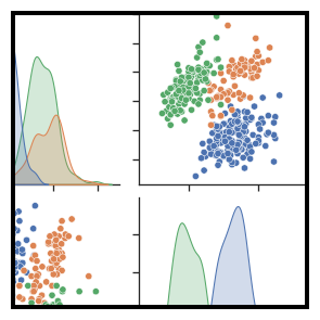
### sns.pairplot
```python
sns.pairplot(df)
```
 Sign in with Wallet
Connect another wallet
Sign in with Wallet
Connect another wallet