###### tags: `Typography` `book`
# Establishing a typographic system
## Hi there
#### h3
- adawd
- asd asd
```
<html>
```
Setting up the typography for any sizable project is always complicated. There are literally hundreds of tweakable variables and it's very easy to spend endless hours adjusting sizing, line-heights, margins and weights. The best way to save your sanity is to have a design system that can generate quick answers to most of the little questions – which lets you concentrate the 'big picture' decisions.
## Locking in your body text size
Often our first ***big*** typography decison is to set the body font size for our default layout (let's put responsive design to the side for now). For me, I see setting the body font-size (paired with the line-height) as the DNA in a type-heavy, content-centric typography system. Everything else is defined relative to those base body font settings.
For many years 16-pixels was considered the default body size of the web. However, with today's larger screens, text-heavy sites such as blogs and news services are generally choosing 18-21px body font-sizes. Social media and ecommerce apps that use busier, more modular UI units have tended towards 14-16px body fonts. Obviously, these are broad trends, and not hard and fast rules, but you can see these general trends in the list below.
### Typical body font sizes
- Medium.com: 21px
- NYTimes.com: 18px
- CNN.com: 18px
- AirBNB.com: 18px
- SitePoint.com: 18px
- BBC.co.uk: 16px
- Developer.mozilla.org: 16px
- Twitter.com. 15px
- Etsy.com: 14px
- Wikipedia.com: 14px
- Facebook.com: 14px

*Fig 4.x: Body font-size samples for The NYTimes, Medium, SitePoint and Wikipedia*
Remember that these big internet properties do a lot of user-testing so put some thought into where your application fits into this list. When you've settled on your base text sizes, eye-test them on real screens, tablets and phones until you're happy with that as a starting point.
## Scaling your Type
So, you have your body font-size. How do you decide on the sizing of your article titles, section headings, subheaders, lists and blockquotes?
For me, the answer used to be '*Umm,..Tweak it till it what looks...kinda right..?*'. I'd scale up a heading, bump the weight a little, jog it a pixel up,.. push it back down,... and back up again. Frankly it was exhausting because there were so many finicky little decisions and very few scientifically-proveably wrong answers.
Type scaling – sometimes called modular scaling - lets you use *simple* math to give you *simple* typographic answers. We set a single scaling ratio to generate all our font-sizes while keeping them in harmony. It's like a musical scale for type sizing.
### Type Scaling in Practice
Let's start with a body font-size of 18px. That makes our default paragraph size 1rem (or 18px).
```css
body{font-size: 18px;}
p{font-size: 1em; /* or 18px */ }
```
I'm going to set my type scale of 1.25. To calculate my H5 font-size I simply multiply my paragraph font-size by 1.25. That would be `1em * 1.25` or 1.25em.
H5 = P * 1.25 = 1.25em
Our H4 headings would be the H5 size * 1.25 (`1.25em * 1.25`) or 1.563em. Continuing the process gives us something like this:
```css
/* Using a type scale of 1.25 */
h5 {font-size: 1.25em;} /* 22.50px */
h4 {font-size: 1.563em;} /* 28.13px */
h3 {font-size: 1.953em;} /* 35.16px */
h2 {font-size: 2.441em;} /* 43.95px */
h1 {font-size: 3.052em;} /* 54.93px */
```
If I decided that my H1 headings felt a little oversized at that scale, I could bump my typescale down to 1.2 to get this result:
```css
h5 {font-size: 1.2em;} /* 21.60px */
h4 {font-size: 1.44em;} /* 25.92px */
h3 {font-size: 1.728em;} /* 31.10px */
h2 {font-size: 2.074em;} /* 37.32px */
h1 {font-size: 2.488em;} /* 44.79px */
```
### So, do I need a pocket calculator to size my text?
Happily, no. There are some great tools that let you tweak and test type scales in generate CSS in real-time. My favorite is Jeremy Church's [Type-scale.com](https://type-scale.com/), a tool that lets you quickly test different type scales and generate working CSS. There's even a dummy layout on the right panel to roadtest your sizings and a CodePen export. This is a great foundation for your typography CSS.
<!-- Browser -->
<div class="sitepreview">
<div class="browser">
<div class="browser__bar">
<div class="browser__dots"></div>
<div class="browser__address">
<a class="browser__url" target="_blank" id="site-url"
href="https://type-scale.com/">https://type-scale.com/</a>
</div>
</div>
<div class="browser__body">
<img id="target" alt="Type-scale.com generates an consistently scaled set of font-sizes" class="browser__image"
src="https://cdn.statically.io/gh/sitepoint-editors/design4/dac5c1d883ee5a82d142641590e4663837d377a8/images/chapter4/typescale-2.gif" />
</div>
</div>
</div>
*Jeremy Church's Type-scale.com lets you experiment with typefaces, line-heights, weights and sizes in real-time*
### Mobile considerations
A good question is 'Will a single type scale ratio work for all device sizes?'. Often the answer is, no it doesn't.
If you compare the typography of a typical newspaper to that of a classic paperback novel you'll notice some interesting differences beyond the obvious paper sizes.
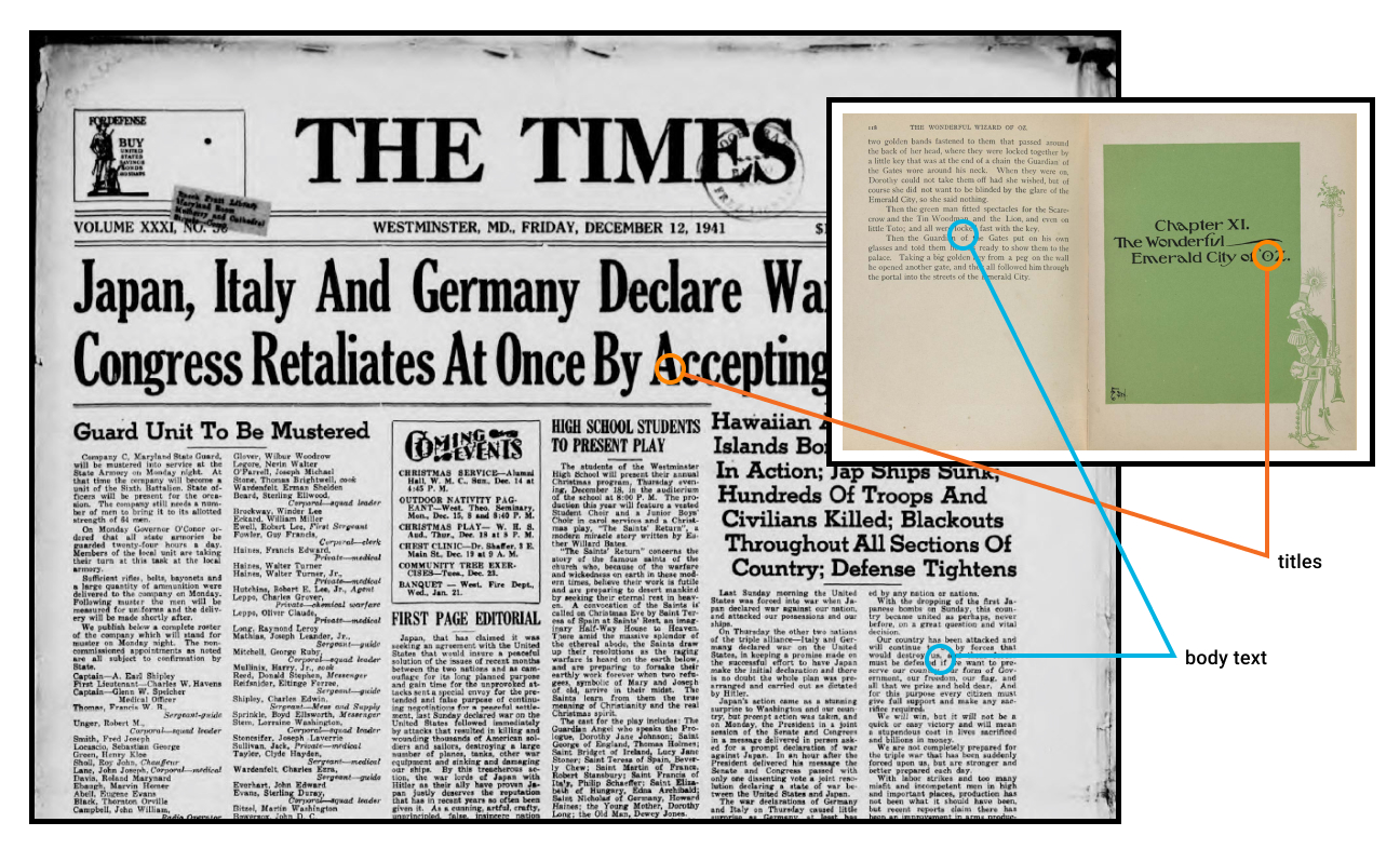
*Fig 4.xx: Body type sizes are comparable but headings scale much larger on larger formats*
While their body font sizes may be quite similar, the variation in heading sizes is quite different. Imagine trying to cram the *'The Times'* headline size into *'The Wizard of Oz'* chapter titles. In simple terms, smaller formats (i.e. phones and books) usually need shallower type scales.

*Fig 4.x: Larger format layouts can accomodate wider heading size variations.*
This difference in type scale doesn't need to be huge. As Fig 4.x shows, a small increase in type scale – 1.125 up to 1.25 – ripples through the scale to generate a much larger top-level heading. While that H1 title looks fine on the laptop, it would chew up far too much real estate on the mobile. In short, it's wise to use CSS `@media` queries to serve two type scales – a steeper type scale for large screens and a more compressed type scale for smaller screens.
So, now we have a reliable, repeatable process to scale the type in our designs. Now let's look at the spaces ***inbetween*** that type.
## What is Vertical Baseline Rhythm?
Vertical baseline rhythm — sometimes called the ‘vertical measure’ — is a grid of horizontal lines that you can use to hang your typography in. It’s not unlike the blue-lined school workbooks we all learned to write in. The trick is getting your larger type units to fit into same grid as your body text.

*Fig x: Regular lines help organise the text – even when the sizing changes.*
Richard Rutter describes baseline rhythm like this:
> *Headings, subheads, block quotations, footnotes, illustrations, captions and other intrusions into the text create syncopations and variations against the base rhythm of regularly leaded lines. These variations can and should add life to the page, but the main text should also return after each variation precisely on beat and in phase.*
>[The Elements of Typographic Style Applied to the Web](http://webtypography.net/2.2.2)
### How does that work on the web?
Let's look at a real-world example. The excellent [Colossal Magazine](https://www.thisiscolossal.com/) uses a very open, airy layout, yet it still manages to feel strong and structural. How does it do that? It turns out that if we super-impose a 21px vertical grid over the whole layout (see Fig 4.x), we see a previously hidden structure emerge. For this example, let's call one row of this grid a 'unit'.
You'll notice that:
* The site branding fits nicely into a 4-unit high box
* The main navigation is 3-units high
* Article titles are 2-units high
* Secondary navigation and social links are 1-unit high
<!-- Browser -->
<div class="sitepreview">
<div class="browser">
<div class="browser__bar">
<div class="browser__dots"></div>
<div class="browser__address">
<a class="browser__url" target="_blank" id="site-url"
href="https://www.thisiscolossal.com/">https://www.thisiscolossal.com/</a>
</div>
</div>
<div class="browser__body">
<img id="target" alt="Type-scale.com generates an consistently scaled set of font-sizes" class="browser__image"
src="https://cdn.statically.io/gh/sitepoint-editors/design4/f0966973ee44695d1295b59470f4950813117374/images/chapter4/colossal.gif" />
</div>
</div>
</div>
*Fig 4.x Colossal Magazine uses a loose 21px grid*
In fact, most UI elements 'hang' on this underlying grid like socks pinned on an invisible clothesline. Even though we can't see the underlying grid, we’re aware of it through a feeling of balance and harmony. It just feels right.
Note that we're not talking about `font-size`, but instead ***the whole space the text occupies*** – made up of its`line-height`, and `margin`. So in the Colossal example, the article title would have a line-height of 42px – or 2-units for each line.
However you'll notice **not** every element is locked to this grid. The designers have choosen to offset elements like the photos from the grid. That's fine too. The grid is a great starting point – not the law.
## TIP: Hey, You!
Most modern graphic layout tools (Sketch, Figma or Adobe XD) make it easy to add a vertical baseline to any canvas/frame. In this Figma example (see Fig 4.x), I selected the document frame and used the '+' button to add separate rows and columns in the Layout Grid panel. These grid layers can be switched on and off using the eye icon. I find that with a grid in place and 'snap-to-grid' switched on, it simply becomes easier to size items by the grid than not. And that makes your life easier.
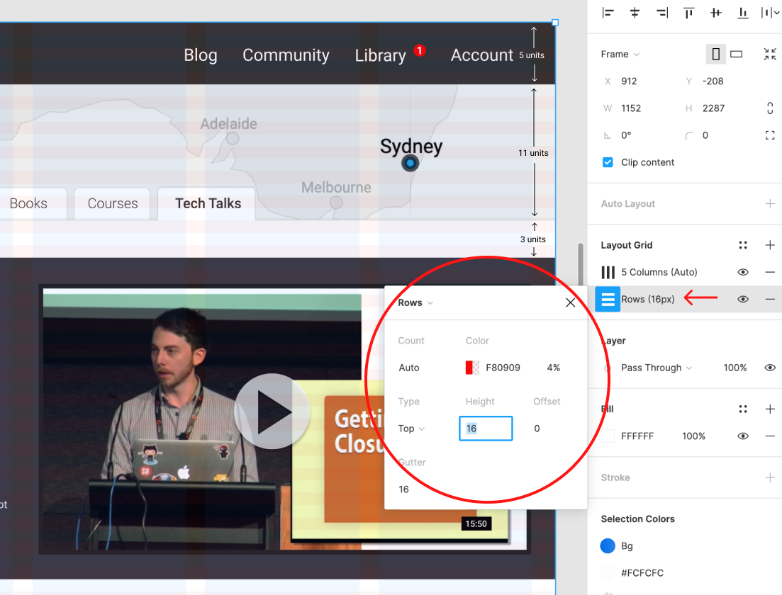
*Fig 4.xx: Layout grids in Figma help you make sizing decisions.*
## Is there a tool to help me with the CSS?
As a matter of fact there is. [Gridlover.net](https://gridlover.net/try) is a wonderful, free tool that lets you experiment with different base font-sizes, line-heights and type scalings locked to a baseline. Try adjusting any of the line-heights or margins on the right CSS panel and you'll notice the number only changes by a full 'grid unit' each time.
You'll also notice the tool avoids using CSS padding in typography. I've found this to be a great policy when using a baseline rhythm. I use padding on containers, but never on typography.
This tool not only writes useful CSS but it really helped me get my head around how vertical bassline and type scaling works can in the real world. I think this is a great place to start your CSS typography.
<!-- Browser -->
<div class="sitepreview">
<div class="browser">
<div class="browser__bar">
<div class="browser__dots"></div>
<div class="browser__address">
<a class="browser__url" target="_blank" id="site-url"
href="https://gridlover.net/try">https://gridlover.net/try</a>
</div>
</div>
<div class="browser__body">
<img id="target" alt="Type-scale.com generates an consistently scaled set of font-sizes" class="browser__image"
src="https://cdn.statically.io/gh/sitepoint-editors/design4/fa908899/images/chapter4/gridlovernet.gif" />
</div>
</div>
</div>
*Fig 4.x Gridlover lets you try different base font-size, a line-height and type scales.*
## Vertical Baseline Rhythm is a tool - not a religion
Vertical baselines are a handy tool but they shouldn’t take over your design. I have to admit there was a time where I spent too much sweat trying to bend every page element to obey my mighty grid rules. I was arm-wrestling typographic percentages and margins and ‘hitting the grid’ became a goal in itself, rather than just a tool to help me design better.
That’s neither fun nor useful.
Today I think it’s better to look at vertical baselines as a strong bass drum in a band – a regular beat that helps to measure out the space for the rest of the band to play in. Set up a nice backbeat that everyone can feel, but don’t be afraid of little off-beat flourishes. Often they can add energy and flavor to a composition (visual or musical).
Personally, I like to start with a strong grid and use it. If there’s whitespace between headings or paragraphs, *it might as well* be 1, 2, or 3 whole ‘vertical units’ — rather than 1.38 or 2.75 units.
Likewise, a hero image *might as well be* exactly 12 units tall rather than 11.8 or 12.3 units, as now the bottom edge of the image is more likely to line up nicely with any text flowing alongside it. It's like building with Lego – standardized blocks tend to line up.
But if, on the other hand, the caption on your image looks too spacey when it is spread over 25px line-heights, that’s fine. It’s ok to forget the grid there. Just make it look good.
### The Takeaway
Ultimately the act of '*design*' is just answering a long, long list of 'Why questions'.
* Why is that major heading 48px high?
* Why is that margin-bottom 17px?
* Why does the H3 have a line-height of 1.7778?
* etc...
There are potentially thousands of these little questions in every big design project. And if you're reading this book you probably have enough natural 'designer gut-feel magic' to competently answer all of them – eventually. The problem is that it's ***exhausting***.
However, if you can come up with a repeatable system that answers 95% of the little questions, you can save your 'designer gut-feel magic' for the bigger, questions.
And generally, that's the fun part too.
<!-- STYLES to be added -->
<style>
:root {
--typescale: 1.25;
/*the heading scaling factor relative to the <p>. ( h4 > h3 > h2 > h1). It's a 'type size ramp'.*/
--baselineratio: calc(16/9);
/* The 'line-height:basefont size' ratio ( i.e 16/9 = 1.777778)*/
--basegrid: 32px;
/* phone */
--basegrid-tablet: 28px;
--basegrid-laptop: 32px;
--basegrid-wide: 36px;
--baseline: calc(var(--baselineratio) * 1rem);
/*--baseline: 1.7778 * 1rem;*/
--basefont: calc(var(--basegrid) / var(--baselineratio));
--basefont-tablet: calc(var(--basegrid-tablet) / var(--baselineratio));
--basefont-laptop: calc(var(--basegrid-laptop) / var(--baselineratio));
--basefont-wide: calc(var(--basegrid-wide) / var(--baselineratio));
font-family: Roboto, sans-serif;
font-weight: 300;
}
:root {
/* DEFAULT - mobile */
font-size: var(--basefont);
line-height: var(--baseline);
}
/* The New Typography */
/* palette controls */
ul.palette-ui {
display: flex;
margin: calc(var(--baseline) /2) 0 calc(var(--baseline) * 2);
}
ul.palette-ui li {
color: #3c3c3c;
display: inline-block;
list-style: none;
margin: 0 0em 0 3rem;
padding: 0;
position: relative;
line-height: calc(var(--baseline) * 1.5);
}
ul.palette-ui li span {
color: #333;
}
ul.palette-ui li::before {
background-color: currentcolor;
border-radius: 50%;
content: "";
width: 2rem;
height: 2rem;
border: 2px #f2f2f2 solid;
position: absolute;
top: calc(var(--baseline) * 0.25);
left: -2.5rem
}
/* mini browser - c/o Site Palette */
.sitepreview {
width: 100%;
margin: calc(var(--baseline) / 2) 0;
}
.browser {
width: 98%;
margin: 0 auto;
box-shadow: 0px 10px 40px -10px rgba(24, 65, 107, 0.35);
}
.browser__bar {
height: calc(var(--baseline) / 1);
background: #e7edf3;
border-radius: 4px 4px 0 0;
display: -webkit-flex;
display: flex;
justify-content: flex-end;
padding: 7px 0 8px;
position: relative;
line-height: calc(var(--baseline) / 1);
align-items: center;
}
.browser__dots,
.browser__dots::after,
.browser__dots::before {
position: relative;
width: 8px;
height: 8px;
background: #c7d1da;
border-radius: 50%;
margin-right: 5%;
}
.browser__dots::after,
.browser__dots::before {
margin: 0;
position: absolute;
content: '';
}
.browser__dots::after {
right: 13px;
}
.browser__dots::before {
left: 13px;
}
.browser__address {
width: 86%;
margin-right: 2%;
height: 100%;
background: rgba(0, 0, 0, 0.03);
border-radius: 3px;
white-space: nowrap;
font-size: 9px;
line-height: calc(var(--baseline) / 2);
padding-left: 10px;
color: #96abb7;
text-overflow: ellipsis;
overflow: hidden;
padding-right: 5px;
}
.browser__address a {
text-decoration: none;
color: #96abb7;
transition: all ease 0.3s;
}
.browser__body {
border-radius: 0 0 4px 4px;
overflow: scroll;
max-height: 280px;
max-height: 16vw;
min-height: calc(var(--baseline) * 13);
}
.browser__image {
max-width: 100%;
}
/* Hackmd.io-specific layout hack */
.markdown-body figure {
margin: 0;
}
</style>
 Sign in via Google
 Sign in via Facebook
 Sign in via X(Twitter)
 Sign in via GitHub
 Sign in via Dropbox
 Sign in with Wallet
Connect another wallet
Sign in with Wallet
Connect another wallet