# Session 04 : Flexbox
Flexbox is a technique to layout,organize and distribute HTML elements in efficient way,also manage the space between elements in more sophisticated way.
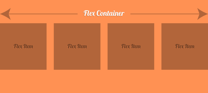
In flexbox, there are two main components you have to recognize them before start play around with flexbox which are **flex-container**, **flex-elements**
and there is something else you have to know before dive in flex box, as we said before flexbox is direction-agnostic so it works with the both direction and each one has it's own name, which are **Main Axis**, **Cross Axis**

**the default direction is horizental**
let's begin with simple example, let's add some boxes (flex elements) inside a conatiner (flex container):
```html
<div class="container">
<div class="box">1</div>
<div class="box">2</div>
<div class="box">3</div>
<div class="box">4</div>
<div></div>
</div>
```
```css
/* Flex Container */
.container {
display: flex;
background: #333;
}
/* Flex Items */
.box {
width: 300px;
height: 300px;
color: #fff;
font-size: 60px;
background: orange;
margin: 5px;
}
```
* Did you see how the layout of the **flex elements** ordered ?
Here CSS ordered elements one by one, starting from the **Main Axis** and putting them horizontally according to there direction which is by default is the row(horizontal direction).
and this is the most basic usage of flexbox, now let's play with the direction of flex:
# Properties for the Parent (flex container)
## flex-direction
<img src="https://css-tricks.com/wp-content/uploads/2018/10/flex-direction.svg" alt="flex-direction" width="500"/>
```css
.container{
flex-direction: row | row-reverse | column | column-reverse;
}
```
**row** (default): Here the elements will start order from left to right in ltr and right to left in rtl.
**row-reverse**: Here the elements will start order from right to left in ltr and left to right in rtl.
**column**: Here the elments will start order from top to bottom.
**column-reverse**: Here the elments will start order from bottom to top.
## flex-wrap
<img src="https://css-tricks.com/wp-content/uploads/2018/10/flex-wrap.svg" alt="align-items" width="400"/>
By default, flex items will all try to fit onto one line. You can change that and allow the items to wrap as needed with this property.
```css
.container{
flex-wrap: nowrap | wrap | wrap-reverse;
}
```
**nowrap** (default): all flex items will be on one line
**wrap**: flex items will wrap onto multiple lines, from top to bottom.
**wrap-reverse**: flex items will wrap onto multiple lines from bottom to top.
## justify-content
This defines the alignment along the main axis. It helps distribute extra free space leftover when either all the flex items on a line are inflexible, or are flexible but have reached their maximum size. It also exerts some control over the alignment of items when they overflow the line.
<img src="https://css-tricks.com/wp-content/uploads/2018/10/justify-content.svg" alt="justify-content" width="400"/>
```css
.container{
justify-content: flex-start | flex-end | center | space-between | space-around | space-evenly;
}
```
**center**: Here the elements will place at the center and extra spaces will be around them
**flex-start**: Here the space will place after the last element
**flex-end**: Here the space will place before the first element.
**space-between**: Items display with equal spacing between them.
**space-around**: Items display with equal spacing around them.
## align-items
This defines the default behavior for how flex items are laid out along the **cross axis** on the current line. Think of it as the `justify-content` version for the cross-axis (perpendicular to the main-axis).
<img src="https://css-tricks.com/wp-content/uploads/2018/10/align-items.svg" alt="align-items" width="400"/>
```css
.container{
align-items: stretch | flex-start | flex-end | center | baseline;
}
```
**stretch** (default): stretch to fill the container (still respect min-width/max-width).
**flex-start**: items are placed at the start of the cross axis.
**flex-end**: items are placed at the end of the cross axis.
**center**: the extra space (of the cross axis) will be distributed equally above and below flex-elements which will make the element in the middle of cross axis.
**baseline**: items are aligned such as their baselines align
## align-content
<img src="https://css-tricks.com/wp-content/uploads/2018/10/align-content.svg" alt="align-content" width="400"/>
This aligns a flex container’s lines within when there is extra space in the cross-axis, similar to how `justify-content` aligns individual items within the main-axis.
> Note: This property only takes effect on multi-line flexible containers, where flex-flow is set to either wrap or wrap-reverse). A single-line flexible container (i.e. where flex-flow is set to its default value, no-wrap) will not reflect align-content.
```css
.container{
align-content: flex-start | flex-end | center | space-between | space-around | space-evenly | stretch;
}
```
**normal** (default): items are packed in their default position as if no value was set.
**flex-start**: items packed to the start of the container.
**flex-end**: items packed to the end of the container.
**center**: items centered in the container.
**space-between**: items evenly distributed; the first line is at the start of the container while the last one is at the end.
**space-around**: items evenly distributed with equal space around each line.
**space-evenly**: items are evenly distributed with equal space around them.
**stretch**: lines stretch to take up the remaining space
---
# **Properties for the Children (flex items):**
## order:
Flexbox provides a way to determine the order of each element, which is a property you can use in flex-elements.
flexbox start placing elements from lower to larger values
example:
```css
.box-1 {
order:2;
}
.box-2 {
order: -1;
}
.box-3 {
order: 3;
}
.box-4 {
order: 4;
}
```
so we have the following values : 2, -1, 3, 4 so CSS we reorder them to -1 -> 2 -> 3 -> 4
and the final result will be :

## flex-grow
<img src="https://css-tricks.com/wp-content/uploads/2018/10/flex-grow.svg" alt="flex-grow" width="400"/>
This defines the ability for a flex item to grow if necessary. It accepts a unitless value that serves as a proportion. It dictates what amount of the available space inside the flex container the item should take up.
If all items have flex-grow set to 1, the remaining space in the container will be distributed equally to all children. If one of the children has a value of 2, the remaining space would take up twice as much space as the others (or it will try to, at least).
```css
.item {
flex-grow: 4; /* default 0 */
}
```
Negative numbers are invalid.
## flex-shrink
This defines the ability for a flex item to shrink if necessary.
```css
.item {
flex-shrink: 3; /* default 1 */
}
```
Negative numbers are invalid.
## align-self
<img src="https://css-tricks.com/wp-content/uploads/2018/10/align-self.svg" alt="align-self" width="400"/>
This allows the default alignment (or the one specified by `align-items`) to be overridden for individual flex items.
```css
.item {
align-self: auto | flex-start | flex-end | center | baseline | stretch;
}
```
 Sign in with Wallet
Connect another wallet
Sign in with Wallet
Connect another wallet