# Визуализация данных
Гущин Александр, DMIA, осень 2019
[TOC]
---
1. Визуализации в анализе данных: что и зачем :notebook_with_decorative_cover:
1. Инструменты для визуализации :key:
1. Типы графиков и ситуации их применения :eyeglasses:
1. Советы по демонстрации найденных закономерностей и результатов вычислительных экспериментов :vertical_traffic_light:
<!-- 2. Советы, как добиться большей наглядности -->
---

<!--  -->
---
## Основные типы визуализаций
Визуализации распределений
  
density, boxplot, histogram
https://python-graph-gallery.com
---
Визуализации корреляций
  
scatterplot, 2D-density, heatmap
---
Визуализации изменений
  
lineplot, stacked area plot, parrallel plot
---
Визуализации карт
  
Choropleth map, Connection map, Bubble map
---
  
Network chart, Dendrogram, Tree plot
---
  
Word cloud, Spider map, Pie plot
<!-- ---
с которыми встречаются в анализе данных
- lineplot
- scatterplot
- histogram
- boxplots
- kdeplot
- matrix plot
- maps
- graphs (это отдельная большая тема)
- images
- многие другие -->
---
## Инструменты и примеры
---
matplotlib

---
matplotlib
```python
import matplotlib.pyplot as plt
fig, axs = plt.subplots(2, 1)
axs[0].plot(t, s1, t, s2)
axs[0].set_xlim(0, 2)
axs[0].set_xlabel('time')
axs[0].set_ylabel('s1 and s2')
axs[0].grid(True)
cxy, f = axs[1].cohere(s1, s2, 256, 1. / dt)
axs[1].set_ylabel('coherence')
fig.tight_layout()
plt.show()
```
https://matplotlib.org/gallery/index.html
---
seaborn

---
seaborn
```python
import seaborn as sns
sns.set(style="ticks")
df = sns.load_dataset("iris")
sns.pairplot(df, hue="species")
```
---
seaborn
---
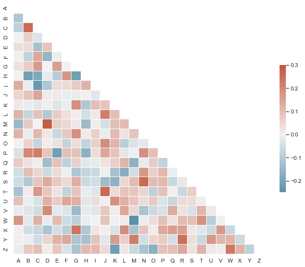
seaborn
```python
import seaborn as sns
import matplotlib.pyplot as plt
sns.set(style="white")
# Set up the matplotlib figure
f, ax = plt.subplots(figsize=(11, 9))
# Generate a custom diverging colormap
cmap = sns.diverging_palette(220, 10, as_cmap=True)
# Draw the heatmap with the mask and correct aspect ratio
sns.heatmap(corr, mask=mask, cmap=cmap, vmax=.3, center=0,
square=True, linewidths=.5, cbar_kws={"shrink": .5})
```
https://seaborn.pydata.org/examples/index.html
---
plotly
```python
import plotly.express as px
gapminder = px.data.gapminder()
fig = px.scatter(gapminder.query("year==2007"), x="gdpPercap", y="lifeExp",
size="pop", color="continent",
hover_name="country", log_x=True, size_max=60)
fig.show()
```
https://plot.ly/python/bubble-charts/
---
plotly
```python
import plotly.graph_objects as go
fig =go.Figure(go.Sunburst(
labels=["Eve", "Cain", "Seth", "Enos", "Noam", "Abel", "Awan", "Enoch", "Azura"],
parents=["", "Eve", "Eve", "Seth", "Seth", "Eve", "Eve", "Awan", "Eve" ],
values=[10, 14, 12, 10, 2, 6, 6, 4, 4],
))
# Update layout for tight margin
# See https://plot.ly/python/creating-and-updating-figures/
fig.update_layout(margin = dict(t=0, l=0, r=0, b=0))
fig.show()
```
https://plot.ly/python/sunburst-charts/
---
Другие инструменты, о которых полезно знать
- Altair
https://altair-viz.github.io
- Bokeh
https://bokeh.pydata.org
- Graphviz
https://graphviz.readthedocs.io
---
## Советы для большей наглядности
1. Подписывайте оси (достаточно крупно :)
1. Оставляйте данные и код для воспроизведения рисунков
https://www.data-to-viz.com/caveats.html
---
https://www.data-to-viz.com

---
Ещё пара интересных ссылок:
- 11 Awesome Data Visualizations Way Ahead of Their Time
https://www.investintech.com/resources/blog/archives/5692-data-visualizations-infographic.html
- 3 Awesome Visualization Techniques for every dataset
https://mlwhiz.com/blog/2019/04/19/awesome_seaborn_visuals/
{"metaMigratedAt":"2023-06-15T00:39:08.774Z","metaMigratedFrom":"YAML","title":"Visualisations","breaks":true,"description":"View the slide with \"Slide Mode\".","slideOptions":"{\"theme\":\"white\",\"transition\":\"slide\"}","contributors":"[{\"id\":\"e0bc91de-98f7-46f8-a3a9-852912833a93\",\"add\":94052,\"del\":90762}]"}