---
tags: ironhack, lecture,
---
<style>
.markdown-body img[src$=".png"] {background-color:transparent;}
.alert-info.lecture,
.alert-success.lecture,
.alert-warning.lecture,
.alert-danger.lecture {
box-shadow:0 0 0 .5em rgba(64, 96, 85, 0.4); margin-top:20px;margin-bottom:20px;
position:relative;
ddisplay:none;
}
.alert-info.lecture:before,
.alert-success.lecture:before,
.alert-warning.lecture:before,
.alert-danger.lecture:before {
content:"👨🏫\A"; white-space:pre-line;
display:block;margin-bottom:.5em;
/*position:absolute; right:0; top:0;
margin:3px;margin-right:7px;*/
}
b {
--color:yellow;
font-weight:500;
background:var(--color); box-shadow:0 0 0 .35em var(--color),0 0 0 .35em;
}
.skip {
opacity:.4;
}
</style>
# CSS | Positioning and Flexbox
## Learning Goals
After this lesson, you will know:
- how to position elements on your page using CSS `position` propeerty,
- what *flexbox* is and what is does, and
- how to structure HTML page using *flrxbox*.
## Positioning
:::info
Flow de page:

=> le montrer en insérant des div `inline-block` dans une page codepen.
:::
:::info lecture
De base, tout le monde à `static`.
:::
The CSS `position` property allows you to organize elements on the screen. Position can be:
- `static`
- `relative`
- `fixed`
- `absolute`
When setting the `position`, you can use the following properties:
- `top`
- `right`
- `bottom`
- `left`
Let's take a look at the different ways to position elements!
### `position:static`
The initial or default value of an element is `static`. It means that the element is **not positioned** in any special way - it just follows the normal flow of the webpage: if they are block level elements, they will each take a full available width; if they are inline level elements, they will flow like a text.
- Elements with `position: static`, are described as **not positioned**.
- Elements with any other form of the `position` property are described as **positioned**.
### `position:relative`
A `relative` positioned element behaves the same as `static` unless you add some extra properties. You can adjust the position by setting the `top`, `left`, `right`, and `bottom` properties.
:::success
It will move the element relative to where it would normally occur in the document. Other content *will not* be adjusted to fit into any gap left by the element.
:::
To understand the `position: relative` property better, take a look at the following example:
<iframe height='265' scrolling='no' title='CSS position relative' src='//codepen.io/ironhack/embed/JRoWwq/?height=265&theme-id=0&default-tab=css,result&embed-version=2' frameborder='no' allowtransparency='true' allowfullscreen='true' style='width: 100%;'>See the Pen <a href='http://codepen.io/ironhack/pen/JRoWwq/'>CSS position relative</a> by Ironhack (<a href='http://codepen.io/ironhack'>@ironhack</a>) on <a href='http://codepen.io'>CodePen</a>.
</iframe>
**To understand what is happening, try to do this**:
- Delete the left and top properties of `relative` class. The `relative` element will be moved into its default place.
- Add back the left and top propeties with their original values. The element will be moved relatively from its default place.
- Finally, uncomment the third element in the HTML code. You can see how relative position ignores any other element in the HTML.
### `position:fixed`
:::info lecture
Hors flow !
Positionnée par rapport au viewport
:::
A fixed element is *positioned relatively to the screen of your device - aka viewport* (computer, mobile, etc.).
:::success
- The element will always be in the same place, even when you scroll.
- As with `relative`, the `top`, `left`, `right`, and `bottom` properties are used.
:::
Here's an example of using `position: fixed`:
<iframe height='265' scrolling='no' title='CSS Position static' src='//codepen.io/ironhack/embed/qaEmWW/?height=265&theme-id=0&default-tab=html,result&embed-version=2' frameborder='no' allowtransparency='true' allowfullscreen='true' style='width: 100%;'>See the Pen <a href='http://codepen.io/ironhack/pen/qaEmWW/'>CSS Position static</a> by Ironhack (<a href='http://codepen.io/ironhack'>@ironhack</a>) on <a href='http://codepen.io'>CodePen</a>.
</iframe>
### `position:absolute`
:::info lecture
Hors flow!
Positionnée par rapport à son ancetre non-`static` le plus proche :

:::
The `absolute` position works similarly to `fixed` position, but instead of being positioned relative to the viewport, **it's positioned to the nearest *positioned* element in the DOM**. That is, the nearest element with a `position` other than `static`.
If there's no ancestor positioned element in the document, it will use the `body`.
Check out the following example:
<iframe height='250' scrolling='no' src='//codepen.io/ironhack/embed/GjgvjK/?height=250&theme-id=0&default-tab=result&embed-version=3' frameborder='no' allowtransparency='true' allowfullscreen='true' style='width: 100%;'></iframe>
As you can see, there are two `div` elements, one over the other. If you inspect the CodePen code you can see that absolutely positioned page elements are removed from the flow of the page. This means that they don't affect the position of other elements, and the other elements will not affect them.
:::info lecture
Exercice de la 

:::
## The basics of Flexbox
### What is flexbox and why should you use it?
:::info lecture
Historiquement : `float` puis `inline-block`
<iframe height="500" style="width: 100%;" scrolling="no" title="ifocop143-ex-float" src="https://codepen.io/abernier/embed/dffb181be4f84aa7583efdbf7527b8de?height=300&theme-id=0&default-tab=result" frameborder="no" allowtransparency="true" allowfullscreen="true">
See the Pen <a href='https://codepen.io/abernier/pen/dffb181be4f84aa7583efdbf7527b8de'>ifocop143-ex-float</a> by Antoine BERNIER
(<a href='https://codepen.io/abernier'>@abernier</a>) on <a href='https://codepen.io'>CodePen</a>.
</iframe>
=> montrer comment on s'est servi des `float` + `inline-block` pour mettre des éléments les uns a coté des autres.
:::
:::info lecture
Limitations:
- prendre le restant de l'espace disponible
- clearfix
- vertical alignement
:::
As you have probably noticed, some times it is really hard to position the elements of a web page where you want them to be. Instead of giving margins and paddings and having to rewrite whenever changes are made, wouldn't be great to have a way to organize the HTML elements in a more adaptive and *flexible* way?
That's why [Flexbox](https://developer.mozilla.org/en-US/docs/Web/CSS/CSS_Flexible_Box_Layout/Basic_Concepts_of_Flexbox) was created.
:::info
By following some rules (implemented by you), it automatically organizes, aligns and rearranges the content according to the changes on width and height of the device while it still preserves the proportions you've written on your code.
:::
To start using Flexbox you need to write only one line of code inside of your css rule: **`display: flex`**.
By using this rule on the parent element, it will **convert it into a *flex container* and every *direct child* of the element will be transformed into it's flex children (elements that will be changed to fit inside the box)**.
After that you'll want to give your flex container a few directives. For example, how will the elements be organized? How will we position horizontally and/or vertically? If you don't decide this by yourself, some of these decisions will be made for you by the default values, but let's have a quick look into what we can do.
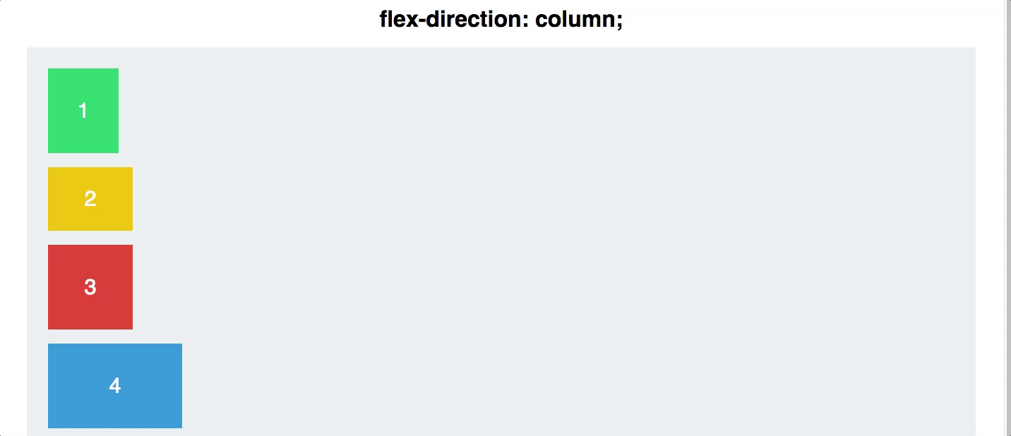
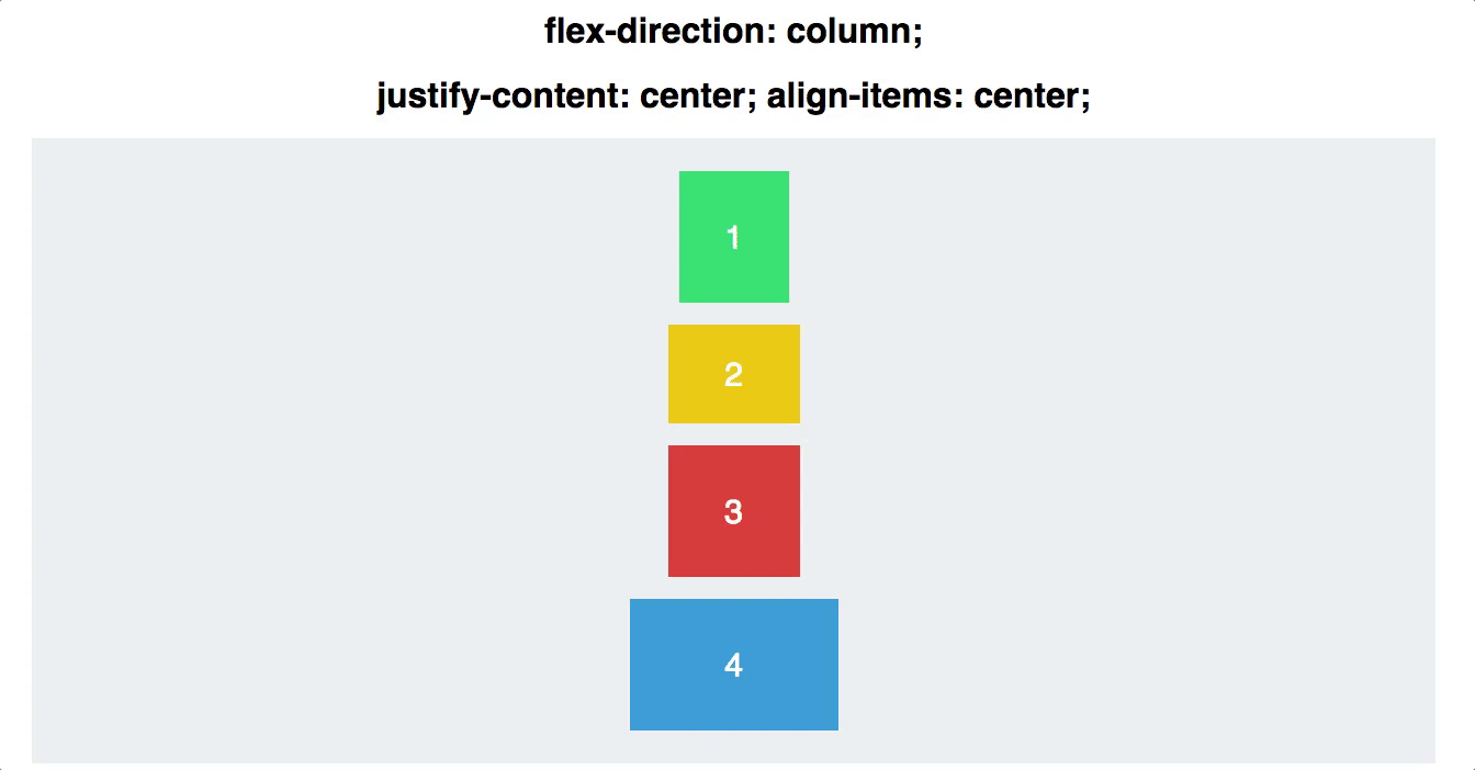
### The `flex-direction` property
:::success
The `flex-direction` shows the direction on which the contents will be aligned.
:::
:::info lecture
2 axes :
- main
- cross
:::
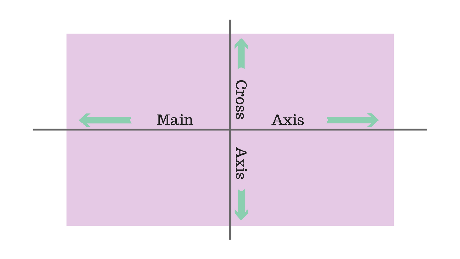
By **default** it is **`row` which is from left to right**. Here are the other options you have:
:::info lecture
`flex-direction` permet de permuter les axes:
<span style="font-size:500%">😀</span><span style="font-size:500%; display:inline-block;transform:rotate(-90deg);">😀</span>
- `flex-direction:row` : l'axe main est l'axe **horizontal** (par défaut)
- `flex-direction:column` : l'axe main est l'axe **vertical**
:::
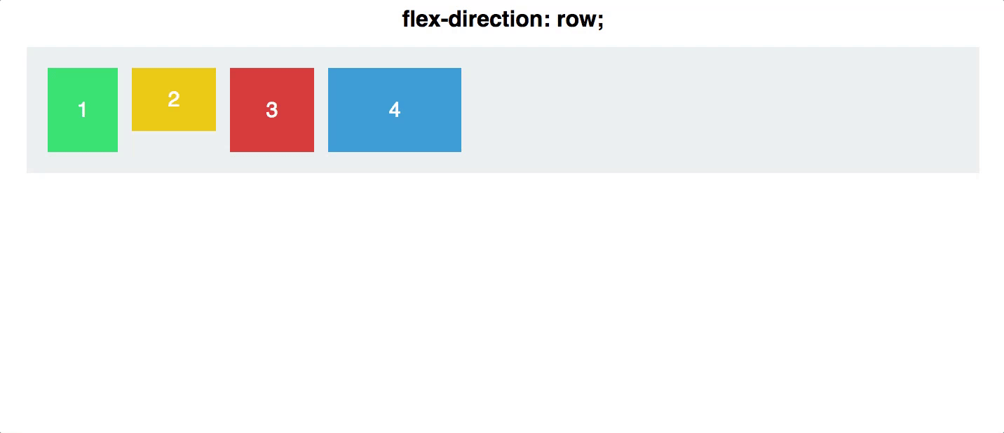
`row-reverse`: from right to left
`column`: from top to bottom
`column-reverse`: same as row-reverse but from bottom to top
### The `justify-content` property
:::info lecture
Aligner les items selon le **main** axis.
NB: permettra donc d'aligner verticalement si axes permuttés avec `flex-direction:column`.
:::
:::info
With `justify-content` we can **horizontally** arrange the items inside the flex container.
:::
By **default** it will be **`flex-start` which will position everything at the beginning of the flex container (according to it's direction)**.
Here are some other options you have:
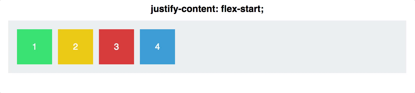
- `flex-end`: items are positioned on the end of the flex-direction line
- `center`: items are centered along the line
- `space-between`: items are evenly distributed in the line; first item is on the start line, last item on the end line
- `space-around`: items are evenly distributed in the line with equal space around them. Note that visually the spaces aren't equal, since all the items have equal space on both sides. The first item will have one unit of space against the container edge, but two units of space between the next item because that next item has its own spacing that applies.
- `space-evenly`: items are distributed so that the spacing between any two items (and the space to the edges) is equal.
### The `align-items` property
:::info lecture
Aligner les items selon le **cross** axis.
NB : par défault à stretch!
:::
This one is a life saver. Remember how hard it was to align the elements **vertically**? With `align-items` you can easily do this. Be careful with this one. If you don't assign any value to this property, it's **default value will be `strecth` which stretches the children to fill the whole container**.
You have these options to vertically align your flex items:
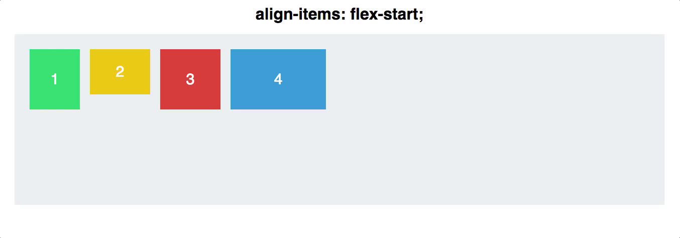
- `flex-start`: cross-start margin edge of the items is placed on the cross-start line
- `flex-end`: cross-end margin edge of the items is placed on the cross-end line
- `center`: items are centered in the cross-axis
- `baseline`: items are aligned such as their baselines align
:::warning
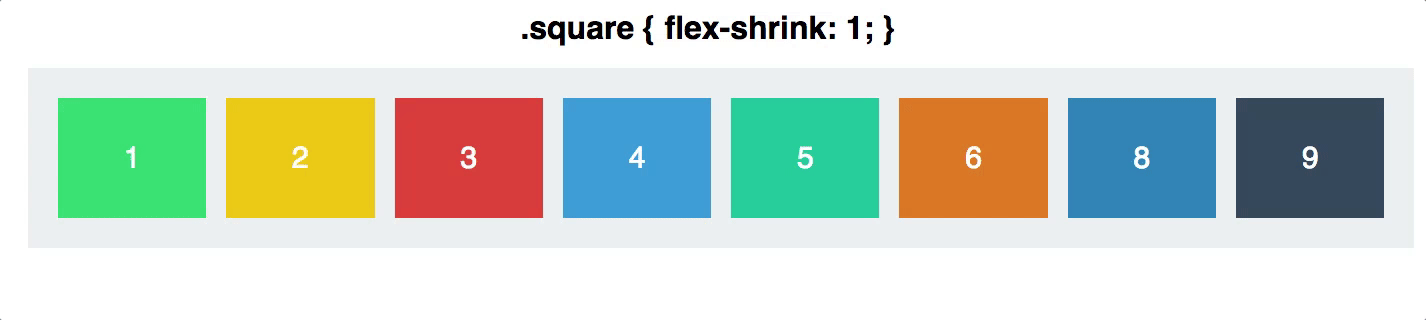
:exclamation: If you have an image as a flex item(a direct children of the flex container), it will be distorted by the automatic sizing and aligning. In order to "protect" the dimensions of an image, we need to put it inside a div.
:::
There are *many* more things you can do with Flexbox. Check out **[CSS Trick's Guide](https://css-tricks.com/snippets/css/a-guide-to-flexbox/)** and take a look at all the possibilities you have.
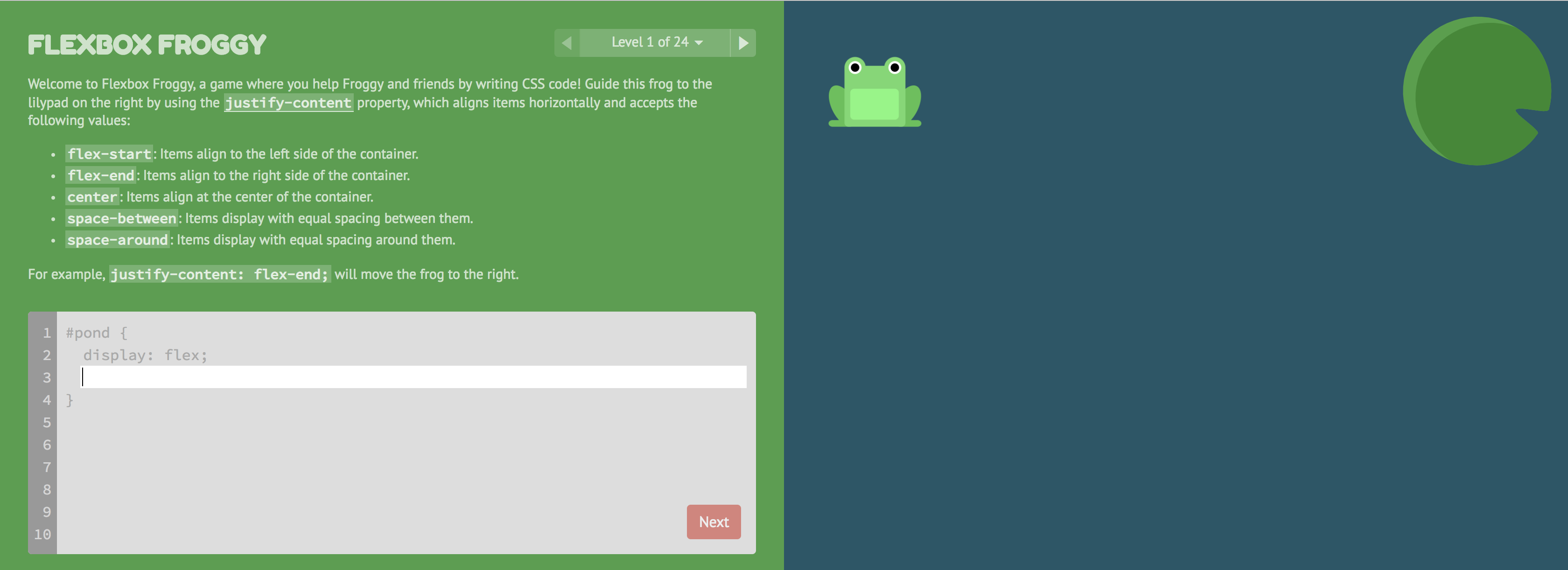
:pencil: **Time to practice**:
To give you some experience with Flexbox and get acquainted with the newly discovered properties, go to [Flexbox Froggy](https://flexboxfroggy.com/) and put your knowledge to practice.
## Summary
In this lesson you have learned how to position elements on your page. You have seen that the `top`, `right`, `bottom`, and `left` properties help you to position elements as you wish.
Also, you have seen that using flexbox you can be much more flexible when positioning elements and you don't have to set strict margin or padding properties.
Positioning is the backbone of CSS. It's the basics of how you can take a boring looking document, and turn it into something really nice. It's also *one of the trickiest* parts of CSS, so don't be discouraged if you found this difficult. Practice makes perfect!
## Extra Resources
- [MDN `position` property](https://developer.mozilla.org/en-US/docs/Web/CSS/position) - See all the detailed information about the property on its documentation.
- [How to use the position property in CSS to align elements + video](https://medium.freecodecamp.org/how-to-use-the-position-property-in-css-to-align-elements-d8f49c403a26)
- [CSS Positioning 101](http://alistapart.com/article/css-positioning-101)
- [Flexbox Froggy](https://flexboxfroggy.com/)
 Sign in via Google
 Sign in via Facebook
 Sign in via X(Twitter)
 Sign in via GitHub
 Sign in via Dropbox
 Sign in with Wallet
Connect another wallet
Sign in with Wallet
Connect another wallet