# Grid | The basics
## Pre-class readings
- [beginners-guide-to-css-grid](https://www.freecodecamp.org/news/a-beginners-guide-to-css-grid-3889612c4b35/)
- [css-grid-layout](https://medialoot.com/blog/a-beginners-guide-to-css-grid-layout/)
- [css-grid-great-example](https://medium.com/@elad/css-grid-for-beginners-ee649080529b)
## Learning goals
After this lesson, you will:
- understand what the Grid does and why we should use it,
- be able to structure your HTML layout with the Grid,
- be able to distinguish between Flexbox and Grid and when you should use you go for one or the other.
## Flexbox vs. Grid
When Flexbox entered the stage it made web developer's work much easier. It was a real life-saver. Although it gave authority over the position of the elements, some people wanted (and needed) more control over the structure. That's why [Grid](https://developer.mozilla.org/en-US/docs/Web/CSS/grid) came to life.
<br>

While Flexbox allows you to control the flow of the elements in one way (horizonally OR vertically), Grid gives you complete control over the structure. You decide how the elements will be placed both on the horizontal as well as the vertical axis.
<br>
<!-- <div style="width:100%;height:0;padding-bottom:51%;position:relative;"><iframe src="https://giphy.com/embed/gxSAtmVNkOmEE" width="100%" height="100%" style="position:absolute" frameBorder="0"></iframe></div>
<br> -->
Does this mean that we need to forget Flexbox and work with only Grid now? _Absolutely not._ You need to be able to discern when is the time to go with Flexbox and when you should go for Grid.
:::warning
Rule of thumb: If you need to align on only one way (horizontal OR vertical), you should use Flexbox. If you need to align on both the vertical AND the horizonal axis, Grid is your pick.
:::
Don't worry, as soon as you start getting comfortable with both technologies, you'll which one to choose.
## Getting started
Now that we've got this cleared, let's start working with Grid. As it was with Flexbox, to make your container behave like a grid you need only one line of code:
`display: grid`
Like it was Flexbox, some values come by default so we need to set them in a way that best fits our interests.
Here are the basic ones that you'll need.
### grid-template-columns and grid-template-rows
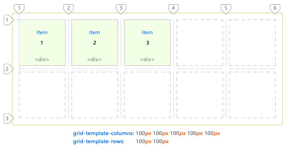
It defines the columns and rows of your grid. You can give percentage, length (all the units) or even a fraction (`fr`) of the free space on the grid. One example:
`grid-template-columns: 20px 20px 20px 20px 20px;`
`grid-template-rows: 20% 60% 20%;`
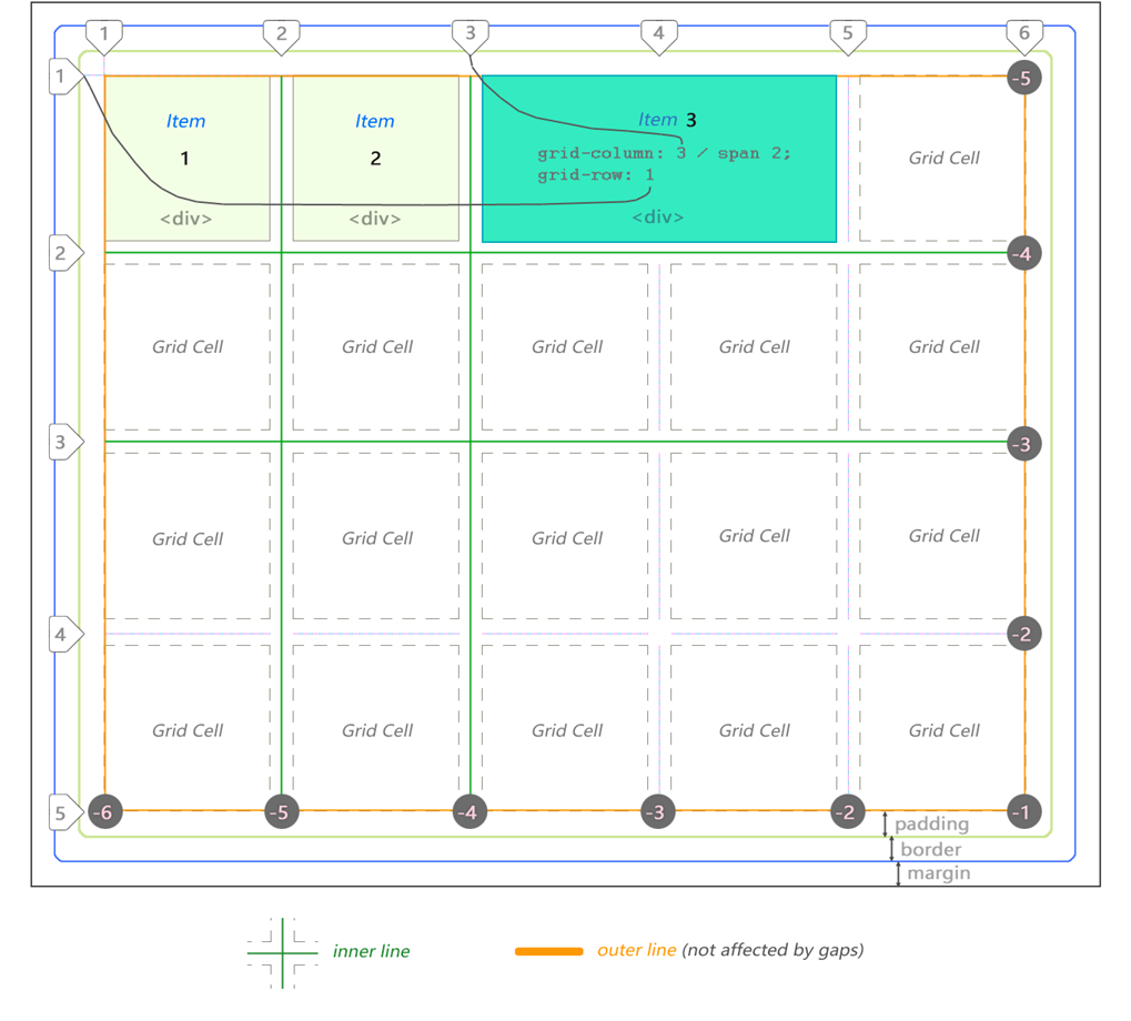
### grid-template-areas and grid-area
Here you can be a bit more semantic and specific when you structure your grid. You identify the children elements with a name and then you organize the grid with these names. By adding a dot `.` you say that this row or column will be empty.
Here's one example of how you can do it:
```css
grid-template-columns: 20% auto;
grid-template-areas:
'header header'
'sidebar content'
'sidebar2 sidebar2'
'footer footer';
```
### grid-column-gap
It allows you to define the space between your grid columns.
For example:
`grid-column-gap: 10px;`
### grid-row-gap
The same but with your grid rows.
### grid-gap
A shorthand that allows you to define both the column and the rows gap. First is the row-gap and then the column-gap.
For example:
`grid-gap: 15px 10px;`
### justify-items
It aligns the grid on the inline axis (row). The value will apply to every direct children of the grid container. By default it is `stretch` which will stretch the grid items to fill the whole grid.
Here are the other values you can give:
`start` - aligns items to be flush with the start edge of their cell
`end` - aligns items to be flush with the end edge of their cell
`center` - aligns items in the center of their cell
### align-items
This one aligns the content along the block axis (column). As it was with `justify-items`, it will affect every direct children of the grid container. Again, it's default value is `stretch`.
Here are other values you can give:
`start` - aligns items to be flush with the start edge of their cell
`end` - aligns items to be flush with the end edge of their cell
`center` - aligns items in the center of their cell
:::info
[Grid by example - Box alignment align-items](https://gridbyexample.com/examples/example24/)
:::
### place-content
Wouldn't be great if we could align everything at once? Well, here is the shorthand for that.
With place-content you align every cell (direct children of the grid container) with only one line.
First you give the `align-items` value then the `justify-item` ones. If you give only one value, it will understand that you want to give the same value to both properties. Useful, no?
:::warning
Be careful when writing these properties. If your get to put them in plural, it won't work.
:::
As we said with Flexbox, there are _many_ more things you can do with Grid. [CSS Trick's Guide](https://css-tricks.com/snippets/css/complete-guide-grid/) will be your best friend again so take a look at it to see all the possibilities you have.
## Grid and Media Queries
With Grid, adjusting the elements according to the device size is much, much simpler.
[Click here](https://codepen.io/rachelandrew/pen/waVBpK) to check out this example of how you can mix grid with media queries.
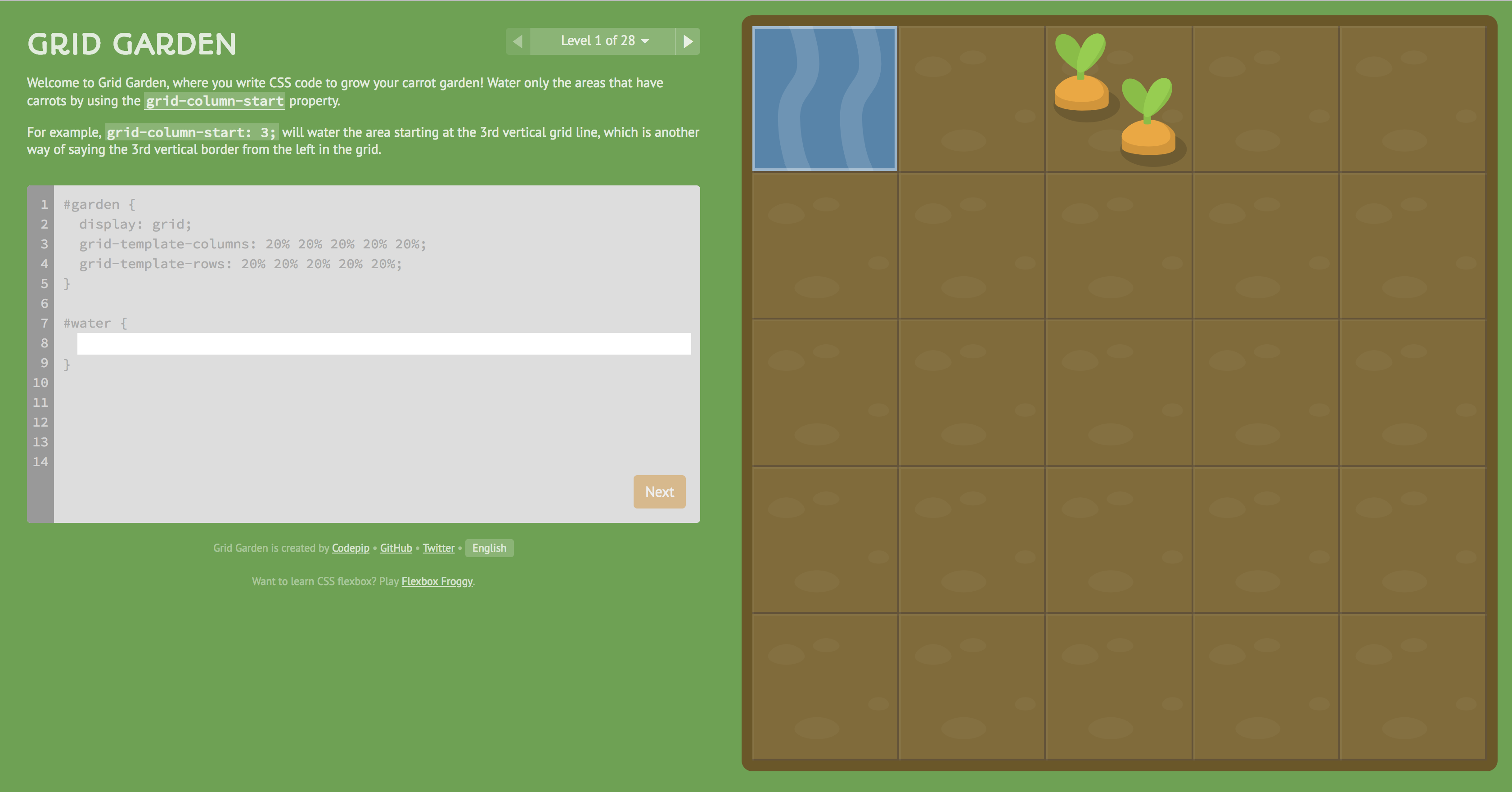
## Let's practice!
After CSS Diner and Flexblox Froggy, we present you [Grid Garden](https://cssgridgarden.com/), a game that you help you solidify your newfound Grid knowledge. Have fun!
 Sign in via Facebook
 Sign in via X(Twitter)
 Sign in via GitHub
 Sign in via Dropbox
 Sign in with Wallet
Connect another wallet
Sign in with Wallet
Connect another wallet