### GDSC NYUST x 資訊創客社
<br>
### 網頁前端開發讀書會
#### CSS進階 & SCSS
<br>
#### 2023/11/13 ( Mon ) 19:00 - 21:00
#### 講師:楊鈞元 Charles
#### 本次課程影片:(⚒️製作中)
<img src="" height="200px">
---
## CSS 進階內容
----
## Layout
## 排版
----
### Box Model
----
#### 每個 block element 都是一個 box
<p class="indent_2"><img src="https://i.imgur.com/L9XTrLY.png" width="500">
</p>
<style>
.indent_2 {
text-indent: 2rem;
}
</style>
----
#### box-sizing
用來定義一個 element 的 box model 大小計算方式
- content-box (預設):
```
element的寬和高僅包括內容的大小
不包括 border, padding, margin
```
- border-box 👍:
```
element的寬和高包含 content 跟 padding
不包括 border, margin
👍 多數 CSS 框架都全域採用此模式
讓 padding 會壓縮內容,margin 不壓縮內容
以此辨別使用時機,也因此只會主要使用 padding 跟 margin
```
----
#### box-sizing 結論
- content-box => 設定內部content大小,外加模式
- border-box 👍 => 設定整個box大小,內縮模式
----
#### context (內容)
顯示內容區域,用 width 和 height 調整內容尺寸
```css=
h1 {
width: 500px;
height: 300px;
background: green;
}
```
----
#### 關於 border-box 的 width 與 height
當 box-sizing 設為 border-box
- width:會設定 border 的寬度
> 任何 block element 預設 width 為100%
- height:會設定 border 的高度
> 設定 height 使用 % 時,若 parent element height 是預設 auto,
> 會導致計算結果 Undefined
> 絕大多數情況不用設定 box 的高度
> 如果有設定,要考慮 overflow (內容超過設定容量)的處理方式
----
#### overflow
- visible (預設): content不會被修剪,會直接呈現在元素框外
- hidden:直接裁切,溢出部分隱藏,不會有滾動軸
- scroll:顯示滾動軸
```css=
p {
overflow: scroll;
/* 可單獨設定overflow-x或overflow-y */
}
```
----
#### padding (留白)
介在 context 跟 border 之間的距離夾層
使用 padding 屬性調整留白大小
```css=
/* 分為
padding-top
padding-right
padding-bottom
padding-left
padding (shorthand)
*/
h1 {
/* 套用四邊 */
padding: 1rem;
}
h1 {
/* 垂直, 水平 */
padding: 5%, 10%;
}
h1 {
/* 上, 右, 下, 左 */
padding: 10px, 22%, 3.5rem, 1.5em;
}
```
----
#### border (邊框)
使用 border 屬性調整邊框大小
```css=
h1 {
/* 同樣邏輯 */
/* 套用四邊 */
/* 垂直, 水平 */
/* 上, 右, 下, 左 */
border: 10px;
}
```
- border-radius (半徑):邊界線條圓滑度
```css=
h1 {
border-radius: 5px;
}
/* 在同寬高的box,設定border-radius: 50%可以畫出整個圓 */
```
----
#### margin(邊界)
使用margin屬性調整大小
```css=
/* 同樣邏輯 */
/* 套用四邊 */
/* 垂直, 水平 */
/* 上, 右, 下, 左 */
h1 {
margin : 10px;
}
```
----
### Display
### 顯示模式
----
- outer display type
- block:寬高可指定,會換行
- inline:寬高不可指定,不會換行
- inline-block:寬高可指定,不會換行
- inner display type
- flex
- grid
----
<p><img src="https://i.imgur.com/4XcF9sm.png" width="100%">
</p>
----
block example
```html=
<head>
<style>
.block-example {
width: 200px;
height: 100px;
background-color: #3498db;
margin-bottom: 10px;
}
</style>
</head>
<body>
<div class="block-example"></div>
<div class="block-example"></div>
</body>
```
----
inline example
```html=
<head>
<style>
.inline-example {
background-color: #e74c3c;
padding: 5px;
margin-right: 10px;
}
</style>
</head>
<body>
<span class="inline-example">Inline 1</span>
<span class="inline-example">Inline 2</span>
<span class="inline-example">Inline 3</span>
</body>
```
----
inline-block example
```html=
<head>
<style>
.inline-block-example {
display: inline-block;
width: 100px;
height: 100px;
background-color: #2ecc71;
margin-right: 10px;
}
</style>
</head>
<body>
<div class="inline-block-example"></div>
<div class="inline-block-example"></div>
<div class="inline-block-example"></div>
</body>
```
----
### Position
### 定位
----
- static(靜態):<br>
預設值,element 會按照 html code 實際由上而下寫的順序進行定位 (以下稱為 [normal flow](https://developer.mozilla.org/en-US/docs/Learn/CSS/CSS_layout/Normal_Flow)) 。
在這種情況下,top, right, bottom, left, z-index 屬性都是無效的。
----
- relative(相對):<br>
element 相對於 normal flow 中的位置進行定位,
但是仍然占據原始空間。
```css=
.example {
position: relative;
top: 10px;
left: 20px;
}
```
----
- absolute(絕對):<br>
element 相對於最接近的已定位 (非 static)
的 parent element 進行定位,如果沒有已定位的父元素,則相對於 `<html> tag`。
```css=
.example {
position: absolute;
top: 30px;
left: 50px;
}
```
----
- fixed(固定):<br>
element 相對於瀏覽器視窗進行定位
即使頁面滾動也會保持在相同的位置。
```css=
.example {
position: fixed;
top: 10px;
right: 10px;
}
```
----
- sticky(黏性):<br>
element 基於用戶滾動的位置進行定位。
在移動到某個位置之前,元素是相對定位的,之後變為固定定位。
```css=
.example {
position: sticky;
top: 20px;
}
```
----
### Stacking Context
### 堆疊環境
----
什麼情況下 elements 之間會產生重疊?
----
- 根元素(HTML):<br>
`<html>` 本身形成一個堆疊情況
在 `<html>` tag 內的 element 預設會蓋在畫面上
----
- position 屬性不為 static 的元素:<br>
當 position 設為 relative, absolute, fixed, sticky 等非預設模式時,element 就會形成堆疊狀態
----
- opacity 屬性不為 1 的元素:<br>
若 element 的 opacity 屬性設為不等於 1,
會形成堆疊狀態。
```
opacity 接受 0 ~ 1 的值,默認 opacity 屬性值是 1,即為完全不透明,
若設為 0.x 出現透明狀態就會產生堆疊狀態。
```
----
- transform 屬性不為 none 的元素:<br>
使用 transform 屬性,並設置不為 none 的值,
會形成堆疊狀態。
<br>
<br>
- z-index 不為 auto 的定位元素
----
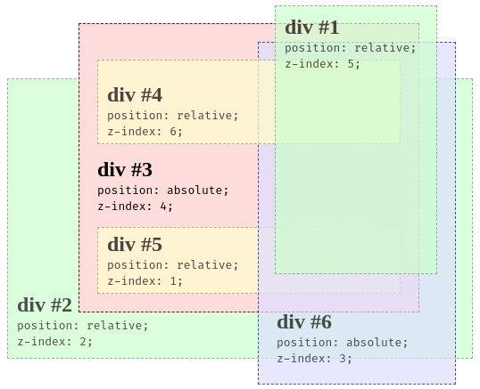
#### z-index
用來設定非 static 的 element 的 重疊優先級
數字越大越越上層,並且接受負數
----

----
```html=
<head>
<style>
.container {
position: relative;
}
.black-box {
position: relative;
z-index: 1;
border: 2px solid black;
height: 100px;
margin: 30px;
}
.gray-box {
position: absolute;
z-index: 3; /* gray box will be above both green and black box */
background: lightgray;
height: 60px;
width: 70%;
left: 50px;
top: 50px;
}
.green-box {
position: absolute;
z-index: 2; /* green box will be above black box */
background: lightgreen;
width: 35%;
left: 270px;
top: -15px;
height: 100px;
}
</style>
</head>
<body>
<h1>Z-index Example</h1>
<p>An element with greater stack order is always above an element with a lower stack order.</p>
<div class="container">
<div class="black-box">Black box (z-index: 1)</div>
<div class="gray-box">Gray box (z-index: 3)</div>
<div class="green-box">Green box (z-index: 2)</div>
</div>
</body>
```
----
👇了解更多判斷依據
- 基本展示 [🔗CSS|z-index|元素堆疊順序 ](https://hackmd.io/@A-Min-Design/BJZ7lGW5v)
- 超複雜情況判斷 [🔗MDN - Stacking context](https://developer.mozilla.org/en-US/docs/Web/CSS/CSS_positioned_layout/Understanding_z-index/Stacking_context)
----
## Styling
## 樣式設計
----
### pseudo-class
### [🔗虛擬類別](https://developer.mozilla.org/zh-TW/docs/Web/CSS/Pseudo-classes)
----
- :hover(懸停)<br>
選擇游標懸停的 element
```css=
a:hover {
color: #ff0000;
}
```
- :active(啟用)<br>
選擇被滑鼠點擊期間直到放開的 element
```css=
button:active {
background-color: #00ff00;
}
```
----
- :focus(焦點)<br>
選擇聚焦的 element,例如等待輸入的輸入框、使用鍵盤如Tab、方向鍵等移動到的區域
```css=
input:focus {
border: 2px solid #0000ff;
}
```
- :not()(非某個)<br>
排除符合特定選擇器的 element
```css=
input:not([type="submit"]) {
border: 1px solid #cccccc;
}
```
----
- :nth-child(n)(第 n 個 child element)<br>
根據其在父元素中的位置選擇元素
```css=
/* 奇數 */
li:nth-child(even) {
background-color: #f2f2f2;
}
/* 偶數 */
li:nth-child(odd) {
background-color: #c2c2c2;
}
/* n倍 + 運算 */
li:nth-child(3n-1) {
background-color: #c2c2c2;
}
```
<span style="font-size:32px"> [🔗進階玩法](https://developer.mozilla.org/en-US/docs/Web/CSS/:nth-child) </span>
----
- :first-child(第一個 child element)<br>
選擇 parent element 的第一個 element
```css=
p:first-child {
margin-top: 0;
}
```
- :last-child(最後一個 child element)<br>
選擇 parent element 的最後一個 child element
```css=
div:last-child {
border-bottom: 1px solid #999999;
}
```
----
### Table Style
### 表格樣式
----
透過對 `<thead>`, `<tbody>`, `<tfoot>`,
以及 `<th>`, `<tr>`, `<td>`
加上 border, padding, margin, backgroud-color 等
可以產生出各種樣式的表格
----
```html=
<head>
<meta charset="UTF-8">
<meta name="viewport" content="width=device-width, initial-scale=1.0">
<style>
table {
width: 100%;
border-collapse: collapse;
margin-bottom: 20px;
}
th,
td {
border: 1px solid #ccc;
padding: 12px;
text-align: left;
}
th {
background-color: #3498db;
color: #fff;
}
tr:nth-child(even) {
background-color: #f9f9f9;
}
tr:hover {
background-color: #e6f7ff;
}
td {
text-align: left;
}
</style>
</head>
<body>
<table>
<thead>
<tr>
<th>產品名稱</th>
<th>價格</th>
<th>庫存</th>
</tr>
</thead>
<tbody>
<tr>
<td>Laptop Pro</td>
<td>$1200</td>
<td>50</td>
</tr>
<tr>
<td>Smartphone X</td>
<td>$800</td>
<td>120</td>
</tr>
<tr>
<td>Wireless Headphones</td>
<td>$150</td>
<td>200</td>
</tr>
<tr>
<td>4K Smart TV</td>
<td>$2000</td>
<td>30</td>
</tr>
<tr>
<td>Gaming Console</td>
<td>$500</td>
<td>80</td>
</tr>
</tbody>
</table>
</body>
```
----
### Opacity
### 不透明度
----
- opacity 用於控制 element 的透明度
這個屬性的值範圍從0 ~ 1 (預設)
代表完全透明 ~ 完全不透明
```
這種方式會影響 element 的所有內容,包括文字和 child element
如果只想調整背景透明度,可以使用rgba
```
----
### Cursor
### 游標樣式
----
- 透過修改 Cursor 可以在游標懸停指定 element
產生不同的樣式變化
但不同瀏覽器樣式會有些許差異
----
[🔗 MDN - 游標樣式表](https://developer.mozilla.org/en-US/docs/Web/CSS/cursor)
----
### Transition
### 轉場 / 過渡
----
- Transition<br>
在 element 狀態改變時,添加動畫效果
通常搭配 pseudo-class 作為觸發條件
----
```css=
.element {
transition: property duration timing-function delay;
}
```
- property:例如 color、opacity 等
- duration:持續時間,可以使用 s(秒)或 ms(毫秒)作為單位
- timing-function:控制過渡速度曲線,例如 ease、linear、ease-in-out 等
- delay:延遲時間,同樣使用 s 或 ms
<br><br>
[🔗 transition - example](https://alvarotrigo.com/blog/css-page-transitions/)
----
### Transform ()
### 變形
----
- Transform<br>
將 element 進行旋轉、縮放、傾斜、平移
瀏覽器透過內部矩陣乘法計算結果位置、大小、形狀,可以搭配Transition使用
<br>
[🔗 MDN - Transform](https://developer.mozilla.org/zh-TW/docs/Web/CSS/transform)
----
### Animation
### 動畫
----
transition + transform 可以完成簡單動畫
更複雜的動畫設定 animation 可以完成
----
- @keyframes
用來定義動畫的關鍵幀
```css=
@keyframes example {
0% { /* 起始狀態 */ }
50% { /* 中間狀態 */ }
100% { /* 結束狀態 */ }
}
/* 在要應用動畫的元素上使用animation屬性 */
.animated-element {
animation: example 3s infinite; /* 3秒循環播放 */
}
```
----
#### animation 系列屬性
- animation-name: 指定動畫名稱
- animation-duration: 指定動畫持續時間
- animation-timing-function: 動畫的時間曲線,如ease-in,ease-out等
- animation-delay: 動畫開始前的延遲時間
- animation-iteration-count: 動畫的循環次數,使用infinite表示無限循環
----
#### direction
| 名稱 | 說明 |
|:----------------- |:----------------------------------------------------------------------------------------- |
| normal | 預設值,正常播放,順向 從0%→100% |
| reverse | 反向播放,逆向 從100%→0% |
| alternate | 正逆向輪流播放,奇數次為0%→100%,偶數次為100%→0%<br>若動畫播放次數只有一次就只會正常播放 |
| alternate-reverse | alternate 的相反,奇數次為100%→0%,偶數次為0%→100% <br>若動畫播放次數只有一次就只會反向播放 |
----
- fill-mode
- none:(預設) 返回最初狀態
- forwards:停留在結束的狀態
- backwards:停留在剛開始的狀態
- both:依據開始或結束決定呈現的狀態
<br>
- play-state
- running:(預設) 播放
- pause:暫停
<br>
[🔗 Animation - Example](https://blog.hubspot.com/website/css-animation-examples)
----
## RWD
## 響應式設計
----
- RWD<br>
使網頁能夠動態調整其佈局和元素的大小,
自動適應各種不同的設備,包括PC, Laptop, Tablet, Mobile 等<br>
RWD沒有通用的標準,只要達成不同裝置
以不同解析度檢視網頁都能適當呈現
減少使用者自行縮放、平移、捲動即可
----
#### 常見的 breakpoint
- 320~480px => 如:行動裝置
- 481~768px => 如:平板裝置
- 769~1024px => 如:筆電
- 1025~1200px => 如:桌上型螢幕
- 1200px => 如:電視、大型投影設備
----
### 常見的策略
- element跟圖片優先使用relative unit
如:rem、%、vw、vh etc.
- 使用 media query
指定寬度範圍套用不同 css
- 採取 flex 或 grid
----
```css
@media not|only mediatype and (mediafeature and|or|not mediafeature) {
/*CSS-Code;*/
}
```
- max-width:最大寬度 (<=)
- min-width:最小寬度 (>=)
```css
@media (max-width: 767px) {
}
@media (max-width: 480px) {
}
@media (min-width: 768px) and (max-width: 979px) {
}
@media (min-width: 980px) {
}
@media (min-width: 1200px) {
}
```
----

[🔗設定臨界點與max、min使用思路](https://blog.hinablue.me/css-media-query-tips/)
----
### Flexbox
----
#### Flexbox 概念<br>
- flex container
任何定義 `display: flex` 的 element
都是 flex container,
其 child element,稱為 flex item
flex item 也可以再定義 `display: flex` ,同時為flex item 跟 flex container
----
- flex-direction:設定main axis (主要方向)
- ➡️row (預設)
- ⬇️column
- ⬅️row-reverse
- ⬆️column-reverse
----
- flex-wrap:設定換行規則
- nowrap:(預設) 強制在一行,若容量不夠會壓縮content
- wrap:自動換行
----
- justify-content:設定 main axis 對齊方式
👇以flex-direction預設row示範
| | <img src="https://i.imgur.com/3tuzb7t.png" width="500px"> | <img src="https://i.imgur.com/fZUSMU1.png" width="600px"> |
| -------- | -------- | -------- |
----
- start:靠容器開頭
- end:靠容器結尾
- center:於基準線置中
- space-between:分散對齊(不留頭尾)
- space-around:分散對齊(留頭尾)
- space-evenly:分散對齊,頭尾間隔只有element間隔的一半
----
- align-items:設定 cross axis (交錯軸) 對齊方式
<img src="https://i.imgur.com/3V6iWcq.png" width="50%">
----
- stretch:(預設) 當child element沒有設定高度時,會被拉長到符合parent element一樣的長度
- flex-start:靠容器開頭(的順時針90度)
- flex-end:靠容器結尾(的順時針90度)
- center:於交錯軸置中
- baseline:以文字為準對齊交錯軸
> cross axis即跟main axis垂直的方向,
> 當flex-direciton為預設row,則
> justify-content => 水平對齊方式
> align-items => 垂直對齊方式
----
- align-self:為單個 flex item 覆寫預設對齊方式 <br>(用法同align-items)<br>
例如container內有3個items
設定align-items為center
中間2號item單獨設定align-self: flex-end

----
- flex items
- flex-grow:container 的剩餘空間分配給 flex items 的伸展係數
- flex-shrink:container 裝不下 items 時,<br>該 flex item 可接受的被壓縮係數
- flex-basis:flex item 基本大小 (預設為0)<br>basis代表的是寬還是高,同樣取決於 main axis
----
usage
```css=
/* 1 value,無單位:grow */
flex: 2;
/* 1 value,有單位:basis */
flex: 10em;
flex: 30px;
flex: min-content;
/* 2 value:grow | basis */
flex: 1 30px;
/* 2 value:grow | shrink */
flex: 2 2;
/* 3 value:grow | shrink | basis */
flex: 2 2 10%;
```
----
sample 1:
```css=
.red{
flex: 1 2 100px;
}
.blue{
flex: 2 1 100px;
}
/* 當containter > 200px:red佔1/3,blue佔2/3 */
/* 當containter < 200px:red佔2/3,blue佔1/3 */
```

----
sample 2:
```css=
.red{
flex-grow: 2;
flex-basis: 100px;
}
.blue{
flex-grow: 1;
flex-shrink: 0;
flex-basis: 100px;
}
```

----
[🔗 Flexbox - Playground](https://codepen.io/peiqun/pen/WYzzYX)
---
## SASS / SCSS
----
SASS 跟 SCSS 都是 CSS 預處理器
用來提高 CSS 的開發效率並使 Code 更易於維護
在編譯之後會將 Code 還原成 CSS 讓瀏覽器讀取
----
使用 SASS 或 SCSS 後的 Feature
- 變數:兩者都支持變數,可以方便地定義和重用數值。
- 巢狀規則:可以使用巢狀規則,使得CSS的層次結構更加清晰。
- 混合(Mixin):允許定義可重用的樣式片段,類似於函數。
- 繼承:可以通過@extend實現樣式的繼承。
- 運算:支持更多數學運算,使得尺寸和顏色的計算更加方便。
----
| CSS | SASS | SCSS |
| -------- | -------- | -------- |
|  | |  |
----

----
[🔗 鐵人賽-30天掌握 Sass 語法](https://ithelp.ithome.com.tw/users/20040221/ironman/562)
---
## 結語和問答
----
### 回顧課程
----
### 補充學習資源
----
- [coding_dev_](https://instagram.com/coding_dev_)
- [vlt_dev](https://instagram.com/vlt_dev)
- [codebustler](https://instagram.com/codebustler)
- [codewith_random](https://instagram.com/codewith_random)
- [hopeui.io](https://instagram.com/hopeui.io)
- [juliocodes](https://instagram.com/juliocodes)
- [coding.stella](https://instagram.com/coding.stella)
- [codeworks4u](https://instagram.com/codeworks4u)
- [baby_wolf_codes](https://instagram.com/baby_wolf_codes)
- [coderlab.dev](https://instagram.com/coderlab.dev)
- [mr__frontend](https://instagram.com/mr__frontend)
- [(中文) this.web](https://instagram.com/this.web)
- [(中文) Coding Studio](https://www.instagram.com/coding.studio.tw/)
----
### Q & A
{"title":"CSS進階 & SCSS","slideOptions":"{\"transition\":\"concave\",\"allottedMinutes\":100}","contributors":"[{\"id\":\"f8142aa2-66aa-4867-821d-2f1ffff7a7ba\",\"add\":20879,\"del\":4616}]","description":"用來定義一個 element 的 box model 大小計算方式"}