# CSS Flex Box Documentation
---
**CSS Flexbox**, or the Flexible Box Layout, is a layout model that allows you to design responsive web layouts more easily and efficiently. It provides a way to distribute space among items in a container, even when their sizes are unknown or dynamic. Flexbox is particularly useful for creating one-dimensional layouts, either in a row or a column.
- **Flex Container**: The parent element that holds flex items. You make a container a flex container by setting its display property to flex or inline-flex.
- Flex Items: The direct children of a flex container that will be arranged according to the flexbox model.
## Properties of CSS Flex Box
1. Flex-basis
2. Flex-grow
3. flex-shrink
>```
> **Flex-basis**
This property defines the initial size of a flex item before any space distribution takes place. It can be set to a specific length (like 100px), a percentage (like 50%), or auto, which means the item's size will be based on its content.
> **Refer Image**
> **<https://drive.google.com/file/d/1dPZvsa2yzb6GCwUvLTzimQ37CO3f5Uby/view?usp=drive_link>**
```css
.item {
flex-basis: 200px;
}
```
> **Flex-grow**
This property determines how much a flex item should grow relative to the rest of the flex items in the container when there is extra space available. It accepts a unitless number (usually between 0 and 1). A value of 0 means the item will not grow, while a higher value means it will take up more space.
> **Refer Image**
> **<https://drive.google.com/file/d/1HyfTlT1q_zVLQe7ip-HaKXHPV0Uz1P18/view?usp=drive_link>**
```css
.item {
flex-grow: 1; /* This item will take up available space */
}
```
> **Flex-shrink**
This property defines how much a flex item should shrink relative to other flex items when there isn't enough space. Like flex-grow, it also accepts a unitless number. A value of 1 means the item can shrink if needed, while 0 means it will not shrink.
> **Refer Image**
> **<https://drive.google.com/file/d/19YBaIzXx8r5Bn8JN3mKuXUsYOQND84NU/view?usp=drive_link>**
```css
.item {
flex-shrink: 1; /* This item can shrink to fit the container */
}
```
> **Combining Properties**
These three properties can be combined using the shorthand flex property, which can set flex-grow, flex-shrink, and flex-basis all at once.
```css
.item {
flex: 1 1 200px; /* grow, shrink, basis */
}
```
# MCQ's
---
> 1.**The flex-basis property defines the initial size of a flex item.**
a) True
b) False
> 2.**What property do you use to make an element a flex container?**
a) display: block;
b) display: flex;
c) display: grid;
> 3.**Which property determines how much a flex item can grow?**
a) flex-shrink
b) flex-basis
c) flex-grow
> 4.**What is the default value of flex-direction?**
a) row
b) column
c) row-reverse
> 5.**Match the property with its description:**
| Property | Description
| --- | ---
| A. flex-basis | 1. How much the item can shrink |
| B. flex-grow | 2. Initial size of the flex item |
| C. flex-shrink | 3. How much the item can grow |
6.**Given the following CSS:**
```css
.container {
display: flex;
}
.item1 {
flex-basis: 100px;
flex-grow: 1;
}
.item2 {
flex-basis: 50px;
flex-grow: 2;
}
```
>**If there is extra space in the container, which item will take up more space?**
a) item1
b) item2
c) Both will take the same space
7.**Given the CSS:**
```css
.item {
flex-shrink: 0;
}
```
> **If the container is smaller than the item, what will happen?**
a) The item will shrink
b) The item will not shrink
c) The item will disappear
> 8.**The default value of flex-wrap is __________.**
> 9.**The property that controls how flex items are aligned in the main axis is __________.**
> 10.**If you have three items with `flex-grow: 1` and one item with `flex-grow: 2`, which item will take up more space when there’s extra room?**
a) The first item
b) The last item
c) All items equally
> 11.**Match the flex-direction values with their meanings:**
| Value | Meaning
| --- | ---
| A. row | 1. Items arranged from top to bottom |
| B. column | 2. Items arranged from left to right |
| C. row-reverse | 3. Items arranged from right to left |
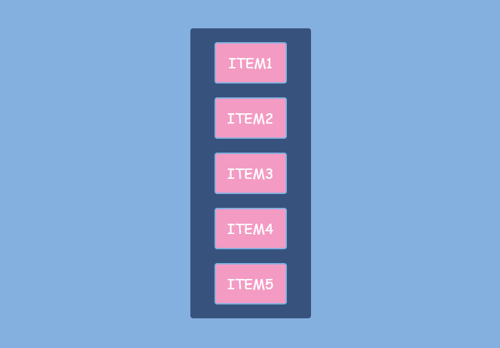
> 11.**What is the flex-direction of the flex container?**
a) column
b) row
c) column-reverse

> 12.**What property is used to achieve this alignment?**
a) justify-content
b) align-items
c) flex-direction
> 13.**Which of the following properties can be used to control how flex items are displayed on different screen sizes?**
a) flex-basis
b) media queries
c) flex-direction
> 14.**What is the purpose of the align-content property?**
a) To align individual items within a row
b) To align the entire flex container in the main axis
c) To align the flex lines within the container
15.**Given the CSS:**
```css
.item {
flex-grow: 2;
}
```
> **What will happen if there is extra space?**
a) The item will grow twice as much as items with flex-grow: 1
b) The item will remain the same size
c) The item will shrink
> 16.**The gap property can only be used in grid layouts, not in flex layouts.**
a) True
b) False
> 17.**The flex-shrink property allows items to grow in size.**
a) True
b) False
> 18.**Which property is used to control the spacing between flex items?**
a) gap
b) margin
c) padding
> 19.**Which property would you use to center items horizontally in a flex container?**
a) align-items: center;
b) justify-content: center;
c) align-content: center;
> 20.**Which of the following is NOT a value for flex-direction?**
a) row
b) column
c) diagonal
> 21.**If you want all items in a flex container to have equal space around them, which value should you use for justify-content?**
a) flex-start
b) space-between
c) space-around
> 22.**Match the Flexbox Terms with Their Definitions**
| Term | Definition
| --- | ---
| A. Main axis |1. The axis perpendicular to the main axis |
| B. Cross axis |2. The primary direction items are arranged |
| C. Flex item | 3. An individual item within a flex container |
> 23.**To create space between flex items without using margins, you can use the __________ property in a flex container.**
> 24.**The default value of the align-items property is __________.**
> 25.**Description:** A flex container with three boxes, one significantly larger than the others.
**Question: If the large box has a ``flex-basis set to 200px``, what does this imply?**
a) It will only grow to 200px
b) It starts at 200px before any growth
c) It cannot grow
> 26.**Description:** A flex container with three boxes evenly spaced across the width.
**Question: Which justify-content value is applied?**
a) flex-start
b) space-between
c) center
> 27.**Given this CSS:**
```css
.container {
display: flex;
flex-direction: column;
}
```
> **How will the items be arranged?**
a) In a row
b) In a column
c) In a grid
> 28.**What will happen if you apply ``flex: 2 1 150px; ``to a flex item?**
a) It will grow twice as fast, shrink if necessary, and start at 150px.
b) It will not shrink and will always be 150px.
c) It will take up all available space.
> 29.**Imagine a flex container with ``flex-direction: column`` and three items inside, each with different flex-basis values. What will happen if the container's height is reduced?**
a) All items will remain the same size.
b) The items will shrink based on their flex-shrink values.
c) The largest item will disappear.
> 30.**If a flex container has `align-content: space-between` and contains two lines of items, how will the space be distributed?**
a) The space will be distributed evenly between the items on each line.
b) There will be no space between the lines, and all items will be packed together.
c) The space between the two lines will be distributed evenly, with no extra space above the first line or below the last line.
 Sign in with Wallet
Connect another wallet
Sign in with Wallet
Connect another wallet