# CSS
---
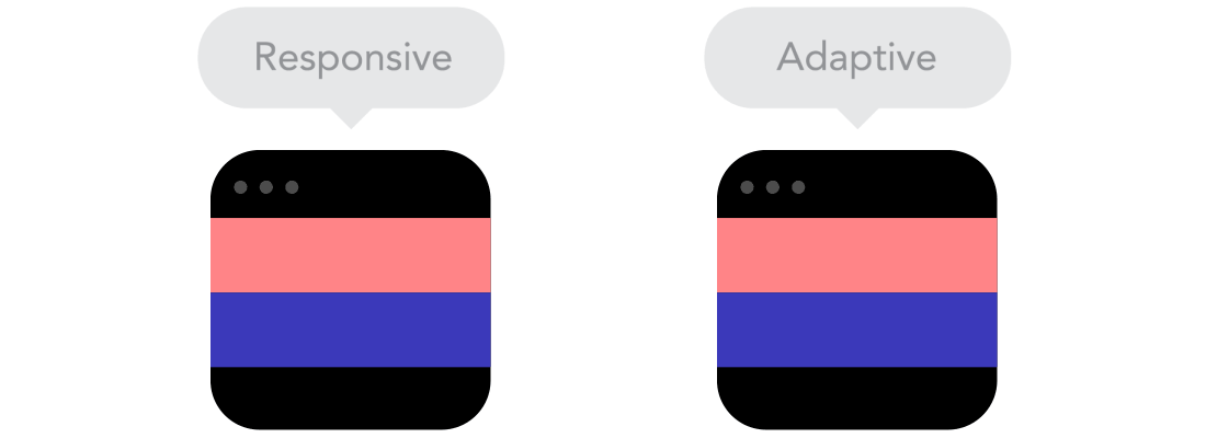
### Responsive and Adaptive Design
Responsive and adaptive design are methods to allow the appearance of our site to change depending on the size of the browser we are viewing it on.
To retain a useful and continuous design for your page, we use either responsive or adaptive design, but there are differences between the two methods.
---
### What is responsive design?
Responsive websites _respond_ to the size of the browser **at any given point**.
Responsive design can be thought of as ‘smooth’ design.
---
### What is adaptive design?
Adaptive design waits for specific conditions at which to _adapt_ the layout.
Can be thought of as ‘snap’ design
---

---
### Responsive VS Adaptive
Responsive can be applied to a wider range of devices and potential resizes, but adaptive can be more efficient for specific applications, such as designing for just a few known device displays.
---
### Responsive design links
Links
Ethan Marcott’s 2010 article outlining responsive design theory

Illustrated xplanation of various basic principles of responsive design

---
### Desktop First vs Mobile First

---
### Media Queries
/* On screens that are 992px or less, set the background color to blue */
@media screen and (max-width: 992px) {
body {
background-color: blue;
}
}
/* On screens that are 600px or less, set the background color to olive */
@media screen and (max-width: 600px) {
body {
background-color: olive;
}
}
---
The mobile-first approach is a tenet of **progressive enhancement**. It is the ideology that mobile design, as the hardest, should be done first. What it boils down to is that, the smallest of the designs will have only the essential features, so right away you have designed the heart of your UX. The opposite approach is **graceful degradation**.
http://www.milehighcomics.com/ - bad mobile experience
USEFUL EXPLAINER https://www.uxpin.com/studio/blog/a-hands-on-guide-to-mobile-first-design/
---
| PROS | CONS |
| -------- | -------- |
| Reduces websites and apps to absolute essentials | Less creative freedom
| Allows you to create a user experience that favours mobile devices | Requires more time and effort to develop from scratch |
---
| PROS | CONS |
| -------- | -------- |
| Decreases download times | Clients are used to seeing a desktop version of the site as a prototype
| Increasing numbers of users use the mobile internet | Do your users even use the mobile internet? |
Prioritises content over aesthetic design | Desktop version might feel overly simplistic
---
### BEM CSS
---
#### WHAT is BEM CSS?
###### BEM is a Front-End Methodology splitting your HTML into classes
Blocks Elements Modifiers

---
#### WHY BEM?
###### BEM improves modularity and avoids CSS inheritance
* Modularity: chopping projects into pieces to make it manageable.
* Inheritance: Child elements inherit their traits from the parent block - this can be troublesome when the Element is removed from the Block.
* Cascading:
---

---
#### HOW do I BEM?
###### There are strict class naming rules for BEM
```
blockname
blockname__element
blockname__element--modifier
blockname--mod-ifier
```
---
###### Let's look at an example:

---
Recommended reading:
* http://getbem.com/introduction/
* http://getbem.com/naming/
* https://www.phase2technology.com/blog/used-and-abused-css
---
### Viewport Units vs. Percentage
#### Comparing vh/vw & % when sizing elements
The viewport is the area where the browser renders the site
Percentage is used to size an element based on the viewport, eg. a sidebar
vh measures 1/100th of the height
vw measures 1/100th of the width
They are responsive length units!
---
| PROS | CONS |
| -------- | -------- |
| Viewport units allow sizing to be scaled down| Percentage is relative to parent properties |
| Overflow can be avoided by the hidden property | Viewport units can overflow |
| Viewport units reduces the amount of code needed to make a website responsive |
---
### The **em** & **rem** debate
**em:** equal to the computed value of the font-size property of the element in which it is used.
**rem:** equal to the computed value of font-size on the root element.
While em is relative to the font-size of its direct or nearest parent, rem is only relative to the html (root) font-size.
---
**rem** allows you to scale font sizes across the whole page but **em** does allow for more control.
You may prefer to use **em** to allow for scalability within a specific design element - like in a navigation menu.
But **rem** allows the layout to accomodate specific user preferences and adjust to fit their browser.
---
https://create.kahoot.it/share/d3e9a89f-5d31-4f81-910c-6f9231778d15
{"metaMigratedAt":"2023-06-15T01:13:45.889Z","metaMigratedFrom":"Content","title":"CSS","breaks":true,"contributors":"[{\"id\":\"5c8d1f73-6329-4c8b-88d4-bfb2f8bc28c4\",\"add\":1590,\"del\":295},{\"id\":\"b7e4b4c1-5e70-41f5-9ed1-09ff128c58df\",\"add\":1906,\"del\":335},{\"id\":\"7a8e5efa-23d6-4b8f-8e21-d8d2bcafea85\",\"add\":1440,\"del\":450},{\"id\":\"09c2cb97-7340-43ab-a79b-d087b968c372\",\"add\":1761,\"del\":361}]"}