---
tags: ll-cluster-illustrating-ideas
---
# Illustrating Ideas: Comic Prototype Tutorial (Marcus K)
*by Marcus Knoke*
> [time=Wed, Feb 2, 2022 1:15 PM]
## Researching & Choosing Your Topic and Images
You will start with researching models for what you want your comic strip to look like, and what you want to talk about. I would recommend community comic spaces, like the [comic subreddit](https://www.reddit.com/r/comicbooks/). Look for topics that interest you, and think about how you can use a comic-style product to analyze them.
After your research, find images that you want to edit or draw to include in your comic. For a 2-page product, I recommend finding at least 6 images (3 images/page), but the more the merrier! You don't want your images to get too small. Good comic policy is a maximum of 12 images per page, if each of your panels is very very small. This is a design decision that you will have to make -- how many images? How big? In what alignment? Also, think about the composition of the photo.
Take this image for example:
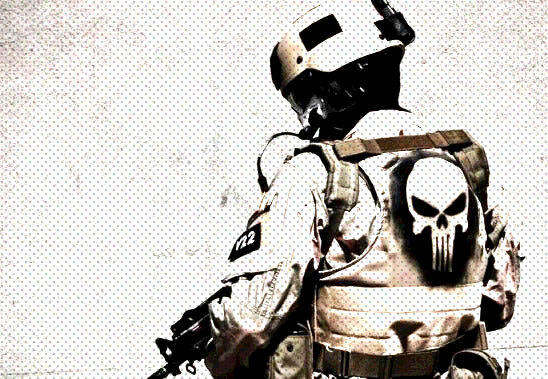
The subject is off-center -- he is mostly on the right side of the frame, while the left side is more empty. I picked this image because I knew that the empty space provided the perfect spot to put a comic word blurb.
I did crop the helmet out, as well, in order for the image to fit into a horiztonal rectangle. But I knew this was okay, because the focus of my panel was the punisher skull, anyways, which is still very clear.
It's important that you pick good pictures, because after you've edited all of them, it would be a shame to discover that your images are the wrong sizes for what you were imagining.
## Editing Your Images
Once you have your pictures, there are two main ways that you can turn them into comics: through tracing or editing. In this tutorial, I will explain how I edited my photos in Photoshop.
First, I open my image in Photoshop. I begin with Adjustments -- I want to change the Brightness/Contrast, the Vibrance/Saturation, and the Posterization. I turn up Brightness, Contrast, Vibrance, and Saturation. The exact amount is subjective. I usually find myself in the 40-80 range for all of these properties.
Next is Posterization. This is a bit more complicated. It takes values from 2 to 225, and the lower the number, the higher the posterization. This is an effect that really makes your image look like a comic book illustration. I usually choose between 5 and 12. If the posterization is too low, the image will be too distorted, but if it is too high, you won't be able to tell that the adjustment was applied.
My final step in Photoshop is to add Noise, in that comic book way. I create a new layer and fill it with white, and place this on top of all my other layers. I add Noise -- usually around 50%. Then, I add "Halftone color". For my settings, I do "4, 45, 45, 45, 45". For my noise layer, I turn down the opacity to about 20-30% (again, subjective depending on the image). After that, I export the photo and I'm good to go!
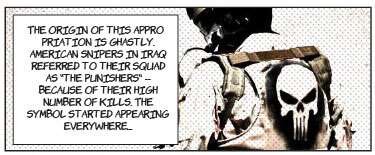
Here's what I created today:
## Arranging and Adding Text
I used Adobe Illustrator to arrange my images and add text to them. [This was a very helpful video tutorial that I followed in order to complete by two-page comic spread](https://www.youtube.com/watch?v=UpG6V2WbhDs)
Here is a general, step-by-step guide.
To start, make sure that the edited images that you want to use are saved and organized into a single folder. This will make importing and managing your files much easier.
Open Illustrator, create a new document, go to "advanced settings" and then "more settings" and set up your document like this.
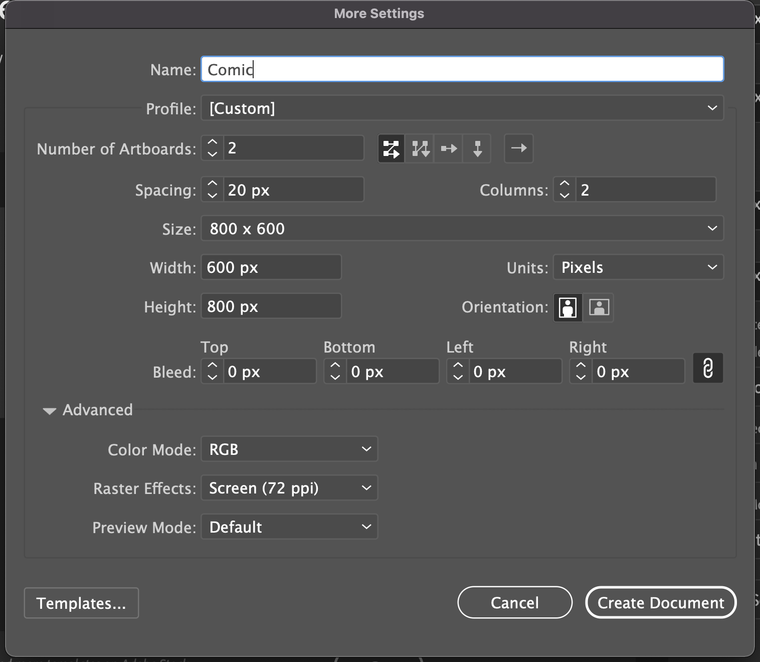
"Number of artboards" refers to the number of pages that you want. So if you are doing a two-page comic spread, make sure to select two. Create your document.
Next, you need to create your gutters, or your panels. A "gutter" is the space between comic panels, where there is nothing. Use the rectangle tool to draw panels. Leave enough space between them so that nothing feels crowded. Don't be symmetrical -- comics are much more interesting when the panels are asymmetrical and progress unexpectedly. Here's an example of what a two-page spread could look like:
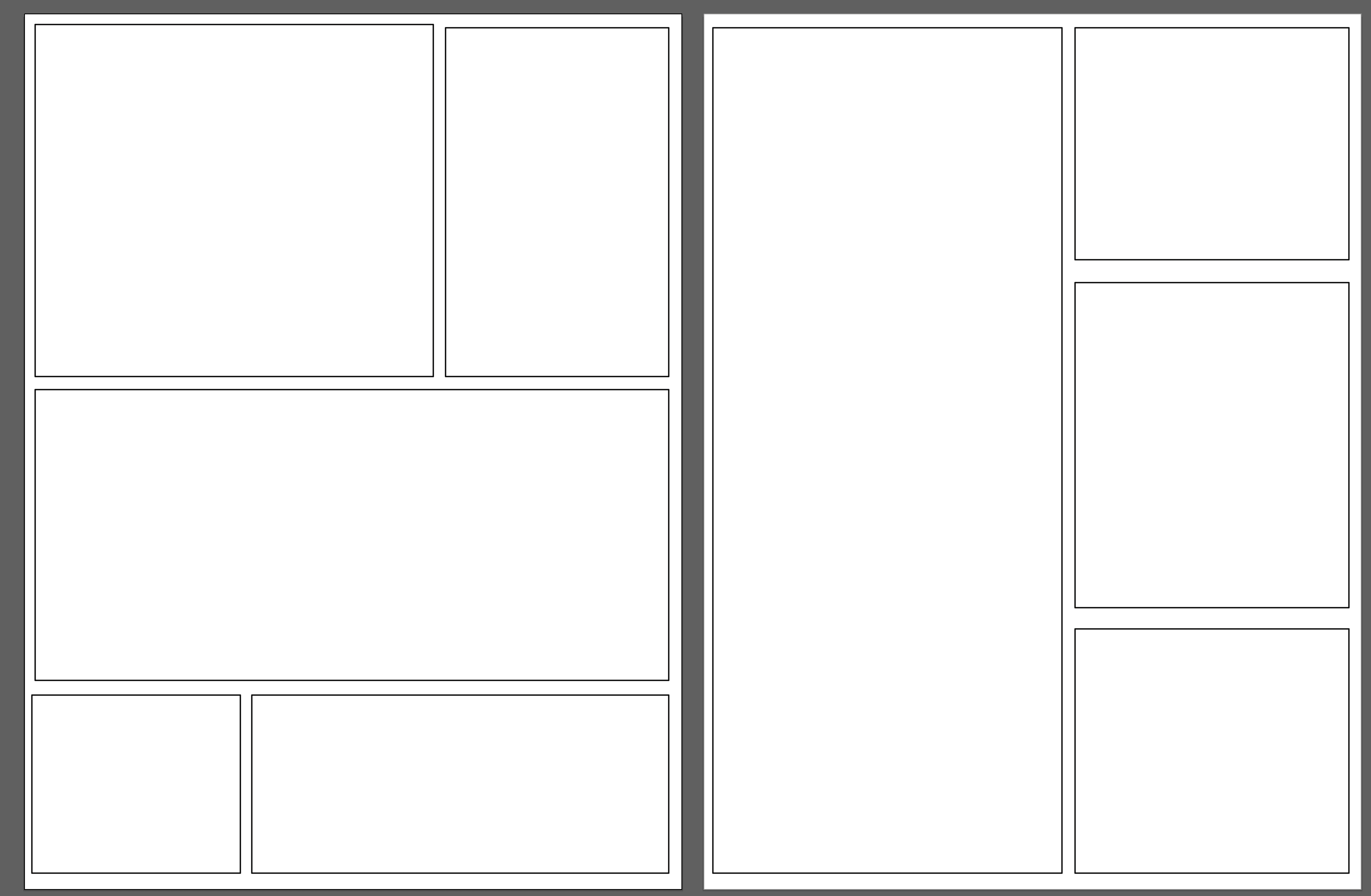
You can adjust the width of your box lines with the "stroke" property. Select a box, and on the right side of the screen you should see a properties window where "stroke" is an adjustment option. I wouldn't make the lines too thick, or it will distract from the images. When creating your box sizes, also keep in mind how many images you want to use, and generally what size they are. You couldn't use a long rectangle (like I have on the second page of the example) if you didn't have a long, vertical photo that would be suitable for that panel. Have fun with this!
Now, in order to upload and crop our images as simply as possible, we must create a clipping layer and a border layer. When you've made your borders and feel certain, duplicate the layer in the "layers" tab on the far left side of the screen. I recorded my screen to show you what this looks like:
<iframe width="560" height="315" src="https://www.youtube.com/embed/Isf4tItDabw" title="YouTube video player" frameborder="0" allow="accelerometer; autoplay; clipboard-write; encrypted-media; gyroscope; picture-in-picture" allowfullscreen></iframe>
At the end, you saw that I locked and hid the "frame" layer. That's because while we are working with our images, we only want to work with clipping masks, and don't want to mess up our formal frames.
Start by dragging an image from finder/files into your Illustrator window. Start by resizing your image if necessary -- hold down shift while grabbing the corner in order to maintain your proportions. Move it to fill one of your comic panels and adjust the size as much as possible to fit. It's better that the image flows over a little bit, as we are going to use the frame as a clipping mask! Once you have it sized, right-click the image. A menu will come up -- hover over "arrangement" and then hit "send to back". This will send the image behind your white-fill comic panel. You will select **both** the image and the comic panel it is under, right-click, and click "make clipping mask". This will clip your image to fit exactly the comic panel.
<iframe width="560" height="315" src="https://www.youtube.com/embed/i5Wn4xMhh0Y" title="YouTube video player" frameborder="0" allow="accelerometer; autoplay; clipboard-write; encrypted-media; gyroscope; picture-in-picture" allowfullscreen></iframe>
Do this with all your images until your artboard is full! Then, you will move on to the final step: adding text!
## Text
The last step to creating a really great 2-page comic spread is adding text. In Illustrator, you will do this on a new empty layer, with the frame and clipping layers locked. You want to make sure that once you have finalized your design, nothing moves unless you want it to. You don't want to put your text right on the image -- in comics, text is most often contained within a text bubble or a rectangular text blurb.
If you want text to appear alongside characters -- narrating the story, for example -- you will start by adding a rectangle to the image. Choose an empty spot that will not obscure the meaning of the image, click on the rectangle tool in the toolbar, and click and drag to create your ideal text box size. The rectangle fill should be white, and the stroke should be black.
Now, add your text on top. Select the "text" tool from the toolbar, click where you want your text to start, and drag out a rectangle for where you want your text contained. Lorem ipsum (filler) text should appear. Now, edit your text to say whatever you would like!
If you want your text to appear as if the character is saying it, you will want to draw a bubble instead of a box. Hold click on the rectangle tool and from the dropdown list, select "oval" instead. Click and drag to create your oval. To add a tail to the mouth of the character, use the line or shape tools to draw two lines towards your character's mouth. Then, add your text as before!
The font of text that you choose for your comic strip is very important. In your basic fonts package, the only suitable font is Comic Sans. This is not a bad font, but most comics use a different font called Komika. Download the font [here](https://www.1001fonts.com/komika-font.html) and it should be available for use in Illustrator!
Here is my finished comic. Hope you enjoyed the tutorial!

 Sign in with Wallet
Connect another wallet
Sign in with Wallet
Connect another wallet